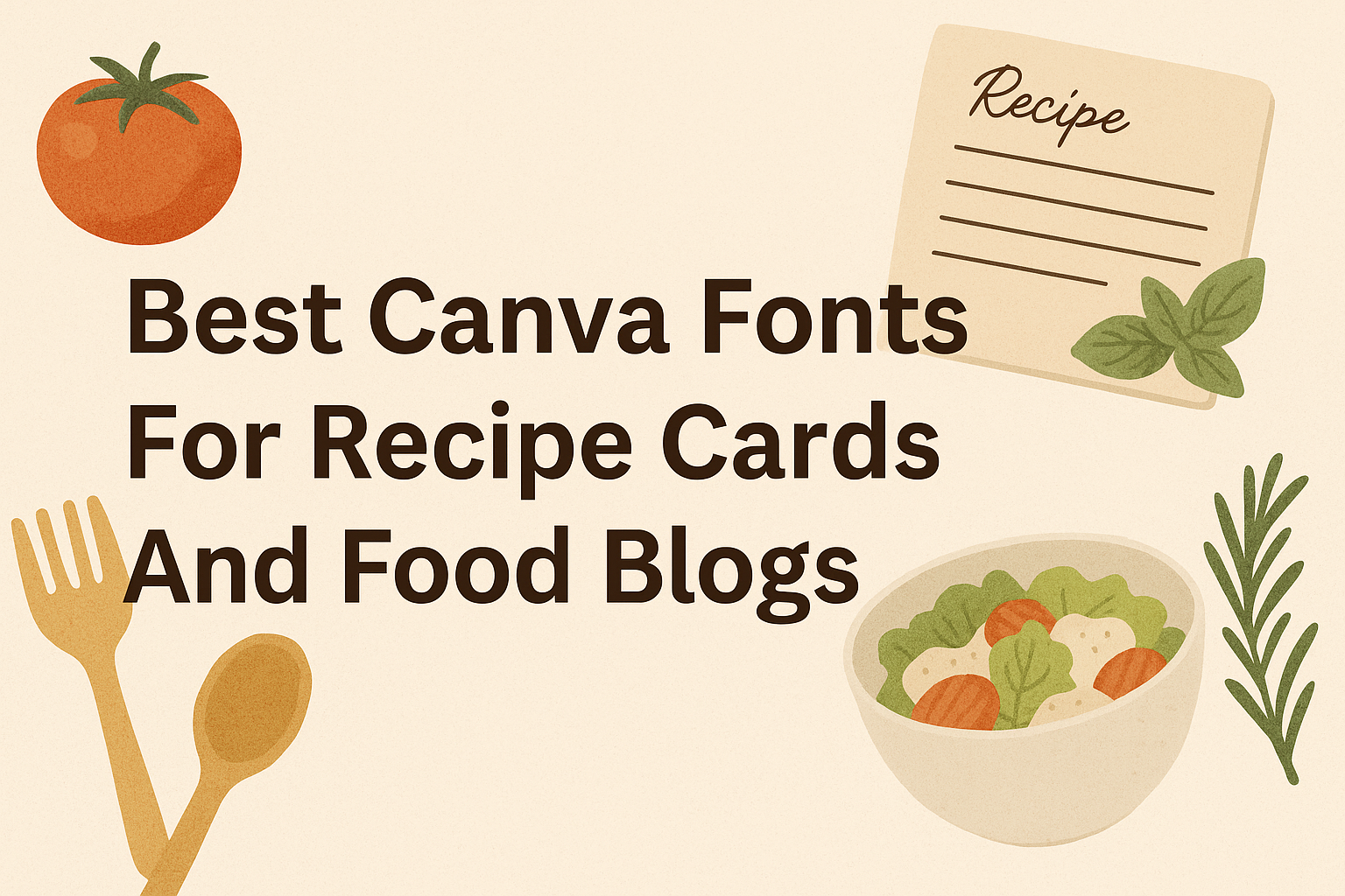
Choosing the right font can make recipe cards and food blogs look tasty and inviting. The best fonts are easy to read but also match the style of the food, whether it’s a cozy home-cooked meal or a fancy dessert.
Fonts like Atkinson Hyperlegible and Poppins are great choices because they keep the text clear, while calligraphic fonts like Lavonia Classy add a stylish touch to titles or headers. A perfect font mix helps readers enjoy the recipes without struggling to read them.
People who design food content want fonts that work well for different uses, from headlines to ingredient lists. Using the right font sets the mood and makes the recipes memorable, whether on a card, blog, or social media post. You can learn more about the best Canva fonts for these projects at 10 Best Canva Fonts For Menus.
Top Canva Fonts for Recipe Cards
Fonts that add charm, feel personal, or keep things clean all work well. This balance helps the reader enjoy the recipe without strain or confusion.
Script Fonts That Add Personality
Script fonts like Eyesome Script are great for adding a personal touch. They mimic handwriting but often with a neat style that stays easy to read. These fonts are best used for titles or headings on recipe cards to catch attention.
While script fonts give a stylish look, they should be used sparingly. Too much script text can make reading long instructions harder. Combining script fonts with simpler fonts helps keep the card clear and beautiful.
Handwritten Fonts for a Homemade Feel
Handwritten fonts give recipe cards a warm, cozy vibe that feels like a family recipe. They look friendly and informal, which suits dishes made with care. People choosing this style often want to highlight the personal story behind the food.
Fonts that look handwritten should still be legible at small sizes. If the text is too fancy or messy, readers might struggle with the recipe steps. Canva offers several neat handwritten fonts that balance charm and clarity well.
Modern Sans Serif Fonts for Clarity
Sans serif fonts have no extra strokes on letters, making them clean and modern. These fonts stand out clearly, especially when listing ingredients or directions. They work well on recipe cards where easy reading is important.
A modern sans serif font is often paired with a serif or script font for titles to add contrast. Sans serif fonts like Montserrat or Poppins help the main text look crisp and professional. This style works for food blogs looking for both style and readability.
Choosing the Right Canva Fonts for Food Blogs
Picking fonts for food blogs means balancing style with ease of reading. Fonts should capture the blog’s personality while keeping readers engaged. Using different fonts for headers, body text, and accents helps organize content and makes the blog visually appealing.
Fonts for Blog Headers
Blog headers need fonts that grab attention without overwhelming the reader. Many food bloggers choose serif fonts for headers because they look elegant and can add a touch of sophistication.
Calligraphic or script-style fonts also work well for blog titles if they match the blog’s theme, but they should be clear. Fonts like Lavonia Classy or Eyesome Script give a personal and creative feel, which suits food blogs with artistic flair.
Headers should not be too busy. Using a bold or large size helps the title stand out and sets the mood for the content that follows.
Body Text Font Choices
For body text, readability is key. Many bloggers opt for sans serif fonts because they are simple and clean, making long paragraphs easy to read on screens.
Fonts like Atkinson Hyperlegible, Montserrat, or Poppins work well since they keep the text neat and avoid eye strain. Consistency is important; using the same font and size throughout body text keeps the blog professional.
Avoid decorative or complex fonts in body text because they can distract or confuse readers. The file size of the font also matters for loading speed; simpler fonts often load faster, improving user experience.
Accent and Decorative Fonts
Accent fonts add personality to recipe cards or special blog sections like quotes, categories, or buttons. These fonts should contrast the body text without clashing.
Small doses of decorative fonts, such as RoxBoroughCF or WC Mano Negra Bold, highlight important parts without hurting readability. They work well in headers or subheaders, giving a little fun or art to the design.
Using accent fonts sparingly keeps content clear and focused. Pairing a simple sans serif with a subtle decorative font often creates a balanced and inviting look.
Best Sans Serif Fonts for Food Design
Sans serif fonts are a popular choice for food designs because they keep text clear and modern. They work well for recipe cards and food blogs where readability matters. Some styles focus on simplicity, while others add personality with bold shapes and fun details.
Clean and Minimal Sans Serif Styles
Clean sans serif fonts are perfect when the goal is a neat and easy-to-read look. Fonts like Raleway and Barlow offer smooth lines and balanced spacing. They help readers quickly scan ingredients and instructions without feeling crowded.
These styles are often used for body text on recipe cards because they don’t distract from the content. Minimal fonts match well with simple food photos, letting the food itself stand out. They give a fresh, calm vibe that suits many types of cooking styles.
Playful and Bold Sans Serif Options
For a more eye-catching design, bold sans serif fonts bring energy and fun to food projects. Fonts like Garet Book and Glacial Indifference have strong shapes that can make headings or titles pop. Using these fonts helps highlight key parts, like the recipe name or special ingredients.
Playful sans serif fonts are great when the brand is friendly and approachable. They add character without losing readability. Combining a bold font for headings with a clean one for body text creates a balanced, inviting look for any food blog or recipe card.
Learn more about popular sans serif styles and their uses in The Best Sans Serif Fonts on Canva.
Essential Serif Fonts for Culinary Content
Serif fonts bring a timeless and professional feel to any culinary project. They balance style with clarity, making them ideal for recipe cards and food blogs. The right serif font can highlight titles while keeping the main text easy to read.
Classic Serif Fonts for Titles
Classic serif fonts stand out with their strong, clean lines and elegant details. They work well for recipe card titles or food blog headings because they catch the eye without being too flashy.
Fonts like Cormorant Garamond offer wide spacing and a graceful look that makes titles pop. The small decorative strokes on each letter add a sense of tradition and quality, perfect for gourmet or homemade recipes.
Choosing a classic serif for titles ensures the name of the dish or section is clear and memorable. This helps readers quickly find what they want on a recipe card or blog page.
Elegant Serif Fonts for Readability
When it comes to recipe instructions or blog body text, readability is key. Elegant serif fonts provide smooth, flowing letter shapes that guide the eye easily across lines of text.
Fonts such as Georgia or Merriweather combine grace with simplicity. Their moderate contrast between thick and thin strokes reduces eye strain during longer reading sessions.
These fonts keep recipes and tips clear without dulling the text’s personality. Italic versions of serif fonts can also add a subtle flair to ingredient lists or emphasized steps, making the content feel polished yet accessible.
For those designing culinary content, selecting serif fonts that blend beauty with legibility makes a big difference in engaging readers.
Find more suggestions about serif fonts suited to food projects at 20 Best Serif Fonts for Timeless Designs on Canva.
Script and Handwritten Fonts That Inspire Appetite
Fonts that look like handwriting or flowing script can add warmth and personality to recipe cards and food blogs. They often make food feel more inviting, fresh, and homemade. Different styles of these fonts, from fancy curls to relaxed strokes, suit various food themes.
Curly and Decorative Script Fonts
Curly and decorative script fonts bring a sense of elegance and flair. They use swirls and loops that can make titles and dish names stand out. Fonts like Eyesome Script fit well here, offering stylish curves that look fancy but remain readable.
These fonts work great for upscale or artisanal foods, like bakery menus or gourmet recipe cards. They add a feeling of creativity and care. When used sparingly for headings, they catch the eye without overwhelming the rest of the content.
Casual Handwritten Choices
Casual handwritten fonts feel personal and approachable. They often mimic everyday handwriting, making recipes and food blogs seem friendly and down-to-earth. These fonts suit home cooking, family recipes, or farmer’s market guides.
They tend to be simple and clear, helping readers focus on the text rather than the style. Casual fonts work well for notes or ingredient lists. They give a genuine, warm vibe without being too fancy or complex.
Tips for Mixing and Matching Canva Fonts
Choosing the right combination of fonts can make recipe cards and food blogs look both stylish and clear. To do this well, it helps to understand how to mix different font styles and keep the text easy to read. Using font pairings that balance personality and clarity is key.
Pairing Script with Serif or Sans Serif
Script fonts like Eyesome Script add a personal, handwritten feel. They work best when paired with simpler fonts. A script paired with a serif font gives a classic, warm look. For example, using Eyesome Script for headings with a serif like Libre Baskerville for body text creates a nice contrast without clutter.
Pairing a script with a sans serif font often feels more modern and clean. Sans serif fonts like Montserrat or Open Sans keep the text readable and fresh. This combo is great for food blogs that want a casual but neat style.
When pairing scripts, keep the script limited to short titles or accents. This avoids crowding the design and keeps the focus balanced.
Balancing Readability and Style
Readability is the most important factor for recipe cards. Fonts need to be clear at smaller sizes since people read recipes quickly. Sans serif fonts usually offer the best clarity for body text because their plain shapes are easier on the eyes.
Style can come from font weight or using different variants like bold or italic. For example, using Montserrat Light for the ingredients list and Montserrat Bold for section headers keeps the card attractive but easy to follow.
Creating hierarchy with size and weight helps users scan the recipe fast. Avoid using too many fonts; two or three is enough. Using simple, clean fonts paired with one expressive font keeps the design readable and interesting.
Exporting and Using Canva Fonts in Digital and Print Projects
Using Canva fonts effectively means knowing how to export designs properly and understanding the rules about font use. This helps keep projects looking sharp and avoids legal issues when sharing or printing recipes and blog content.
Exporting Font Files for Different Uses
Canva does not allow users to export font files directly. Instead, users can export their entire design as a file, such as a PDF, PNG, or JPG. For print projects like recipe cards, exporting as a high-quality PDF is best because it keeps fonts sharp and ready for professional printing.
For digital use, formats like PNG or JPG work well since they save the design as an image, preserving the font style exactly as it appears. Users can also export PDFs with embedded fonts, ensuring compatibility across platforms and devices.
If someone wants to use a font outside Canva, they must find and download it elsewhere, as Canva only licenses fonts for use inside its platform. More details on this are in the guide on exporting from Canva.
Font Licensing Considerations
Fonts in Canva are licensed for use within Canva’s design platform, including for commercial projects like food blogs and recipe cards. This means users can legally create and share designs using these fonts without buying extra licenses.
However, if someone wants to use a Canva font outside the platform—like in other software or for selling the font itself—they must buy a license from the font’s original creator. Not all Canva fonts are free to download or use outside Canva, so checking the font’s licensing terms is important.
More help on understanding font licenses is available with the Canva font download guide.