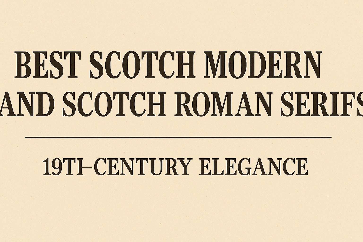
Scotch Modern and Scotch Roman serifs are known for their timeless 19th-century elegance, blending classic style with modern readability. These typefaces bring a refined look that works well for both body text and headings. They are prized for their clean lines, distinct serifs, and balanced contrasts, making them a perfect choice for anyone seeking a sophisticated yet legible font.
Originating in the early 1800s, Scotch Roman fonts became popular in the United States and the UK, thanks to type designers like William Miller and Richard Austin. Scotch Modern, a close relative, offers a slightly sharper, more Didone-inspired style. Many modern fonts, like Georgia and Miller, draw inspiration from these timeless designs.
Anyone interested in vintage typography or looking to add a classic touch to their project will find these serifs especially appealing. Their combination of readability and style keeps them relevant, even in today’s digital age.
Defining Scotch Roman and Scotch Modern Serifs
Scotch Roman and Scotch Modern are serif fonts with roots in the 19th century. Both reflect a style that balances clarity and elegance through strong contrast and distinct serif shapes. These two font styles share history but differ in details like serif shape and stroke contrast.
Key Features and Characteristics
Scotch Roman is known for its broad, flat, bracketed serifs and a vertical axis. It shows medium-high stroke contrast with narrow apertures. This makes it easy to read in both body text and headings.
Scotch Roman fonts have a “small, neat, round” shape with long ascenders, giving text an elegant but approachable look. The lowercase “t” often has a flat top, which is a detail from the early 20th-century versions by foundries like A.D. Farmer.
Scotch Modern evolved as a refinement of Scotch Roman and the Didone style. It has sharper and more lavish serifs, with pot hook shapes and tighter apertures. Scotch Modern’s stroke contrast is stronger, leaning more towards the “modern” style seen in Bodoni and Didot, but it keeps bracketed serifs, maintaining some softness compared to pure Didone fonts.
Distinguishing Traits vs. Bodoni and Didot
Bodoni and Didot are classic Didone fonts, known for extreme contrast and thin, unbracketed serifs. Scotch Roman, by contrast, uses broader, bracketed serifs that create a less rigid feel.
While Bodoni and Didot have sharply vertical strokes with hairline serifs, Scotch Roman’s letters modulate stroke width a bit more. The apertures in Scotch Roman are narrower, which improves readability in small sizes.
Scotch Modern sits between the two groups. It shares strong contrast with Bodoni and Didot but keeps bracketed serifs, unlike their pure Didone designs. This makes Scotch Modern a bolder but still warm choice for designers wanting Victorian-era style without the harshness of pure Didone fonts.
Evolution of the Scotch Genre
The Scotch Roman style began in early 1800s Scotland, based on William Miller’s Pica No. 2 design. Richard Austin likely cut the original types, which were later modified in the U.S. by the A.D. Farmer foundry.
By the late 19th century, Scotch Roman was widely used in print, praised for its elegance and legibility. It influenced American fine printers and remained popular for book text.
Scotch Modern emerged as a refined evolution of Scotch Roman and the Didone style. Designers like Nick Shinn brought new life to it in the 21st century by blending Victorian influences with modern type needs.
For more details, visit Scotch Roman – Wikipedia.
Historical Origins and 19th-Century Context
The Scotch Roman style began with precise type design efforts in early 19th-century Scotland and quickly became popular in the United States. Its development was shaped by key designers and foundries, as well as by influential voices in the printing world who helped define its practical and aesthetic qualities.
William Miller and Richard Austin
William Miller’s foundry in Edinburgh played a major role in creating the original Scotch Roman typefaces. The earliest surviving example is from 1813, based on a design called Pica No. 2. Some sources credit Richard Austin, an expert punch-cutter, with crafting the metal punches. Austin was well-known for his work on the Bell types for the British Letter Foundry before collaborating with Miller.
Their work featured clear, balanced letterforms with broad, flat serifs and distinct ball terminals. This style aimed to be legible and refined for use in printing newspapers and books. Their designs set lasting standards for Scotch Roman typography.
The Role of Miller & Richard Foundry
The Miller & Richard foundry became known for producing these influential typefaces, spreading their design through Britain and, importantly, across the Atlantic to the U.S. In America, the style was adapted and renamed Scotch Roman. The A.D. Farmer foundry in New York made modifications like flat-topped lowercase t’s, which helped define the American version.
These foundries refined the style while maintaining its essential legibility and neat appearance. They helped Scotch Roman typefaces become a go-to choice for body text and headlines throughout the 19th century.
Influence of De Vinne and Typographic Movements
Theodore Low De Vinne, a prominent printer and author, praised Scotch Roman for its neat and readable qualities. He described it as having small, round letters and long ascenders, striking a balance between style and function. His endorsement influenced printers to use this serif style widely.
Scotch Roman typefaces fit within the broader “modern” genre of typography, marked by high contrast in stroke widths and broad, bracketed serifs. However, they remain distinct from Didone styles due to their moderated stroke contrast and narrower apertures. These movements shaped the evolving look and feel of printed text during that century.
For more detailed history, see Scotch Roman’s evolution at Wikipedia.
Influence on Modern Typeface Design
Scotch Modern and Scotch Roman serif typefaces have shaped the way designers create fonts today. Their clear shapes, legibility, and refined details continue to inspire many modern serif typefaces used in print and digital media.
Revival Efforts: Miller, Caledonia, Escrow
Several typefaces have brought Scotch Roman and Scotch Modern styles back into use. Miller, designed by Matthew Carter in the 1990s, revives Scotch Roman with a focus on readability for newspapers and magazines. It keeps the classic contrast and bracketed serifs but suits modern printing needs.
Caledonia, created by William Addison Dwiggins in the 1930s, is inspired by Scotch Roman but tailored for book text. It balances elegance with functionality, making it popular in publishing.
Escrow is a newer design that blends Scotch Modern’s sharp serifs and Victorian flair with contemporary clarity. These revivals show how designers value the style’s legibility and charm, updating it for today’s use.
Transition from 19th to 21st Century
The shift from the 19th century to the present brought changes in technology and taste in typography. Scotch Modern and Scotch Roman, initially crafted for metal type and printing presses, adapted to phototypesetting and, later, digital screens.
This evolution demanded clearer characters and better performance at small sizes. Modern printing presses and digital displays required fonts that retained detail without losing sharpness.
Connection to Contemporary Serif Fonts
Many contemporary serif fonts owe their shapes and design principles to Scotch Roman and Scotch Modern. Their strong vertical stress, high contrast between thick and thin strokes, and bracketed serifs remain foundations in modern typography.
Fonts like Georgia and other widely used modern serifs share these traits, emphasizing readability on screens. Designers still rely on the balanced structure and timeless elegance found in Scotch types when creating new fonts that need to work in both print and digital environments.
Popular and Influential Scotch-Inspired Fonts
Scotch Modern and Scotch Roman typefaces have shaped 19th-century serif design with their distinctive elegance. Different foundries and platforms have played key roles in keeping these styles alive through digital adaptations and broad distribution. Many designers rely on well-crafted versions from historic and contemporary sources to use these fonts today.
Notable Digital Adaptations
Nick Shinn’s Scotch Modern is one of the most recognized digital adaptations. Released in 2008, it draws from Victorian times but adds modern refinements, such as lavish serifs and tiny apertures. This version balances classic style with detailed shapes perfect for text and display use.
Other similar fonts capture the sharp contrasts and bracketed serifs typical of Scotch Romans. These adaptations often include small caps, old-style figures, and italic swash capitals, enhancing typographic options. Their precision helps maintain the historical feel but with clean digital form.
For designers seeking these vintage styles, high-quality digital revivals offer a solid mix of tradition and modern usability, preserving the core identity of Scotch typefaces while improving legibility on screens.
Typefaces from Monotype and Linotype
Monotype and Linotype, two major font foundries, have also contributed notable versions of Scotch Roman and Modern fonts. Monotype’s collections often include classic Scotch designs repurposed for modern printers and digital screens. They focus on good readability and traditional serif details.
Linotype’s approach emphasizes versatility. Their Scotch Roman fonts maintain historical features like strong vertical stress and bracketed serifs, suited for both book typesetting and headlines. Linotype versions are popular among publishers who want authentic Victorian-era flavor.
Both foundries ensure their fonts are available in a range of weights and styles. This allows designers to use Scotch-inspired fonts in many projects, from formal documents to creative branding with a classic edge.
Bureau and Contemporary Font Foundries
Bureau, a known contemporary type foundry, offers fresh takes on Scotch genre typefaces. Their releases often blend historical roots with modern stylistic tweaks. Bureau focuses on clear structure and intricate details that make these fonts fit current graphic design trends.
Other newer foundries also produce Scotch-inspired serif fonts that feature sharp contrasts and elegant serifs. These updates reflect ongoing interest in 19th-century styles but add features like expanded character sets and better screen performance.
Using fonts from Bureau and similar foundries helps designers add old-fashioned charm combined with modern usability. This variety benefits digital projects needing a mix of tradition and crisp appearance.
Role of myfonts and fonts.com
myfonts and fonts.com serve as crucial hubs for sourcing Scotch Modern and Scotch Roman fonts. They offer large libraries where designers can preview, compare, and buy fonts from many foundries, including Monotype, Linotype, and Bureau.
Both platforms provide detailed font samples, licensing options, and user reviews. This makes it easier to choose between digital revivals or contemporary iterations of Scotch serifs. They bridge font creators and users globally, helping keep these typefaces widely accessible.
Furthermore, myfonts and fonts.com often showcase font families with multiple weights and styles. This helps users build consistent typography systems using Scotch-inspired fonts for print or web projects.
Scotch Modern and Scotch Roman in Typography Today
Both Scotch Modern and Scotch Roman continue to influence typography with their distinct serif styles. They offer strong legibility and timeless appeal, making them suitable for various design needs. Their use spans branding, editorial work, and digital platforms, balancing tradition with modern demands.
Applications in Branding and Editorial Design
Scotch Modern and Scotch Roman are popular choices for brands seeking a classic yet refined look. Their sharp serifs and clear letterforms convey professionalism and reliability. Many editorial designers prefer these fonts for book printing or high-end magazines due to their clean, readable shapes.
Brands in finance, publishing, and luxury goods often use these serifs to suggest authority and trust. Scotch Modern, with its subtle stroke endings, adds elegance without feeling outdated. Scotch Roman’s historic roots appeal to designers aiming for a vintage or scholarly tone.
Readability and Versatility in Web and Print Use
Both serifs work well in print and digital formats because they maintain clarity at multiple sizes. Scotch Modern especially benefits from its slightly rounded stroke ends, which reduce eye strain in body text.
On screens, modern digital versions support better rendering and scalability than earlier metal type origins.
Their versatility also means they adapt from formal paragraphs to stylish headlines without losing impact. Designers value that these fonts hold detail in print while staying legible on lower-resolution displays.
Comparisons with Sans Serif and Other Serifs
Compared to sans serif fonts, both Scotch Modern and Scotch Roman offer more traditional and formal styles. Sans serifs are often preferred for minimalism and modernity, but these Scotch serifs provide warmth and historical depth.
When comparing to other serifs, Scotch Roman is a bit more robust with higher contrast, while Scotch Modern leans toward a cleaner, more refined look. Both stand apart from classic old-style serifs by balancing sharpness with legibility.
For projects needing elegance with function, they often outperform overly decorative serifs or crisp but neutral sans serifs.
Key Variations and Related Serif Families
Scotch Modern and Scotch Roman typefaces have connections to earlier serif styles and have influenced later designs.
Granjon, Garamond, and Square Serif Connections
Scotch Roman shows influence from older serif styles like Granjon and Garamond. These historic typefaces are known for their classic, elegant shapes and moderate contrast between thick and thin strokes. Granjon and Garamond have soft, rounded serifs compared to the sharper Scotch Roman serifs.
Square serifs also play a role in this mix. They have straighter, block-like ends on letters, giving a more geometric feel. Some Scotch Romans have this square serif style, blending traditional and modern touches.
Transitional and Modern Adaptations
Scotch Modern evolved as a transition from Scotch Roman and Didone typefaces. It features sharper, pot-hook serifs and a strong contrast between thick and thin strokes. These details make it taller and more dramatic than Scotch Roman but less stark than other Modern types like Bodoni.
Nick Shinn’s revival of Scotch Modern updated these characteristics for digital use. His version keeps the elegance but improves legibility in smaller sizes.
For more details on Scotch Modern’s style and history, see Scotch Modern typeface information.