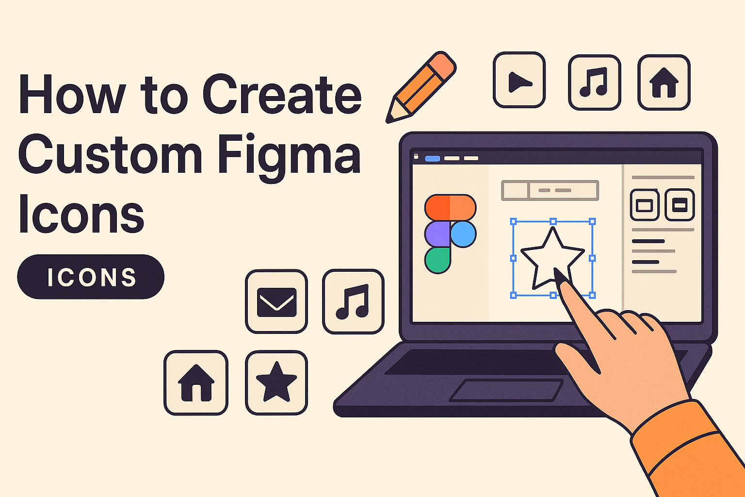
Creating custom icons in Figma can be an exciting way to showcase creativity and enhance design projects. With the right steps, even beginners can craft icons that stand out.
In the realm of digital design, Figma offers a flexible environment for crafting icons. Designers can create a new file, set up their artboard using the Frame tool, and then start designing. This hands-on approach not only improves design skills but also helps in creating a personalized touch in projects.
By following a step-by-step guide, anyone can unlock the full potential of Figma. Whether it’s through learning basic tools or experimenting with more advanced techniques, the journey of creating icons can lead to the production of standout visuals. Explore this further to learn about crafting icons that aren’t just functional but visually appealing too.
Understanding the Basics of Figma
Before diving deeper into Figma, it’s important to grasp the fundamental components, such as the interface, how to use vector networks, and the tools for managing frames and layers.
The Figma Interface
Figma’s interface is designed to be intuitive for both beginners and experienced designers. Key elements include the toolbar, which contains essential tools like the move and shape tools. The left sidebar houses layers and assets, while the right sidebar is for design properties. The center area is the canvas where creations come to life. Navigating these components efficiently speeds up the design process. For example, users can quickly switch between tools using keyboard shortcuts, enhancing productivity.
Vector Networks Explained
Vector networks in Figma offer a more flexible way to create shapes compared to traditional vector paths. Unlike typical vector paths, nodes in vector networks allow multiple connections. This allows users to create complex shapes more easily and edit them with precision. To modify a vector network, users can simply add or remove nodes and adjust their connections. This ensures that designers can produce more intricate designs without hassle. The ability to manipulate these networks without breaking them gives Figma an edge in design flexibility.
Working With Frames and Layers
Frames are the foundation of Figma’s design system. They act as containers for other objects, such as text, images, and shapes. Frames can be nested, which is useful for organizing design projects. Layers, on the other hand, help in arranging elements within a frame. They work similarly to other design tools, maintaining a stack order where items can be adjusted to appear in front or behind others. Understanding how to work with frames and layers is vital for managing complex designs efficiently. This knowledge enables designers to keep their projects tidy and easy to navigate.
Setting up Your Figma File
Getting started in Figma involves setting up a new file and organizing your workspace effectively. This includes creating a new design file and arranging the artboard to ensure smooth workflow and accessibility to tools.
Creating a New File
To begin working on custom icons in Figma, opening a new file is the first crucial step. Click on the ‘New File’ button when you launch Figma. This opens an empty canvas where all your icon designs will take shape. Starting fresh allows for creativity without limits.
After opening a new file, users should explore the toolbar to become familiar with tools like the Frame and Shape tools. These tools help in laying down the initial design elements. It’s also important to set the file’s properties, like name and description, which helps in organization later.
Organizing Your Workspace
Organizing your workspace well can make the design process much smoother. In Figma, it’s useful to set up an artboard, known as a Frame. This will be the base for your icons. By drawing a square or other shape, designers can keep all elements neatly aligned.
Using layers is another great way to organize the file. Layers can hold different parts of your design, making it easy to modify or update elements without confusion. Naming and grouping layers helps maintain clarity, especially in complex projects.
Lastly, customizing shortcuts and tool placements can enhance efficiency. Figma provides options to adjust these settings, allowing users to streamline their workflow further. A well-organized space aids in creativity and productivity.
Design Principles for Icons
Designing icons in Figma requires attention to consistency, color choice, and proper use of grids. These elements ensure icons are both functional and visually appealing. Each aspect plays a crucial role in creating icons that are effective and easy to understand.
Consistency in Design
Consistency is key when designing icons. It helps to maintain a uniform look across all icons, making them easily recognizable and visually compatible. This involves using similar shapes and line weights, which ensures harmony.
Maintaining a consistent size is also important. Icons should appear balanced when viewed together. When creating a set, establish rules for dimensions and strokes. Keep these settings the same for each icon. This approach prevents any icon from standing out in an undesirable way.
Additionally, keep the style consistent. Whether using a flat design or adding depth through shadows and highlights, stick with one style throughout. This helps reinforce the visual language of the icon set.
Choosing a Color Palette
A well-chosen color palette enhances icon design by adding clarity and focus. Begin by selecting a base palette with a few key colors. Limit the number of colors to maintain simplicity and avoid visual clutter.
Contrast is important in making icons stand out. Using contrasting colors can highlight important parts of an icon. For example, a dark icon on a light background, or vice versa, increases visibility.
Colors in icons should also align with the overall design scheme of the project they are part of. This creates a cohesive look between the icons and other design elements, like buttons and text. Carefully selected hues can also convey specific meanings or emotions.
Understanding Icon Grids and Size
Grids play a crucial role in creating icons with precision and alignment. By using grids, designers can ensure each element of an icon is evenly spaced and aligned. This helps achieve a polished, professional appearance.
An icon’s size must be considered carefully, as it affects how users perceive the icon. Icons are often used in various contexts, from small size in a mobile app to larger sizes on a desktop interface. Scaling the icon correctly while maintaining detail is essential.
Using grids also aids in maintaining consistent sizing across a set of icons. Stick to a standard grid size for all icons, which ensures that they appear uniform when used together. This is especially important for projects like user interfaces, where icons must integrate seamlessly with other elements.
Drawing and Editing Shapes
Creating custom icons in Figma involves mastering a few different techniques for working with shapes. This includes starting with basic forms, combining them using special tools, and adjusting their curves and points for precision.
Starting With Basic Shapes
In Figma, basic shapes like rectangles, circles, and lines are the building blocks for icon design. Users can find these under the shape tool in the Figma toolbar.
To draw a shape, simply select the desired shape icon and drag your cursor on the canvas to size it just right. Holding Shift while dragging will help in maintaining proportions for perfect squares or circles.
Experimenting with these basic forms provides a strong foundation for more complex designs. For beginners, practicing shapes like triangles and polygons can be beneficial.
Combining Shapes with Boolean Operations
Boolean operations allow designers to merge, subtract, or intersect shapes. This technique is essential for creating more intricate icons.
Figma offers options like Union, Subtract, Intersect, and Exclude to modify shapes. For example, using Union combines multiple shapes into one, simplifying complex designs.
To use Boolean operations, select the shapes you wish to modify and choose the desired operation from the top panel. It allows for cleaner, more efficient design processes.
Editing Points and Curves
Fine-tuning shapes involves editing their individual points and curves. This step brings precision and refinement to icon design.
Figma provides a pen tool that allows for adding or removing points on a shape. Each point can be adjusted by dragging to modify the angle or curve.
For smoother curves, designers can use the bezier handles that extend from each point. Using handles effectively brings fluidity to designs, ensuring they look polished and professional.
Adding Details and Textures
When creating custom icons in Figma, adding details and textures can really make them stand out. This involves creatively incorporating text or logos, and using effects like grain to give depth.
Incorporating Text and Logos
Text and logos can personalize icons. This involves using the text tool in Figma to add custom typography to represent brands or specific messages.
They should be kept simple and legible. Choosing the right font size and style is crucial to ensure clarity. Icons must remain balanced, so adjustments in weight and alignment might be necessary.
Logos, when incorporated, should not overshadow the icon’s primary function. Using the vector tools, designers can merge logos smoothly. This helps maintain the icon’s integrity and ensures the additional element doesn’t feel out of place.
Using Effects and Grain
Effects, like shadows or gradients, can add dimension. Figma provides various effects that help draw attention to specific parts of an icon.
Grain is one such effect that textures the icon subtly. It can create a tactile feel, making icons more visually appealing. Applying grain involves adjusting transparency and size so it blends effortlessly with the icon.
Balancing the grain’s intensity is key to prevent overpowering the original design. Experimenting with different effect combinations can lead to unique outcomes, offering the icon a custom look while maintaining functionality and style.
Finalizing Your Icon
Finalizing a custom icon in Figma involves tweaking the design and ensuring it looks perfect on any screen size. This includes adjusting its composition for balance and checking every pixel to ensure clarity and sharpness.
Adjusting the Final Composition
The final composition of an icon is crucial for visual appeal. Begin by checking the alignment of elements within the icon. Use Figma’s alignment tools to ensure everything is perfectly centered, both horizontally and vertically. It’s important for individual elements to not feel cramped within the frame.
Adjust the spacing between components for clarity. Consider the negative space around and within the icon. This space allows the design to breathe and enhances readability. Choose colors that contrast well, creating a strong visual presence. Consistency with style, such as stroke weight and corner radius, is essential. These elements provide uniformity and a professional look.
Reviewing for Pixel Perfection
Pixel perfection is vital for an icon to look sharp on various devices. Zoom in to check the edges of each shape. The lines should be crisp and unblurred. Use Figma’s pixel preview mode to see how the icon appears at different resolutions.
Edges should align with Figma’s pixel grid. This avoids blurry lines when scaled. If lines look jagged or blurred, adjust their placement within the grid. Review each element to ensure there are no unnecessary extra pixels.
Exporting Icons from Figma
Exporting icons from Figma is simple and essential for sharing and using your designs. To start, select the icon’s frame by clicking on it. This will open the Design Panel on the right side of your screen.
In the Design Panel, look for the Export section. Click on the + symbol next to “Export” to begin. Here, you can choose the format you want, such as SVG, PNG, or JPEG.
If you need different sizes, select your desired dimensions in the Export section. You can export multiple formats simultaneously by clicking the + symbol again. This feature is handy for preparing icons for various platforms.
For batch exports, consider using helpful Figma plugins like IconCrab – Icon Exporter. Such tools allow you to select frames and preview your icons before deciding on the sizes to export.
After setting up your preferences, click on “Export X layers.” This will start the export process, and your icons will be saved accordingly. Be sure to check each icon for quality to ensure they meet your project standards.
Sharing and Collaborating on Your Icons
When creating custom icons in Figma, sharing and collaborating effectively can enhance workflow and creativity. Figma provides tools to keep your team coordinated, such as the Team Library for asset sharing and a comment feature for feedback.
Using Figma’s Team Library
With Figma’s Team Library, sharing icons becomes seamless. Assets can be stored and accessed by everyone on the team. To share icons, team members can upload their designs to the library. From there, others can use these assets in their projects with ease.
Keeping the library updated ensures everyone has access to the latest versions. Consistency in icon usage across projects becomes effortless. Version control is also very manageable, reducing the risk of outdated or mismatched icons. A well-maintained library promotes a cohesive design language.
Organizing the icons into categories can save time and reduce hunting for specific files. This method enhances efficiency and keeps design teams on the same page. It allows for quick updates and sharing among collaborators.
Collaborating with Comments
Figma offers a comment feature that allows real-time feedback. Team members can leave suggestions directly on certain icons by clicking the canvas. This direct communication helps resolve design questions quickly and keeps everyone in the loop.
Notifications can be set up to alert you when someone comments. This way, no feedback is missed, and responses can be timely. Engaging in discussions directly in the design file minimizes the back-and-forth often involved in emails or meetings.
Using comments strategically can streamline decision-making. A good practice is to maintain a clear record of feedback and iterations. This helps track changes and ensures that all ideas are considered, making collaboration smoother and more productive.
Best Practices for Icon Design in Figma
Creating icons in Figma can be fun and rewarding. To start, using basic shapes like squares and circles helps build simple icons. These shapes can be combined or adjusted using the tools in Figma to make more unique designs. This approach lays a solid foundation for more complex icons.
Using the Pen Tool is another effective method. It allows designers to create custom shapes and lines, offering flexibility and precision in icon design. By placing vector points and connecting them, designers can draw completely new shapes. This versatility is key to crafting distinctive icons.
Boolean operations are powerful in Figma. With options like Union, Subtract, Intersect, and Exclude, designers can merge simple shapes into complex ones. This process helps create intricate patterns without losing the simplicity of the original shapes. Mastering these functions can significantly enhance icon design.
Consistency in style and size is important. Keeping a uniform stroke weight and size across icons in a set ensures a cohesive look. It’s helpful to maintain a standard size, like 24×24 pixels, for easy scalability and alignment within a design system.
Consider using a best practice template for icons. It organizes and ensures that elements are used correctly across different projects. Templates save time and help maintain consistency across various design tasks.
Finally, designers should make sure to test their icons. Checking how they look at different sizes and in different contexts ensures they work well in varied situations. Being thorough in testing results in icons that are both functional and aesthetically pleasing.
Advanced Techniques and Tips
Creating custom icons in Figma can be taken to the next level by learning advanced techniques. This includes making reusable components and animating icons within Figma to enhance design projects.
Creating Reusable Components
Reusable components are essential for efficient design. Figma allows designers to create components that can be used multiple times across different projects. This feature saves time and keeps the styles consistent.
To create a component, select the elements you want to include. Right-click and choose “Create Component.” This component can now be reused by dragging it from the assets panel into any Figma file. When you update the original component, changes are reflected automatically in all instances, ensuring uniformity.
Users can also use Figma’s features like variants to manage different states of a component, such as active or inactive buttons. It helps in organizing different styles, all within one component, making the design workflow smooth and adaptable. Proper use of reusable components streamlines the design process and enhances productivity.
Animating Icons within Figma
Animating icons can bring life to the user interface, making interactions more engaging. Figma offers simple tools for adding animation to icons without needing complex coding.
Start by selecting the icon you wish to animate and create different frames of the icon in various states. Use Figma’s “Prototype” mode to add transitions between these frames. You can define interactions like hover effects or click animations, which guides users through actions smoothly.
To refine the animations, adjust timing and easing options for more dynamic effects. Animations can be previewed directly within Figma to ensure they look polished. Using plugins can further enhance the animation process by adding pre-built effects that can be customized to fit the design needs. This flexibility allows designers to experiment and innovate, creating engaging user experiences.