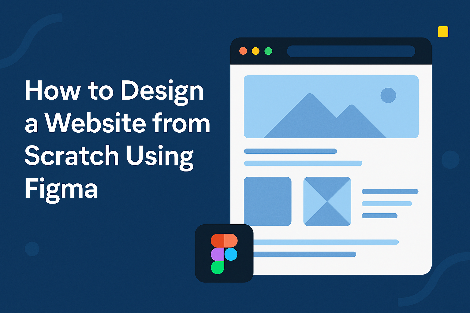
Creating a website from scratch can seem like a challenging task, but with the right tools, it can be an exciting journey. Figma, a powerful design tool, allows users to bring their website ideas to life, offering a streamlined process for both beginners and experienced designers. By mastering Figma basics, anyone can design a professional-looking website from start to finish without advanced skills.
With Figma, users can experiment with various layouts and design elements, making it easier to visualize and perfect their ideas. The platform’s features, such as prototyping and collaboration, enable designers to test and refine their designs in real-time. For those eager to dive deeper, resources like the Figma tutorial for beginners offer a step-by-step guide to crafting a complete website.
Whether you’re a novice or looking to enhance your web design skills, Figma opens the door to endless creative possibilities. Its intuitive interface makes it accessible for everyone, encouraging creativity while focusing on functionality. From understanding essential design principles to implementing interactive components, the journey to creating a stunning website begins with Figma.
Getting Started with Figma
Starting with Figma is a straightforward process that begins with setting up an account, familiarizing yourself with the interface, and exploring essential tools. These steps are key for anyone looking to design a website using Figma effectively.
Signing Up and Setting Up Your Workspace
Setting up Figma starts by visiting their website and signing up for a free account. Users can opt for a paid plan for additional features if needed. Once signed in, it’s important to customize the workspace for optimal usability.
Users can create teams for collaboration or choose to work solo. They should also explore the settings to adjust interface preferences and shortcuts to their liking. This creates a more personalized and efficient design environment. Making the workspace comfortable ensures a better design experience.
Understanding the User Interface
The Figma interface consists of three main areas: the canvas, the layers panel, and the properties panel. The canvas is where all design work happens.
In the layers panel, users can manage different design elements. They can organize these elements in groups for better clarity. The properties panel allows for adjustments to be made to elements on the canvas, such as color, size, and position. Familiarity with this layout helps streamline the design process.
Exploring the Tools Panel
Figma offers a range of tools in its tools panel. These include the move tool, shapes, pen tool, and text tool. Each tool serves a specific function that aids in design creation.
The move tool simplifies repositioning elements. Shapes like rectangles and ellipses form the base for many designs. The pen tool allows for drawing custom shapes. Users can also add text elements using the text tool. Understanding these tools is vital for unleashing creativity within Figma.
Figma Design Principles
Figma is a powerful tool for designing websites. Key principles include working effectively with frames, layers, colors, and text to create a cohesive and visually appealing design.
Working with Frames and Shapes
Frames and shapes are foundational in Figma’s design process. Frames act like containers for other design elements, letting designers structure their layouts efficiently. By using frames, they can group elements, making it easy to manage complex designs.
Shapes like rectangles, circles, and lines are building blocks in Figma. These shapes can be customized with size, color, and border changes to fit any design. Frames also allow users to create responsive designs, adjusting automatically to different screen sizes.
Designers should structure their projects well, maintaining cleanliness and organization. Regularly naming frames and shapes makes it simpler to locate and edit elements.
Utilizing Layers and Groups
Layers and groups in Figma help organize design projects. Layers represent each design element, from images to text. Keeping layers named and ordered prevents confusion. Users can easily lock or hide layers when focusing on specific aspects of their design.
Grouping layers streamlines design management. Grouped elements can be moved or resized simultaneously, saving time. This is helpful when multiple items need adjustments at once.
Layer-specific features like opacity and blending mode allow deeper design customization. Experimenting with these settings can lead to unique visual effects, enhancing the project’s appearance.
Applying Colors and Gradients
Colors are vital in conveying mood and brand identity. Figma offers a rich color selection tool that lets users pick exact hues and shades. A consistent color palette ensures uniformity across the design.
Gradients add depth and interest, transitioning smoothly from one color to another. Designers can create linear or radial gradients in Figma with ease. Using gradients wisely can draw attention to key areas or create subtle background effects.
Saving color styles allows for quick updates across a design. A change in a saved color style will apply across all linked elements, ensuring consistency throughout the project.
Manipulating Text and Typography
Typography impacts readability and tone. Figma offers a wide range of font styles and customization options, including size, weight, and spacing. Choosing the right font pairings can enhance design coherence and readability.
Text alignment and spacing are crucial for visual balance. Users can adjust line height and letter spacing to ensure text clarity and aesthetic appeal. Figma’s text styles let designers apply consistent typography settings across multiple elements.
Styling text with bold or italic settings can highlight important information or differentiate between content types. For a more polished look, aligning text grid systems helps maintain uniformity throughout the design.
Creating Your First Website Design
Designing a website using Figma involves organizing the project setup, adding content efficiently, and implementing responsive design. With a structured approach, even beginners can master these steps, ensuring their website looks great on any device.
Setting Up a New Project
To start a new project in Figma, he or she should first understand the layout tools available. Begin by creating a new file and setting the canvas size to match the website’s target screen resolution. Selecting a template can help set a consistent style and layout from the start.
Next, organizing components such as headers, footers, and navigation bars into separate frames can keep the project structured. This step makes it easier to edit and maintain the design later. Naming each element and maintaining an organized layers panel will also save time.
Using Figma’s grid system helps with aligning content neatly. He or she might choose a grid size that aligns with the website’s overall look. Figma offers column and row options for creating neat layouts, which are essential for easy navigation and aesthetic appeal.
Adding and Organizing Content
The next step involves positioning text, images, and other media elements on the canvas. Users can utilize Figma’s drag-and-drop feature to quickly add images and text boxes. It’s important to use styles and components to create uniformity across different pages.
To organize content, using frames and groups helps in managing elements efficiently. For text, employing styles like headings and body text maintains consistency. Inline text editing provides immediate adjustments and updates which is handy for ongoing projects.
For images and icons, using the component feature allows for easy reuse across multiple pages. Ensuring that each element has a specific and descriptive name keeps the layers sorted, which simplifies future edits.
Responsive Design Techniques
Responsive design ensures a website functions well on different devices. In Figma, users can create multiple frames for mobile, tablet, and desktop views. This helps visualize how the design will adapt to various screen sizes.
Figma’s Auto Layout feature is crucial for responsive design. It automatically adjusts elements as the screen size changes. He or she can use constraints and resizing options to define how components should behave on different devices, maintaining a polished look.
For further flexibility, using the Prototype tab allows for testing interactive elements. This feature helps users preview how their design reacts to different actions, ensuring a smooth experience across all device types.
Advanced Figma Features
Figma offers a range of advanced tools that enhance design work. These include components and assets for consistency, interactive prototyping for real-time feedback, and team libraries for seamless collaboration.
Using Components and Assets
Components in Figma help streamline the design process. They are reusable elements that maintain consistency across designs. Designers can create a component as a master design. When changes are made to a master component, they automatically update all instances in the project.
Assets make it easy to manage and reuse design elements. The assets panel allows designers to drag and drop components, colors, and fonts directly into their designs. By organizing these assets, teams save time and ensure a unified look and feel throughout the project. Organized components and assets lead to efficient and cohesive designs.
Implementing Interactive Prototyping
Interactive prototyping in Figma allows designers to create functional demos of their designs. This feature helps teams see how a design will perform before finalizing it. Users can add interactions such as button clicks and page transitions, making the prototype feel real.
Designers can test usability and identify issues through this hands-on approach. It’s also easier to communicate design ideas to stakeholders with interactive prototypes. By linking pages and elements, users can experience the flow of the design. This process aids in refining design details and enhances the approval process.
Collaboration and Team Libraries
Collaboration is a key advantage of Figma. With team libraries, everyone works from the same set of assets and styles. Libraries ensure that team members use consistent design elements across projects. This setup reduces errors and makes updates straightforward.
Real-time collaboration means multiple people can work on the same file simultaneously. This feature enhances teamwork and allows instant feedback. Changes are visible to all members, promoting transparency. Team libraries and real-time editing streamline the collaborative process, leading to better design outcomes.
Exporting and Sharing Your Design
Exporting and sharing designs in Figma is key for collaboration and development. Export assets in various formats and easily share projects to gather feedback from team members or clients.
Exporting Assets for Development
When exporting assets, Figma allows users to choose formats like PNG, JPG, and SVG. To start, select the object or frame you want to export. Options for exporting include right-clicking on the object or using the “Export” tab in the right panel.
Selecting Formats:
- PNG/JPG: Good for images.
- SVG: Best for scalable vectors.
- PDF: Suitable for documents.
To select multiple items, hold down the Shift key and choose each one. Batch exporting is handy to send all necessary files to developers at once. Figma allows control over the resolution and size, ensuring the assets fit perfectly into any project.
Learn more about how to export from Figma in different formats.
Sharing Your Design for Feedback
Sharing designs is simple with Figma’s built-in features. Designers can invite team members by sharing links, allowing for real-time collaboration. To share a design, click on the “Share” button at the top-right corner and set permissions for viewing or editing.
There are options to send the link directly or generate a public link. Figma also integrates with communication tools like Slack for seamless updates. Feedback can be collected by allowing comments directly on the design, helping teams to make better decisions.
This collaborative environment boosts productivity and ensures everyone is on the same page.