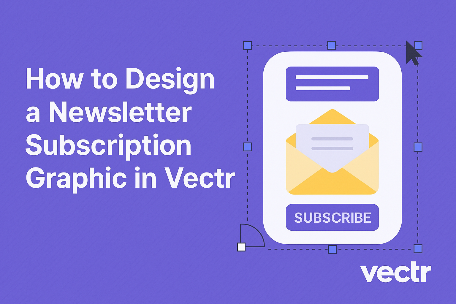
Creating an eye-catching newsletter subscription graphic can significantly boost a brand’s ability to gain subscribers. Using Vectr, one can easily design a professional-looking graphic that stands out and invites users to subscribe. This simple tool offers a range of features that make graphic design accessible, even for beginners.
With Vectr’s user-friendly interface, anyone can develop an attractive graphic that complements their newsletter’s theme.
It allows for the incorporation of various design elements, making it easy to create something unique and engaging.
This blog post will guide readers through the process, offering tips and techniques for effective design.
Whether starting from scratch or looking to enhance existing graphics, this article will provide valuable insights. By the end, readers will not only know how to use Vectr effectively but also understand the importance of a well-designed subscription graphic in growing their audience.
Getting Started with Vectr
Vectr is an easy-to-use graphic design tool that helps users create stunning visuals. With its intuitive interface and straightforward setup, users can begin their design journey with confidence.
Understanding the Vectr Interface
When users first log into Vectr, they are greeted by a clean and organized interface. The menu bar at the top offers essential tools like file management and help options.
On the left, the side bar displays various design tools, including shapes, text, and images. Each tool is easy to access and allows for quick customization.
The workspace in the center is where the actual design takes place. Here, users can drag and drop elements, rotate, resize, and play around with layouts.
Learning the shortcuts and features will help users work more efficiently as they move through their design process.
With practice, the interface feels more familiar, making it easier to produce high-quality graphics.
Setting Up Your Document
To get started, users should create a new file.
Clicking on the “Create File” button brings them into the document setup area.
Here, users can choose the page size, which is crucial for a newsletter graphic. Options may include standard sizes like A4 or custom dimensions, depending on the design needs.
Next, users should set the background color or image if desired. A clean background helps enhance the readability of the newsletter content.
Finally, users must remember to save changes often to avoid losing progress.
Utilizing the collaborative features of Vectr can make sharing with team members smooth and efficient, allowing for real-time feedback and adjustments.
Designing Your Newsletter Graphic
Creating an engaging newsletter graphic involves careful consideration of layout, text elements, and images. Each element plays a crucial role in attracting subscribers and conveying the right message.
Choosing a Layout
Selecting the right layout is essential for a newsletter graphic. A well-organized layout guides the reader’s attention.
Start by considering a grid-based design, which helps in aligning elements neatly.
Using white space effectively can make content easier to read.
He or she should choose a clear hierarchy to help direct focus. The reader’s eye should move naturally from the header to the body text and any call-to-action buttons.
Additionally, it’s important to adapt the design for different devices. A responsive design ensures that the graphic looks good on both desktop and mobile screens.
Working with Text Elements
Text is vital in communicating the newsletter’s purpose. Choosing the right fonts can significantly impact readability.
He or she should select fonts that align with the brand’s voice.
It’s important to limit the number of different fonts to two or three. This creates a cohesive look that isn’t overwhelming.
Text size and color should also be considered. Headlines should be bold and noticeable, while body text needs to be easy to read.
Using bullet points and short paragraphs can enhance clarity and keep the reader engaged.
Incorporating Images and Logos
Images play a key role in making a newsletter graphic visually appealing. Selecting high-quality images can capture attention immediately.
He or she should choose images that relate directly to the content or theme of the newsletter.
Incorporating the company logo is also important. The logo should be placed prominently, as it helps in branding.
Using images effectively includes adjusting them to fit well within the layout.
Consider using borders or shadows to make images stand out.
Ensuring that images load quickly is also crucial for user experience.
Prioritizing these elements will create a dynamic and attractive newsletter graphic.
Enhancing Your Design
A great newsletter subscription graphic is about more than just the basics. It’s important to use color and fonts wisely, add engaging icons and shapes, and apply filters to create a polished look. Each of these elements can elevate the design significantly.
Using Color and Fonts Effectively
Colors evoke emotions and set the mood of the newsletter.
He or she should choose a color palette that aligns with the brand’s identity.
For example, brighter colors can attract attention, while softer shades can convey calmness.
Fonts also play a crucial role in design. A combination of a bold header font and a readable body font can enhance clarity.
It’s best to limit font choices to two or three to maintain consistency and avoid clutter.
Adding Icons and Shapes
Incorporating icons can illustrate key points without cluttering the design. Simple icons can guide the reader’s eye and emphasize important information.
For example, using a pencil icon next to a call-to-action invites readers to subscribe.
Shapes can also frame text or create visual breaks. Rounded corners can give a friendly feel, while sharp angles might lend a professional touch.
Experimenting with shapes can balance the graphic and direct focus.
Applying Filters and Effects
Filters and effects can add depth and make a design more eye-catching.
Using subtle shadows can create a sense of dimension. For instance, adding a shadow behind text can make it pop off the background.
Applying color overlays can unify the graphic’s look. A light transparency filter can blend design elements while keeping the overall image intact.
It’s essential to use these effects sparingly to enhance without overwhelming.
Exporting and Integrating With Email Platforms
When designing a newsletter subscription graphic in Vectr, exporting and integrating it with email platforms is crucial for effective communication. The process involves saving the graphic in the right format and ensuring it works smoothly with various email services.
The Export Process
To begin, the user should export the graphic from Vectr. It’s typically best to save the design as a PNG or JPEG file for clarity and compatibility.
- In Vectr, go to the File menu.
- Select Export.
- Choose the preferred file format, such as PNG or JPEG.
- Adjust the settings for resolution if necessary, then hit Export.
This streamlined method allows for easy uploading to email platforms later.
Keeping the file size manageable is essential to ensure it loads well in emails. Aim for a file size under 1MB to enhance loading speed and user experience.
Ensuring Compatibility with Email Services
Compatibility is key when integrating the graphic with email services. Different email platforms may have unique requirements for image files.
- Mailchimp and Constant Contact support PNG and JPEG formats effectively.
- Ensure the dimensions of the graphic fit within standard email layouts, typically around 600 pixels wide.
It’s also wise to preview how the graphic appears in various email clients. Some may compress images, affecting clarity.
Testing on platforms like Gmail and Outlook can help confirm that the graphic displays correctly.