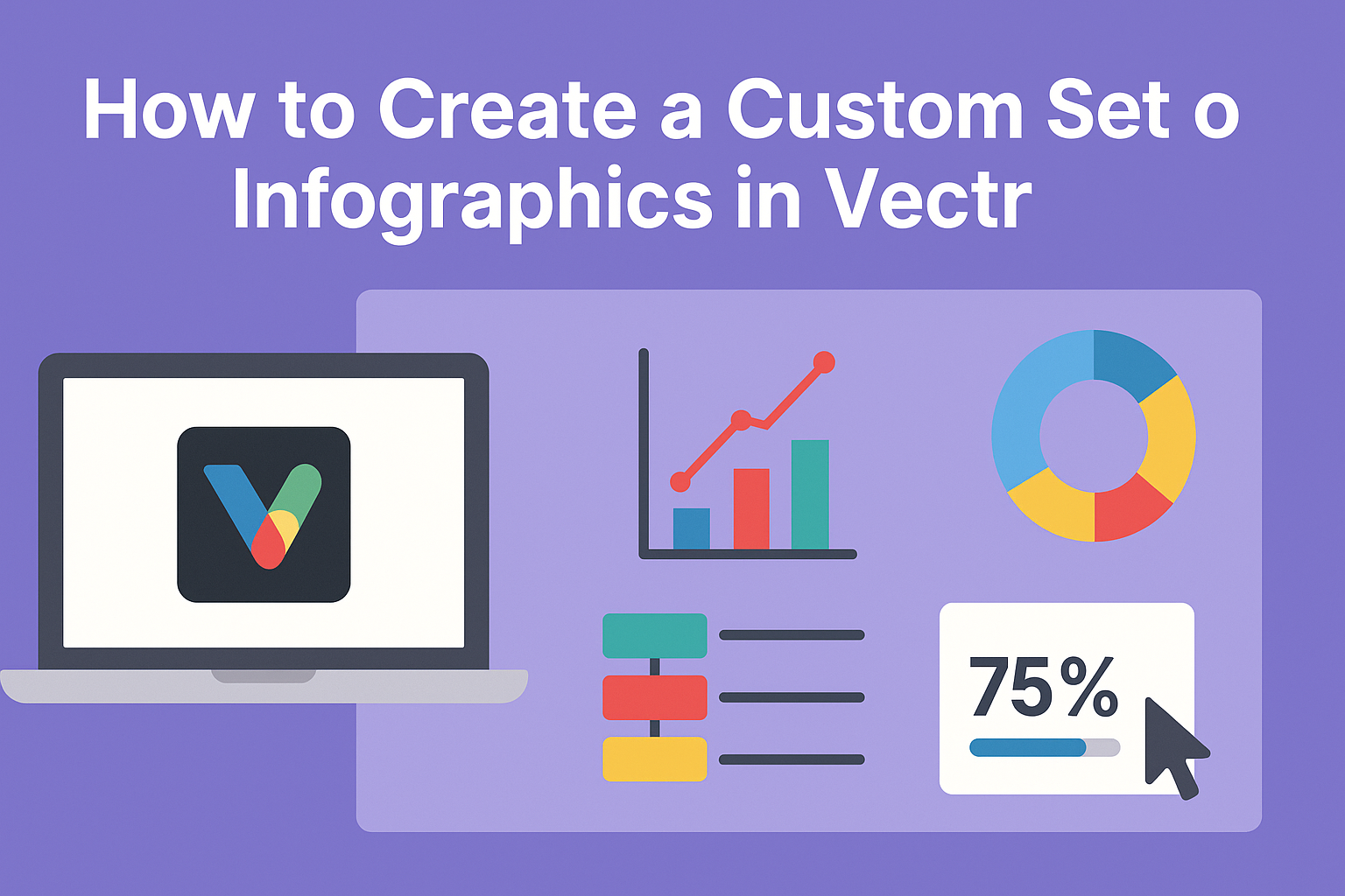
Creating a custom set of infographics can be an exciting way to present information visually. With Vectr, anyone can design stunning infographics that engage and inform their audience.
The platform’s user-friendly tools make it simple for users of all skill levels to turn their ideas into eye-catching graphics.
Infographics are more than just images; they tell a story with data. By utilizing Vectr’s features, one can highlight key points and organize information in a way that captures attention.
This blog post will guide readers through the steps to make beautiful and informative infographics that stand out.
From gathering relevant data to choosing the right design elements, this guide offers practical tips for success. They’ll discover how to combine creativity with useful information, resulting in infographics that are both fun to look at and valuable to read.
Getting Started with Vectr
To begin creating infographics using Vectr, it’s important to know how to sign up and set up your workspace.
Understanding how to navigate the interface will also help make the design process smooth and enjoyable.
Signing Up and Setting Up Your Workspace
First, she needs to visit the Vectr website. Once there, she should click on the “Sign Up” button.
After entering her email and creating a password, she can confirm her account through the email link sent to her.
Once logged in, she will see the dashboard. This area includes the menu bar at the top, a sidebar on the left, and a space for her projects in the center.
To set up her workspace, she can click “Create File” to begin a new project. This opens up a blank canvas where she can design her infographics.
Navigating the Interface
After creating a file, navigating the Vectr interface is key to effective design.
The menu bar contains tools like “File,” “Edit,” and “Help.” Each tool offers options needed for customization.
On the left sidebar, there are icons for shapes, text, and images. She can easily drag and drop these elements onto her canvas.
The right panel shows properties for selected items, allowing her to change colors, borders, and more.
With a little practice, she will become familiar with using the tools to create professional-looking infographics.
Each feature is designed to enhance her creative process.
Creating Your First Infographic
Creating an engaging infographic starts with choosing the right templates, effectively using vector shapes, and adding clear text. Each step is essential to make the infographic visually appealing and informative.
Selecting the Right Templates
Choosing a template sets the foundation for an effective infographic. Vectr offers various templates to suit different topics and styles.
Users should browse through the library and select a template that aligns with their content needs.
Consider the layout and how elements will flow together. A good template provides a balance between images and text, ensuring that the information is easy to read.
It’s helpful to think about the intended audience. A professional design might work for business topics, while a colorful and fun template would be better for educational content aimed at children.
Working with Vector Shapes
Vector shapes are key components in designing infographics. They allow for easy customization and scaling without losing quality.
Users can find various shapes in Vectr, such as circles, rectangles, and arrows.
These shapes can highlight important information or create visual breaks between sections. For example, using a circle to draw attention to a statistic can be impactful.
When working with vector shapes, it’s important to maintain consistency. Users should stick to a color palette that matches the theme of the infographic, ensuring a cohesive look throughout.
Adding Text and Typography
Text plays a crucial role in conveying the message of the infographic. Choosing the right fonts and sizes can enhance readability.
Vectr allows users to customize text easily, so select fonts that complement the design.
Users should keep important information concise. Bulleted lists can help organize details clearly.
Consider using bold or italic styles to emphasize key points. Larger text works well for headings, while smaller text can be used for descriptions.
Always ensure that text color contrasts well with the background for easy reading. Following these tips leads to an effective infographic that communicates information clearly.
Customizing and Styling Elements
Customizing and styling infographics is crucial to making them visually appealing and effective. By focusing on color schemes, icons, and graphics, as well as applying filters and effects, one can create a custom look that captures the audience’s attention.
Using Color Schemes Effectively
Colors play a significant role in conveying messages and emotions. To create a cohesive look, he or she should start by selecting a color scheme that matches the theme of the infographic.
Using tools like color palettes can help in choosing complementary colors.
A good rule of thumb is to limit the palette to three to five colors. This ensures the design feels balanced and not overwhelming. Consider using a mix of light and dark shades to create depth. Contrast is key; make sure the text stands out against the background.
Using colors to emphasize important data can guide the viewer’s attention. For example, highlighting critical statistics in a bright color will make them pop. Consistency is essential, so all elements should follow the same color scheme throughout.
Incorporating Icons and Graphics
Icons and graphics add interest and help explain concepts quickly. When choosing icons, they should match the overall theme and style of the infographic. Simple, flat designs often work best as they are easy to understand.
It’s important to maintain a consistent style. He or she should use a set of icons from the same source or create custom illustrations to ensure uniformity. This will tie the entire design together cohesively.
Incorporating graphics can break up text-heavy sections, making the infographic more engaging. He or she can use charts, graphs, or illustrations to represent data visually. Always align graphics with the content for maximum impact.
Applying Filters and Effects
Adding filters and effects can elevate the look of an infographic.
He or she can apply subtle shadows or gradients to create depth and interest. Be careful not to overdo it, as too many effects can distract from the main message.
Using transparency is another technique. Overlaying text on images can make both elements pop without crowding the design. This approach ensures that the information remains clear and readable.
Experimenting with different effects can help find the perfect balance. Customizing elements with filters can lead to a unique look that distinguishes one’s infographic from others. Always remember to preview the design to see how changes affect the overall look.
Finalizing and Exporting Your Design
At this stage, it’s important to ensure that the design looks cohesive and ready for sharing. The next steps involve checking for consistency and properly exporting the infographic for its intended use.
Checking Design Consistency
Before finalizing, reviewing the design for consistency is key. This means confirming that colors, fonts, and styles match throughout the infographic.
- Color Palette: Stick to 3-5 colors to maintain visual unity.
- Fonts: Use the same font family with variations for headings and body text.
It helps to zoom out and view the entire design at once. This way, any inconsistencies will be more noticeable.
Additionally, check the alignment of elements. Ensuring everything is properly spaced and aligned enhances professionalism. A grid or alignment tools in Vectr can be handy here.
Exporting for Web and Print
Once satisfied with the design, it’s time to export the infographic.
Choosing the right format is essential based on where it will be used.
- For Web: Save as PNG or JPG. These formats keep file sizes manageable and quality high for online viewing.
- For Print: Use PDF or SVG formats. These ensure better quality and scalability when printed.
In Vectr, the export option is straightforward.
Users can select their desired format and set the resolution. For print, a resolution of 300 DPI is recommended for clarity.
Being mindful of these details will help produce stunning infographics for any platform.