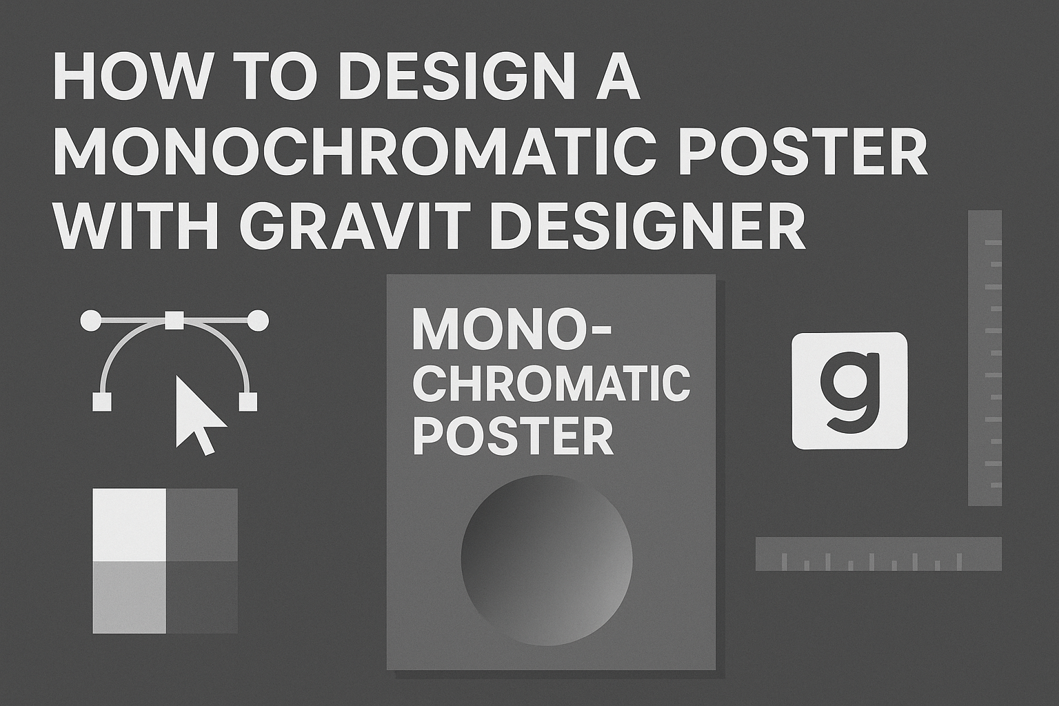
Designing a monochromatic poster can seem challenging, but it’s a great way to create striking visuals with just one color.
Using Gravit Designer, anyone can easily achieve a professional look by focusing on shades, tints, and tones of a single hue. This approach not only simplifies the design process but also gives posters a cohesive and stylish appeal.
In this guide, readers will discover step-by-step instructions on how to use Gravit Designer’s tools to craft their own stunning monochromatic posters.
Whether for an event, promotion, or personal project, mastering this technique can elevate anyone’s design skills.
With just a few basic skills in Gravit Designer, anyone can unlock the potential of monochromatic color schemes. This article will provide helpful tips and tricks, making it easier than ever to bring creative visions to life.
Getting Started with Gravit Designer
Gravit Designer is a user-friendly vector design tool that enables users to create impressive artwork, including monochromatic posters.
Understanding the interface and setting up a new document are essential steps for effective design.
Overview of the Interface
The Gravit Designer interface is intuitive and organized.
At first glance, users will see a toolbar on the left, a property panel on the right, and a canvas in the center.
- The toolbar contains essential tools such as the selection tool, shape tools, and text tool.
- The property panel allows users to adjust colors, sizes, and other attributes.
- Users can also access layers and pages from the panel for better organization.
Familiarizing oneself with these elements will help streamline the design process.
Setting Up a New Document
Creating a new document in Gravit Designer is straightforward.
Users should start by opening the application. From the landing page, they can choose “New Design.”
Users have options to set document dimensions. They can select from predefined sizes or input custom dimensions.
- For example, common poster sizes include A4 (210 x 297 mm) or A3 (297 x 420 mm).
- Users can also choose the document’s orientation: portrait or landscape.
Once the document is set, users can begin designing, ensuring their workspace fits their project needs.
Fundamentals of Monochromatic Design
Monochromatic design is all about using variations of one color to create a cohesive and appealing look. Understanding its core principles can help designers make effective choices when creating posters.
Understanding Monochrome
Monochrome means using one main color along with its shades, tints, and tones. This approach provides unity in a design, making it visually striking.
Designers select a base color and create variations by altering the color’s lightness or darkness.
For instance, a bright blue can turn into a light sky blue by adding white, while a darker navy can be achieved by mixing in black.
Using these variations creates depth and interest without overwhelming the viewer. This is the essence of building harmony through a single hue.
Choosing Your Color
Selecting the right color is crucial in monochromatic design. The chosen hue should resonate with the message of the poster.
For example, blue often conveys calmness, while red can evoke energy and excitement.
Designers should start by considering the emotional response they want to elicit.
After selecting a base color, they should create a palette that includes lighter tints and darker shades. This diversity helps maintain balance throughout the design.
Tools like color wheels and online generators can assist in finding the perfect variations.
By thoughtfully choosing a color and its variations, a designer can craft an impactful monochromatic poster.
Creating Your Poster
Designing a monochromatic poster in Gravit Designer involves essential steps that focus on text, images, and overall layout. Each element plays a significant role in creating a balanced and visually appealing design.
Working with Text and Fonts
Selecting the right font can enhance the poster’s message.
It’s important to choose a font that aligns with the theme and tone.
For a monochromatic poster, sticking to one or two font styles helps maintain cohesiveness.
To start, he should explore options within Gravit Designer. Using the text tool, he can create headings, subheadings, and body text.
Adjusting attributes like size, spacing, and color will further refine the text.
For color, he can use variations of a single hue to provide contrast. Using bold fonts for headlines and lighter shades for body text can effectively guide the viewer’s eye through the design.
Incorporating Images and Shapes
Images and shapes add visual interest to the poster.
He should begin by selecting high-quality images that complement the monochromatic theme. Using a single color palette, he can adjust the image’s hue to fit the design.
Shapes are also valuable tools. Rectangles or circles can frame text or images.
Gravit Designer allows adjustment of transparency and color, which helps integrate these elements smoothly into the poster.
Balancing images and text is crucial. He should ensure that neither element overwhelms the other to keep the message clear. Combining images with shapes helps in creating a dynamic look.
Layer Management
Layer management is vital for organizing elements.
Gravit Designer enables users to keep text, images, and shapes in separate layers. By doing this, he can easily edit or move elements without affecting others.
He should label each layer to avoid confusion. Grouping related layers can also streamline the workflow.
Using the alignment tools in Gravit Designer, he can ensure that every element is properly positioned. This attention to detail enhances the overall layout, making the poster look polished and professional.
Finalizing Your Poster
Once the design is complete, the next steps involve applying finishing touches and exporting the final product. These elements ensure the poster looks polished and is ready for sharing or printing.
Applying Finishing Touches
To make the poster stand out, it’s essential to refine the details.
Start by checking the alignment of text and images. They should be well-balanced on the page.
Next, consider adding shadows or highlights. This can create more depth and draw attention to key elements.
Font enhancements can also improve readability. Use bold for important information and keep the text uniform in style.
Finally, review the color contrasts. Ensure that the monochromatic scheme remains effective. Adjust the brightness or saturation where needed to create the best visual impact.
Exporting Your Design
Once the design is finalized, exporting it correctly is important.
In Gravit Designer, go to the “File” menu and select “Export.”
Choose the format that best suits your needs.
Common options include PNG for online use and PDF for printing.
Make sure to set the resolution according to the final use.
For print, a resolution of 300 DPI is ideal. For digital display, 72 DPI is usually sufficient.
Lastly, name your file clearly and save it in a designated folder for easy access.