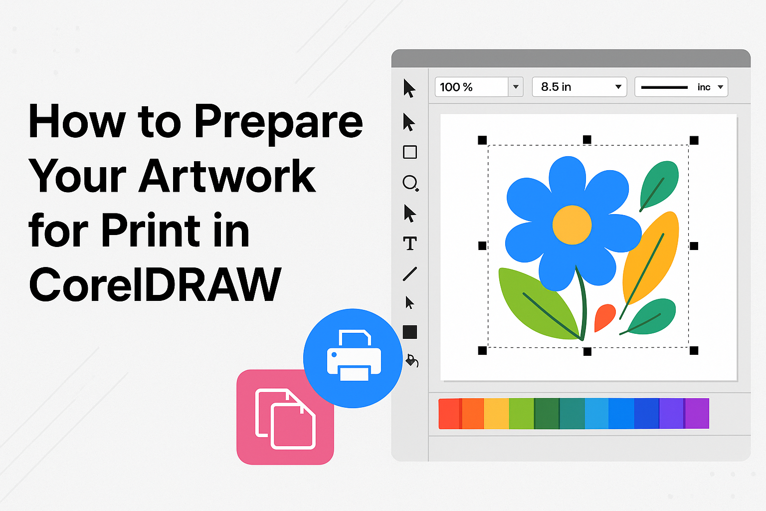
Creating stunning artwork in CorelDRAW for print can bring your creative vision to life. CorelDRAW offers a variety of tools and options to make sure your designs are print-ready. The key to successful printing with CorelDRAW is ensuring your files meet industry standards, which includes setting up the right color profile and adding necessary printer marks.
Understanding the basics of file preparation is essential for anyone looking to achieve professional results. When preparing your artwork, it’s important to consider elements like bleed, cut lines, and proper file formats. For instance, adding a bleed can help avoid unwanted white edges on your final print, and selecting the right file format is crucial for maintaining quality.
Anyone looking to dive deeper into this process will find valuable resources, such as this comprehensive guide by the Corel Discovery Center. These tools and tips not only ease the print preparation process but also help in achieving striking final products that capture and captivate.
Understanding the Basics of Print
Understanding how print differs from digital formats is crucial. This includes recognizing variations in color models and resolution to ensure your artwork looks its best in print.
Differences Between Digital and Print
Digital art is created and viewed on screens, using light to display colors and details. When printing, the artwork is made from ink or toner on paper or canvas.
This shift requires adjustments to ensure fidelity. Digital work can handle various sizes effortlessly, but printed materials need specific planning based on dimensions and paper type.
One main concern in printing is the bleed area, which ensures colors reach the edge of the paper without leaving blank space. Misunderstanding these differences can lead to unwanted results.
Color Models: RGB vs. CMYK
Digital art typically uses the RGB color model, which stands for Red, Green, and Blue. Screens mix these colors to display the full spectrum. However, printers use CMYK, or Cyan, Magenta, Yellow, and Black. This creates colors by layering ink.
The conversion from RGB to CMYK can impact the vibrancy of colors. Bright, neon-like hues in RGB might appear muted in CMYK. It’s crucial to design with this in mind, ensuring that essential colors translate well.
CorelDRAW provides tools to preview how RGB artwork will look in CMYK, helping artists make necessary adjustments.
Resolution Requirements for Printing
Resolution is crucial for crisp, sharp print results. Printing art requires higher resolution than digital displays. Most printers need files at 300 DPI (dots per inch).
This contrasts with the typical 72 PPI (pixels per inch) used for web images.
Artwork below required resolutions may print blurred or pixelated. Using vector graphics in CorelDRAW can prevent issues since these images scale without losing quality.
Scanned work should also meet resolution needs. When scanning, settings like 300 DPI are advised to capture details finely. Keeping an eye on these settings ensures the final product appears polished and professional.
Setting Up Your CorelDRAW Workspace
Setting up your CorelDRAW workspace efficiently can greatly impact your design process. This involves choosing the right document size and understanding how to navigate the interface, ensuring a smoother workflow.
Choosing the Right Document Size
Selecting the correct document size is crucial in CorelDRAW for any print project. Users can start by opening CorelDRAW and creating a new document. It’s important to set the dimensions according to the final print requirements. For instance, using a standard business card size, such as 3.5 by 2 inches, ensures that it fits most print specifications.
In CorelDRAW, users should adjust the page size and orientation using the Property Bar. When preparing files for print, it’s also essential to set the bleed. A typical bleed size is 3mm, which ensures that your design extends beyond the trim line, so there are no white edges after cutting. Users can access these settings efficiently, making sure the print-ready file meets professional standards.
Navigating the CorelDRAW Interface
Understanding the CorelDRAW interface is essential for maximizing productivity. Initially, users will see a welcoming layout with a toolbox on the left and a docked panel on the right. These tools allow easy access to features like shapes, text, and color adjustments.
To customize their workspace, users can rearrange toolbars by dragging them to their preferred location. They can also create shortcut keys for frequently used functions. This involves navigating through Tools > Customization and setting up shortcuts that best suit individual workflow needs. Customizing the interface in this way streamlines the design process and allows designers to focus more on creativity and less on navigating the software. For additional guidance, CorelDRAW offers tutorials, like this one on how to customize your workspace, to help users make the most of their tools.
Creating Your Artwork
Creating artwork for print in CorelDRAW requires careful attention to detail. Key aspects include handling different file types like vectors and bitmaps, organizing using layers, and following specific design practices to ensure high-quality prints.
Working with Vectors and Bitmaps
In CorelDRAW, vectors and bitmaps play crucial roles in designing artwork. Vectors are made from paths defined by mathematical equations, which makes them scalable without losing quality. This is ideal for logos and illustrations. Bitmaps, on the other hand, are pixel-based and can lose quality if resized. They are best for complex images like photos.
It’s important to know when to use each type. Vector graphics are best for designs that will be resized often. Bitmaps should be used when you need detailed, rich images. Ensuring you choose the right type will enhance the overall quality of your printed work. Combining these in one design could give you the best of both worlds.
Utilizing Layers for Better Organization
Using layers in CorelDRAW helps keep your design organized. Layers can separate different elements, making it easier to edit them individually. This is useful in projects with multiple components, like text, shapes, and background images.
Each layer can be locked, hidden, or reordered without affecting the rest of the design. When preparing files for print, ensure each element is on its correct layer to avoid mistakes. For instance, having text on a separate layer allows you to change it easily without altering the rest of your design. Naming layers clearly also simplifies navigation within your file.
Design Best Practices to Ensure Print Quality
Designing for print involves following certain practices to ensure the artwork looks good after printing. One key factor is the color mode; use CMYK for print to achieve accurate color reproduction. It’s also important to use high-resolution images, ideally at 300 DPI, to prevent the final print from appearing pixelated.
Another practice is to add a bleed area to your design. This prevents white edges when the artwork is cut. Finally, saving your work in a suitable format, such as .ps, .eps, or .prn, will ensure compatibility with print requirements. Following these practices will help maintain the integrity of your design from computer to print.
Incorporating Text Elements
When preparing artwork for print in CorelDRAW, it’s essential to choose the right fonts and adjust text for readability. These steps help ensure the final printed materials are effective and professional.
Choosing Fonts for Print
Selecting fonts for print involves thinking about both style and clarity. Sans-serif fonts often work well because they’re easy to read in small sizes. Serif fonts, like Times New Roman, can also be suitable for body text in books or magazines due to their classic look.
It’s important to avoid using too many different fonts in one design. Limiting to two or three fonts keeps the design clean. Font size matters as well; headings need to be larger and bolder, while body text should be comfortable to read.
Using bold or italic styles can create emphasis without adding more fonts. It’s also helpful to convert text to outlines before sending the file for print. This ensures that any font compatibility issues are resolved, maintaining the design’s integrity.
Adjusting Text for Readability
Line spacing and alignment are crucial for text readability. Increasing line spacing slightly can make large bodies of text feel less cramped and easier on the eyes. Justified alignment, while neat, can sometimes create awkward spaces in text, so it might be better to stick with left alignment.
Contrast between text and background must be strong. For example, dark text on a light background, or vice versa, ensures clear visibility. Avoid intricate or vibrant background patterns that might distract or make text hard to read.
Finally, in cases where text overlaps various elements or images, using a text box with a subtle background can enhance readability without distracting from the overall design. These adjustments help ensure that the text is both readable and maintains high visual appeal in the final print.
Color Management in CorelDRAW
Color management in CorelDRAW ensures your artwork looks consistent from screen to print. It involves setting up color profiles and proofing colors before printing to achieve accurate results.
Setting Up Color Profiles
Setting up color profiles is essential for accurate color reproduction in CorelDRAW. Users should begin by accessing the Color Management Settings dialog box. This allows them to assign specific color profiles to their documents, whether it’s for RGB, CMYK, or grayscale colors.
Choosing the right profiles depends on the intended output. For example, the North America Prepress preset is useful for projects printed by North American providers. This helps ensure the colors you design digitally will match those produced in print.
Enabling the “use document color settings” option can help manage color conversion accurately. It allows CorelDRAW to perform any necessary conversions instead of relying on a printer’s settings, which might not be calibrated correctly.
Proofing Colors Before Printing
Proofing colors is a crucial step to ensure your printed output matches your digital design. In CorelDRAW, users can view how their document will appear when printed, detecting any discrepancies early on. This process involves simulating the print environment on your screen.
Users can enable the Simulate Color Management Off feature in CorelDRAW to visualize their artwork as it would appear without any color adjustments. This view helps identify any unexpected color shifts.
Additionally, when working with spot colors, users must ensure these are correctly set up for separation. Color separations help in previewing how different colors will print, allowing for adjustments before final printing.
Exporting Your Design
When preparing your design for print in CorelDRAW, it is essential to choose the correct file format, ensure your artwork has appropriate bleeds and margins, and complete a thorough preflight checklist. These steps help maintain the quality and accuracy of your printed design.
File Formats for Print
In CorelDRAW, selecting the right file format is key for high-quality print results. Common formats include PDF, TIFF, and EPS. The Publish to PDF feature is especially useful for maintaining design integrity, with options like PDF/X-4:2010 CMYK ensuring color accuracy.
TIFF files are great for raster images and retain high resolution, making them suitable for detailed prints. EPS, on the other hand, is vector-based, perfect for illustrations or logos.
Always consult with your printer to confirm the best format for your specific project needs. Compatibility and color fidelity often dictate the choice of format.
Ensuring Proper Bleeds and Margins
Bleeds and margins are vital in preventing unwanted white spaces around your design. Adding a bleed extends your artwork beyond the trim line, helping achieve clean edges when cutting. In CorelDRAW, you can add a 1/8 inch (or about 3 millimeters) bleed to your designs, a common standard in printing.
Margins, or safe zones, are equally important. These buffer areas ensure important elements like text and images don’t get cut off. Keeping critical content at least 1/4 inch away from the edge is a good practice. Adding these elements involves adjusting settings in the layout options typically found in your document setup.
Preflight Checklist Before Export
Before exporting your design, a preflight check ensures everything is set correctly. This includes verifying color modes, resolution, and file dimensions. Design errors can lead to costly reprints, so double-check all aspects.
Ensure all images are embedded properly and that fonts are converted to curves to avoid missing font issues. Color mode should be set to CMYK for print projects.
Reviewing these elements saves both time and resources. A preflight check identifies potential issues and guarantees your design is print-ready. Additionally, utilizing preflight tools or checklists can simplify this process and help ensure nothing is overlooked.
Working with Printers
Ensuring a smooth collaboration with your print provider is vital for achieving the desired results. This involves clear communication and agreeing on specific print specifications.
Communicating with Your Print Provider
Building a good working relationship with your print provider is key. Clear communication can prevent misunderstandings and errors. Start by discussing all details of your project. Share your objectives and the desired outcome for your artwork. It helps the printer understand what you need.
Ask questions about their processes. This includes turnaround times, materials, and any special techniques they may use. A collaborative approach will likely yield better results. Be sure to provide your contact details for ongoing communication. This will help address any issues that might arise during the printing process.
Finalizing the Print Specifications
Finalizing your print specifications involves several important steps. Start by setting the dimensions and format of your artwork. Make sure the file is in the correct format, such as PDF or TIFF, based on your printer’s requirements.
Discuss color profiles with your provider. Most printers prefer CMYK color profiles for consistent and accurate colors. List the materials you intend to use and confirm with your printer that they are suitable. It’s also important to agree on the finishing techniques, like lamination or binding.
Before sending your file, double-check everything with a sample print or proof. This step helps to catch any errors and confirms that the final output will meet your standards.