Creating custom user interface sliders can significantly enhance the user experience of any application.
Designing sliders in Gravit Designer allows for unique customization, ensuring they fit seamlessly into a project’s theme and functionality. This article provides step-by-step guidance to help anyone master the art of slider design using this versatile tool.
In today’s digital landscape, sliders are not just functional; they are also a key visual component. Users enjoy the interactivity sliders provide, and well-designed sliders can make an application look more polished and user-friendly. With the right techniques, anyone can create sliders that are both attractive and easy to use.
Whether someone is new to design or looking to refine their skills, this guide will offer essential tips and tricks for working with sliders in Gravit Designer. By following this roadmap, they can create sliders that not only fulfill their needs but also impress their users.
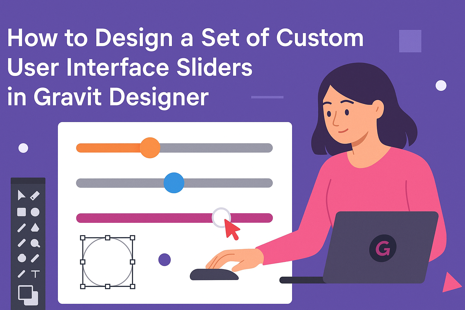
Getting Started with Gravit Designer
Gravit Designer is a powerful tool for creating custom designs, including user interface sliders. Before diving into design, it’s important to understand how to set up the software and navigate its features.
Downloading and Installing
To begin, users must download Gravit Designer from the official website.
The software is available for multiple operating systems, including Windows, macOS, Linux, and as a web app. Once the installer is downloaded, simply follow the prompts to install the application.
After installation, users can create an account, which allows them to save and access designs across devices. This feature is helpful for designers who work from multiple locations.
Familiarizing with the Interface
When Gravit Designer opens, users are greeted with a clean, intuitive workspace. The main sections include the toolbar, canvas, and layers panel.
The toolbar on the left offers essential tools like selection, shapes, and text, making it easy to start a new design.
The canvas is where all action happens; it’s the area for drafting and reviewing designs. The layers panel on the right allows for easy organization of design elements.
Users should explore the options in each section. Taking time to hover over buttons reveals tooltips for guidance.
Understanding Basic Tools and Functions
Gravit Designer provides a variety of tools to help users create and manipulate design elements. Key tools include shapes, pen, and text tools.
The shape tool lets users draw rectangles, circles, and more, providing a solid base for sliders.
The pen tool is essential for custom shapes, enabling detailed designs.
Text tools allow users to add labels to their sliders. Additionally, understanding functions like grouping and aligning elements can significantly improve the design process.
Experimenting with these tools in practice files helps users gain confidence and proficiency before starting on custom projects.
Creating Your First Slider
To create a custom slider in Gravit Designer, it’s essential to set up a proper canvas first, draw the slider track, and design the slider thumb. Each of these steps is vital for achieving a functional and visually appealing slider.
Setting Up the Canvas
To begin, she needs to open Gravit Designer and create a new project. Choosing the right dimensions is important.
Typically, sliders are wider than they are tall. A common size might be 400 by 100 pixels, allowing enough space for both the track and the thumb.
Next, setting the background color can help visualize the design better. She can use a light gray or white for a cleaner look.
To configure the grid, enabling it can make aligning elements easier. This way, every part of the slider will fit perfectly into the layout.
Drawing the Slider Track
After setting up the canvas, it’s time to draw the slider track. She can use the rectangle tool to create a long, narrow shape for the track.
It’s best to keep it rounded by adjusting the corner radius for a modern look.
For color, a neutral or muted tone like light blue or gray works well. To ensure a good contrast, she can use a darker color for the border of the track.
Adding a slight shadow can give it depth. When the track is ready, she should position it in the center of the canvas for balance.
Designing the Slider Thumb
Next, she needs to design the slider thumb, which is the part users will drag. Using the circle tool is an excellent way to start. A diameter of about 20-30 pixels gives a nice size for easy interaction.
To make it stand out, using a bright color like orange or green can be effective. Adding details like a subtle gradient or shadow will provide depth.
Finally, positioning the thumb correctly on the track is crucial—center it horizontally so it aligns perfectly with the track’s edges. This attention to detail will enhance the user experience.
Customizing the Slider Design
Customizing the slider design can greatly enhance its visual appeal and usability. By focusing on colors, shadows, fonts, and labels, one can create unique sliders that stand out in any user interface.
Adding Colors and Gradients
To make sliders visually interesting, adding colors and gradients is essential.
Start by selecting a color palette that aligns with the overall design theme. Using complementary colors ensures that the slider integrates well with the rest of the interface.
Gradients can add depth and dimension. For example, a gradient from light blue to dark blue can give the slider a soothing look while still being noticeable.
When applying colors, consider using tools like the color picker to achieve precise shades. Remember to test the colors for accessibility, ensuring that all users can easily interact with the slider.
Implementing Shadows and Highlights
Shadows and highlights can create a more three-dimensional feel for sliders. Adding a subtle shadow beneath the slider can make it appear elevated, drawing attention to its functionality.
Choose a light source direction and apply shadows accordingly. For instance, a shadow on the bottom right corner gives the impression of depth.
Highlights can be applied on the edges to enhance the glossy effect, making the slider look polished. The combination of these effects helps the slider stand out while ensuring it remains user-friendly.
Applying Custom Fonts and Labels
Custom fonts and labels help convey purpose and enhance aesthetics. When selecting fonts, opt for clear and readable styles. Sans-serif fonts are often best for sliders, as they are easy to read.
Labels should be concise and placed near the slider control for quick understanding. Using tooltips can also provide users with additional information without cluttering the design.
To ensure that the text is visually prominent, consider contrasting colors with the background. This makes sure that users can quickly grasp the slider’s function at a glance.
Exporting and Integration
When creating custom sliders in Gravit Designer, exporting and integrating them into various projects is key. This process allows designers to make their sliders functional and ready for use in user interfaces or web designs.
Saving Your Slider Design
After finishing a slider design, saving it is crucial. Gravit Designer allows users to save their work in several formats. Designers should consider using the native Gravit Designer format for future edits.
For projects requiring collaboration, saving the file in a cloud format provides easy access for team members. Furthermore, version control can help track changes.
Selecting File > Save As ensures the design is stored properly. Keeping a backup is a good practice to prevent any data loss.
Exporting as an Image or Vector Graphic
Exporting sliders as images or vector graphics is essential for flexibility. Designers can choose formats like PNG, SVG, or PDF, depending on the project needs.
To export, navigate to File > Export and select the desired format. PNGs are great for raster images, while SVGs allow for scalable vector graphics that maintain quality across different sizes.
When exporting, paying attention to resolution is important. A higher resolution provides better quality but may result in larger file sizes. Choosing the right format and resolution optimizes performance in web and app interfaces.
Tips for Using Sliders in UI Kits and Web Design
Integrating sliders into UI kits or web designs makes them more interactive.
It’s vital to maintain consistency with the rest of the design elements. Using similar colors and styles ensures the sliders blend seamlessly.
Designers should also keep in mind the user’s experience.
Sliders should have clear labels to indicate their purpose. Providing instant feedback when adjusting the slider enhances interactivity.
Testing sliders across devices is necessary to ensure functionality and responsiveness.
This practice helps in identifying any issues before the final implementation in a project.