Creating a custom web layout can seem challenging, but with the right tools, it becomes an exciting task.
Gravit Designer offers a user-friendly platform that allows anyone to craft unique and professional-looking web designs easily.
This article will guide readers step-by-step through the process, making it accessible for beginners and useful for more experienced designers.
With Gravit Designer, users can explore their creativity without worrying about complicated software.
By following this guide, they will learn how to utilize the various features and tools that Gravit Designer provides, from layout options to graphic elements.
Each section will highlight practical tips that will make the design journey smoother and more enjoyable.
Whether one is starting a personal project or working on a client’s website, understanding how to build a custom layout in Gravit Designer is essential. Readers will find valuable insights that empower them to create tailored designs that stand out. With just a little time and practice, they will be on their way to producing impressive web layouts that capture attention.
Getting Started with Gravit Designer
To begin using Gravit Designer, one needs to understand the layout of the workspace and how to set up their project effectively.
These skills allow users to navigate the software smoothly and start their design tasks with confidence.
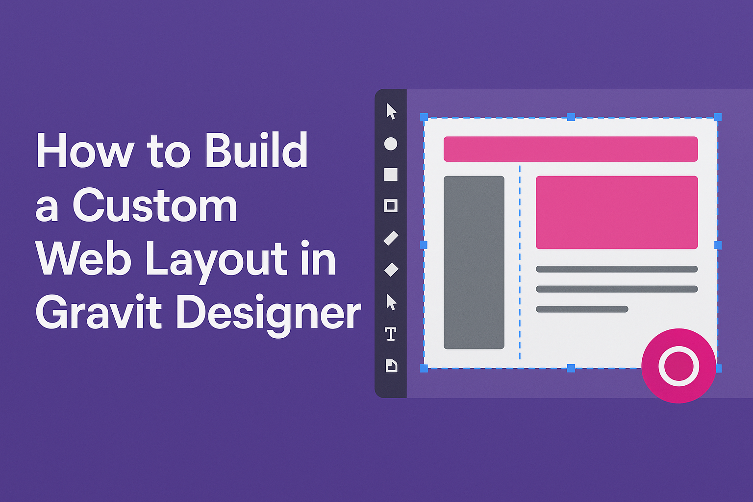
Understanding the Workspace
Gravit Designer has a user-friendly workspace that includes essential tools and panels. The main components are:
- Canvas: This is where designs take shape. It shows the workspace for creating and editing.
- Tool Panel: Located on the left side, this panel provides tools for shapes, text, and other design elements.
- Properties Panel: On the right, this panel adjusts settings for selected items, like color, size, and effects.
Familiarizing oneself with these elements helps create a smooth workflow. It allows designers to easily find tools, adjust settings, and visualize their designs.
Users can also organize their workspace to better fit their style.
Setting Up Your Project
Setting up a project in Gravit Designer is straightforward. First, launch the application, then create a new file. Users can choose from various presets or set custom dimensions.
After selecting a canvas size, it’s important to choose a suitable unit, such as pixels or inches. This decision affects how the design will scale.
Next, consider saving the project early. Clicking the save icon helps avoid losing progress. Regular saves keep the workflow efficient.
Designers can also use the “Save As” option to create different versions. This setup gives users a solid foundation for building their custom web layout.
Designing Your Web Layout
Designing a web layout requires careful planning to make it functional and visually appealing. The process involves creating a wireframe, managing layers, adding text elements, and choosing colors that fit the theme.
Creating a Wireframe
A wireframe is the blueprint for a web layout. This step helps outline the basic structure and flow of the site.
To create a wireframe, start by sketching a simple layout on paper. It can include headers, footers, and navigation areas. This will give a clear idea of where elements should go.
In Gravit Designer, users can utilize shapes to represent different sections. For example, use rectangles for images and lines for navigation.
Ensuring that the wireframe is clear aids in visualizing the final product. The wireframe should be simple and not focus on colors or small details.
Working with Layers and Groups
Effective use of layers and groups helps maintain organization within a design. In Gravit Designer, layers allow the user to separate different elements within the layout.
For example, a user can create a layer for the navigation bar, another for images, and a third for text. This organization makes it easy to edit specific parts of the design.
Grouping elements that work together is also important. For instance, text and images that belong to the same section can be grouped. This way, moving them around becomes easier.
The ability to hide or lock layers helps avoid accidental changes when working on specific elements.
Adding Text and Typography
Typography plays a critical role in web design. It affects readability and contributes to the overall style of the site.
In Gravit Designer, users can select various fonts and adjust sizes easily. They should prioritize clarity and legibility, especially for body text. A good practice is to use a maximum of two or three different fonts.
Headings should stand out and guide visitors through the content. Using different weights and styles can help create a visual hierarchy.
It’s also essential to consider line spacing and letter spacing for easy reading. Properly formatted text enhances user experience.
Incorporating Colors and Gradients
Color choice is key in creating an engaging web layout. It can set the mood and influence how users interact with the site.
When selecting colors, start by defining a color palette. Use complementary colors to create harmony. Gravit Designer offers various gradient tools for more depth.
Users can apply gradients to backgrounds or buttons, creating a modern look. For example, a subtle gradient can make a button appear more inviting.
Always test color contrast to ensure accessibility. A visually appealing design should also cater to users with different vision types.
Advanced Techniques
In creating a custom web layout in Gravit Designer, advanced techniques can enhance the design process. Two important areas to explore are vector tools and the application of effects and filters. These techniques help to refine the design and add unique touches.
Utilizing Vector Tools
Vector tools in Gravit Designer offer precision and flexibility. Users can draw shapes and customize them easily. For instance, the Pen Tool allows drawing free-form shapes for a unique design.
Steps for Using Vector Tools:
- Select the Pen Tool: Choose it from the toolbar.
- Click to Create Points: Each click creates a point; lines connect these points.
- Adjust Points: Use the Node Tool to move or edit points.
Additionally, the Boolean Operations feature helps combine or subtract shapes. This can create complex designs quickly. By utilizing these tools, designers can craft unique layouts that stand out.
Applying Effects and Filters
Adding effects and filters can elevate a design’s visual appeal. Gravit Designer provides various options to adjust how elements look. Users can apply shadows, gradients, and blurs.
Key Effects to Consider:
- Drop Shadow: Adds depth to an object, making it appear lifted.
- Blur Effect: Softens edges, creating a smooth transition.
- Gradient Fill: Blends colors for a dynamic look.
Applying these effects is simple. Designers should select the element, then explore the Effects panel. Adjust settings to achieve the desired outcome.
Using effects and filters appropriately can significantly enhance the overall impact of a web layout.
Exporting and Sharing
To effectively share designs created in Gravit Designer, it’s essential to understand the steps for exporting projects and collaborating with others. This section discusses how to export design files and ways to gather feedback from teammates or clients.
Exporting Your Design
In Gravit Designer, exporting a design is straightforward. Users can go to the File menu and select Export.
There are several formats available for export, including:
- PDF: Great for printing.
- SVG: Ideal for scalable graphics.
- PNG/JPG: Perfect for web use.
Before exporting, it’s important to choose the appropriate file format based on the project’s requirements.
Additionally, Gravit Designer allows users to customize export settings. They can adjust resolution, size, and file type within the Export Panel. This customization helps ensure the final product meets specific needs.
Collaboration and Feedback
Gravit Designer enhances collaboration by enabling users to share their designs easily.
Through cloud-based options, they can invite team members to view or edit files.
To share designs, users can export them or provide access to their cloud-based project. This feature allows for real-time feedback, which is crucial in collaborative work.
Feedback can also be gathered through comments and suggestions on shared files.
This ongoing communication helps refine the design and ensures everyone’s ideas are considered.
By using these collaboration tools, designers can work more effectively with others, improving the overall design process.