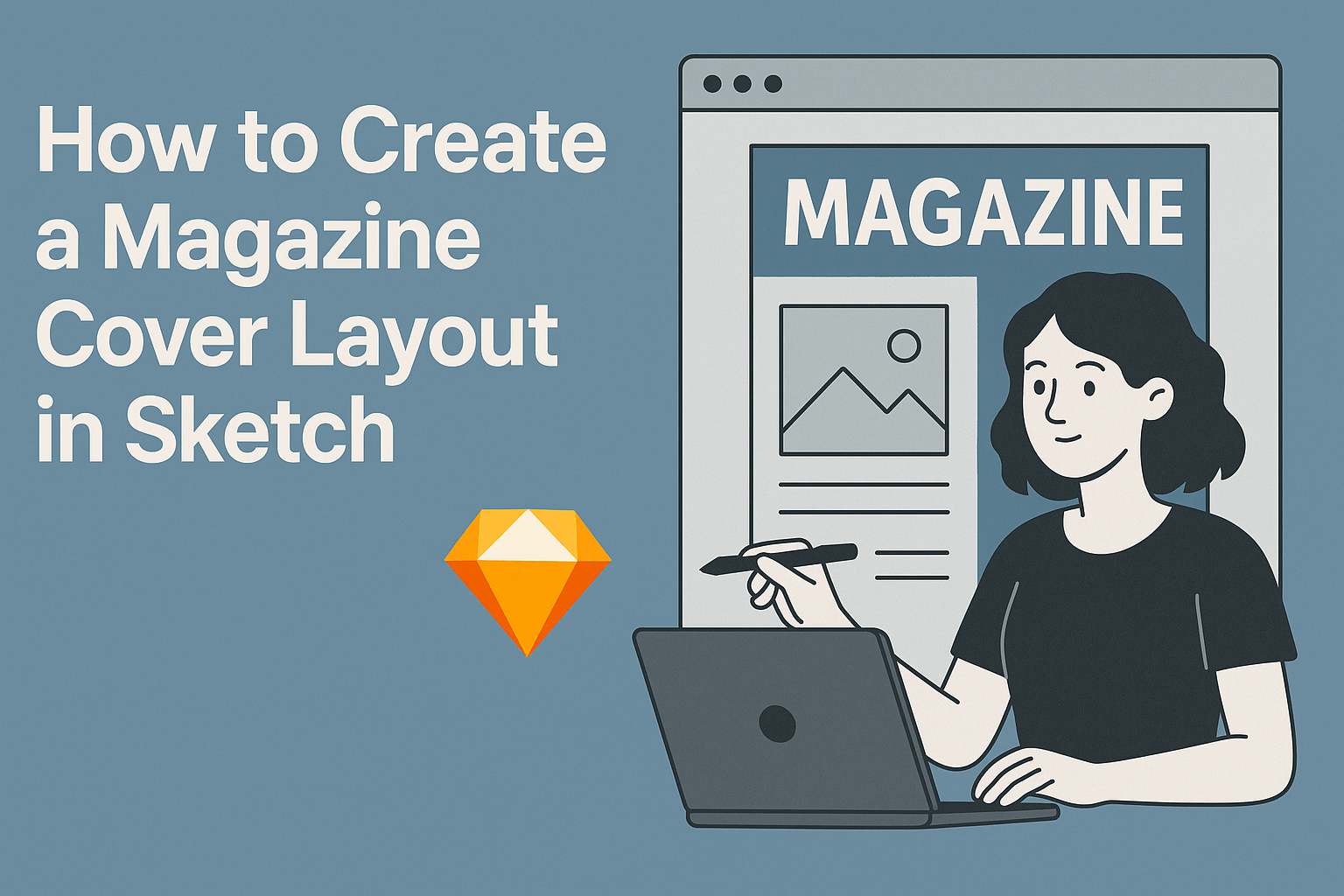
Creating a magazine cover layout in Sketch can be an exciting way to showcase design skills. With the right tools and techniques, anyone can craft an eye-catching cover that grabs attention and communicates the magazine’s theme effectively.
This guide will walk readers through the process, making it simple and enjoyable.
Whether someone is a beginner or has some experience, learning to use Sketch for magazine design opens up a world of creative possibilities. They will discover tips for selecting the perfect layout, choosing compelling images, and using typography to enhance the overall look.
In just a few steps, readers can transform their ideas into a polished magazine cover that stands out. By understanding key design principles and utilizing the features of Sketch, they will create professional-quality layouts that impress.
Getting Started with Sketch
To create a magazine cover layout in Sketch, it’s important to first understand the workspace, set up a new document, and explore available templates. Each of these steps lays the foundation for designing a professional cover that stands out.
Understanding Sketch Workspace
The Sketch workspace is designed for ease of use. The main parts include the Toolbar, Inspector, and Canvas.
The Toolbar contains essential tools like the Selection tool and the Shape tool, which are crucial for creating designs.
The Inspector shows properties for selected items. This is where adjustments such as colors, border styles, and shadows can be modified easily.
Using the Canvas, users can arrange and visualize their designs effectively. Knowing where everything is located helps streamline the workflow.
Setting up a New Document
To kick off a project, creating a new document is the first step. Start by clicking on File and selecting New.
A window will pop up for document settings. Here, set the dimensions for the magazine cover—commonly 8.5 x 11 inches.
Once the size is set, users can choose a resolution, typically 300 DPI for print. This ensures high-quality visuals.
It’s also beneficial to choose a color profile, such as CMYK, which is ideal for printed materials.
Exploring Templates for Magazine Covers
Templates can greatly reduce design time. In Sketch, users can access a variety of templates tailored for magazine covers.
Finding templates can be done through the Library feature or online resources that offer free and premium options.
Once a user finds a suitable template, they can customize it to fit their theme. Adjust colors, fonts, and images to align with the magazine’s branding.
Templates serve as a great starting point to inspire creative ideas and visualize the layout more effectively.
Designing the Cover
Creating a magazine cover layout in Sketch involves several key elements. It is important to manage layers effectively, select appealing colors, use suitable typography, and incorporate meaningful images. Each aspect plays a crucial role in capturing attention and conveying the magazine’s theme.
Working with Layers
Layers are fundamental in designing magazine covers. They help organize various elements, making it easy to edit and adjust the design.
He or she should start by creating separate layers for backgrounds, images, text, and graphics. This practice allows for smooth adjustments without affecting other parts of the design.
Naming the layers can enhance the workflow. Using labels like “Header,” “Image,” or “Footer” keeps everything organized.
Additionally, adjusting the transparency of layers can create depth, making certain elements stand out. This technique can help attract the viewer’s eye to the most important features of the cover.
Choosing Color Schemes
Color schemes are vital for creating an inviting cover. A well-chosen palette sets the mood and helps communicate the magazine’s theme.
He or she should consider using a color wheel to pick complementary or analogous colors.
Start with primary colors that reflect the theme, and then add secondary colors for variety. Keeping the number of colors limited to three or four can maintain cohesiveness.
It’s also important to test colors against each other to ensure readability, especially with text. Tools like contrast checkers can help guarantee that text is legible on various backgrounds.
Incorporating Text and Typography
Typography greatly influences the magazine’s tone. Choosing the right fonts can convey professionalism or creativity, depending on the content.
It’s best to stick with two or three fonts to maintain visual harmony. Using one font for headings and another for body text creates a balanced look.
He or she should also pay attention to font size, ensuring that titles stand out. Hierarchy in text style helps guide the reader’s attention to critical information first.
Line spacing and letter spacing can affect readability as well. Keeping lines spaced evenly makes text easier to read and more visually appealing.
Adding Images and Graphics
Images and graphics serve as focal points on the cover. Selecting high-quality visuals that match the magazine’s theme is essential.
He or she should consider using illustrations or photographs that evoke emotion or curiosity. The size and placement of images should complement other design elements without overwhelming them.
Incorporating graphics like shapes or icons can enhance the overall design. These additional elements can help frame text or images, guiding the viewer’s eye around the cover.
Cropping images creatively can also add interest. It’s crucial to ensure that all visual components work together, creating a unified and attractive layout.
Refining the Layout
Refining the layout of a magazine cover is crucial for grabbing reader attention. This involves carefully aligning elements, using grids effectively, and implementing whitespace to enhance the overall design.
Aligning Elements for Visual Balance
Visual balance ensures that the magazine cover is appealing to the eye. He should start by organizing the main elements such as headlines, images, and subheds.
Symmetrical arrangements can create stability, while asymmetrical layouts can draw interest.
Using tools in Sketch, he can easily adjust the placement of these elements. For instance, placing the title at the top-center and balancing images on either side helps create harmony. Overlaying text slightly on images can enhance engagement, creating depth.
She should also consider the size of each element. Larger images can attract attention, while smaller text should complement without overwhelming. Adjusting these factors will refine the layout beautifully.
Using Grids and Guides
Grids and guides are essential for a clean magazine cover. They help lay out elements in a structured manner.
In Sketch, he can activate the grid to provide a visual reference for placement.
He should start by setting up a grid that suits the cover size. Using a consistent number of columns allows for alignment of titles and images. For example, three columns can make space for a large image on one side and detailed text on the other.
Guides can also be dragged onto the canvas to mark margins and spacing. This helps maintain even spacing between elements. Ensuring elements align with grid lines can prevent any clutter, completely enhancing the overall look.
Implementing Whitespace Effectively
Whitespace, or negative space, is crucial in layout design. Effectively using whitespace helps elements stand out. It gives breathing room to text and images, making the cover look more polished.
He should aim for a balanced amount of whitespace around key elements. This might mean adjusting text placement to ensure it doesn’t feel cramped.
For instance, if the headline is dense, placing it with more space nearby can highlight it better.
Additionally, she can use whitespace to guide the viewer’s eye to focal points. Avoiding overcrowding allows for a more elegant and effective design. Experimenting with different amounts of whitespace can reveal the best balance for the cover layout.
Finalizing the Cover Design
At this stage, the magazine cover design needs careful assessment and adjustment. It involves checking elements for accuracy and preparing the file for different formats.
Review and Revise
Reviewing the layout is essential for a polished final product. This includes examining the typography, ensuring the fonts are legible, and that headings are distinct.
She should check the color scheme as well. It should be vibrant yet harmonious. If any elements feel out of place, adjustments can be made.
Consider the alignment of images and text to maintain balance.
Getting feedback from colleagues can also be invaluable. They might spot issues that were overlooked. Revisions based on constructive comments can greatly enhance the final design.
Exporting for Print and Digital Formats
Exporting the magazine cover correctly ensures it looks great in all settings.
First, she must choose the right resolution. A minimum of 300 DPI is recommended for print to maintain image quality.
For digital, different formats may be preferred, like JPEG or PNG. PDF is often a good choice for print-ready files.
It’s important to verify color settings, too. CMYK is best for print, while RGB works for digital.
Naming files clearly helps in keeping everything organized during production or when sharing.
Finally, she should double-check the file before sending it out. Ensuring everything is correct helps avoid any last-minute surprises.