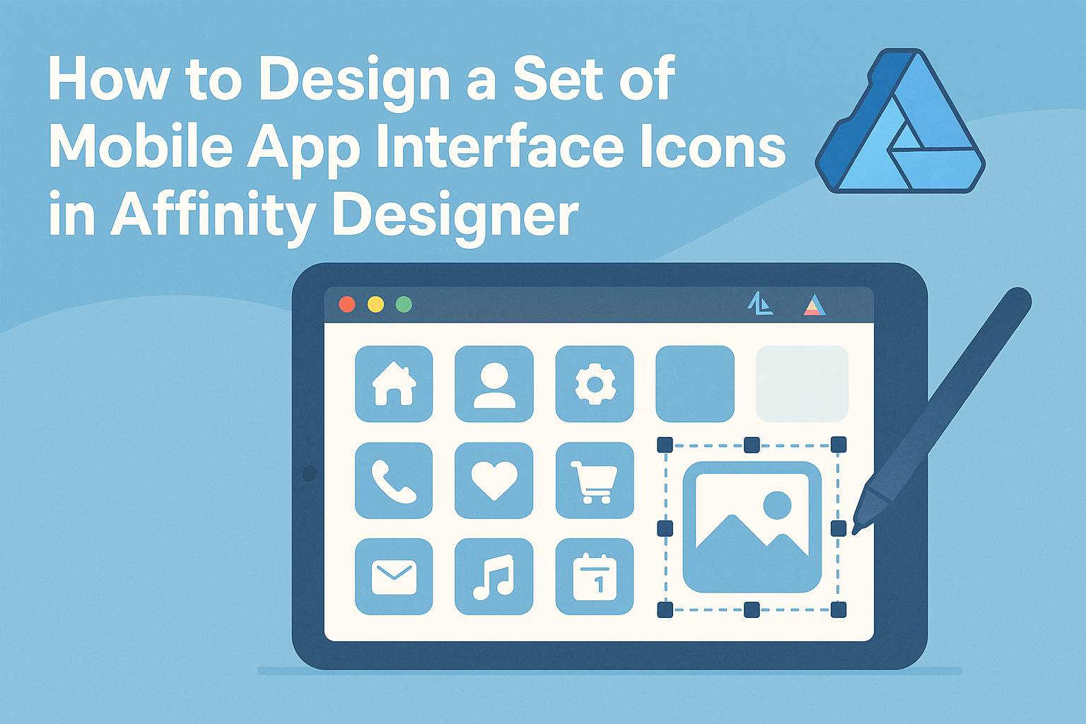
Creating a set of mobile app interface icons can be an exciting challenge for any designer. With Affinity Designer, you can easily craft unique icons that not only look great but also enhance user experience.
This guide will provide practical steps that will help in designing effective and visually appealing icons for mobile applications.
Many designers struggle with the icon design process, often feeling overwhelmed by the technical aspects. By leveraging the tools available in Affinity Designer, anyone can streamline their workflow and achieve impressive results.
This article will break down essential techniques and tips to simplify the design process.
Whether she is working on a personal project or a client’s app, mastering icon design is vital for any creative professional. Readers will discover how to use shapes, colors, and symbols to create a cohesive icon set that fits their app’s theme.
The journey to designing eye-catching mobile app icons starts here, and it promises to be rewarding.
Getting Started with Affinity Designer
Affinity Designer is a powerful tool for creating stunning mobile app interface icons.
Knowing how to navigate its interface, set up a canvas, and customize the workspace can significantly enhance the design experience.
Understanding the Interface
When opening Affinity Designer for the first time, it can look a bit overwhelming. The main parts of the interface include the toolbar, toolbox, and canvas.
The toolbar at the top contains essential tools like the selection and shape tools.
On the left side, the toolbox gives direct access to frequently used features like the pen tool and text tool. Users can switch between vector and pixel personas using icons at the top-left corner.
Familiarizing oneself with these elements helps streamline the design process.
Setting Up Your Canvas
Setting up the canvas is crucial for any design project. To start, select the File menu and choose New. This will prompt a window where users can specify the dimensions.
For mobile app icons, a typical size might be 1024×1024 pixels. It’s important to consider the resolution; 72 DPI is standard for digital design.
After setting the size, click Create to start working on the canvas tailored to your needs.
Customizing Your Workspace
Customizing the workspace increases efficiency and comfort while designing. Users can drag panels like Layers and Colors to preferred locations.
To change the layout, right-click on any panel title to find docking options.
Affinity Designer also allows for saved workspaces. After customizing the layout, navigate to View and select Studio, then New Workspace to save the current setup. This makes it easy to return to a preferred configuration while working on different projects.
Design Principles for App Icons
Creating effective mobile app icons involves careful planning and adherence to design principles. Important aspects include consistency, color choices, and visual hierarchy. Each principle plays a crucial role in designing icons that are both appealing and functional.
Consistency in Style and Size
Consistency is key when designing a set of app icons. Each icon should share similar elements, such as shapes, graphics, and overall style. This unity helps users recognize the brand easily.
For size, all icons should maintain the same dimensions across the app. The standard size often used is 1024×1024 pixels, ensuring quality on various devices.
Uniform size prevents visual clutter and confusion, making the interface cleaner and more user-friendly.
Choosing a Color Scheme
Color selection is vital for app icon designs. A harmonious color scheme not only attracts users but also conveys the app’s purpose.
Designers often select a primary color that represents the brand’s identity. Complementary colors can enhance visibility and appeal.
Tools like Adobe Color can assist in generating pleasing color palettes.
Maintaining color consistency throughout the icons reinforces brand recognition. A simple palette with 2-3 colors usually works best to avoid overwhelming users.
Creating a Visual Hierarchy
Visual hierarchy is essential in guiding users’ attention. The most important elements of the icon should stand out, ensuring easy recognition.
Designers can achieve this by using size, color contrast, and placement. For instance, larger and bolder elements will grab more attention.
Using light and shadow can create depth, adding interest and dimension. Additionally, limiting clutter in the design allows the main feature to shine. An effective visual hierarchy makes the icons not only attractive but also functional and lasting in users’ minds.
Creating and Exporting Icons
When designing mobile app interface icons, it’s crucial to master the creation and export processes. This section covers drawing basic shapes, applying effects, and exporting icons to ensure they look great on any device.
Drawing Basic Shapes and Vectors
In Affinity Designer, creating icons starts with basic shapes. Designers can use tools like the Rectangle, Ellipse, and Pen tools to form the foundation of their icons.
These shapes can be combined and manipulated to create unique designs.
Using the Node Tool is essential for adjusting vector points. By clicking on any shape, one can reshape and refine the design.
It’s also helpful to use layers for organization. Grouping related elements together makes editing easier later on.
Designers should keep simplicity in mind. Icons should effectively convey their function at a glance. Maintaining a clean design ensures clarity when users view the icons on their devices.
Applying Effects and Adjustments
Once the basic shapes are complete, it’s time to apply effects. Shadows, gradients, and strokes can enhance the appearance of icons.
Affinity Designer offers various effects that can add depth or visual interest.
Designers can use the Effects panel to apply these adjustments. For instance, adding a drop shadow can help an icon stand out.
Adjusting opacity levels can also create a more polished look.
Remember that colors should align with the app’s theme and brand identity. Testing different color combinations can lead to impressive results.
Exporting Icons for Different Devices
After designing the icons, exporting them correctly is essential.
Affinity Designer allows exporting in multiple sizes for different devices. This ensures icons will appear sharp and clear on all screens.
To export, navigate to the File menu and select Export.
From there, designers can choose formats like PNG or SVG. For mobile apps, PNG is commonly used due to its transparency support.
Setting the correct dimensions is crucial.
For instance, the minimum size for iOS app icons is typically 180×180 pixels. Designers should also consider exporting at different resolutions, like @2x or @3x, to accommodate various devices.