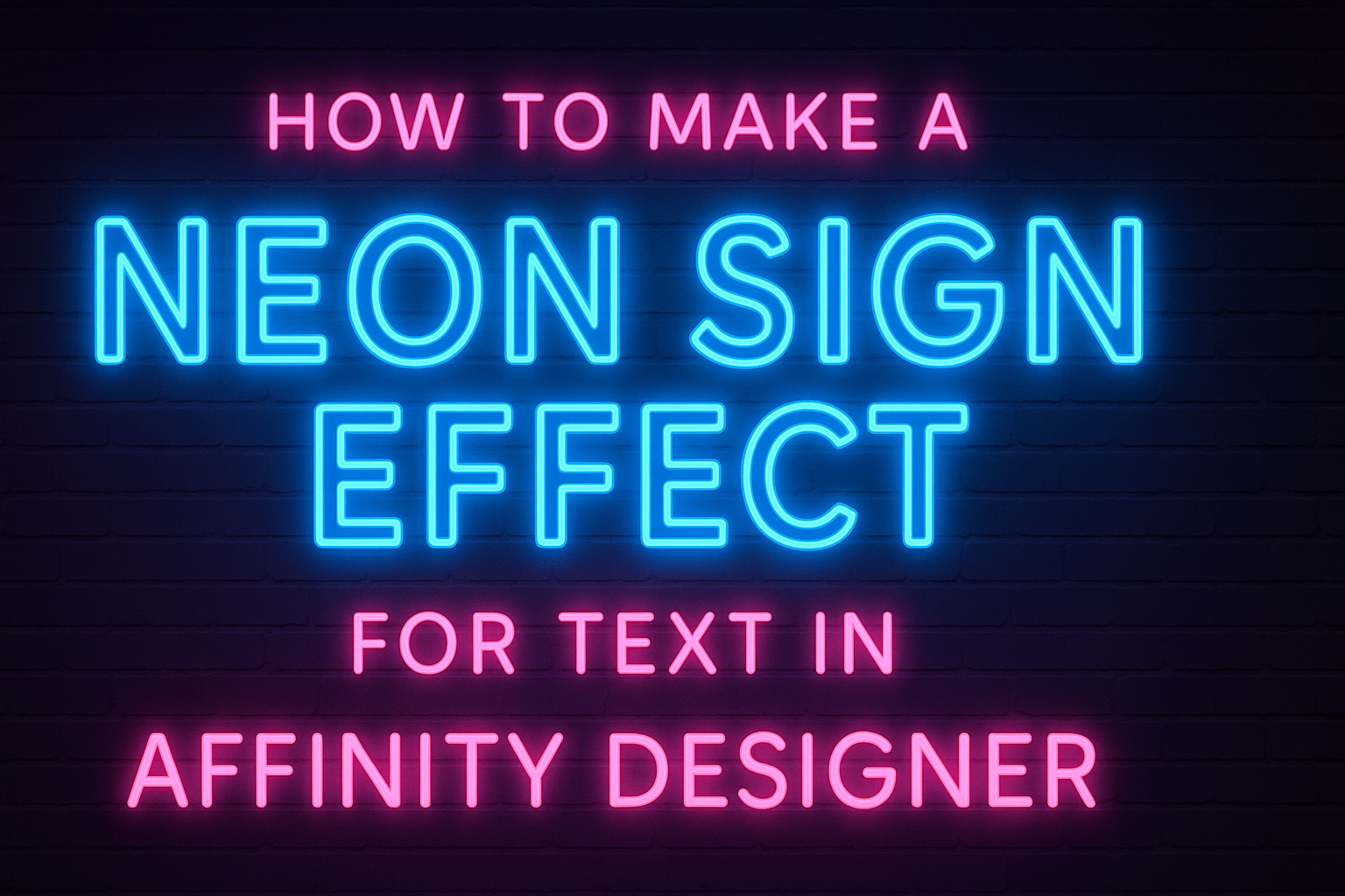
Creating a neon sign effect for text in Affinity Designer can be an exciting project for anyone interested in graphic design. This effect adds a vibrant and eye-catching quality to designs, perfect for posters, social media graphics, or personal projects.
With just a few simple steps, one can transform regular text into a glowing neon masterpiece that stands out.
In this blog post, readers will discover the techniques used to make a striking neon effect. They will learn how to manipulate text, apply color choices, and use blur effects to achieve the desired look.
By following the tips and steps outlined, they can make their own unique neon designs with ease.
Whether someone is a beginner or has some experience with Affinity Designer, this guide will provide helpful insights and inspiration. With clear instructions and practical advice, it is possible to create stunning neon text that captures attention and conveys a lively mood.
Preparing Your Affinity Designer Workspace
To create a stunning neon sign effect in Affinity Designer, it’s essential to set up the workspace correctly. This involves configuring the document size and understanding the tools available on the interface.
Setting Up the Document
First, opening a new document is crucial. Click on File and select New. A dialog box will appear.
Here, he should select a width and height that suit the project. For a neon sign effect, a common choice is 800×400 pixels, which provides a good balance between detail and size.
Next, he should choose a color format. RGB is ideal for digital projects, as it allows vibrant colors.
After setting the dimensions, he can adjust the DPI. A standard DPI of 300 is recommended for clearer text. Then, click Create to start working on the canvas.
Understanding the Interface
The Affinity Designer interface is user-friendly but can be overwhelming at first. Familiarizing oneself with the key panels is important.
The Tool Panel on the left side offers all the drawing and text tools needed for design.
On the right side, the Layers Panel is essential for organizing elements. Layers can be renamed for clarity.
He should also explore the Color Panel, where he can select and customize colors for the neon effect.
Finally, the Context Toolbar at the top adjusts based on the selected tool. This provides quick access to specific options, enhancing efficiency.
Taking time to explore these features will greatly improve the design experience.
Creating the Text Effect
This section covers how to effectively create a neon sign effect for text in Affinity Designer. The focus is on adding text, choosing the right font, and adjusting properties to achieve a vibrant look.
Adding Text
To start, the user should create a new document in Affinity Designer. They can do this by selecting “File” and then “New.”
After setting up the desired canvas size, the user should click on the Text Tool (T) in the toolbar.
Next, clicking anywhere on the canvas will allow them to type the text they want. It’s best to keep the text short, like a word or phrase, for a clear neon effect.
Once the text is in place, they can adjust the position. This helps to center the text or place it where it’s most effective on the canvas. This is the foundation of creating the neon text effect.
Applying the Suitable Font
Choosing the right font is essential for a neon effect. A bold, sans-serif font usually works best. These fonts capture attention and provide enough surface area for the glowing effect.
Users can find suitable fonts within Affinity Designer or import new ones. When exploring font options, they should aim for styles that mimic typical neon signage.
Popular choices might include fonts like “Montserrat” and “Roboto.”
To apply the font, simply select the text and choose from the font dropdown menu. This step sets the stage for the vibrant glow.
Adjusting the Text Properties
Adjusting text properties can greatly enhance the neon effect.
Users should first select their text layer. In the “Style” panel, they can play with the font size and weight to make the text stand out more.
A crucial part of this step is setting the color. A bright color, like cyan or magenta, is ideal for a neon look.
Users can do this by clicking on the color box and selecting a vibrant shade.
Finally, adding effects like “Outer Glow” can create the signature neon glow. This is done by going to the “Effects” panel and adjusting the settings until the desired glow is achieved. This completes the neon text effect.
Designing the Neon Effect
Creating a neon sign effect in Affinity Designer involves several key techniques. These include layering to create depth, applying glow effects for that vibrant look, and choosing the right colors and blending modes to enhance the design.
Layering for the Neon Effect
Layering is crucial for achieving a realistic neon effect. First, the text should be placed prominently on the canvas. Using a bold font, like Avaneonz or LOVELO, helps create that tube-like appearance.
After placing the text, duplicate the layer. Change the color of the bottom layer to a darker shade, which will give an illusion of depth. This technique mimics the way neon lights are typically built with tubing and shadows.
To enhance the effect, continue duplicating layers and adjusting each one’s opacity. This can create a warm, glowing effect that draws the eye.
Applying Glow Effects
Glow effects are what really make a neon sign pop. In Affinity Designer, glow can be added through the layer styles.
Select the text layer, then choose “Outer Glow” from the effects options.
Adjust the size and blur of the glow until it resembles the vibrant light of neon. A soft, diffused glow usually works best.
Experimenting with the glow color can also help match the design’s theme, whether it’s blue, pink, or any other neon shade.
Always consider layering multiple glow effects. Each can be set at different opacities to achieve a more dynamic and realistic glow.
Coloring and Blending Modes
Color is vital in creating a neon effect. Start with bright, saturated colors for the text. Neon colors like electric blue, hot pink, and lime green work wonderfully.
Next, to bring the neon effect to life, use blending modes. The “Add” or “Screen” blending modes can enhance the brightness, making the colors appear to glow.
Adjusting the layer opacity will also help manage the brightness levels. This combination of color choice and blending modes can elevate the design, giving it that signature neon feel while ensuring the text remains legible and impactful.
Finalizing and Exporting Your Design
Before wrapping up the design, attention to detail is crucial. Refining the neon effect will enhance the overall look. After refinement, exporting the design correctly ensures it maintains quality across different platforms.
Refining the Details
To create a polished appearance, refining the details of the neon sign effect is essential.
Start by adjusting the glow intensity. He or she can do this by selecting the glow layer and modifying the opacity. This step helps achieve the desired luminosity.
Next, consider adding extra highlights. Using the Ellipse Tool, she can draw circles around the text. Applying a slight Gaussian Blur to these shapes will create a soft glow.
Lastly, double-check the color balance. The colors should be vibrant but not overpowering. Adjusting the saturation slightly can bring the neon effect to life. Ensuring that the layers are organized will help maintain clarity in the design.
Exporting the Final Design
Once the design looks complete, exporting it correctly is key.
First, it is important to choose the right file format. For designs with transparency, PNG is recommended. If the design is for printing, using a high-resolution PDF will work best.
Before exporting, check the dimensions to make sure they align with the intended use, such as social media or print.
In Affinity Designer, go to “File” then “Export” to select the desired format.
Finally, confirming the export settings is crucial.
Choosing the right DPI (dots per inch) ensures quality. For print, set it to at least 300 DPI. For online use, 72 DPI is typically sufficient.