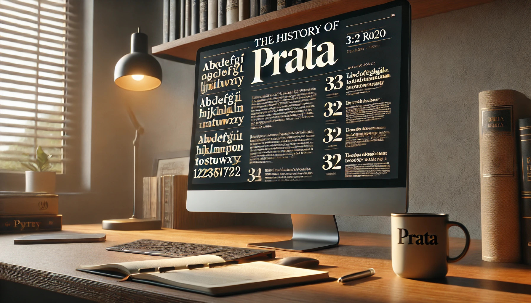
Prata is a typeface that stands out with its elegance and timeless charm. Designed by Ivan Petrov, Prata combines sharp features with organic teardrops to create a unique and sophisticated look. This font is inspired by Didone typefaces, known for their high contrast between thick and thin strokes.
The triangular serifs and teardrop-shaped terminals give Prata its distinctive character. This design choice makes it particularly suitable for display sizes, where its refined curves and strong features can be appreciated. Readers may find Prata available for free through Google Fonts.
Prata’s single style and weight make it an excellent choice for projects needing a touch of classic beauty. Its versatility and open-source availability have made it popular among designers. For those interested in exploring font combinations, websites like Typewolf provide inspiration for pairing Prata with other typefaces.
Origins of Prata Typeface
Prata is a distinctive and elegant serif typeface designed to bring a touch of sophistication to any text. It combines sharp features with refined curves to create a high-contrast design. This section explores the creator’s background, the design philosophy, and the initial release date of Prata.
Creator Background
Ivan Petrov, the designer of Prata, is known for his work in creating fonts that are both elegant and functional. His expertise in typography comes from years of studying the intricacies of font design. He has collaborated with various design firms, honing his skills and understanding of what makes a font stand out. Petrov’s work not only emphasizes beauty but also ensures readability across different formats. His attention to detail and dedication to creating unique typefaces have earned him recognition in the design community. This skill set laid the foundation for designing Prata, which he crafted for Cyreal.
Design Philosophy
The design philosophy behind Prata focuses on elegance and sophistication. Petrov drew inspiration from Didone typefaces, which are characterized by their high contrast between thick and thin strokes. The typeface features triangular serifs and organic teardrop shapes that offer a unique visual tension. These elements make Prata particularly suited for display sizes, where its high-contrast design can be fully appreciated. The balance between sharp serifs and delicate curves aims to evoke a sense of classic beauty. This approach reflects Petrov’s keen eye for detail and his ambition to create a font that stands out while maintaining readability and aesthetic appeal.
Initial Release Date
Prata was released in 2011, marking its introduction to the world of typography. The font was launched as an open-source project, making it accessible for a wide range of uses. Released through various platforms, including Google Fonts, it quickly gained a following among designers and typographers. The choice to make it open-source helped increase its popularity by allowing more designers to experiment and incorporate it into their projects. Prata has since been utilized in various design projects, particularly those requiring a touch of sophistication.
Distinctive Features
Prata stands out with its elegant Didone style and refined design. This typeface is known for its high contrast strokes and unique serif details, making it suitable for display use.
Character Set
Prata includes a rich character set that supports a wide range of languages. It covers the basic Latin script, ensuring accessibility for common uses. The addition of accented characters allows it to serve various European languages, broadening its versatility. The font’s comprehensive glyph range also supports numbers, punctuation marks, and special symbols. This makes it a practical choice for both digital and print projects where such diversity is necessary.
Typographic Style
Prata’s typographic style is characterized by its Didone classification. This gives it a sharp and formal appearance, thanks to the high contrast between the thick and thin lines. The vertical stress in the letterforms enhances its stately look, while the refined serifs add a touch of elegance. Such features make Prata ideal for headlines and formal contexts where a sophisticated style is desired. The combination of soft curves and angular features contributes to its unique charm in typographic arrangements.
Glyph Design
The glyph design in Prata features unique elements that enhance its readability and visual appeal. The lowercase ‘a’ has a teardrop terminal, while the single-storied ‘g’ simplifies its form. These subtle details contribute to its grace and readability. Prata’s serifs are slightly bracketed and triangular, providing distinction and style. The elongated ascenders and descenders lend a sense of height and elegance to the text. These design traits make it suitable for prominent display purposes where both readability and style are crucial.
Technical Specifications
The Prata font offers unique features and extensive versatility. It comes in various formats for compatibility and supports multiple languages, allowing for broad use across different regions and platforms.
Font Formats
Prata is made available in several digital formats to ensure compatibility with various systems and applications. These formats include TrueType (TTF) and OpenType (OTF), which are widely used for both Windows and macOS platforms. TTF and OTF provide flexibility and support for web and desktop use. Moreover, Prata can be embedded in websites using formats like Web Open Font Format (WOFF) and WOFF2. This ensures that Prata maintains its distinctive appearance and functionality across a range of digital mediums.
Language Support
Prata is designed to meet the needs of a diverse audience by supporting a variety of languages. This typeface covers an extensive range of characters from the Latin script, making it suitable for European languages. Some supported languages include English, French, German, Spanish, and Italian. The broad language support allows for Prata to be a versatile choice for international projects. This wide-ranging support ensures that Prata can be used effectively in multilingual contexts, providing both elegance and readability regardless of the language setting.
Usage and Applications
Prata is a high-contrast typeface often chosen for its classic elegance, making it suitable for both traditional and modern projects. It is widely used in print media, digital media, and branding due to its unique design features.
Print Media
In print media, Prata stands out for its sophistication and readability. Its high contrast makes it a favorite for magazines and book covers. The font’s elegance adds a touch of class to wedding invitations, formal event programs, and stationery.
Because of its Didone style, Prata is ideal for headlines, titles, and any text that needs to make an impact. Magazines often choose Prata for its ability to convey both style and readability, especially in glossy spreads or editorial layouts.
Digital Media
For digital media, Prata works best in large sizes. The font’s sharp features and high contrast ensure that it grabs attention on websites and digital ads. While it is not usually chosen for body text due to its single weight, Prata excels in creating eye-catching headings and banners online.
Designers frequently use Prata for hero images and landing pages where elegance and readability can enhance user engagement. The font is also used in digital publications that value a classic and sophisticated appearance.
Branding Examples
In branding, Prata conveys elegance and quality. Luxury brands that want to communicate sophistication often incorporate Prata into their logos and promotional materials. Because Prata has limited styles, it is often paired with modern sans-serif fonts to create contrast.
A well-known example of Prata in branding is its use in fashion magazines, which appreciate its ability to stand out while maintaining a timeless feel. Brands in the high-end hospitality industry might also choose Prata to reflect their classic and refined image, giving an elegant face to their products and services.
Version History
Prata has evolved over time, with changes that reflect new design trends and technology. These updates highlight Prata’s journey from its initial release to its most recent enhancements.
Initial Versions
Prata was first introduced as a display font with a high contrast style and distinctive teardrop shapes. Designed by Ivan Petrov, it was meant for use in large sizes to showcase its elegant features. Early versions emphasized its sharp serifs and refined curves, capturing attention with their distinct look. The font quickly gained popularity for its decorative style, often used for headlines and titles where elegance was key. During this period, the focus was on maintaining its classic Didone characteristics, making it stand out in the world of typography.
Major Updates
Over time, Prata underwent significant updates to enhance its usability and flexibility. One of the key improvements was the expansion of its character set, allowing for more extensive language support. This made Prata a more versatile choice for international projects. The font’s structure was also optimized for better legibility, ensuring it could work well not only in display sizes but also in smaller text settings. These updates were crucial in cementing Prata’s reputation as a reliable and stylish option for designers across various fields.
Recent Changes
Recently, Prata has seen adaptations to improve its digital adaptability. These changes include optimizing its performance on various screens and resolutions, making it an excellent choice for web use. Additionally, the introduction of italic styles brought a sense of dynamism, offering designers more options for text emphasis and layout variety. Prata continues to pair well with sans-serif fonts, expanding its use in modern design contexts. These recent enhancements ensure that Prata remains relevant and appealing in an ever-evolving design landscape.
Typographic Pairings
Finding the right font combinations can make designs look balanced and professional. Prata, with its elegant and high-contrast appearance, is ideal for headlines and titles.
Montserrat makes an excellent body text when paired with Prata. Its clean lines complement Prata’s sophistication, creating a harmonious look across platforms. This pairing can enhance readability and visual appeal when used in various media.
Another great option for pairing with Prata is Open Sans. Known for its readability and versatility, Open Sans works well for longer texts. This combination ensures that both headings and body text are easy to read.
Here is a simple list of recommended pairings with Prata:
- Prata with Montserrat
- Prata with Open Sans
- Prata with Roboto
Each pairing offers a different vibe, giving designers flexibility in their layouts. For headlines, Prata’s sharp features stand out, while the body fonts remain legible and inviting.
Experimenting with these combinations helps in achieving a unique and cohesive design style. It’s easy to mix and match to find the perfect balance for any project.
Licensing and Availability
Prata is an open-source typeface, making it accessible for personal and commercial projects without cost concerns. Many designers appreciate its elegant and sophisticated look. This font is freely available through Google Fonts, which ensures easy access for web and print design projects.
The font is available in a single style and weight, which is ideal for display purposes. Although it may not have multiple styles, its high contrast and graceful design make it stand out.
For those interested in further exploration or customization, Prata can be found on GitHub, where the open-source community can contribute and modify the font. This option exemplifies its flexible licensing and encourages creative use and adaptation by different users.
Influence and Reception
Prata is known for its elegance and sophistication, often used in design projects that require a refined touch. Its unique features have been appreciated by designers who seek to create impactful visual statements, especially when using the font in headlines or titles. Prata’s distinct style has also drawn comparisons to other Didone typefaces.
Design Community
In the design community, Prata has been embraced for its high contrast and striking appearance. Designers appreciate its boldness, which is ideal for display use. With its sharp serifs and smooth curves, it stands out in projects that require a classic yet stylish look. Because of its singular style, designers often use Prata in branding and advertising to convey elegance and tradition.
Prata is available for free via Google Fonts, making it accessible to many creatives. The font’s open-source nature encourages experimentation and allows designers from various backgrounds to incorporate it into diverse projects. Its versatility has made Prata a favorite for both digital and print designs, ensuring it remains a staple in many design arsenals.
Comparative Analysis
Prata compares well with other Didone fonts due to its striking contrast between thin and thick strokes. Its triangular serifs and organic teardrop shapes add a layer of sophistication not always found in similar typefaces. While Prata thrives in large sizes, its singular weight might limit versatility, especially in body text roles.
Although Prata shares aesthetic elements with other classic typefaces, its distinctive features set it apart. These characteristics make it a favorite for designers looking for a font that combines elegance with impactful presence. By offering unique elements in its design, Prata stands as a notable choice among serif typefaces.
Related Typefaces
Prata is known for its elegant style and strong contrast. Similar fonts share these features, making them suitable options for designers looking to use Prata or find an alternative.
Bodoni: This classic font is also a Didone typeface. It has high contrast between thick and thin strokes, just like Prata.
Didot: Another Didone typeface, Didot shares Prata’s elegance and refinement. Its clean lines make it popular in fashion magazines.
Playfair Display: With its bold, high-contrast letters, Playfair Display echoes the style of Prata. It’s favored for headlines and titles.
Comparison Table:
| Typeface | Characteristics |
|---|---|
| Bodoni | High contrast, traditional, elegant |
| Didot | Classic, refined, high contrast |
| Playfair Display | Bold, elegant, high contrast |
Prata’s use of triangular serifs and teardrop-shaped terminals can also be compared to some vintage-inspired fonts. These features give it a unique appeal while maintaining readability.
When choosing a typeface similar to Prata, consider where and how it will be used. High-contrast fonts are often best for large, eye-catching displays.