Creating professional charts and graphs in PowerPoint can make a big difference in how information is presented.
Knowing how to effectively create and format these visuals helps in capturing the audience’s attention and enhances understanding. This skill is essential for anyone looking to elevate their presentations.
PowerPoint offers various tools and features that simplify the process of making charts and graphs. By learning to use them properly, anyone can transform raw data into compelling visuals that stand out.
This article will guide readers through creating and formatting professional-quality charts and graphs in just a few easy steps.
Whether for a school project, business meeting, or personal presentation, effective data visualization is key.
Readers will discover practical tips and tricks that can improve their presentation skills and ensure their charts convey the right message.
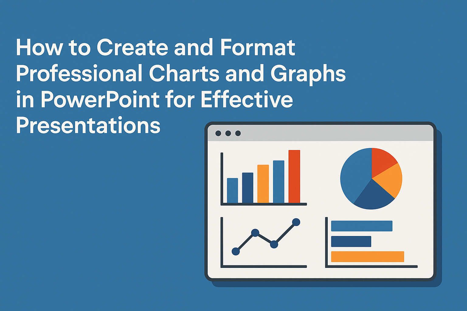
Understanding the Basics of Charts and Graphs
Charts and graphs are essential tools for visualizing data. They help in presenting complex information in a clear and understandable way.
Types of Charts and Graphs
There are several types of charts and graphs, each serving distinct purposes:
- Bar Chart: Shows comparisons among different categories using vertical or horizontal bars.
- Line Chart: Displays data points connected by lines, ideal for showing trends over time.
- Pie Chart: Represents parts of a whole, useful for showing percentage breakdowns.
- Scatter Plot: Illustrates the relationship between two variables, aiding in identifying correlations.
- Column Chart: Similar to bar charts but uses vertical bars for category comparisons.
Each chart type has its unique strengths, making them suitable for different data presentation scenarios.
When to Use Each Type
Choosing the right chart is crucial for effective communication:
-
Use a Bar Chart when comparing discrete categories. It clearly illustrates differences in size across different groups.
-
Opt for a Line Chart to display trends over time. This chart effectively highlights increases or decreases.
-
Select a Pie Chart for illustrating proportions. This is perfect for showing percentage distribution.
-
Use a Scatter Plot when exploring relationships. It helps in visualizing how one variable affects another.
-
Choose a Column Chart for displaying a range of data comparisons, particularly when the data categories are numerous.
Understanding when to use each type can significantly enhance data presentations.
Getting Started with PowerPoint
PowerPoint is a powerful tool for creating visually appealing presentations. This section focuses on how to open a new presentation and insert slides for your charts.
Opening a New Presentation
To begin, users should launch Microsoft PowerPoint on their computer. Upon opening the program, they will see a start screen with options for new presentations.
They can select Blank Presentation to create their own from scratch or choose from various templates. Each template comes with pre-designed layouts and color schemes.
Once the users pick a template, they can view their blank slide. The default slide layout usually has placeholders for titles and content.
They can click on the File menu and select Save As to name their project and choose where to save it. It’s good practice to save frequently to avoid losing any progress.
Inserting a New Slide for Your Chart
To insert a new slide, users should navigate to the Home tab in the toolbar. Here, they will find the New Slide button, which offers several layout choices.
Users can pick a layout that best suits their chart, such as a title slide or a content slide.
Once the slide for the chart is chosen, it appears in the presentation. They can click on the slide and customize it by adding a title and any other elements.
To insert a chart, users should find the Insert tab and select Chart from the Illustrations group. This opens a dialog box where various chart types can be chosen.
Creating a Chart in PowerPoint
Charts are a great way to present information clearly and effectively. In PowerPoint, users can easily create and customize various chart types to visualize data. This section covers how to choose the right chart, input data, and use templates and styles for a professional look.
Choosing the Right Chart Type
Selecting the right chart type is crucial for clear data presentation. Different charts serve different purposes. For example, bar charts are excellent for comparing quantities, while line charts are ideal for showing trends over time.
When deciding, consider the data itself. A pie chart works well for depicting proportions, while a column chart is useful for displaying data changes. Ensuring the chart aligns with the message helps in communicating effectively.
PowerPoint offers various options, including scatter plots, area charts, and more. Users should experiment to find the best match for their data.
Inputting Data into the Chart
Once the chart type is chosen, inputting data is the next step. In PowerPoint, users can click on the chart, which opens an Excel-like spreadsheet. This is where they input their data.
It’s important to organize data clearly in rows and columns. For example, headings should represent categories, and individual data points should follow suit.
Users should double-check for accuracy to avoid misleading visuals. After entering the data, the chart automatically updates to reflect changes. This feature allows for adjustments as new information becomes available.
Utilizing Chart Templates and Styles
PowerPoint provides a variety of pre-designed templates and styles that can enhance charts. Using these templates saves time and adds a professional touch.
Users can find templates in the Chart Design tab after selecting a chart. There, individuals can apply different color schemes and layout styles to fit their presentation’s theme.
Customizations can include adjusting fonts, altering colors, and adding borders. This feature ensures that the charts not only display data but also complement the overall design of the presentation.
By utilizing these tools, users create charts that are not only informative but visually appealing.
Formatting Your Chart
Formatting a chart is essential for clarity and impact. Focus on customizing chart elements, adjusting color schemes and fonts, and working with axes and gridlines. These steps enhance the overall presentation and make the data easier to understand.
Customizing Chart Elements
Customizing chart elements improves readability and visual appeal. Start by selecting individual elements like titles, data labels, and legends.
For titles, use clear language that describes the chart’s content. Data labels should provide precise values without cluttering the visual.
To access these features, click on the element you wish to customize, then use the “Format” tab in PowerPoint. Here, you can change sizes, fonts, and styles.
Adjusting the legend’s position can also help ensure it doesn’t obstruct data, keeping your chart clean and organized.
Adjusting Color Schemes and Fonts
Choosing the right colors and fonts enhances the chart’s professionalism. Use a color palette that complements your overall presentation while ensuring visual cohesion.
Consider using contrasting colors to highlight different data series.
Font selection is equally important. Stick to simple and readable fonts like Arial or Calibri. Avoid overly decorative fonts that may distract from the data.
Adjusting font sizes for headings and labels ensures that the text is legible from a distance. Using bold or italic styles can help emphasize key points without overwhelming the viewer.
Working with Axes and Gridlines
Axes and gridlines provide context to the data, so it’s vital to format them correctly. For the axes, ensure they are labeled with appropriate units and descriptions. This helps viewers understand what they are looking at.
Gridlines can aid readability but can also clutter the chart if overused. Consider using light or subtle gridlines that do not distract from the main data.
Adjusting the scale of the axes can also help highlight trends without distorting the data.
Regularly review the balance between clarity and detail to ensure effective communication of the data.
Enhancing Chart Readability and Impact
To create charts and graphs that captivate the audience, it is important to focus on clarity and visual appeal. By enhancing readability and impact, the information conveyed becomes more effective and engaging.
Incorporating Data Labels and Legends
Adding data labels to charts can significantly improve their clarity. Data labels help viewers understand the exact values represented in the chart, making trends easier to follow.
It is best to place these labels close to the corresponding data points for better visibility.
Legends are also crucial. They identify what each color or symbol in the chart means. Placing the legend in a straightforward, consistent location helps ensure the audience can quickly grasp the information.
Applying Visual Effects
Visual effects can transform a basic chart into an eye-catching visual. Simple adjustments like adding shadows or 3D effects make charts stand out. However, it is important to use these effects sparingly, as too many can distract from the data itself.
Color choices are essential as well. Using a color scheme that is easy on the eyes while highlighting key data points can enhance overall readability. Options like contrasting colors for bars and background make trends pop.
Binding a Chart to Excel Data
Linking a PowerPoint chart to Excel data streamlines updates and ensures accuracy. When data changes in Excel, the chart in PowerPoint automatically updates.
This saves time and helps maintain consistent information presentation.
To do this, the user needs to select the “Insert” tab in PowerPoint, choose “Chart,” and connect it to the Excel file. This method simplifies presentations by allowing real-time data adjustments.
This practice can eliminate the need to manually input new data, reducing chances for errors.
Animation and Presentation Techniques
Incorporating animations and transitions can enhance the viewer’s experience during a PowerPoint presentation. Thoughtful animations help to keep the audience engaged and can clarify complex data. This section will explore how to effectively add animations to charts and smoothly transition between slides that feature these visuals.
Adding Animations to Charts
To add animations to charts, the first step is to select the chart that needs enhancement. Once selected, click on the Animation tab in the ribbon.
Choosing an appropriate animation effect can make data easier to digest. Common options include Fade, Wipe, or Fly In.
After selecting the desired animation, it’s important to customize the order and timing. This can be done using the Animation Pane, which allows users to control the sequence of entry for each chart element.
For example, animating each data series separately can help the audience focus on one piece at a time.
Lastly, preview the animations before presenting. This step ensures everything flows smoothly and captures the intended attention.
These simple techniques create visual interest without overwhelming the audience.
Transitioning Between Slides with Charts
Transitions can also play a key role in maintaining audience attention. To start, the presenter should click on the Transitions tab in PowerPoint.
Here, they can select from various options to smoothly shift from one slide to the next. Popular choices include Push or Cover.
Setting the transition duration is crucial. A short time, such as 0.5 seconds, can keep the presentation dynamic.
Applying the same transition to all slides creates a consistent feel throughout the presentation.
It’s important to use transitions sparingly. Too many can distract from the data being presented. A well-timed transition helps maintain viewer focus and enhances the overall storytelling of the presentation.
Tips for Professional Chart Presentations
Creating professional charts requires clear projection and consistency across slides. These tips will help in making charts that effectively communicate data and engage the audience.
Projecting Charts Clearly
Clear visuals are essential for effective presentations. First, ensure that all text and data are legible from a distance. Use a font size of at least 18 points for key labels.
Second, simplify charts to avoid clutter. Limit the number of data points and use concise titles. Focus on one main message per chart to keep the audience’s attention.
Lastly, choose colors wisely. Use a color palette that is not only appealing but also accessible for color-blind viewers. This improves readability and helps convey the information clearly.
Maintaining Consistency Across Slides
Consistency in presentation style is key.
Use the same fonts, colors, and chart styles throughout the slides. This unifies the presentation and makes it look more professional.
Next, keep the layout similar across charts.
Place titles and legends in the same positions on each slide. This way, the audience can easily follow along without getting distracted.
Lastly, avoid using overly flashy effects.
Stick to basic transitions and animations to ensure that the focus remains on the data.
A simple and clean presentation honors the information being shared.