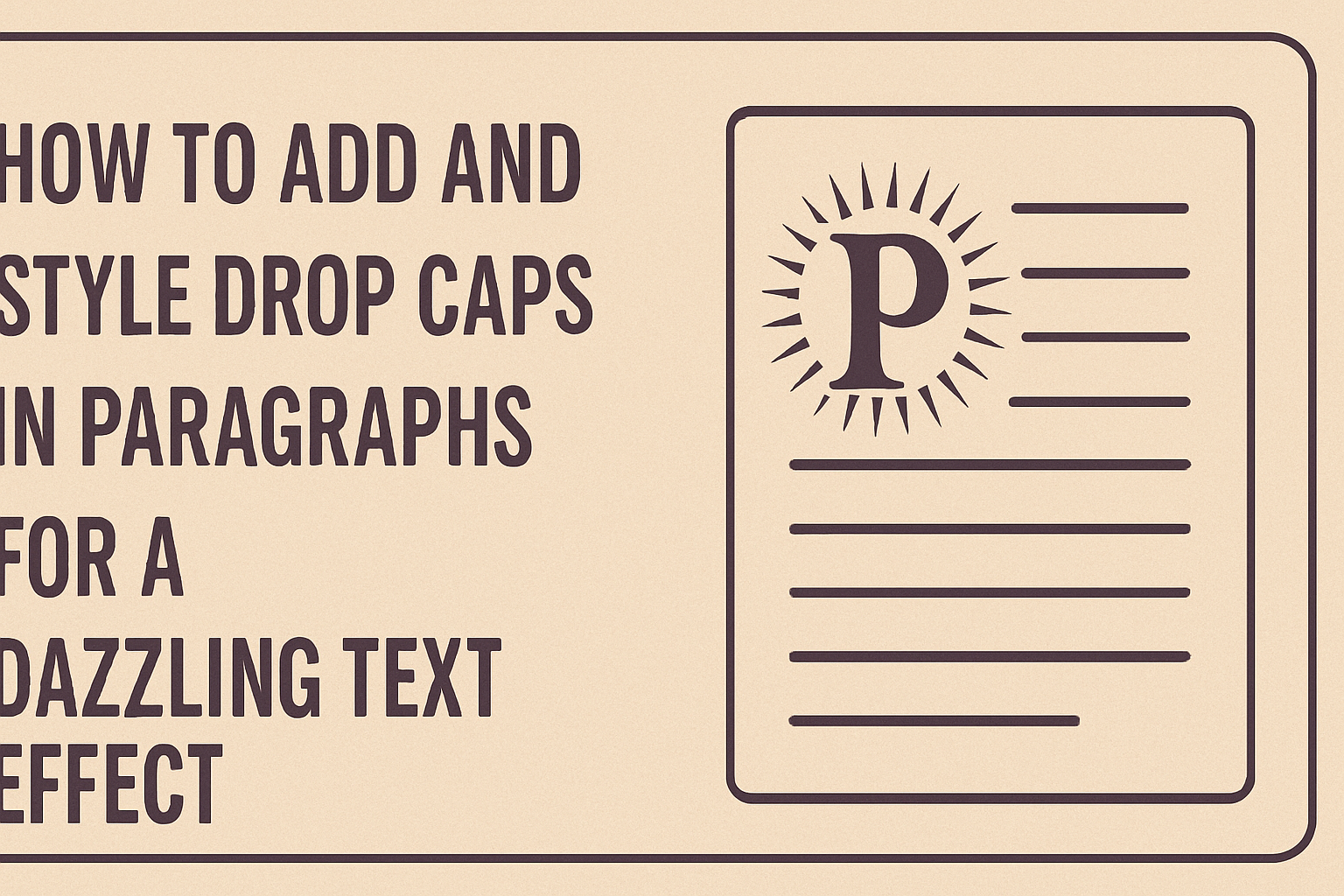
Adding a drop cap to a paragraph can make any text look more appealing. It draws attention to the start of the paragraph and adds a touch of creativity to your writing.
Whether for a blog post or a document, drop caps can enhance the reader’s experience.
Styling drop caps is simple and can be done using tools in word processors like Microsoft Word. Readers can learn the steps to insert drop caps easily and explore different options to customize their look, making content more engaging.
With a little creativity, anyone can transform plain text into something eye-catching. This blog post provides a straightforward guide to adding and styling drop caps, helping writers elevate their work with an attractive design feature.
Understanding Drop Caps
Drop caps are a stylish element in text formatting. They add a decorative touch to the beginning of paragraphs, making them visually appealing and drawing the reader’s attention.
History of Drop Caps
Drop caps date back to ancient manuscripts. Monks often embellished the first letter of a paragraph with intricate designs. This practice aimed to enhance readability while showcasing artistic skill.
During the Renaissance, drop caps became more popular in printed text. They were used in books to signal the start of a new section or chapter.
Over time, this tradition continued into modern print and digital media.
In many styles, drop caps have evolved to be simpler yet more effective. Today, they can be found in novels, magazines, and websites, blending art with functionality.
Purpose and Usage in Design
The purpose of drop caps is primarily decorative. They serve to create visual interest at the start of a paragraph.
By doing so, they help guide the reader’s eye and establish a hierarchy in text.
In design, drop caps can enhance the overall layout. They can be styled in various fonts, sizes, and colors to match the theme. A careful choice of drop cap can improve both aesthetics and readability.
Drop caps can also differentiate sections within a document. They signal shifts in topics or ideas, making it easier for readers to navigate through text.
Whether in print or digital formats, drop caps remain a popular choice for enhancing design.
Adding Drop Caps in HTML and CSS
Adding drop caps is a stylish way to enhance paragraphs in web design. This technique captures attention by making the first letter stand out. Here’s how to incorporate drop caps using basic HTML structure and CSS.
Basic HTML Structure for Paragraphs
To add drop caps, it’s important to start with a simple HTML structure. Each paragraph should be wrapped in a <p> tag. For example:
<p>This is an example of a styled paragraph with a drop cap.</p>
In this setup, the drop cap will affect the first letter of this paragraph.
Be sure to keep your HTML clean and well-organized. Having a clear layout will help keep styles effective and maintainable.
Styling with CSS: The Initial Letter Property
Styling the drop cap requires CSS. The ::first-letter pseudo-element is ideal for this. Here’s a basic example:
p::first-letter {
    font-size: 3em;
    float: left;
    margin-right: 5px;
    color: #903;
}
In this code, the first letter of any paragraph styled this way will be larger and float to the left. Adjusting the font-size and margin-right creates a visually appealing layout. Color can be added for extra impact, making the drop cap really pop.
Cross-Browser Compatibility Considerations
When using drop caps, cross-browser compatibility is key. Not all browsers support the same features.
The ::first-letter pseudo-element is widely supported, but the initial-letter property may not be.
When styling, it’s recommended to test the design on various browsers like Chrome, Firefox, and Safari.
Using fallbacks is helpful too. For example, if initial-letter doesn’t work, ensure the drop cap still looks good with just ::first-letter.
This approach ensures that the design is consistently displayed for all users, enhancing the reading experience.
Design Tips for Drop Caps
When adding drop caps to paragraphs, thoughtful design choices can enhance the visual appeal. Consider factors like typeface, color, and size to make the drop cap stand out while still matching the overall style of the text.
Choosing the Right Typeface
Selecting the right typeface is crucial for an effective drop cap. A bold and decorative font can create a striking first impression.
For instance, serif fonts like Times New Roman or Georgia can convey tradition and elegance.
On the other hand, sans-serif fonts like Arial or Helvetica offer a modern look. He should ensure the chosen typeface is readable and complements the body text.
Mixing fonts can work, but he should avoid overly elaborate styles that distract from the main content.
Color and Contrast for Emphasis
Color plays a vital role in making drop caps eye-catching. A contrast between the drop cap and the surrounding text is essential.
For example, using a darker color for the drop cap on a lighter background makes it pop.
He could choose a color that ties into the overall color scheme of the document. Using accent colors can also help emphasize important sections.
Consistent use of color will help maintain harmony throughout the design.
Size and Alignment Best Practices
The size of the drop cap should be larger than the body text to draw attention. A common practice is to increase the drop cap size by 2-3 lines of text. This makes it noticeable without overwhelming the paragraph.
Alignment matters too. Many designers opt for a left alignment for a clean look.
Central alignment can work in some designs but may need careful consideration to keep balance. Proper spacing between the drop cap and the text ensures it blends seamlessly into the design.
Advanced Techniques
Adding and styling drop caps can go beyond the basics. There are advanced techniques that can enhance their appearance and impact on the reader. This section focuses on using web fonts and animating drop caps.
Using Drop Caps with Web Fonts
Web fonts provide a unique way to make drop caps stand out. By selecting specific web fonts, a designer can create a distinct look that matches the document’s theme.
To use web fonts, follow these steps:
- Choose a web font from a service like Google Fonts.
- Add the font link to the website’s HTML.
- In the CSS, specify the font for the drop cap element.
Using distinctive fonts can add personality to the text. Combining styles, like bold or italic, can further enhance the drop cap’s visual appeal. With web fonts, the possibilities for creativity are endless.
Animating Drop Caps for Enhanced User Engagement
Animating drop caps can capture a reader’s attention and create a dynamic reading experience.
Simple animations can make the drop cap appear lively without being distracting.
Common animation techniques include:
- Fade-in: The drop cap gradually becomes visible.
- Scale: The drop cap grows in size when the user scrolls or hovers.
To implement animation, use CSS transitions or JavaScript libraries like GSAP.
By adding subtle animations, drop caps can engage readers and encourage them to continue reading.