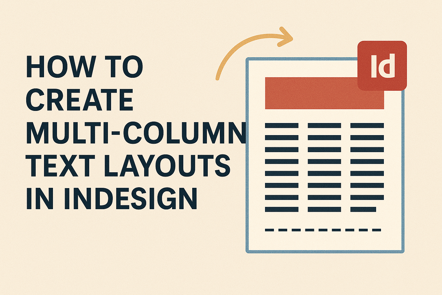
Creating multi-column text layouts in InDesign can greatly improve the design and readability of any document. Users can easily achieve stunning layouts by adjusting the column settings in a few simple steps.
Whether for a magazine article or a newsletter, this technique adds structure and flow to the text.
InDesign offers various methods for setting up columns, allowing for flexibility and creativity. By mastering these techniques, designers can enhance their projects and make the content more engaging for readers.
Through this guide, they will discover how to utilize InDesign’s powerful tools effectively.
Getting started with multi-column layouts opens up new possibilities for visual storytelling. Those who learn these skills will find that well-organized text not only looks professional but also draws in the audience.
Understanding InDesign’s Text Framework
InDesign offers a structured approach to handling text, making it easier for users to create visually appealing layouts.
Key elements include text containers and their functions, which support multi-column designs effectively.
Basic Concepts of Text Containers
Text containers are essential in InDesign for managing how text appears on the page. They include text frames and other defined areas where content can flow.
Users can create a text frame by selecting the Type tool and dragging to form a box. Once defined, text can be added, edited, or formatted within this space.
Text containers can also have specific properties, like columns and spacing. Adjusting these properties directly influences the readability and visual appeal of the layout.
For multi-column setups, the distance between the columns is crucial. A comfortable reading width for text typically ranges from 65 to 75 characters per line. This ensures an ideal reading experience.
The Role of Text Frames in Layouts
Text frames are the backbone of text layouts in InDesign. They allow for precise control over where the text appears in relation to images and other design elements.
When creating a layout, users can choose to apply columns within a single text frame. This approach simplifies the design process, providing a cleaner look.
By using the “Text Frame Options” dialog, one can quickly set the number of columns. The user can also adjust the gutter space, which is the space between the columns.
These features enhance the design flexibility and organization. The clarity of text frames makes it easy to manage large amounts of text. This organization is key to achieving a polished, professional layout.
Setting Up Your Document
Setting up the document properly is the first step to creating effective multi-column layouts in InDesign. Getting the right document size and adjusting margins and columns can help achieve a polished design.
Choosing the Right Document Size
Selecting the appropriate document size is crucial for layout success. First, consider the final medium where the design will appear—print or digital.
Common sizes for print include:
- Letter: 8.5 x 11 inches
- A4: 8.27 x 11.69 inches
- Tabloid: 11 x 17 inches
For digital layouts, sizes can vary. A standard web page often measures 1920 x 1080 pixels.
To set the size in InDesign, go to File > New > Document. Here, you can choose presets or enter custom dimensions. Make sure to account for bleeds if the design extends to the edge of the page. This careful setup ensures alignment with printing standards or digital displays.
Margins and Columns Setup
Establishing margins and columns is key to guiding your text. Start by selecting Layout > Margins and Columns. This helps in determining the space around the text.
Margins provide breathing room and improve readability. Here are common margin sizes:
- Narrow: 0.5 inches
- Moderate: 0.75 inches
- Wide: 1 inch
Next, set the number of columns. Choose a layout that best fits your design needs. For example, a two-column setup works well for articles, while three columns suit brochures.
Ensure the gutters (the space between columns) are wide enough for clarity. A standard gutter width is typically 0.2 to 0.5 inches. Adjusting these settings early creates a strong foundation for effective multi-column text layouts.
Creating Multi-Column Text Layouts
Creating multi-column text layouts can enhance the readability and aesthetic appeal of a design. It allows the designer to organize information neatly and guide the reader’s eye through the content effectively.
Linking Text Frames for Continuous Flow
In InDesign, linking text frames ensures that text flows smoothly from one column to another.
Designers can start by creating individual text frames where text will be placed. By selecting the first text frame and clicking the small square at its bottom right corner, they can link it to the next frame.
This creates a continuous flow of text. When text is added or edited, it will automatically shift between linked frames. This feature helps maintain a structured layout, especially when dealing with long articles or reports where text needs to span multiple columns.
Balancing Columns for Visual Appeal
Balanced columns improve the visual appeal of a layout. InDesign offers various tools to help achieve this. If columns have different amounts of text, designers can use the “Balance Columns” feature.
This feature distributes text evenly across all columns. Designers can also manually adjust the height of frames to ensure columns appear uniform. Utilizing guides can help maintain consistent margins and spacing.
Designers should also consider the alignment of text. Centered text can create a different feel than left-aligned text. Choosing the right approach will depend on the overall design intention.
Managing Text Flow Across Columns and Pages
Managing text flow is crucial, especially in longer documents. InDesign has features to control how text moves from one column to another and even across multiple pages.
To manage this, designers can create threaded text frames that connect across columns and pages.
Using the “Next Frame” function lets the designer jump to the next frame where text continues. This provides a seamless reading experience.
Additionally, designers might face challenges like avoiding orphaned or widowed lines in columns. InDesign allows setting these preferences in the paragraph settings to ensure proper text flow and formatting throughout the layout.
Enhancing Your Layouts
To create visually appealing multi-column layouts in InDesign, it’s important to thoughtfully integrate graphics and optimize typography. Using these elements can elevate the reader’s experience and make the content more engaging.
Incorporating Graphics and Images
Graphics and images play a vital role in enhancing text layouts. They can break up large blocks of text and provide visual interest. When choosing images, ensure they are relevant to the content.
-
Use High-Quality Images: Low-resolution images can make a layout look unprofessional. Aim for images that are at least 300 DPI for print.
-
Balance Text and Images: Place images strategically between text columns. This method creates a more dynamic layout.
-
Use Wrap Text Options: In InDesign, utilize text wrap features to flow text around images. This keeps the design clean and readable.
Using Typography to Improve Readability
Typography greatly affects how content is perceived.
Proper font selection and layout can increase clarity and reader engagement.
-
Choose Clear Fonts: Sans-serif fonts like Arial or Helvetica often work well for body text, while serif fonts like Times New Roman can be effective for headings.
-
Establish Hierarchy: Use different font sizes and weights to create a visual hierarchy.
Larger, bolder texts grab attention, guiding the reader through the content.
- Adjust Line Spacing and Tracking: Proper line spacing (leading) and letter spacing (tracking) improve legibility.
A good rule of thumb is to set leading at 120% of the font size.
By effectively incorporating graphics and focusing on typography, designers can create layouts that are not only attractive but also easy to read.