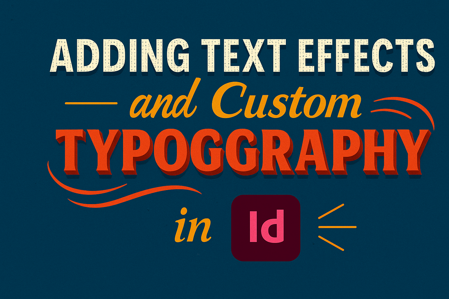
Creating eye-catching designs is easier than ever with Adobe InDesign. Text effects and custom typography can transform a simple project into a stunning visual experience. Adding the right effects not only enhances readability but also grabs the viewer’s attention, making their content stand out.
InDesign offers tools that allow users to play with various styles, from shadows to outlines, giving each piece a unique flair. By mastering these techniques, designers can elevate their work, ensuring it leaves a lasting impression.
It’s all about finding the right balance between creativity and functionality to effectively communicate their message.
Whether for a professional project or a personal endeavor, knowing how to add text effects and utilize custom typography can significantly impact the final outcome. Designers of all skill levels will benefit from exploring these features and incorporating them into their workflow.
This journey into the world of typography opens up endless possibilities for artistic expression.
Getting Started with InDesign
InDesign offers a powerful platform for creating stunning designs. Understanding its workspace, setting up documents correctly, and working effectively with text frames are key steps for beginners.
Understanding the Workspace
InDesign’s workspace consists of various panels that help users create and edit their projects. The main components include the Control Panel, Tools Panel, and Panels like Pages, Layers, and Swatches.
- The Control Panel shows options based on the selected tool or object.
- The Tools Panel on the left provides access to selection, text, and shape tools.
Users can customize their workspace by arranging panels to suit their preferences. This flexibility allows for a more comfortable working environment tailored to specific projects.
Setting Up a Document
To start a new project, one must set up a document properly. Users can create a new document by selecting File > New Document.
Key steps include:
- Page Size: Choose a standard size like A4 (297 mm x 210 mm) or set custom dimensions.
- Number of Pages: Decide how many pages the document will have, adjusting as necessary.
- Margins and Bleeds: Set margins for text flow and add bleeds to prevent white edges in printed documents.
These settings allow for a structured approach to layout and design, making later adjustments easier.
Working with Text Frames
Text frames are essential for adding and formatting text in InDesign. To create a text frame, select the Type Tool and draw a box where the text will go.
Key tips for text frames include:
- Linking Frames: Create multiple frames by linking them, allowing text to flow from one frame to another.
- Text Formatting: Use the Control Panel to adjust font, size, and style for the text, ensuring it fits the design.
Proper use of text frames enhances the overall appearance of the project. By mastering these basics, users can create more effective and visually appealing documents.
Exploring Typography Tools
Effective typography can make a big difference in design. It combines choosing the right fonts, adjusting sizes, and fine-tuning spacing for the best results. This section covers several important typography tools that aid in creating stunning text effects.
Choosing Fonts
Selecting the right font is crucial for any design project. Fonts can evoke different feelings or moods in the viewer. Designers should explore a variety of font families, such as serif, sans-serif, and script.
Using the Adobe Fonts library is a great option, as it offers thousands of choices. Always consider readability over style when picking fonts. A well-chosen font will enhance the message rather than distract from it. Mixing fonts can add interest, but it’s best to limit yourself to two or three fonts in a single design.
Adjusting Font Size and Leading
Font size significantly impacts how text is perceived. Larger fonts draw attention, while smaller ones provide important details. InDesign allows users to adjust size easily in the Character panel.
Leading refers to the space between lines of text. Proper leading improves readability. A general rule is to set leading 120% of the font size for a comfortable appearance. For example, if the font is 10 pt, the leading should be around 12 pt. Adjusting these settings ensures a visually appealing and easy-to-read layout.
Kerning and Tracking
Kerning affects the space between individual characters, while tracking relates to spacing across entire words or blocks of text. This tool helps create a balanced appearance and can enhance the overall aesthetics of the text.
In InDesign, kerning can be adjusted manually or automatically. Designers should pay close attention to how letters fit next to each other. If they appear too loose or tight, adjustments are necessary for a polished look. Tracking can also refine the spacing in body text or headlines for better legibility.
Using Baseline Shift
Baseline shift allows for precise placement of text. It moves selected characters up or down on the page, helping to create visually dynamic text layouts. This tool is especially useful for making creative titles or when combining text with graphic elements.
By adjusting the baseline, designers can emphasize certain words or phrases. In InDesign, this can be done from the Character panel. A slight shift can make a significant difference in how text interacts with other design elements, enhancing the overall composition.
Applying Text Effects
Text effects can enhance the visual appeal of typography in InDesign. These effects include drop shadows, bevels, and gradient fills. Each technique adds depth and interest to text, making it stand out in any layout.
Drop Shadows and Outer Glows
Drop shadows create a sense of depth by making text appear to float above the background. To add a drop shadow, select the text and go to Effects in the Object menu. Adjust the settings like distance, angle, and opacity to achieve the desired look.
Outer glows can also brighten text by adding a soft halo around the letters. Similar steps apply: navigate to Effects and choose Outer Glow. Experiment with color and spread to complement the design, ensuring visibility against various backgrounds.
Bevel and Emboss Techniques
Bevel and emboss effects give text a three-dimensional feel. They can make letters look raised or recessed. To apply this effect, select the text and open the Effects menu. Choose Bevel and Emboss to access settings like depth, direction, and size.
Adjusting these settings allows for customization based on the project’s theme. A subtle bevel can add sophistication, while a stronger emboss might convey a bold statement. Carefully trial different combinations for best results.
Creating Gradient Text
Gradient text can produce striking visual effects, adding color transitions to letters. In InDesign, the first step is to select the text. Then, go to the Swatches panel and create a new gradient.
After creating the gradient, apply it by selecting the Text Frame and choosing Fill from the Control Panel. This technique works well for headings and titles, attracting attention and enhancing brand colors. Adjust the gradient angle for varied effects to make the text truly unique.
Customizing Your Typography
Customizing typography in InDesign is essential for creating unique designs. By implementing styles and special characters, users can enhance their projects and improve readability.
Creating Paragraph Styles
Creating paragraph styles helps maintain consistency across a document. Users can define various attributes, such as font, size, spacing, and alignment.
To create a paragraph style, open the Paragraph Styles panel. Click on the New Style button and name the style appropriately for easy identification.
Next, set options like Font Family, Size, and Leading to manage space between lines. Attributes like Left Indent and Space Before/After can adjust how text is positioned.
Applying styles is easy; just select the text and click the desired style. This method saves time and improves document organization.
Using Character Styles
Character styles are great for highlighting important text elements. Unlike paragraph styles, they focus on individual text portions, allowing for tweaks without affecting entire segments.
To create a character style, access the Character Styles panel. Click on New Character Style and give it a name. Customize attributes such as Font Style, Size, and Color.
Using character styles is simple. Highlight the desired text, then choose the style from the panel. This method brings attention to keywords or phrases effectively and efficiently.
Working with Glyphs and Special Characters
InDesign allows the use of glyphs and special characters to add flair. These can include arrows, symbols, or accents to enhance text visually.
To access glyphs, navigate to Type > Glyphs. This opens a panel displaying various characters.
Users can browse through fonts to find specific glyphs. Special characters, like smart quotes or em dashes, enrich the text. They help convey the intended meaning more clearly.
A detailed glyph map aids in finding these unique symbols quickly, enhancing design creativity.