Creating a professional business card is an essential step for anyone looking to make a good impression.
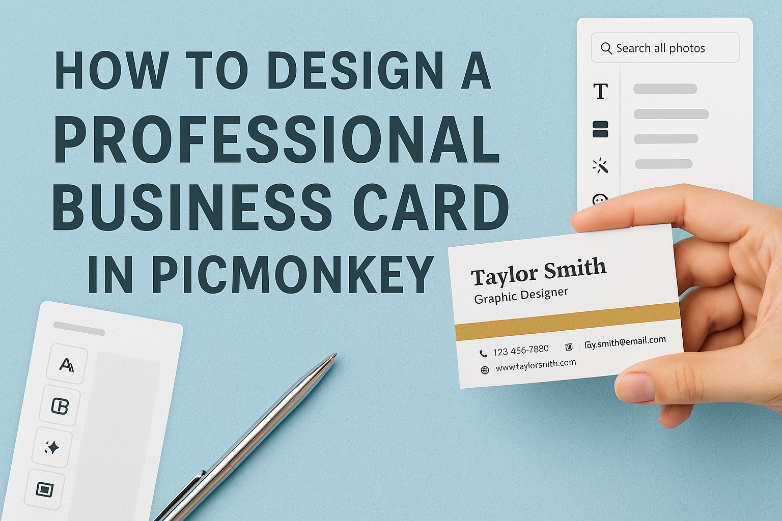
In PicMonkey, designing a standout business card is simple and efficient. PicMonkey allows users to showcase their brand personality through customizable templates and tools. With a few clicks, anyone can craft a card that looks polished and professional.
PicMonkey offers a variety of graphics, fonts, and layouts, making it easy to reflect personal style. Users can start from scratch or choose a template that fits their vision.
With its user-friendly features, designing a business card has never been more accessible.
Getting Started with PicMonkey
Starting with PicMonkey is easy and fun. Users can create an account, explore the interface, and select the perfect canvas size for designing their business cards.
Creating Your PicMonkey Account
To begin using PicMonkey, users need to create an account. This is a simple process.
Just visit the PicMonkey website and click on “Sign Up.” Users can choose to sign up with an email address or through a social media account like Facebook or Google.
After completing the sign-up form, a confirmation email will be sent. Clicking the link in the email will activate the account. Once logged in, users can explore various design options and tools available on the platform.
Overview of PicMonkey Interface
Upon logging in, users will encounter a clean and organized interface. The main menu is located at the top and includes options such as “Create New,” “Templates,” and “My Projects.”
On the left side, there is a toolbar containing tools for editing images, adding text, and customizing designs. Users can easily navigate through the options to find the right features.
The right side shows the canvas where designs come to life. It is important for users to become familiar with this layout to make their design experience smooth and enjoyable.
Selecting the Right Canvas Size
Choosing the correct canvas size is crucial for creating professional business cards. Users should typically select the dimensions of 3.5 x 2 inches for standard cards.
To set this up in PicMonkey, start by clicking “Create New” and then select “Blank Canvas.” Users can enter the dimensions manually or use a pre-sized template.
For high-quality printing, setting the resolution to 300 pixels per inch (PPI) is recommended. This helps ensure that the final design looks sharp and professional.
By getting the canvas size right, users can avoid any cropping issues during printing.
Design Elements of a Professional Business Card
Creating a professional business card involves careful attention to various design elements. Each part plays a crucial role in ensuring that the card is not only visually appealing but also communicates key information effectively.
Choosing a Color Scheme
Selecting a color scheme is one of the first steps in designing a business card. Colors should reflect the brand’s personality and values. For example, blue often conveys trust, while green can symbolize growth.
A good practice is to limit the palette to two or three main colors. This prevents the design from becoming overwhelming. Using complementary colors can create a balanced look. Testing different combinations using tools available in PicMonkey helps find the perfect match for the brand.
Integrating Your Brand Logo
Incorporating a brand logo is essential for identity. The logo should be placed prominently on the card, usually in a corner or the center. It acts as a visual anchor for the design.
When integrating the logo, ensure it is of high quality and resolution. This prevents it from appearing pixelated or unclear. The size should align well with other elements. A logo that is too large may distract from contact information, while one that is too small can go unnoticed.
Typography and Font Selection
Typography greatly affects readability and style. Choosing the right fonts is important for conveying professionalism.
It’s best to use no more than two different fonts on a card. This keeps the design simple and cohesive.
Sans-serif fonts are often recommended for modern cards as they are clean and easy to read. When selecting font sizes, ensure that contact details stand out, but also remain legible. The use of bold text for names or titles can help differentiate key information.
Utilizing White Space Efficiently
White space, or negative space, is crucial in card design. It prevents the card from looking cluttered. This space allows the eye to rest and helps emphasize important details.
A well-designed card uses white space strategically. Keeping margins around text and images ensures clarity.
It’s also beneficial to have areas on the card that are left intentionally blank for a clean appearance. This not only improves aesthetics but also enhances usability when someone needs to add notes or details later.
Layout and Composition Techniques
When designing a business card, layout and composition are vital to create a professional look. Each element must fit well together to convey the right message. This section will cover the arrangement of contact information, adding visual hierarchy, and ensuring alignment and balance for an effective design.
Arranging Contact Information
Placing contact information in a clear manner is crucial. It’s best to start with the most important details like the name, title, and company name. Then, include phone numbers and email addresses.
A simple way to arrange this information is by using blocks. For instance:
- Name: John Doe
- Title: Marketing Manager
- Company: ABC Corp
- Phone: (123) 456-7890
- Email: john.doe@abccorp.com
Using bold text for the name and title helps these details stand out. Ensure there is enough space between each contact point to avoid clutter. This makes it easier to read at a glance.
Adding Visual Hierarchy
Visual hierarchy helps guide the viewer’s eyes to the most important information first. It involves using size, color, and placement effectively. For example, the name should be the largest text on the card.
Using different font weights can also differentiate between elements. For instance:
- Bold for the name
- Italics for the title
Colors play a role too. Darker colors can emphasize elements better than lighter ones. Creating focal points using these techniques directs attention appropriately.
Ensuring Alignment and Balance
Alignment ensures all elements in the design look organized. It’s essential to maintain straight margins and lines. For instance, aligning text to the left or centering it can create a cleaner look.
Balance can be symmetrical or asymmetrical. A symmetrical design has equal visual weight on both sides. An asymmetrical design is more dynamic, but it needs careful placement to avoid looking chaotic.
Using grid lines in PicMonkey can help maintain alignment and balance. These features guide the placement of all elements for a polished finish. Keeping everything balanced and well-aligned gives the card a professional touch.
Exporting and Testing Your Design
After creating a stunning business card in PicMonkey, it’s important to know how to export it and test its design. This process ensures that the final product looks professional and meets expectations before printing.
Saving in Different Formats
When exporting a business card from PicMonkey, users have several format options. Common choices include PNG, JPG, and PDF. Each format has its advantages.
- PNG is great for digital use and preserves transparency.
- JPG is perfect for photos but does not support transparency.
- PDF is best for printing as it maintains the highest quality.
To save, go to the export option and select the desired format. Ensure the file size is under 25 MB to avoid issues with uploads.
Properly saving the design helps maintain its quality and ensures it looks good in any medium.
Print Testing Your Business Card
Before finalizing the design, it’s smart to print test copies. This step allows for checking colors, layout, and clarity.
He or she should print on high-quality cardstock to see how the card feels. A test print can reveal any layout issues that might not show on screen.
After printing, reviewing the design in hand helps with spotting mistakes. It’s a good idea to hold the card up to a light to check for any blurriness or color mismatches.
Making these tests ensures the business card will look great when shared with others.