The 1950s were a vibrant time for design and typography, influencing many artistic choices for years to come.
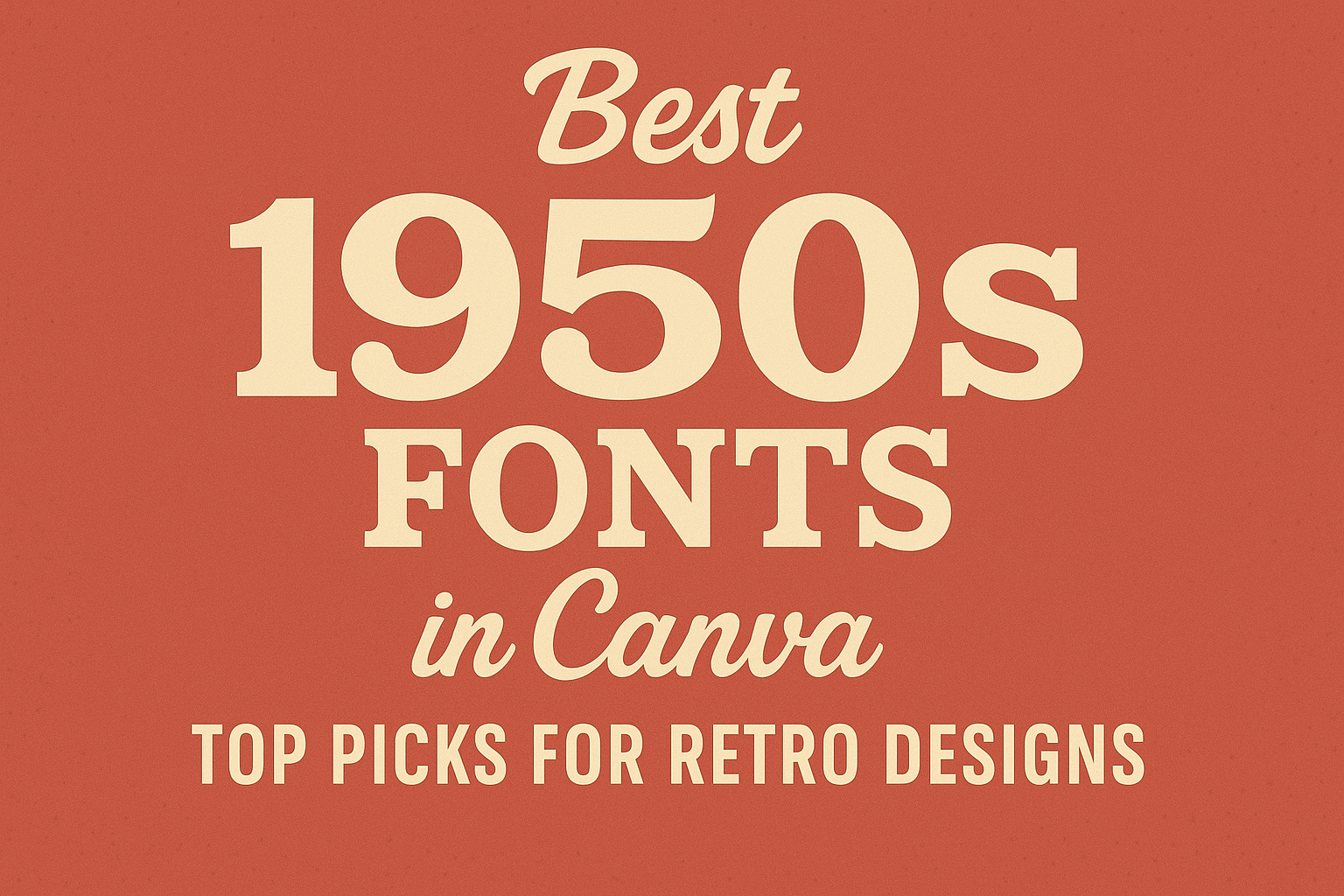
When creating vintage-inspired designs in Canva, using the best 1950s fonts can capture the essence of this lively era and enhance overall aesthetics.
From stylish headlines to captivating logos, the right font can make all the difference in a project.
Canva offers a range of fonts that evoke the charm and nostalgia of the 1950s. Designers can explore options like Bodoni FLF and Futura, among others, to add a retro touch to their work.
Whether it’s for a personal project or a professional design, these fonts can help bring ideas to life.
By choosing the right 1950s fonts, designers can easily tap into the nostalgic feel of this golden age of style. These fonts not only provide clarity but also bring personality to designs, making them memorable and engaging.
With so many options available in Canva, finding the perfect font is both exciting and rewarding.
Exploring Vintage Aesthetics
Vintage aesthetics draw inspiration from past styles, creating a nostalgic feel in design. This approach highlights unique typography and connects historical elements to modern trends.
The Rise of Retro Typography
Retro typography gained popularity as designers sought to capture the charm of past decades. In the 1950s, fonts became more adventurous and expressive. This was a time when the focus shifted to playful designs and bold colors.
Today, many fonts reflect this lively spirit. Designers often choose fonts like Metropolis, known for its clean lines, and Quicksand, which offers a friendly vibe.
These fonts help convey an inviting and casual atmosphere while honoring the historical context of the time.
Connecting the Past and Present in Design
Designers use vintage fonts to create a bridge between the past and present. By incorporating retro typography, they evoke feelings of nostalgia while keeping their work relevant.
For example, using a font like Harlow can evoke memories of classic advertisements, while fonts such as ITC Bottleneck and Monoton offer a bold, elegant touch.
These choices enhance branding or creative projects by appealing to audiences’ emotions and memories.
This connection to the past helps craft designs that resonate deeply, making them memorable and engaging. The blend of retro and modern styles enriches the overall aesthetic in various applications, from websites to print media.
Top 1950s Fonts in Canva
Canva offers a range of 1950s fonts that can bring vintage charm to any design. These fonts capture the essence of the era, making them perfect for anything from invitations to business graphics.
Script & Handwritten Styles
Script and handwritten fonts in Canva evoke a personal touch that was popular in the 1950s. Harlow is a standout choice, characterized by its flowing, elegant curves. It gives a nostalgic feel, ideal for retro-themed projects.
Another excellent option is Bodoni FLF, which offers a stylish look and high-contrast letterforms. It works well for headlines and fashion-related designs.
These fonts add warmth and character, making them great for announcements or branding that aims to feel unique and inviting.
Bold and Blocky Typefaces
Bold and blocky typefaces defined many mid-century designs. Jason Caps is a perfect example, featuring thick letters that grab attention. This font reflects the optimistic spirit of the era, making it suitable for promotional materials.
Metropolis is another notable font with clean, sharp lines. It channels urban vibes, looking great in headlines or logos.
Using these strong typefaces can convey clarity and confidence, helping designs stand out in any context.
Classic Serif Elegance
Classic serif fonts bring timeless elegance to any design. Futura is a fantastic choice, known for its geometric shapes that reflect modernity while still nodding to the past. It’s often used in advertising and print materials due to its clean lines.
Another excellent option is Saltburg, which exudes a fresh, optimistic feel. Its traditional serif style adds depth and seriousness to any project.
Incorporating these fonts into designs can elevate the overall aesthetic and create a sense of nostalgia.
Design Tips for 1950s Fonts
When designing with 1950s fonts, attention to detail can make a significant difference. The right combinations can enhance a project and capture the vintage feel of the era. Here are some specific tips to help achieve a polished look.
Pairing Fonts with Graphics
Choosing the right graphics to go with 1950s fonts is essential. Classic imagery, like retro diner scenes or vintage advertisements, can complement the fonts perfectly.
A good practice is to mix bold and script fonts. For example, pairing a bold sans-serif for headlines with a playful script for subheadings can create a dynamic look.
Avoid overloading the design with too many elements. Keep it simple to ensure that each font and graphic stands out.
Limit font choices to two or three to maintain clarity and cohesion.
Creating a Cohesive Design Theme
To achieve a cohesive theme, it’s important to choose a color palette that reflects the 1950s vibe.
Think pastel shades like mint green, soft pink, or vibrant red. These colors can help tie together the fonts, graphics, and overall layout.
Consistent spacing and alignment play a crucial role in keeping the design neat.
Use grid systems to help position elements evenly. This way, the fonts can shine while looking balanced against the graphics.
Incorporating patterns, such as polka dots or stripes, can add an extra layer of retro charm.
Just ensure these patterns don’t overshadow the text. Simplicity often leads to the most effective designs.