Choosing the right font can make all the difference in readability, especially in design tools like Canva.
The best legible fonts in Canva are those that balance style with clarity, ensuring that the audience can easily read the text.
With a variety of options available, users can find fonts that suit their project needs.
In any design, clarity is key.
Fonts like Zico Sans and Bree Serif stand out for their modern and bold styles, making them excellent choices for both visuals and written content.
Readers will appreciate the thoughtful selection of easy-to-read fonts that enhance their projects while maintaining a professional look.
Exploring the top legible fonts available in Canva opens up a world of creative possibilities.
From whimsical scripts to strong serifs, there is something for everyone.
It’s essential to choose fonts that communicate effectively and complement the overall design.
Understanding Font Legibility
Font legibility is crucial for effective communication in design.
Choosing the right font can make text easier to read and can impact how well a message is received. Each typeface has unique features that contribute to its clarity.
The Importance of Font Choice
Choosing the right font is not just about aesthetics; it greatly affects readability.
A clear font helps the audience quickly understand the content. When fonts are hard to read, the message can get lost, leading to frustration.
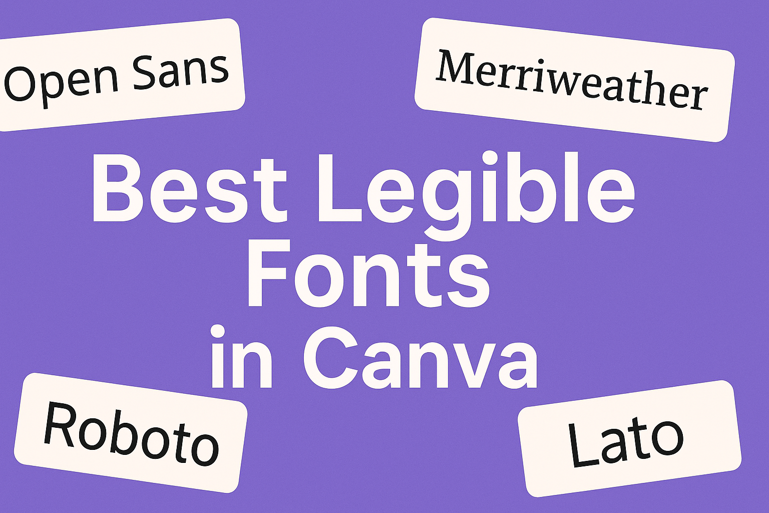
Fonts like Open Sans and Helvetica are popular for their clean styles. These fonts suit various designs, from websites to printed materials, ensuring accessibility for all users.
This is especially important for people with visual impairments, who may struggle with less legible options.
Good font choice supports effective communication by making text inviting. Engaging designs start with legible fonts, making it easier for everyone to enjoy the message.
Characteristics of Legible Fonts
Legible fonts share several key characteristics that enhance readability. Some important features include:
- Clear letterforms: Letters should have distinct shapes. This helps readers quickly recognize each character.
- Appropriate size: Larger fonts are generally easier to read from a distance. Small fonts may cause strain.
- Proper spacing: Adequate spacing between letters and lines improves clarity and prevents crowding.
Fonts like Georgia and Arial are known for their legibility. Georgia is ideal for screens, while Arial works well in various formats.
Each font type can serve unique purposes, enhancing the overall design and user experience.
Using these characteristics helps designers choose the best fonts for their projects. Ultimately, a well-chosen font supports effective communication.
Top Legible Fonts in Canva
Choosing the right font is crucial for clarity and readability in any design project. This section will explore some of the best options available in Canva, covering choices that cater to different design needs and aesthetics.
Sans Serif Favorites
Sans serif fonts are known for their clean and modern look. They usually have no decorative strokes, making them easy to read on screens and in print.
Zico Sans is a great choice; it features geometric shapes that enhance readability.
Another popular option is Pecita, a bold and modern sans serif font. Its minimalist design fits well in tech-related projects and corporate branding.
Drunken Hour, with its unique style, can add personality to casual designs. This blend of clarity and character makes these fonts suitable for various design needs.
Serif Fonts That Read Well
Serif fonts have small lines or decorations at the ends of their letters, giving them a classic touch.
Merriweather is an excellent serif that balances style and legibility. It’s perfect for long blocks of text, making it great for articles or reports.
Playfair Display is another top choice; its elegant design catches the eye while remaining readable.
These serif fonts often work well in printed materials due to their traditional style, making them ideal for brochures or formal invitations.
Display Fonts for Impact and Clarity
Display fonts are designed to grab attention, making them perfect for headings and titles.
Oswald is a striking display font that remains readable even at larger sizes. Its boldness makes it suitable for banners or promotional materials.
Black Mango is another standout choice, known for its versatility. It can adapt to various design styles while maintaining clarity.
These display fonts are valuable tools for designers wanting to make a strong impression while keeping text understandable.
How to Choose the Right Font for Your Project
Selecting the right font is crucial for any design project. It helps convey the intended message and captures the audience’s attention. Both context and font pairing play important roles in making that choice.
Considering the Context and Audience
When choosing a font, context is key. He or she should think about where the design will be used.
For instance, a playful font might work well for a children’s party invitation but could feel out of place in a formal business report.
The audience also matters. Different demographics respond to various styles.
A tech-savvy audience may appreciate modern sans-serif fonts, while a more traditional audience might prefer classic serif options.
Keeping the audience’s preferences in mind helps in selecting a font that resonates with them.
Pairing Fonts for Cohesion
Font pairing is essential for a balanced design. It’s important to choose complementary fonts that create visual harmony.
A great way to do this is by picking one font for headlines and another for body text, ensuring they share similar characteristics like mood and style.
Example Pairings:
-
Headline: Open Sans
Body: Roboto -
Headline: Playfair Display
Body: Lato
He or she should avoid using more than two to three different fonts in one project. This can create confusion and distract from the message.
Using contrast in weight or size between the two fonts can help establish a clear hierarchy in the text.