Creating eye-catching designs is easier than ever with tools like Canva.
Many people want to know how to make their images stand out, and adjusting the colors can help achieve that unique look.
In Canva, you can easily change image colors by using filters, sliders, and other editing features designed for customization. This can turn a plain picture into something vibrant and personalized.
The ability to tweak the hues and tones means designers of all levels can enhance their projects in exciting ways.
By learning a few simple techniques, users can transform their images to suit any design preference. Whether it’s changing the tint, adjusting the saturation, or exploring creative filters, Canva provides the tools necessary to elevate an image’s appeal.
For those who want to dive into the details, understanding how to work with Canva’s sliders and controls is key.
Steps like adjusting the Tint and X-Process sliders can make subtle yet impactful changes. Engaging with these features allows users to experiment and find what best fits their vision for their design.
Getting Started with Canva
To begin editing images in Canva, users need to know how to access the platform and choose the right images to work with. These steps are foundational for anyone who wants to master Canva’s design tools.
Accessing the Canva Platform
To start using Canva, users should visit Canva’s website or download its app from the app store.
Both options require creating an account, which can be done using an email address or social media login.
Once registered, users will enter Canva’s home page filled with templates for various projects like social media posts, presentations, or flyers.
Using the sidebar, they can access their previous projects or start a new design. A clean and intuitive interface makes navigation easy even for beginners. Familiarizing oneself with the dashboard can vastly improve the design experience, as countless tools and options are readily available.
Selecting Images to Edit
Choosing the right image is crucial when designing in Canva.
Users can upload their own images by clicking the “Uploads” tab on the sidebar or by selecting images from Canva’s expansive library.
Canva provides millions of free and premium images that can fit any theme or style. By using the search bar, users can find images by keywords or categories, making it easy to select exactly what they need.
Careful selection of images helps ensure the final project meets the intended aesthetic and message. Understanding how to import and access different types of images is essential for effective editing.
Understanding Color Adjustments
Color adjustments in Canva help enhance the visual appeal of images and graphics.
Knowing how to handle color balance and applying basic color theory can make a significant difference in the final look of a design.
Importance of Color Balance
Color balance ensures that an image appears natural and visually pleasing. In Canva, users can manipulate color settings to make images more vibrant or subdued.
Achieving proper balance involves adjusting the brightness, contrast, and saturation. These elements work together to create harmony.
For instance, increasing brightness can add light to an otherwise dark image, while contrast adjustments enhance the depth between the lightest and darkest parts. Saturation changes the intensity of colors, which can draw attention to specific details or create a more muted appearance.
In design, skilled color balance aids in creating mood and emphasis. It helps ensure that colors do not clash and that important elements stand out. Adjusting color balance is often a trial-and-error process, but with practice, it can become an intuitive aspect of design work in Canva.
Basic Color Theory for Image Editing
Basic color theory is essential in editing because it explains how colors interact.
Using a color wheel, designers can choose complementary, analogous, or triadic color schemes to enhance images.
Complementary colors are opposite each other on the wheel, creating high contrast and vibrant looks. Analogous colors are next to each other and tend to blend well, providing a calming effect.
Understanding hues, tones, and shades also plays a role. A hue refers to the base color, like red or blue. Adding white creates tints, while black adds shades. These variations affect the overall mood of an image.
Grasping these elements helps in making informed decisions about color adjustments in Canva. It makes images more visually cohesive and effective at conveying the intended message.
Navigating the Canva Editor Interface
Exploring the Canva editor can greatly enhance your design experience. Understanding the toolbar and image adjustment options are crucial for creating visually appealing graphics.
Using the Toolbar
The toolbar in Canva is essential for accessing various design tools. Positioned at the top of the editor, it features essential functions like text addition, element insertion, and background alteration.
Users can click on the “Text” tab to choose different fonts and styles.
The elements tab allows for the addition of shapes, lines, and other graphics. To change a background, simply select the “Background” option and browse through the available patterns or upload your own.
For quick access, recent uploads also appear on the toolbar, ensuring that any changes or additions can be made without hassle.
Image Adjustment Options
Image adjustments are straightforward with Canva’s editor. When a user clicks on an image, several adjustment options become available, showcasing a range of modifications.
The “Filter” feature allows users to apply preset filters to change the overall look quickly.
For more precise control, the “Adjust” tab offers sliders for brightness, contrast, and saturation. Users can also modify the tint or blur levels to focus on certain image areas.
For projects involving color changes, the Canva Help Centre can assist in altering hues, saturation, and brightness with ease. These tools collectively make sure that users can fine-tune their images to fit any design preference.
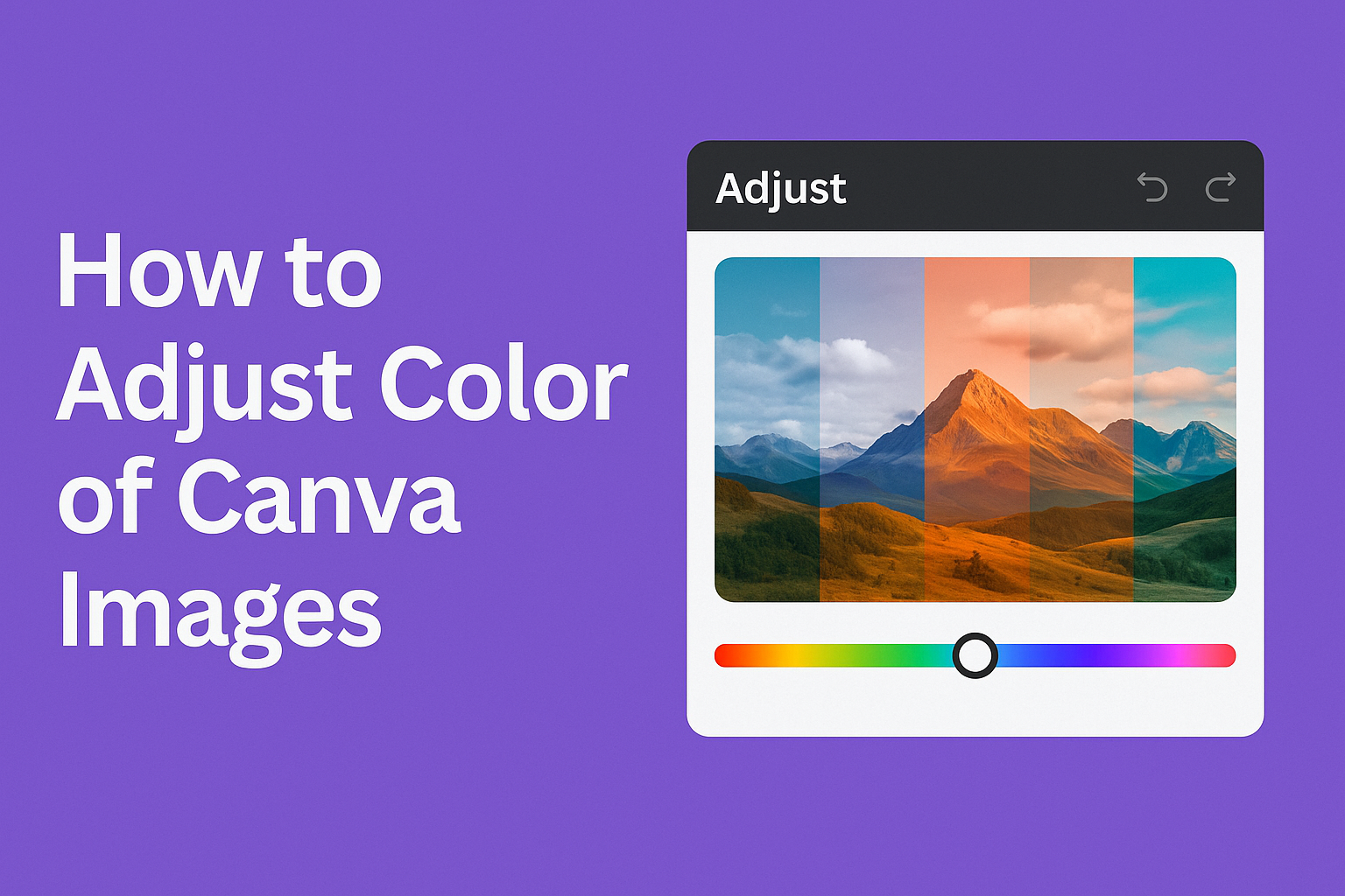
Adjusting Image Colors
Color adjustment in Canva lets users change how images look by tweaking filters, saturation, contrast, brightness, and tint. These tools help create a visual impact and enhance the image’s appeal.
Applying Filters
Applying filters in Canva allows users to quickly change the mood and tone of an image. Filters can warm up a picture, cool it down, or make it look more classic.
With a variety of preset filters, Canva provides easy options for altering photos. Users can browse different filter styles, such as vintage, playful, or elegant. Each style comes with specific effects like sepia tones or high contrast looks.
To apply a filter, select the image, click on “Edit Image,” and choose “Filters.”
Experimenting with various options helps find the perfect look that complements the design. This feature is especially useful for designing consistent visuals across multiple images.
Tweaking Color Saturation
Tweaking color saturation in Canva can make an image look more vivid or subdued. Adjusting this aspect changes how intense the colors appear.
To adjust saturation, click on the image, then “Edit Image,” and use the “Saturation” slider.
Moving the slider to the right enhances color intensity, making images pop. Sliding it to the left reduces the saturation, creating a more muted, grayscale-like appearance.
Different projects may require various saturation levels. For example, advertising designs may benefit from high saturation for eye-catching visuals, while subtle, desaturated tones work better for formal publications. Mastering saturation adjustment helps in customizing the visual impact of an image.
Enhancing Contrast
Enhancing contrast is about balancing light and dark areas in an image to create depth. High contrast can make details stand out, whereas low contrast can produce a softer, dreamy effect.
In Canva, adjust contrast by selecting the image, clicking on “Edit Image,” and using the “Contrast” slider.
Moving the slider to the right highlights edges and increases definition. Sliding it left softens the visual impact.
It’s all about finding a good balance: too much contrast can make an image look harsh, while too little can render it flat. Users should try different settings to complement their overall design goals.
Adjusting Brightness
Adjusting brightness changes how light or dark an image appears. This tool is helpful for enhancing underexposed images or toning down overexposed ones.
To change brightness, select the image in Canva, go to “Edit Image,” and use the “Brightness” slider.
Sliding to the right makes the image brighter, bringing light into dark areas. Sliding to the left darkens it, adding mood or drama.
Correct brightness adjustment ensures readability and visual appeal. It’s crucial for making sure that all image elements are visible and that the overall design remains easy on the eyes.
Fine-Tuning Color Tint
Fine-tuning color tint in Canva helps adjust the image’s overall hue, giving it a cool or warm feel. This adjustment can align images with a specific color scheme or mood.
To change the tint, select the image, click “Edit Image,” and use the “Tint” slider.
Sliding towards the blue end gives a cooler effect, while sliding towards the red end warms up the image.
Tint adjustment is ideal for creating harmony with other design elements. It ensures that every image works well with the colors used in other parts of the project, maintaining a cohesive and professional look.
Advanced Color Adjustment Techniques
Advanced color adjustment in Canva goes beyond simple sliders, offering powerful tools like filters and custom enhancements. Users can fine-tune their visuals to create striking effects and personalized styles.
Working with Advanced Filters
Filters in Canva offer more than just basic color changes. They add artistic flair to any image with ease.
Applying filters can transform the mood or style of a photo. For instance, a vintage filter can give photos an old-time feel, while a vibrant filter can make colors pop.
To use advanced filters, users should first click on their image and navigate to the filter section. Here, they can choose a predefined filter that suits their creative vision.
Once selected, the intensity of the filter can be adjusted to achieve the desired effect. This flexibility ensures the image matches the project’s theme.
Filters like sepia, classic, and vivid are popular choices. They provide different moods and tones, enhancing storytelling in visuals.
Custom Color Enhancements
Custom color enhancements allow users to refine every detail of their images. Unlike filters, which apply broad changes, custom enhancements focus on fine-tuning specific elements.
To begin, users access the “Edit Photo” option. From there, sliders for brightness, contrast, and saturation come into play. These settings provide control over each aspect of the image’s appearance.
For instance, increasing saturation can make colors more vivid, whereas adjusting contrast can create sharp distinctions between light and dark areas.
Additionally, the tint and x-process sliders offer even more customization. The tint can shift the overall color balance, adding warmth or coolness. The x-process slider adjusts the image colors for dramatic effects.
By using these advanced options, users can create a truly unique style.
Tips for Optimal Color Adjustments
Adjusting colors in Canva can make designs more engaging and visually pleasing. By considering the mood and ensuring consistent color schemes, the final output will be both attractive and coherent.
Considering the Mood of the Image
When adjusting colors, think about the emotion you want to convey. Bright colors can feel cheerful and energetic, while softer tones might evoke calmness.
For instance, using a brighter shade of yellow can make an image feel happy and lively, whereas pastel blues might suggest tranquility.
It’s helpful to think about the theme of the project. For a festive holiday design, vibrant reds and greens can be effective. On the other hand, a design for a spa might benefit from muted greens and purples to suggest relaxation.
Reflect on the original image’s colors and consider whether a slight alteration can better express the desired mood. Easy adjustments, like using Canva’s tint and saturation sliders, can be a great starting point.
Maintaining Color Consistency
Consistency in color makes a design look more professional. It helps the viewer identify the purpose and brand behind the visuals.
Choosing a color palette that complements the brand or theme is crucial.
One method is using Canva’s grid system to test different colors. With this, users can ensure each color harmonizes with the others.
Checking contrast and brightness levels can also make a difference, ensuring all elements are legible.
Tools in Canva, such as the eyedropper, can aid in maintaining uniformity across different elements. For brands, using their specific color codes when making adjustments is key to staying consistent with existing branding.
Saving and Exporting Edited Images
After editing images in Canva, it’s important to save and export them in the right format and resolution to suit your needs.
This section will guide you on choosing the best file format and setting the appropriate resolution to maintain image quality.
Choosing the Right File Format
The file format you choose affects both the quality and size of your image. Canva offers several options, including PNG, JPEG, and PDF.
PNG is ideal for high-quality images with transparent backgrounds. Meanwhile, JPEG is suitable for smaller file sizes, making it great for web use. For documents or printing, PDF is recommended due to its scalability and professional appearance.
Consider how the image will be used. For web graphics, faster loading times are beneficial, so JPEG might be preferable. Meanwhile, PNG retains more detail, making it a better choice for complex images or graphics featuring text.
Resolution and Quality Settings
Resolution defines the clarity and detail of your exported image. Higher resolution results in better quality but larger file size.
Canva provides different quality settings like Standard and High Quality. For online use, standard resolution is typically sufficient, balancing quality and file size.
For print purposes, select high-quality settings. This ensures sharpness and detail, crucial for professional-looking prints.
Always check the resolution requirements for your specific use, especially if you’re printing flyers, brochures, or posters. If unsure, opting for a higher resolution is often safer to avoid pixilation.
Understanding these settings ensures your Canva creations appear just as you envisioned, whether on screen or in print.