Aligning text in Canva can seem tricky at first, but it’s actually quite simple once you know the steps.
To align text in Canva, select the text box, then use the alignment options on the toolbar to perfectly position your text. This ability to align text precisely opens up creative possibilities for designing social media posts, presentations, and other graphics with ease.
Whether someone is designing a promotional flyer or a personal project, aligning text well can make all the difference in achieving a professional look.
With Canva’s user-friendly tools and some easy-to-follow steps, anyone can create visually appealing designs that capture attention.
For those who are interested in learning these techniques, this article is a great place to start.
By exploring different alignment features, users can enhance their designs significantly. These features allow them to arrange text exactly where they want, making their work stand out.
With just a bit of practice, even beginners can become proficient with these tools and elevate their creative projects in Canva.
Understanding the Canva Text Editor
The Canva Text Editor is a user-friendly tool that helps users create professional-looking designs. It offers various text elements and typography options, along with an intuitive interface that simplifies the design process.
Text Elements and Typography
In the Canva Text Editor, users can choose from a wide range of text elements. These include headings, subheadings, and body text.
Each type can be customized with different fonts, sizes, and styles. Typography options let users experiment with different looks, tailoring designs to suit specific purposes.
Canva offers numerous fonts to inspire creativity. Whether looking for something classic or modern, users can find a font that fits.
Users can also adjust spacing and alignment, making text easier to read and more visually appealing. For a designer, these options are essential for crafting a unique style.
Interface Overview
The Canva interface is designed to be accessible and easy to use, even for beginners. With clearly labeled icons and tools, users can quickly find what they need.
The text tools are typically found in the toolbar, making it simple to add and edit text.
The “Arrange” button is key for aligning text. Users can position text elements precisely, ensuring a polished look.
Additionally, shortcuts and drag-and-drop features enhance workflow. The interface supports both creativity and efficiency, enabling users to bring their design ideas to life without hassle.
Basic Text Alignment Techniques
Text alignment in Canva is crucial for creating visually appealing designs. The following techniques explore how to use tools to align text, arrange it within frames, and adjust orientation effectively.
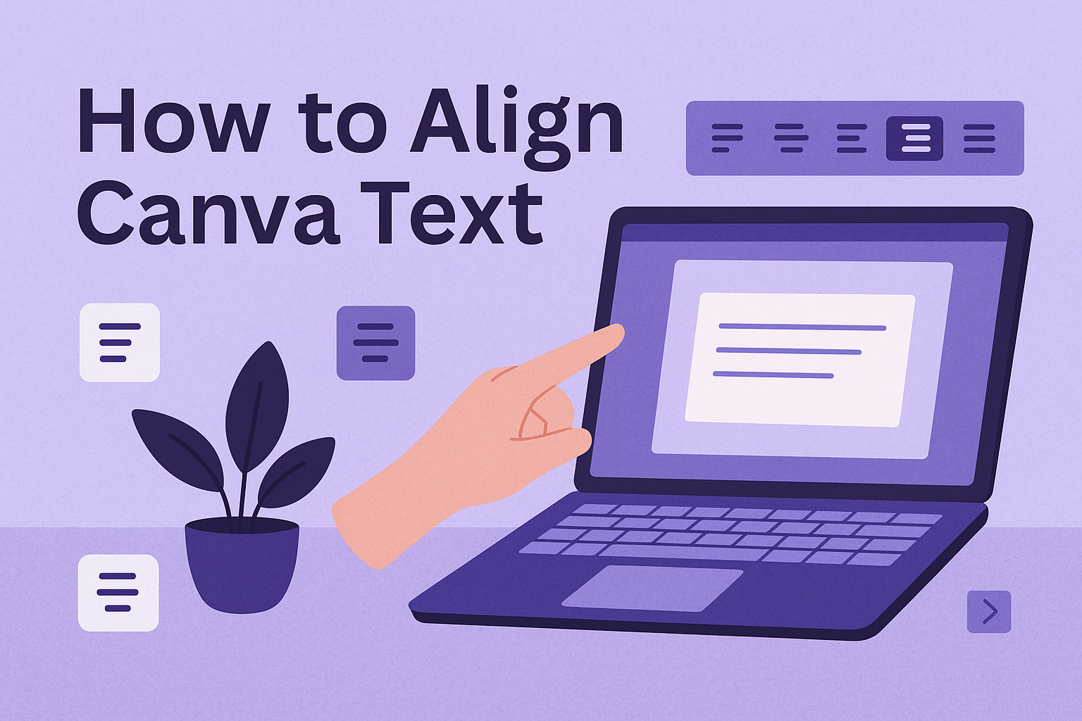
Using the Alignment Toolbar
Canva’s alignment toolbar is a powerful tool for designers. It’s found at the top of the workspace when selecting a text box.
The toolbar includes options like Align Left, Align Center, and Align Right. These options ensure text is lined up appropriately within the design.
Another useful feature is the Distribute Horizontally tool, which helps space out text evenly. This is particularly beneficial in multi-column layouts.
Learning where to find these tools and how to use them can significantly impact the overall look of the project.
Aligning Text Within a Frame
Placing text within a frame is essential when designing posters or presentations. Canva allows users to create frames where text can fit seamlessly.
To align text properly, users must ensure that text boxes are of equal size and proportionate to the frame.
Using the Align Vertical and Align Horizontal options ensures balanced text placement. This creates a pleasing visual symmetry.
Text boxes can be adjusted by dragging their edges, ensuring the text stays neat and orderly within the frame.
Setting Text Orientation
Text orientation in Canva involves the direction and angle at which the text is placed. Users can easily change text orientation by selecting the text box and using the rotation handle.
This allows designers to create dynamic text effects in their designs.
For more precise adjustments, users can input specific angle values. Vertical Text options add another dimension, letting users create attention-grabbing designs.
It’s vital to experiment with different orientations to find the most effective presentation for the text. Proper orientation can make the text stand out and complement other design elements.
Advanced Text Features
In Canva, advanced text features can enhance the visual appeal of your projects. Users can fine-tune spacing and indentation, layer text with images, and experiment with custom fonts, allowing for a tailored and professional design approach.
Spacing and Indentation
Proper text spacing and indentation can greatly improve readability and aesthetic appeal. On Canva, users can adjust line spacing and letter spacing easily. This fine-tuning helps to make designs look organized and visually balanced.
Indenting text, although not a native feature, can be mimicked by using spaces or transparent blocks.
To ensure text doesn’t look cramped, avoid using too much or too little space. A balanced approach makes for neat and clear text presentation.
Keep experimenting with different settings to find what best fits your design vision.
Layering Text and Images
Layering text over images is a technique used to create dynamic and engaging visuals. Canva makes it simple by allowing text boxes and images to be dragged and positioned freely.
Users can adjust transparency to ensure text is readable over images, adding depth and visual interest.
Using layers effectively can create a hierarchy of information, making it easy for viewers to follow the content.
Avoid placing text over busy areas of images. Instead, use clear spaces or apply background effects to highlight the text.
Custom Fonts and Uploads
Custom fonts can give your design a unique touch. Canva offers a diverse set of fonts, but users can also upload their own, personalizing the design further.
It is important to ensure the uploaded fonts are compatible and legally allowed for use.
Users can experiment with different font styles to match the design’s theme. Whether formal, casual, or artistic, the choice of fonts influences the project’s tone.
Mixing fonts can be effective, but it should be done sparingly to maintain cohesion and readability.
Design Consistency
Design consistency in Canva ensures that all elements align well and create a cohesive look. When text and other elements follow consistent patterns, it enhances the visual appeal and readability of a design.
Grids and Guides
Grids and guides are essential tools for achieving design consistency. Canva provides these features to help users place their text and elements accurately.
By using grids, designers can ensure even spacing and alignment. Guides offer specific pointers that help in keeping elements line up perfectly.
These tools are especially helpful for maintaining uniformity in layouts such as brochures and posters.
Designers can activate the grid view in Canva and adjust the grid size to suit the project’s needs. When snapping a text box to these guides, it aligns perfectly, creating a polished and professional look.
Alignment for Visual Harmony
Aligning text correctly plays a crucial role in creating visual harmony in any design. In Canva, proper text alignment ensures that the design elements look cohesive and appealing.
Whether choosing left, right, or center alignment, consistency across text boxes is vital.
For example, having a mix of different alignments can disrupt the flow and make the design look disorganized. Consistent alignment throughout a project ties elements together.
It’s important to decide on alignment at the start of a project and stick to it. Consistency in alignment improves the overall experience for viewers by making it easier for them to follow and understand the design’s message.
Troubleshooting Common Issues
Aligning text in Canva can sometimes lead to challenges such as misaligned boxes or responsive issues. By addressing these common problems, users can enhance their design efficiency.
Text Box Alignment
One frequent issue is text boxes not lining up, which can disrupt the flow of a design. This usually happens when multiple text boxes are used on one project, creating a cluttered look.
To fix this, select all text boxes individually.
Use Canva’s alignment tools to arrange them either horizontally or vertically. This feature lets the user achieve precision.
Keyboard shortcuts, such as holding “Shift” while clicking, allow for selecting multiple elements at once. This method simplifies aligning and adjusting any overlapping or out-of-place boxes.
Proper alignment ensures a polished look, making the design more professional. More information on aligning text is available in a YouTube tutorial.
Resizing and Responsiveness
Text resizing can affect how a design responds across different devices or screen sizes. A common challenge is ensuring that text maintains its proportion and does not overflow or shrink excessively.
To address this, designers should make use of Canva’s tool that allows them to adjust text size and box dimensions proportionately.
By locking the aspect ratio, resizing happens smoothly without disrupting the alignment.
Furthermore, previewing the design on different devices can help in spotting any issues early. Adjusting the font size or spacing might be necessary for optimal responsiveness.
By fine-tuning these settings, designs remain consistent and readable on any platform. More insights on these processes can be found in resources like Tecnobits.
Tips and Best Practices
When working with text in Canva, aligning text properly and choosing the right font combinations can greatly impact your design. Paying attention to hierarchy and contrast enhances readability and draws attention to key elements.
Pairing Fonts Effectively
Choosing the right font pairings is crucial for creating visually appealing designs.
He should start by selecting a primary font that reflects the design’s mood.
Pairing a bold, readable font with a simple sans-serif can create a nice balance. For instance, if she uses a decorative script for headers, pairing it with a clean sans-serif for body text ensures clarity while adding elegance.
It’s helpful to limit font choices to two or three. This avoids visual clutter and keeps the design cohesive.
Canva provides several font pairing suggestions that can inspire combinations and help maintain consistency throughout the project. Using built-in tools such as alignment options in Canva allows for precise adjustment.
Hierarchy and Contrast
Establishing a clear hierarchy guides the viewer’s eye and highlights important information. She should utilize font size and weight to create a visual hierarchy.
Larger fonts naturally draw attention and are ideal for headings, while smaller text works well for body content.
Contrast is another essential design principle. It can be achieved through font weight, size, or even color.
For instance, combining a bold headline with lighter body text can enhance legibility. Using contrasting colors between background and text can also improve readability.
Canva’s tools for adjusting text can help achieve these effects smoothly.