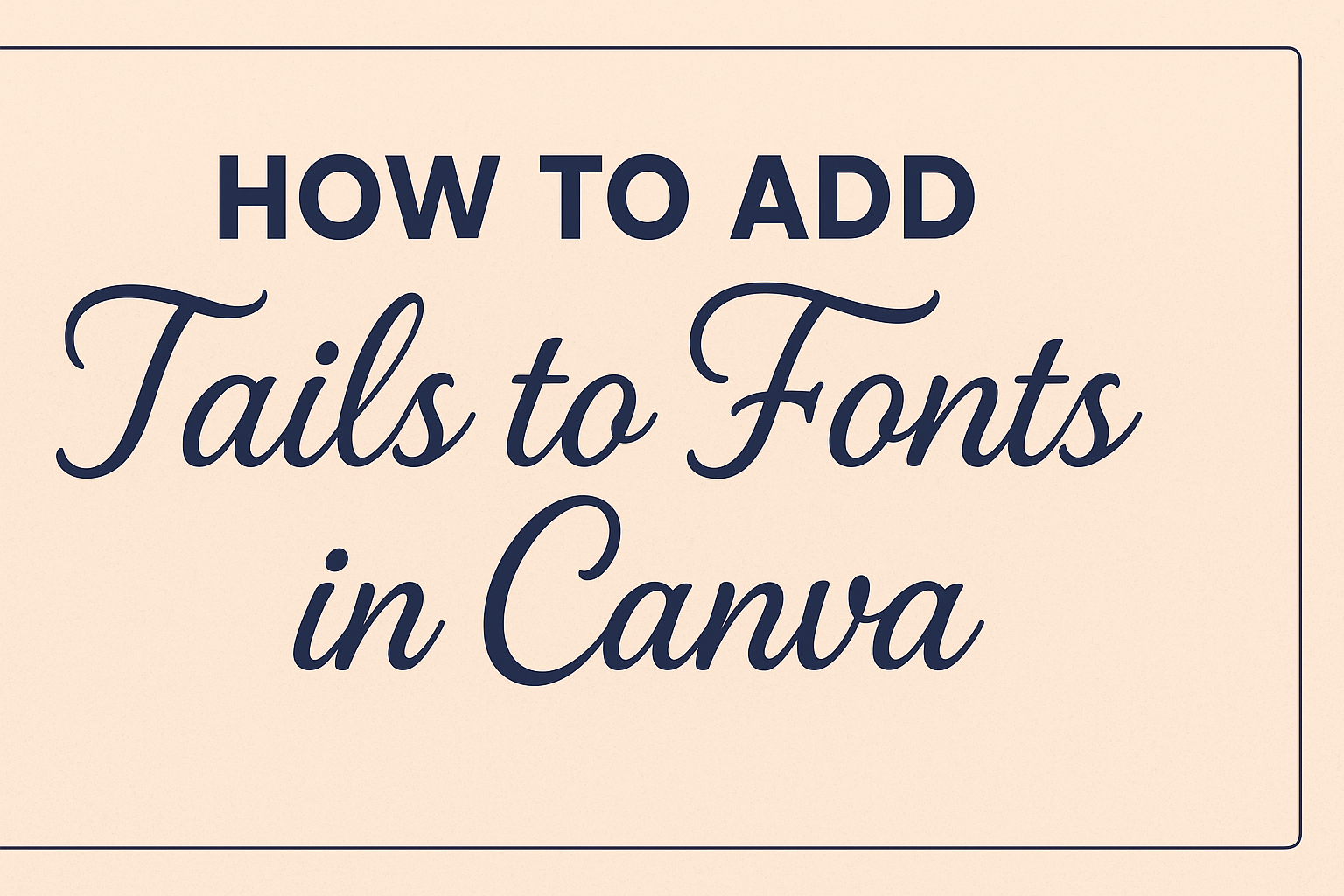
Adding tails to fonts in Canva can transform a simple design into something elegant and eye-catching.
To add tails to your fonts in Canva, select a font with glyphs and access them through the font options menu. This small enhancement can make your text stand out, giving it a creative flair that is perfect for various projects like invitations, social media graphics, or branding materials.
For those exploring graphic design, understanding how to customize fonts with tails can be a valuable skill. It allows users to inject personality into their work, aligning with specific themes or audiences.
If Canva is your go-to design tool, knowing how to use font tails can expand what you can create and elevate the quality of your designs.
Experimenting with font styles in Canva not only enhances typography but also adds a professional touch to designs.
Through simple steps, designers can incorporate unique elements into their projects, captivating their audience and improving the overall aesthetic of their work.
This guide will take you through each step, providing tips to make the process seamless and enjoyable.
Understanding Font Tails in Design
Font tails add an artistic flair to text and can significantly enhance the aesthetics of design projects. They can make words look more dynamic and elegant, adding character and personality to text-based graphics.
The Role of Font Tails
Font tails are decorative elements that extend from letters. They add a sense of movement and elegance to text. Designers use them to give text a more sophisticated or whimsical look.
This is especially useful in headers, logos, and invitations where visual impact is key. By elongating the strokes of letters, these tails can guide the reader’s eye along the text path, creating a more engaging experience.
Types of Font Tails
Font tails come in various styles and shapes. Some are simple and subtle, providing just a hint of flair. Others are more intricate, with loops and curls that catch the eye.
Common types include ascenders, which extend from the top of the font, and descenders, which reach below the baseline. Script and calligraphy fonts often feature these tails prominently, enhancing their artistic appeal.
Font Tails in Canva
In Canva, adding tails to fonts is a creative way to enhance design impact. Several fonts in Canva come with built-in glyph options, including tails that can be activated easily.
To add these, users can select a font and explore the Effects option to enable tails or additional glyphs. Websites like Creative Writing Prompts provide step-by-step guides to adding flair through glyphs in Canva.
Getting Started with Canva
Canva is a user-friendly platform for graphic design projects, providing various tools to create stunning visuals. Understanding how to sign up, navigate the interface, and choose the right project type helps beginners start designing quickly.
Signing Up for Canva
Creating an account on Canva is simple and free. Users can visit Canva’s website and select the “Sign up” button. They can choose to register using their email, Google, or Facebook accounts for easy access.
After providing basic information and agreeing to the terms of service, the account is ready.
New users might receive a welcome email with tips to get started. Canva also offers a Pro version with advanced features, but the free version provides ample tools for basic design needs. Exploring the available features helps users get familiar with the platform.
Navigating the Canva Interface
Once logged in, users reach the Canva homepage. This clean and intuitive interface has several sections.
The navigation bar at the top shows different design categories, including social media posts, presentations, and more. On the left side, the toolbar offers project templates, elements, and uploads.
The main dashboard displays recent designs and recommended templates. Users can easily access their projects and make quick edits.
The design editor, where most design work happens, provides tools to add text, images, and elements. The drag-and-drop feature makes it convenient to customize each design to suit personal needs.
Selecting the Right Project Type
Choosing the right project type is essential for effective design. Canva offers numerous templates tailored for different needs, like social media graphics, posters, or presentations.
Users can start by clicking on “Create a design,” then selecting from the dropdown menu based on the project’s requirements.
The selection of projects includes standard sizes to match different platforms, such as Instagram posts or YouTube thumbnails. Custom dimensions can also be set for unique projects. Understanding the purpose and dimensions ahead of time ensures that the design fits the intended use, helping users achieve professional results effortlessly.
Adding Tails to Fonts
Adding tails to fonts in Canva can make your text more stylish and eye-catching. This process involves choosing the right font, customizing it, or even adding the tails manually when needed.
Choosing a Font with Tails
Selecting a font already designed with tails can save time. These fonts often come with decorative glyphs and flourishes built-in. Fonts like “Lilirose” are examples where tails are included as part of the design.
To select such a font in Canva, users can explore the available font options and look for keywords like “swash” or “tail.” It’s important to verify that the chosen font supports the tail feature by typing out sample text and checking its appearance.
Customizing Existing Fonts
When existing fonts in Canva lack the desired flair, users can customize them. Canva offers options such as Text Effects to add unique touches.
Start by selecting your text, then click on the “Effects” option from the toolbar. Users can experiment with different effects until they’re satisfied.
Note that while Canva’s built-in tools offer many possibilities, customizations might be limited compared to dedicated graphic design software.
Adding Tails Manually
For more creative freedom, adding tails manually might be necessary. This involves using additional graphic elements to mimic tails.
Canva provides various lines and shapes that can be adjusted to fit the text. Users can rotate or reshape these elements to integrate them seamlessly into the font.
While more labor-intensive, this method allows for personalized designs that might not be achievable through font selection alone.
Customizing Your Text
When working with text in Canva, personal touches can transform the look and feel of your design. This guide explores adjusting font size and color, aligning text with different design elements, and using text effects for emphasis.
Adjusting Font Size and Color
Font size and color are crucial for readability and visual appeal. Begin by selecting the text box you want to adjust. You can find the font size options in Canva’s toolbar.
Larger fonts work well for headlines, while smaller sizes fit fine print.
Experiment with color to match your design’s theme. Click on the color palette icon and choose from Canva’s wide range of colors. Use the color picker tool to create custom shades that fit your needs.
Contrast is key when selecting font color, so ensure that the text is easily readable against the background.
Aligning Text with Design Elements
Proper alignment of text with other design elements can create a balanced and professional look. Canva offers alignment tools to help you position your text exactly where you want it.
Use the alignment buttons in the toolbar for left, center, or right alignment.
For more precision, drag the text box around the canvas until it snaps into place. Utilize Canva’s guides and snap features for perfect alignment with images, shapes, or other text boxes.
These features make it easy to align everything neatly and accurately in your design.
Using Text Effects for Emphasis
Text effects can add a unique flair to your design, making certain elements stand out.
In Canva, click on the text you want to modify and explore the “Effects” option in the toolbar. There, you can choose from a variety of effects like shadow, lift, and hollow.
Effects can add depth and interest, emphasizing specific words or phrases. Adjust the intensity and direction of these effects to suit your design.
Be mindful that too many effects can clutter your layout, so use them sparingly for the best impact.
Advanced Tail Customization
Creating custom tails in Canva can elevate your text designs by giving them a more stylish and dynamic appearance. Through layering, shape manipulation, and integrating graphics, users can achieve unique visual effects.
Working with Layers
Using layers in Canva allows for precise control over each element of your design. By layering text and tail elements, users can experiment with depth and visual hierarchy.
To begin, users should add their main text as the base layer.
Next, users can create or import the tail element on a separate layer. To adjust the layers, they can use the position tools found in the toolbar. Aligning and moving layers ensures the tails fit perfectly with the text.
Locking certain layers can prevent them from being accidentally moved. This is handy when multiple elements are involved. As users work, adjusting the opacity of layers can help visualize interactions between different parts.
Manipulating Tail Shapes
Customizing tail shapes offers a personalized touch to text designs. Users can modify these shapes by using Canva’s shape and line tools.
To start, they can select a basic shape that resembles the desired tail.
Users can then adjust the curve, size, and orientation to fit the text. By combining several basic shapes, unique and intricate tail designs can be achieved. Each shape can be rotated and scaled using the corner handles.
Canva’s color tools allow for changes in both fill and outline colors, matching the rest of the design. For further customization, users can adjust the transparency or apply shadows to give more depth and realism.
Combining Text with Graphics
Incorporating graphics with text can enhance the overall design. Users can search the Canva library for graphics that complement the text and tail setup.
It’s important to choose graphics that match the style of the tail.
Once selected, these graphics can be resized and positioned with the text. Aligning them effectively ensures they work in harmony with the typography. Using grids or guides can help maintain alignment and proportion.
Adding graphics as background elements might also support the text visually. By experimenting with blend modes, users can integrate graphics seamlessly into the design, making the text appear as a unified composition.
Best Practices for Font Tails
When adding tails to fonts in Canva, it’s important to focus on readability, the balance between text and imagery, and maintaining consistency throughout the design. Each of these aspects plays a crucial role in ensuring the final design looks polished and professional.
Maintaining Readability
Readability is key when adding tails to fonts. While decorative tails can make text stand out, they shouldn’t make it hard to read.
Choose fonts with tails that enhance the design without making the text confusing or cluttered.
Select sizes carefully. The text should be large enough for the tails to be seen but not so large that they dominate the design. Adjust spacing between letters if needed. This can help ensure the text is clear and easy to read.
Sometimes, using bold or italic styles can add emphasis. But too much styling can distract from the message. Keep a balance between decoration and clarity.
Balancing Text and Imagery
When using font tails, it’s essential to balance their visual weight with any images or graphics in your design. The text should complement the imagery, creating a cohesive look that feels well-integrated rather than disjointed.
Consider the placement of the text. Text with tails can be used to frame or lead the eye toward key visuals.
It’s important to ensure that the tails do not obscure or clash with other elements.
Color choice is crucial. Text color should contrast with the background, making it stand out visibly while ensuring it doesn’t overpower the images. Using a consistent color scheme can enhance harmony between text and visuals.
Consistency Across Your Design
Consistency in your design ensures a unified and professional appearance.
This means using similar font styles and tails throughout your project to create a sense of cohesion.
When choosing fonts, pick those that have stylistic tails that match the theme and tone of the entire design.
Refrain from using too many different font styles, as this can create confusion and a lack of unity.
Establish guidelines for font sizes, styles, and effects.
This helps in maintaining uniformity and ensures every design element feels part of the same family.
Regularly reviewing the design for consistency can help catch any issues early on.
Exporting Your Design
Exporting your Canva design properly is key to maintaining its quality and ensuring it displays well for its intended purpose.
Key points include selecting the right file format, ensuring the resolution is suitable, and making it easy to share on social media platforms.
Choosing the Right File Format
Selecting the correct file format is essential for preserving the quality and appearance of your design.
Common formats include PNG, JPEG, and PDF.
PNG is great for web use because it supports transparency and high-quality images.
JPEG is suitable for photographs and social media posts where quick loading times are preferred.
If you’re planning to print, PDF is advisable as it maintains high resolution and is compatible with most printers.
When sharing designs that contain texts with added font tails or glyphs, choosing a format that supports these features is crucial.
Consider what your design will be used for to pick the most appropriate file type. This helps ensure that your work looks great wherever it is displayed.
Resolution Considerations
Keeping an eye on resolution is vital for both online and print projects.
For digital designs, a resolution of 72 dpi is typically sufficient. This ensures the file size remains manageable, helping it to load quickly on websites and apps.
For printed projects, it’s recommended to use a resolution of 300 dpi. This higher resolution ensures that printed designs are sharp and clear.
When exporting, Canva usually provides options to adjust these settings.
Always double-check that the resolution matches the purpose of your design.
Optimizing resolution not only keeps your work looking professional but also maintains file efficiency, which is especially important when sending large designs to colleagues or clients.
Sharing Your Design on Social Media
To share your Canva design on social media, first ensure you adjust your design to fit the platform’s specific requirements.
Different platforms have unique dimension guidelines. For instance, Instagram prefers square images, while Facebook covers are often panoramic.
Canva typically offers templates for easy customization. Once sized correctly, export your design using a format like JPEG or PNG that balances quality and speed.
Uploading directly from Canva to platforms like Facebook or Twitter can simplify the process and save time. Utilize Canva’s direct sharing options for a seamless experience.
It’s also a good idea to incorporate any hashtags or captions directly within your post to enhance engagement.