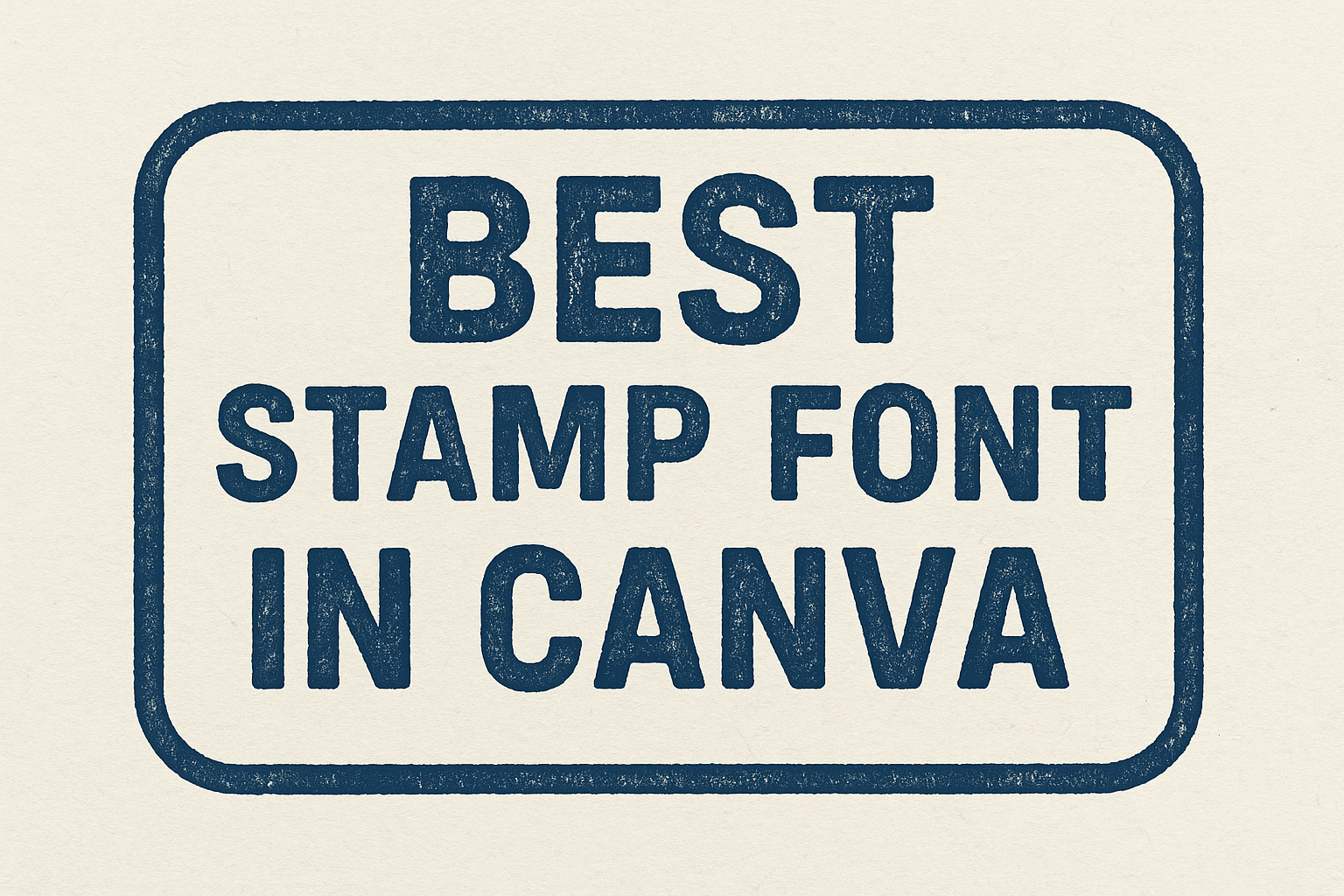
Stamp fonts in Canva provide a unique and vintage feel to any design project.
Whether you’re working on a new brand logo, a special event invitation, or a creative social media post, these fonts can add a touch of charm and authenticity.
One standout option is the Edmund Texture, which boasts a hand-drawn appearance perfect for a rustic and artisanal vibe.
Another popular choice for a stamped look is the Rogue font. Its bold and gritty style suits projects that aim for a more gritty, retro feel.
Designers often gravitate toward these options when looking to create eye-catching visuals that convey warmth and creativity.
Understanding Stamp Fonts in Canva
Stamp fonts play a unique role in digital and graphic design, offering a blend of style and authenticity. They are important for adding a rustic touch to designs, often used in creating logos, posters, and packaging.
The Role of Stamp Fonts in Design
Stamp fonts hold a special place in design projects. They are often chosen for their ability to convey a sense of authenticity and nostalgia.
These fonts can be instrumental in setting a mood, giving designs an aged or vintage look.
Designers frequently use stamp fonts in projects that need a handcrafted or traditional feel. For example, they might choose these for logos of artisanal brands or rustic-themed wedding invitations.
Their textured appearance adds depth and interest to otherwise clean designs, making them versatile for various creative needs.
Stamp Font Characteristics
Stamp fonts are known for specific features that make them stand out. They often have a textured, hand-drawn appearance, which gives them a rough and grungy look.
This unique style makes them suitable for designs aiming for a vintage touch.
Another hallmark of stamp fonts is their bold and distinct letterforms. This allows them to dominate a design without overpowering it. Their structured, yet imperfect forms can create a strong visual impact, making important elements of a design more noticeable.
Stamp fonts like Edmund Texture showcase these characteristics effectively, providing a rustic charm perfect for various design projects.
Top Stamp Fonts in Canva
Choosing the right stamp font in Canva can give any design a unique look. Some fonts bring a vintage charm, others a modern flair, while some boast a rugged, grunge style. Each font style suits different projects, and understanding their characteristics can help make your design stand out.
Vintage Stamp Fonts
Vintage stamp fonts often evoke nostalgia and warmth, making them perfect for projects that aim to highlight classic elements.
Edmund Texture is a popular choice because of its hand-drawn appearance that exudes a rustic charm. This font adds a touch of authenticity, ideal for logos and posters needing a timeless look.
Another option is Comodo Stamp, known for its handcrafted style. This font is particularly effective for designs that want to replicate the ink-based effect of older rubber stamps, giving projects a historical feel. Visit Best Stamp Font in Canva for more on Edmund Texture.
Modern Stamp Fonts
Modern stamp fonts are a great choice for contemporary projects that seek a sleek and polished look. Prisma, a standout font, features a bold and striking geometric design, which is enhanced by its interconnected shapes. This makes it perfect for attention-grabbing projects like logos and headlines.
Simple yet effective, modern stamp fonts often emphasize clean lines and distinct shapes. Rogue is another choice known for its versatility and modern appeal. This font is designed to blend traditional stamp elements with a contemporary twist, making it suitable for both digital and print media.
Grunge Stamp Fonts
Grunge stamp fonts give designs an edge with their textured and distressed looks. They are perfect for projects aiming for a bold, gritty appearance.
Fonts like Lino Stamp have a rough, tactile feel that can bring depth and character to any design, especially those that require an artistic or DIY touch.
Comodo Stamp also shines in this category, with its ink-inspired style that mimics the imperfections of a real stamp. Using grunge fonts can add a layer of detail and uniqueness to posters, album covers, or any creative project that embraces an offbeat aesthetic. Lino Stamp details are available at 10 Best Stamp Fonts.
Using Stamp Fonts Effectively
Stamp fonts can add character and uniqueness to design projects, emphasizing a handcrafted or vintage feel. To get the best results, focus on how these fonts interact with others, their color schemes, and their size and spacing in different layouts.
Combining Fonts
Mixing stamp fonts with other typefaces enhances design balance. Pairing them with contrasting fonts helps create a more dynamic look.
For instance, matching a bold stamp font with a simple sans-serif type can provide clarity and emphasis. Be mindful to maintain legibility while mixing styles.
Experiment with contrasting weights and sizes for headers and body text to create a clear hierarchy. Using two to three font types often works best without overwhelming the design.
Color and Contrast
Colors play a big role in making stamp fonts stand out. Select colors that enhance the rustic charm of stamp fonts without overshadowing other design elements.
Neutral tones often work well, allowing the texture of the stamp font to shine. For greater impact, pair darker stamp fonts with lighter backgrounds.
Ensure there’s enough contrast for readability. Utilizing color wisely can highlight specific features of the font, making it more appealing and ensuring it catches the eye.
Font Sizing and Spacing
Getting the size and spacing right with stamp fonts is key for maintaining visual appeal.
Larger sizes tend to emphasize the font’s unique texture while small sizes might lose detail. Adjust the spacing between letters (kerning) to prevent overlap, especially in dense text.
Proper line spacing (leading) ensures the text doesn’t feel cramped. Consistent alignment also impacts readability and aesthetics.
By carefully considering these elements, designers can improve the visual impact of their work.
Customizing Stamp Fonts
Customizing stamp fonts can bring a unique flair to your projects. By adding textures and effects, and adjusting spacing and alignment, designers can create eye-catching visuals that stand out.
Adding Textures and Effects
Textures and effects can transform a simple stamp font into a striking piece of art. Adding a textured look, like grunge or vintage styles, can make the font feel more authentic and aged. This is perfect for projects aiming for a rustic or antique appearance.
Designers can find tools in graphic design software, such as Canva, to apply these effects easily. By layering textures over the font or using filters, the font gains depth and character.
Effects like shadows, gradients, and highlights can be applied to enhance the font. Shadows can give a 3D effect, while gradients can add color transitions.
Experimenting with different options can help achieve the desired look and feel for different projects.
Modifying Letter Spacing and Alignment
Changing letter spacing and alignment influences how text is perceived.
Adjusting the space between letters can make the text easier to read or give it a tight, compact appearance.
For stamp fonts, increasing space might highlight each letter’s distinct shape, while reducing it can create a more unified look.
Alignment also plays a crucial role in text presentation. Left-aligned text is standard, while center or right can provide unique visual styles.
Playing with alignment settings can alter the font’s impact on the design. Using design tools, these adjustments can be made swiftly, allowing designers to see instant results and fine-tune their projects accordingly.
Incorporating Stamp Fonts into Projects
Stamp fonts in Canva bring a rustic and authentic vibe to various design projects. They are ideal for creating a memorable brand identity through logos, crafting eye-catching posters, and enhancing social media graphics with a unique touch.
Branding and Logo Design
Stamp fonts are perfect for conveying an artisanal and vintage feel in branding. When used in logo design, they can make a business stand out.
These fonts recreate the look of traditional stamps, adding a sense of history and reliability.
Businesses related to handmade goods, crafts, or rustic themes benefit from this style. Using a stamp font can create logos that look both timeless and modern.
Careful selection of font weight and texture ensures that the logo remains legible while expressing its desired aesthetics. Pairing the stamp font with a simple sans-serif font can add contrast, making the overall design more effective. Experimenting with colors and textures can also enhance the visual impact.
Poster and Flyer Creation
For those creating posters or flyers, stamp fonts serve as strong focal points. Their bold and textured appearance grabs attention, making event promotions or informational posters more appealing.
They can be especially effective for events like markets, workshops, or festivals, where a handcrafted look is fitting.
Layouts can be crafted to give prominence to the text, using a mix of bold headings in stamp fonts and classic serif or sans-serif fonts for details. Contrasting the textured font with simple graphics or imagery can create a balanced design.
The versatility of stamp fonts allows them to be resized while maintaining readability, which is crucial for both small flyers and large posters.
Social Media Graphics
Stamp fonts add a unique edge to social media graphics, setting a brand apart in the digital landscape. They bring a sense of warmth and authenticity to posts, which can foster a stronger connection with an audience.
These fonts work well for quotes, announcements, or any content that benefits from a standout, tactile feel.
Designers should focus on clarity by combining the stamp font with other clean fonts to ensure that messages are easily understood.
Integrating stamp fonts into templates can streamline the creation process, allowing for consistent branding across different platforms. Additionally, using these fonts in a variety of colors can keep the social media feed visually engaging and dynamic.
Best Practices for Stamp Font Selection
Choosing the right stamp font in Canva can greatly enhance the visual impact of a design. Key considerations include ensuring the font is easy to read and that it aligns well with the intended message of the project.
Readability Issues
When selecting a stamp font, readability is crucial. The font should be clear and easy to decipher at a glance.
Fonts like Edmund Texture offer a unique look but may have intricate details that reduce clarity in smaller sizes. Designers should test how the font appears in different sizes and on various backgrounds to ensure it remains legible.
It’s also important to consider the project’s audience. A font that is too complex may confuse younger readers or people unfamiliar with the design, while simple, bold fonts might suit a broader audience better.
Matching Fonts with the Message
The style of the stamp font should align with the message the design is trying to convey.
For instance, a rustic font like Edmund Texture can add an authentic feel, ideal for vintage-themed projects.
Designers must evaluate if the font’s vibe enhances or detracts from the project’s purpose. For a modern look, combining traditional stamp fonts with clean, sans-serif fonts can balance the design.
This helps in maintaining visual interest while still conveying the desired tone or theme effectively.
Accessing and Adding Stamp Fonts in Canva
Canva offers a variety of stamp fonts, ideal for giving designs a unique and rustic look. Users can explore Canva’s font library to find stamp fonts or upload their custom fonts for added creativity.
Navigating the Canva Font Library
Users can easily find stamp fonts by opening Canva and starting a new design project.
Once in the design area, they can click on the text tool to access the font menu. Here, they can filter fonts by category or simply browse through the options available.
Canva offers a range of both free and premium fonts, which include textured and vintage styles suitable for creating a stamp effect.
To locate specific styles, users can type keywords like “stamp,” “rough,” or “vintage” into the search bar within the font menu. This will narrow down the results to fonts that fit the stamp aesthetic.
Users can then click to apply their chosen font to their text in the design. Having a Canva Pro subscription provides even more font choices, making it easier to find the perfect style.
Uploading Custom Fonts
For those who want to add a personal touch, Canva allows uploading custom fonts. This feature is available to Canva Pro, Canva for Enterprise, Canva for Education, and Canva for Nonprofits users.
To upload a font, they need to navigate to their Brand Kit located in the sidebar. Here, there’s an option to “Upload a font.”
Users must ensure they have the proper licensing to use these fonts. After uploading, the fonts will automatically appear in their font library and can be used in various designs.
This option provides flexibility for designers who require specific fonts that are not available in Canva’s library, allowing for a wider range of creative possibilities.