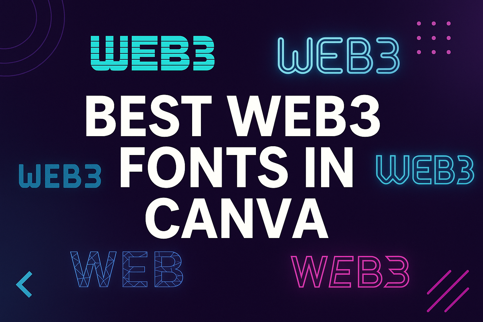
Choosing the right font can shape how a Web3 project looks and feels. Fonts in Canva that fit the Web3 style bring a modern, digital edge that matches blockchain, crypto, and decentralized platforms. The best Web3 fonts in Canva give designs a futuristic yet professional look while staying easy to read.
With so many options available, it can be hard to know which fonts work best. Some lean toward sleek and minimal, while others add bold personality or playful energy. The right choice depends on whether the project needs a polished brand style, a creative touch, or a mix of both.
This guide explores what makes a font “Web3-ready,” highlights top Canva picks, and shows how to pair them for strong design impact. It also covers playful styles for creative projects and practical tips for making fonts work across platforms.
What Are Web3 Fonts in Canva?
Web3 fonts in Canva focus on modern, digital-friendly typography that reflects decentralized technology and online innovation. They balance style with readability so projects look fresh while still being easy to understand across screens and devices.
Definition and Key Features
Web3 fonts are typefaces that mirror the look and feel of blockchain, NFTs, and other decentralized platforms. They often use geometric shapes, clean lines, and minimalistic structures that work well in digital-first environments.
These fonts are designed with scalability in mind, meaning they stay sharp and legible on both small mobile screens and large displays. Many also emphasize cross-platform compatibility, ensuring consistent results when shared across different browsers or devices.
Some Web3 fonts in Canva highlight a futuristic aesthetic, while others lean toward open-source availability that matches the community-driven spirit of decentralized projects. This mix of style and function makes them practical for branding, websites, and user interfaces.
Why Use Web3 Fonts for Digital Projects
Designers use Web3 fonts because they help projects look modern and credible in the fast-moving digital space. A typeface like Inter or Rubik can improve readability on screens while still giving designs a professional edge.
These fonts also support brand identity by standing out from traditional choices. For example, a project that uses Glacial Indifference or Charlevoix can signal innovation and forward-thinking values.
In Canva, Web3 fonts are easy to apply across social graphics, pitch decks, and websites. This makes them useful for startups, NFT marketplaces, or apps that want a consistent, tech-focused look. Using these fonts also ensures accessibility, since many are designed with clear letterforms for better legibility.
Web3 Fonts vs Traditional Fonts
Traditional fonts like Times New Roman or Arial were built for print and general-purpose use. They work well in documents but may not always feel right for blockchain or crypto-related projects.
Web3 fonts, on the other hand, are created with digital environments in mind. They emphasize screen readability, modern aesthetics, and scalable design. This makes them suitable for logos, UI elements, and interactive media.
A simple comparison:
| Feature | Traditional Fonts | Web3 Fonts in Canva |
|---|---|---|
| Primary Use | Print, documents | Digital projects |
| Style | Classic, neutral | Futuristic, modern |
| Screen Optimization | Limited | High |
| Branding Potential | Generic | Distinctive |
By choosing Web3 fonts in Canva, designers get typography that fits both the technical and visual needs of decentralized projects.
Top Picks: Best Web3 Fonts in Canva
Designers often look for fonts that balance style with readability, especially when creating digital projects tied to blockchain, NFTs, or other Web3 platforms. These typefaces stand out for their clean structure, modern feel, and ability to adapt well across different layouts in Canva’s font library.
Golden
Golden is a sleek serif font that brings a mix of elegance and structure. It works well for branding projects that need to appear polished but still approachable. Its sharp lines and balanced spacing make it a strong choice for headlines or logos where clarity matters.
This font is especially useful in Web3 design because it conveys professionalism while keeping a modern edge. Many designers use Golden to highlight key text in presentations, websites, or pitch decks.
Key strengths:
- High readability in both small and large sizes
- Professional tone that fits blockchain or crypto branding
- Versatile use for logos, headers, and short body text
Sunday
Sunday is a playful handwritten font that feels casual yet stylish. It adds personality to designs without being too overwhelming. Its rounded strokes and informal look make it a good fit for creative projects like NFT artwork, community events, or social media campaigns.
Unlike more rigid fonts, Sunday brings a friendly and approachable vibe. This makes it stand out in the list of best Canva fonts for projects that need to connect with audiences on a personal level.
Best uses for Sunday:
- Event posters and invitations
- NFT drops or community-driven campaigns
- Social content where warmth and creativity matter
Marykate
Marykate is a modern script font with smooth curves and a stylish flow. It works best in display settings where elegance and visual impact are important. Its handwritten quality feels more polished than casual fonts, making it suitable for Web3 brands that want to balance creativity with professionalism.
Designers often pair Marykate with clean sans-serif fonts like Inter or Rubik to create contrast. This pairing helps highlight key messages while keeping the overall design easy to read.
Why Marykate stands out:
- Elegant handwritten style without losing clarity
- Strong pairing potential with minimalist fonts
- Ideal for logos, headers, and digital branding
Boston Angel
Boston Angel is a bold display font that combines modern aesthetics with a slightly futuristic edge. Its thick strokes and geometric design give it a commanding presence, making it ideal for Web3 projects that want to appear innovative and forward-thinking.
This font shines in digital branding, especially for blockchain startups or NFT platforms. It captures attention quickly and scales well across different screen sizes.
Key features of Boston Angel:
- Bold and geometric structure for strong impact
- Great for logos, banners, and headers
- Fits well with Web3 themes of innovation and technology
Font Combinations for Web3 Design
Strong font combinations help Web3 projects look modern, professional, and easy to read. Mixing different typefaces can highlight key messages, improve hierarchy, and give designs a clear identity across digital platforms.
Effective Font Pairings
When choosing font pairings, designers often combine a bold display font with a clean body font. For example, Playfair Display works well for headings while Lato or Montserrat keeps paragraphs simple and readable. This balance ensures headlines stand out without making the body text feel heavy.
A good approach is to use contrast. Pairing a geometric sans-serif like Josefin Sans with a more traditional serif can signal innovation while keeping trust. Canva projects benefit from this method because it creates visual interest without overwhelming the reader.
Designers should also test pairings across devices. Fonts like Inter or Rubik scale well on screens, making them reliable partners when combined with expressive display fonts. Testing ensures the combination looks consistent on desktop, tablet, and mobile.
Combining Serif and Sans-Serif
Mixing serif and sans-serif fonts is one of the most reliable strategies for Web3 branding. A serif font such as DM Serif Display or Carelia adds elegance and authority, while sans-serif fonts like Montserrat or Lato provide clarity for digital interfaces.
This contrast is useful for projects that need to communicate both tradition and innovation. For example, a blockchain startup might use DM Serif Display for its logo and Montserrat for its platform text. The serif font conveys trust, while the sans-serif keeps the interface modern and user-friendly.
A simple table can help visualize this pairing style:
| Serif Font | Sans-Serif Partner | Best Use Case |
|---|---|---|
| DM Serif Display | Montserrat | Logos + UI text |
| Carelia | Lato | Headings + body paragraphs |
Balancing Playful and Professional Fonts
Some Web3 projects aim for a creative, community-driven feel. In these cases, pairing a playful font like Lilita One with a clean sans-serif such as Josefin Sans can strike the right balance. The playful font grabs attention, while the sans-serif maintains readability.
This combination works well for NFT platforms, gaming projects, or social apps where branding needs to feel approachable. By keeping the playful font limited to headings or highlights, the design avoids looking unprofessional.
Designers should also check how playful fonts scale. A bold style like Lilita One may look great in large headlines but lose clarity in smaller text. Pairing it with a versatile font like Lato ensures the overall design stays polished and functional.
Playful and Creative Fonts for Web3 Projects
Playful fonts give Web3 projects a more approachable and human side. They can soften the sharp, futuristic look of decentralized branding and make interfaces feel welcoming while still staying modern and functional.
One Little Font
One Little Font stands out for its handwritten style that feels casual yet clear. It works well in projects that want to balance professionalism with friendliness, such as NFT platforms or community-driven apps.
Designers appreciate its rounded strokes and slightly uneven lines, which create a warm and approachable tone. This makes it useful for onboarding pages or tutorials where readability and comfort matter.
Compared to heavier fonts like Sunday, One Little Font gives a lighter impression, making it suitable for playful branding without overwhelming the user. It pairs well with geometric sans-serifs when contrast is needed.
| Best Uses | Why It Works |
|---|---|
| NFT marketplaces | Friendly and casual feel |
| Community apps | Easy to read and approachable |
| Branding logos | Adds personality without clutter |
New Sun Playful
New Sun Playful is a vibrant typeface that mixes bold letterforms with quirky details. It is ideal for projects that want to stand out visually, especially in creative blockchain spaces.
Its thicker strokes and slightly exaggerated curves make it effective for headlines, banners, or promotional graphics. Unlike minimal fonts such as KG Primary, New Sun Playful leans into personality and energy.
This font shines in colorful layouts where attention-grabbing typography is needed. It can be combined with neutral fonts for body text to keep the design balanced and readable.
Designers often use it in campaigns for digital art drops or social media graphics tied to Web3 events. Its lively tone helps create excitement without sacrificing clarity.
Feel Free Playful
Feel Free Playful takes a more relaxed approach, with rounded edges and soft strokes that make it feel approachable. It is less bold than New Sun Playful but still carries enough character to stand out in Web3 design.
Its strength lies in versatility. It can appear in UI elements, buttons, or even small branding assets without feeling distracting. Compared to fonts like Sunday, it has a smoother rhythm that makes reading easy.
This font works well in educational content within Web3 projects, such as guides or onboarding flows. Its friendly look reduces intimidation, which is important for users new to blockchain or NFTs.
Designers also use it in playful branding projects where they want a mix of fun and professionalism. Paired with a clean sans-serif, Feel Free Playful creates a balanced and modern identity.
Tips for Using Web3 Fonts in Canva
Web3 fonts often highlight modern, digital, and futuristic styles, but they need to balance creativity with clarity. Designers should focus on how fonts support branding, improve readability, and adapt to different Canva projects.
Choosing the Right Font for Your Project
Selecting the right font depends on the project’s purpose and audience. A logo for a blockchain startup may benefit from a bold geometric typeface, while a community-driven NFT event might use a more playful style.
Canva’s font library includes options like Glacial Indifference for clean, minimal branding or Belleza for a more sophisticated look. Each choice should reflect the tone of the project and stay consistent across designs.
A simple way to decide is to test fonts in context. For example, apply a headline in one font and supporting text in another. This makes it easier to see if the typography fits the overall visual identity.
Optimizing Readability and Accessibility
Even futuristic fonts must remain easy to read. Large headlines can use decorative or distinctive fonts, but body text should stay simple and clear. Fonts like Inter or Rubik are designed for digital screens and work well for longer text blocks.
Accessibility also matters. Designers should avoid overly thin or condensed fonts that may be hard to read on small screens. Using strong contrast between text and background improves visibility for all users.
Testing across devices helps ensure text looks good on desktops, tablets, and phones. Since many Canva projects are shared online, cross-platform readability is one of the most important factors to check.
Customizing Fonts with Canva Pro
With Canva Pro, users can upload custom fonts to expand beyond the standard font library. This feature is especially useful for projects that require unique typography tied to brand guidelines.
Customization doesn’t stop at uploads. Canva Pro also allows adjustments like spacing, size, and alignment, which help fine-tune how fonts appear in a design. Small tweaks can make a big difference in balance and readability.
Teams working on Web3 projects can also use Pro’s brand kit to store chosen fonts, colors, and logos. This keeps typography consistent across presentations, social graphics, and marketing materials.
Popular Web3 Font Styles and Their Uses
Handwritten and Script Fonts
Handwritten and script fonts bring a personal and approachable touch to Web3 projects. These styles work well in community-focused platforms, NFT art collections, and event promotions where personality matters. Fonts like Carelia provide a natural, hand-drawn look that feels less corporate and more human.
They are best used for short text, such as logos, taglines, or social media graphics. Long paragraphs in script fonts can be difficult to read, so designers often pair them with clean sans-serif options for balance.
In Canva, handwritten fonts can make a project stand out in a space often dominated by futuristic or minimal designs. This style helps highlight creativity while still keeping the message accessible.
Modern Sans-Serif Options
Sans-serif fonts remain the most popular choice for Web3 branding because of their versatility and readability. Fonts like Montserrat, Lato, and Josefin Sans are widely used in Canva for user interfaces, websites, and app dashboards. Their clean shapes make them easy to read across devices.
These fonts work well for both body text and headlines. Montserrat brings a bold, geometric look that feels modern and reliable, while Lato offers a softer, more approachable tone. Josefin Sans has a distinctive style with tall letters that can give projects a unique edge.
Many Web3 designers prefer sans-serif fonts because they scale well on screens and maintain clarity even at smaller sizes. This makes them ideal for mobile-first platforms and blockchain apps.
Elegant Display Fonts
Display fonts are designed to capture attention and create strong visual impact. They are often used in headlines, hero sections, and branding materials where style is more important than long-form readability. Fonts like Playfair Display, DM Serif Display, and Lilita One are popular Canva fonts for this purpose.
Playfair Display adds a classic, high-contrast serif style that works well for luxury or sophisticated projects. DM Serif Display provides a modern serif look with strong personality, while Lilita One offers a bold, playful presence that feels energetic.
These fonts are not suited for paragraphs of text but shine in logos, banners, and marketing campaigns.