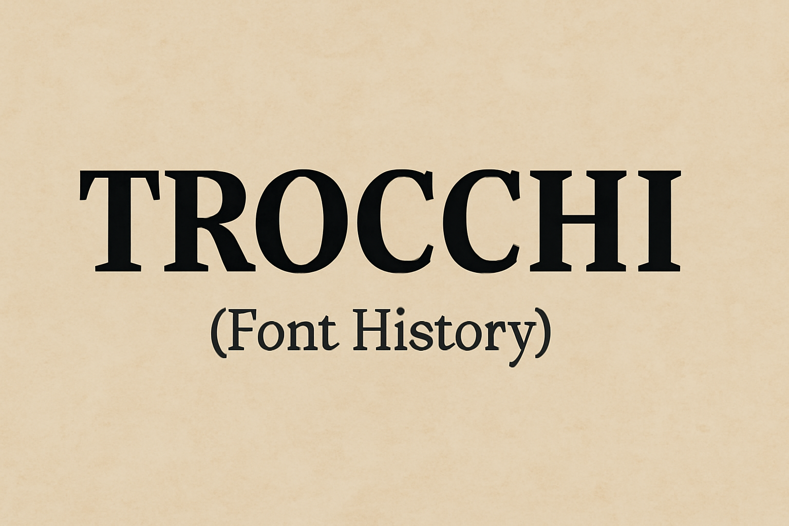
Trocchi is a unique font that draws inspiration from old English typefaces. Named after the Scottish novelist Alexander Trocchi, this font carries a charm that blends the old with the new. It is perfect for both text and display use, making it a versatile choice for various projects.
The Trocchi font stands out with its slab serif style, offering a casual yet elegant look. Developed by Vincent Figgins and others, it has become a popular choice for those looking to add a classic touch to their designs. Whether it’s for a website, an app, or printed materials, Trocchi fits right in and is free to use for personal and commercial purposes.
Modern designers appreciate how Trocchi brings a vintage feel without compromising readability. Its rich history and adaptability make it a favorite among typographers and creators. Explore the possibilities this font offers and see how it can enhance your work with its timeless style.
Origins of Trocchi
Trocchi is a font inspired by historical typefaces. It draws from the designs of the English typecutter Vincent Figgins, who lived from 1766 to 1844. His work included fonts like “Egiziano” and others that influenced this modern typeface.
Named after the Scottish novelist Alexander Trocchi, the font first appeared in 2012. It combines classic elements with a fresh and readable style. Its strong serifs and sturdy appearance give it a distinct look.
The font was designed for both text and display settings. Its bold strokes and consistent line weights ensure high readability. You can find more information about Trocchi’s design in this guide.
Trocchi’s Design Process
Trocchi is a font deeply influenced by specific historical styles and unique design characteristics. Its creation reflects both a reverence for traditional typefaces and a modern adaptation for readability and versatility.
Inspiration and Influences
Trocchi takes its name from the Scottish novelist Alexander Trocchi. The font draws inspiration from vintage designs by Vincent Figgins, a notable English typecutter from the 18th and 19th centuries. Figgins’s work, such as ‘Egiziano’ and ‘Ionic No.2,’ laid the groundwork for Trocchi’s classic yet casual style. These historical typefaces are known for their slab serif form, with Trocchi refining these features for a contemporary audience. This blend of historical depth and modern application makes Trocchi both a nod to the past and a functional tool for today’s design needs. The font’s design emphasizes both elegance and practicality, ensuring it works well in both text and display settings.
Typeface Characteristics
The key features of Trocchi include robust, block-like serifs and consistent line weights, giving it a very sturdy appearance. These characteristics make it highly readable, which is important for both printed and digital media. The font’s design is defined by bold strokes that lend it a strong and commanding presence. Its consistent thickness of lines ensures clarity, while the simplicity of forms prioritizes legibility. These elements work together to create a font that is visually appealing without sacrificing functionality. Its purposeful design allows it to maintain a balance between aesthetic appeal and ease of reading, making it suitable for a wide array of applications.
Trocchi in Modern Usage
Trocchi is a versatile font used widely in digital and print media. Its classic and contemporary mix makes it ideal for branding.
Popularity in Media
Trocchi has gained attention for its clean, professional look. It is often used in online publications and websites due to its readability and appealing design. Designers appreciate its slab serif style, which works well for various digital platforms.
The font’s adaptability allows it to shine in both headlines and body text. Many content creators choose Trocchi for its unique blend of tradition and modernism, making it a favorite for blogs and online articles. Its clarity and style make it popular for e-books and digital storytelling as well.
Use in Branding
In branding, Trocchi offers a balance between classic charm and modern simplicity. Companies seeking a professional yet approachable appearance often select this font. Its strong serifs and balanced spacing provide an elegant look that stands out.
Businesses use Trocchi for logos, business cards, and marketing materials. Its versatility means it can be paired with other fonts without losing impact. Brands across various industries, from tech startups to traditional firms, find Trocchi suitable for establishing a strong visual identity. By choosing this font, companies can convey reliability and creativity effectively.
Technical Details
The Trocchi font is a slab serif typeface known for its versatility and bold character. It offers different variations for both display and text use and is compatible with multiple file formats.
Font Family and Variations
Trocchi, designed by Vernon Adams, includes a slab serif typeface with strong, block-like serifs. This design makes it adaptable for various typesetting needs. Users can choose from multiple weights, offering flexibility in designing projects that require distinct visual emphasis.
The font takes inspiration from classic English typefaces, bringing a touch of historical style combined with modern functionality. Its bold strokes and well-defined characters make it suitable for both headlines and body text, offering continuity in design work.
File Formats and Compatibility
Trocchi is available in multiple file formats, which makes it easy to integrate into different systems. Common formats include TrueType (TTF) and OpenType (OTF), ensuring broad compatibility with most design software and platforms.
These formats are widely supported across various operating systems like Windows and macOS, as well as web design applications. Offering flexibility for both print and digital use, Trocchi allows designers to implement it seamlessly in diverse projects.
Legibility and Readability
The design of Trocchi prioritizes readability with its bold and clear characters. The sharp and block-like serifs aid in distinguishing individual letters, making it well-suited for both large-scale and text-heavy applications.
Its sturdy appearance and clear structure are beneficial in maintaining legibility across different sizes and resolutions. Whether used on a screen or in print, Trocchi ensures that text remains easily readable, providing an optimal reading experience for various audiences.
Availability and Licensing
Trocchi can be found on several popular font platforms. It is hosted on Google Fonts, where users can easily download and integrate it into their projects. It’s also available on FontForge and 1001 Fonts.
This font is licensed under the SIL Open Font License (OFL). This allows anyone to use, modify, and share Trocchi without restrictions for personal, educational, or commercial purposes. The OFL is designed to encourage collaboration among designers and developers.
One of the benefits of Trocchi is its flexibility. It can be used in websites, apps, and printed materials. Users do not need to pay for licenses or seek special permissions, making it an accessible choice for varied projects.
For developers interested in hosting the font themselves, self-hosting options are available. This can be beneficial for performance and customization, especially if not all fonts are available through online font delivery services such as Google Fonts, as noted on the Google Fonts website.
Additionally, Trocchi comes in two different weights, providing some options for style diversity in design projects. Overall, its open license and wide availability make it a go-to font for many designers looking for a casual, elegant look.
Trocchi’s Impact on Typeface Design
Trocchi is a notable slab serif typeface, admired for its robust structure and versatile design. It has made significant contributions to both contemporary and future typeface design, providing inspiration for many designers seeking to balance elegance and readability.
Contemporary Relevance
Trocchi has been embraced in modern design projects due to its clean, sturdy appearance. This typeface offers a timeless feel that aligns well with both classic and digital mediums. Designers today appreciate its ability to maintain readability in various sizes and contexts.
Its use in web and print media showcases its adaptability. Many projects benefit from Trocchi’s ability to convey messages clearly without overwhelming the content. For more details on its use, Trocchi on Fonts In Use highlights various applications in contemporary settings.
Influence on Future Designs
Trocchi’s influence extends into future font designs, serving as a foundation for new typefaces that aim to blend traditional aesthetics with modern functionality. Its origins in the work of Vincent Figgins have inspired a resurgence in slab serif popularity, encouraging designers to experiment with bold and block-like serifs.
Trocchi continues to inspire type designers to create fonts that are both modern and rooted in historical relevance. This ensures it remains a point of reference for new creations, pushing the boundaries of typeface design. Interested readers can find more on its history and influence at FontForge.