Typography is an essential part of design, and mastering text tools can bring your creative vision to life. CorelDRAW offers a wide range of features to enhance your text design skills, allowing you to create stunning typography with ease. Understanding these tools can transform ordinary text into captivating elements that impress and engage your audience.
Whether you’re a beginner looking to learn the basics or an experienced designer seeking advanced tips, CorelDRAW’s text tools can cater to your needs. From simple text manipulation to advanced typography effects, designers have access to a versatile set of options to express their creativity.
The text tool in CorelDRAW is not just for typing; it unlocks a world of possibilities in design. Using features like text alignment, font selection, and decorative effects ensures your design projects are not only functional but also artistically appealing. For those interested in diving deeper into these powerful tools, tutorials such as those found on CorelDRAW’s Text Tool Overview can be immensely helpful.
Getting to Know CorelDRAW’s Text Tools
CorelDRAW offers powerful text tools that allow for creative and precise typography design. Users can explore various text handling features, understand the differences between artistic and paragraph text, and learn how each tool can be utilized in design projects.
Overview of Text Handling
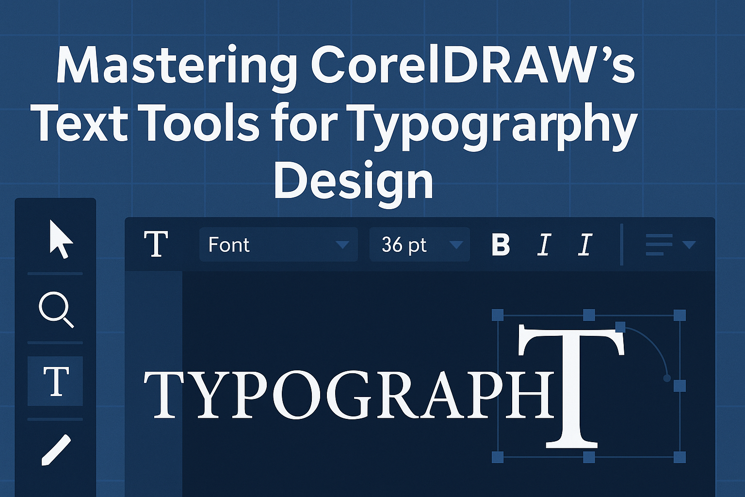
CorelDRAW’s text handling capabilities provide designers with flexibility and control. Text can be arranged horizontally, vertically, or along curves to fit unique design contexts. The Text Tool is accessible via the toolbar or the F8 shortcut key.
This tool allows users to select, edit, and format text with ease. It also offers options to set default fonts and sizes on the Property Bar, streamlining the setup. Designers benefit from quick access to font variations and styles, enhancing the ability to personalize content.
Text Tool Features
The Text Tool in CorelDRAW is packed with features that improve usability. Users can adjust text attributes like kerning, leading, and alignment without hassle. The intuitive interface allows for quick manipulation of text position and size, promoting efficiency.
In addition to baseline text handling, designers have access to advanced options. These include fitting text within shapes or paths, as well as utilizing vertical and mirrored text effects. Activation of the Text docker provides further customization, enabling typographic adjustments with precision.
Tips to remember:
- Use Ctrl+T to open the Text docker.
- Explore vertical text adjustability.
- Combine fonts and colors for impact.
Artistic Text vs. Paragraph Text
Understanding the distinction between artistic and paragraph text ensures optimal design application. Artistic text is ideal for headlines and highlighted text due to its flexibility and ease of manipulation. It allows for sizing and position changes without constraints, making it perfect for creative layouts.
Paragraph text, accessed by dragging out a text box, suits broader text blocks like articles or descriptions. CorelDRAW offers default settings like fonts and sizes visible in the Property Bar. This structured approach is useful for maintaining consistent body text within designs.
Choosing between artistic and paragraph text depends on the project’s nature. Artistic text works for standout elements, while paragraph text excels in detailed information delivery.
Setting Up Your Workspace for Typography
To master typography in CorelDRAW, it’s important to have a well-organized workspace. This involves adjusting text properties for better design control and efficiently using the text menu for ease of access.
Customizing Text Properties
Customizing text properties is key in making your design stand out. CorelDRAW allows designers to modify various text attributes, such as font, size, and color.
Using the Text Tool, users can select different fonts and tweak sizes to suit their project needs. Bold, italic, and underlined options are easily accessible from the toolbar, allowing for quick stylistic adjustments.
Alignment is another crucial feature. Designers can choose to align text left, right, center, or justify it for a more balanced look. Line spacing and kerning are also adjustable, enabling precision in text placement. Through the CorelDRAW text tool, users can further style their text, adding outlines or shadows for added depth.
Navigating the Text Menu
The text menu in CorelDRAW is versatile, providing a wide range of editing options. When accessed from the main toolbar, it offers multiple ways to enhance and manage text layers.
A dedicated section for formatting lets users experiment with colors, fill, and outlines. Adjusting text frames and paths is straightforward, allowing designers to create unique text effects effortlessly. These functions are ideal for creating visually appealing designs with complex layouts.
Moreover, the text menu supports international fonts and language settings, making it easier to work on diverse projects. This comprehensive guide to vector typography and fonts ensures that designers have all the tools necessary for seamless typography design.
Creating and Editing Text
CorelDRAW offers powerful tools for working with text, from adding and importing to customizing font styles. These tools allow users to create both visually appealing and easily readable designs.
Inputting and Importing Text
Users can start by typing text directly on the canvas using the Text Tool. This tool lets them quickly add captions or labels to their work. To add text, they simply select the tool, click on the desired area, and start typing.
CorelDRAW also supports importing text from other documents. This feature is useful when working with large blocks of pre-written content. By using the “Import” function, text from files like Word documents can be seamlessly brought into the design, ensuring everything stays consistent with the original formatting.
Font Selection and Formatting
Choosing the right font is essential for creating effective designs. In CorelDRAW, the Properties Bar provides easy access to a variety of fonts and styles. Users can experiment with different fonts, changing sizes and weights to find the perfect fit for their project.
Formatting text goes beyond choosing fonts. Designers can adjust alignment, spacing, and color to enhance readability and visual impact. CorelDRAW includes options for bold, italic, and underline, enabling designers to highlight key text elements and create contrast.
Editing and Manipulating Text
Once text is added, CorelDRAW allows for extensive editing to meet design needs. Users can click on text boxes to resize or reshape them, ensuring text fits the layout perfectly. The program also supports text fitting along paths or within specific shapes, providing flexibility in design.
Manipulating text includes rotating or skewing it for dynamic effects. CorelDRAW’s interactive tools make these tasks quick and intuitive. Users can also adjust character spacing and line height for precise control over how text appears, ensuring it aligns with their creative vision.
Typography Design Principles
Typography design is crucial in conveying messages effectively. Key factors include understanding typography basics, and utilizing kerning, leading, tracking, and alignment to create a visually pleasing layout.
Understanding Typography Basics
Typography is more than just picking a font. It involves knowing the different typefaces and how they impact communication. Typefaces are generally categorized into serif, sans-serif, script, and decorative styles. Each category has unique characteristics that influence readability and design aesthetics.
Serif fonts, like Times New Roman, have small lines at the ends of characters, making them suitable for print. Sans-serif fonts, like Arial, are cleaner without those lines, offering a modern look ideal for digital content.
Understanding the purpose and mood of a project helps in choosing the right typeface. Knowing how typeface characteristics affect tone and readability is essential for effective communication.
Applying Kerning and Leading
Kerning is adjusting the space between individual letter pairs to improve visual balance. Proper kerning ensures that the text doesn’t appear too loose or too tight, enhancing readability. Manual kerning allows designers to tailor text appearance by modifying specific pairs.
Leading, on the other hand, is the vertical spacing between lines. Adequate leading is necessary to avoid text appearing cramped or scattered. It is typically set at 120% to 145% of the font size, depending on the typeface and overall design goals.
Effective use of kerning and leading allows for a harmonious and easy-to-read text layout. These adjustments help achieve clear and attractive typography that draws the reader’s eye smoothly across the page.
Utilizing Tracking and Alignment
Tracking refers to the uniform adjustment of spacing across a range of characters. It helps in altering the overall density and texture of the text. Adjusted tracking can make long-awaited titles appear less dense or help short text blocks fill a space evenly.
Alignment is also crucial in arranging text in design. It includes left, center, right, and justified options, each serving different purposes in typography. Proper alignment creates order and guides the reader’s gaze in a structured way.
By mastering these tools, designers can create clean, professional text layouts that are both aesthetically pleasing and easy to read.
Advanced Text Effects
Mastering advanced text effects in CorelDRAW can elevate typography design to a new level. By learning how to add text on a path, create dynamic text effects, and use symbols, designers can enhance both the functionality and aesthetics of their projects.
Text on a Path
Adding text on a path in CorelDRAW gives designs a unique flair. It allows text to follow the curves and lines of shapes, creating a visually appealing effect.
To start, use the Ellipse tool or Pen tool to draw a path. Select the text, then use the Text menu to choose Fit Text to Path. This feature aligns the text along the curve, adjusting it to the shape. This technique is perfect for circular logos or banners.
Adjusting spacing and position ensures the text fits naturally. Designers can edit the path later to change the shape or appearance. It’s a great way to add creativity to any project, making text stand out in an engaging manner.
Creating Text Effects
CorelDRAW’s tools make it easy to craft stunning text effects, such as 2D and 3D effects. Using the Interactive Effects toolbox, designers can apply effects like shadows, contours, and transparency.
For a three-dimensional look, try the Extrude tool. It gives text depth and a realistic appearance. Adjust the direction and depth settings in the property bar for the desired effect. Another option is the Envelope tool, which distorts text into various shapes and adds a dynamic twist.
Combining multiple effects results in complex and eye-catching designs. By experimenting with different tools, designers can find the perfect combination to enhance their creative vision.
Using Symbols and Special Characters
Incorporating symbols and special characters into text designs adds a unique touch to any project. CorelDRAW’s Pick tool makes selecting and modifying text elements simple, allowing for creative customizations.
Open the Insert Character Docker from the Text menu to access various symbols and characters. Here, designers can find everything from accented letters to decorative glyphs. These elements help emphasize points or add a visual break in the text.
Special characters can also be used to create brand-specific icons or logos, adding a personal touch to the design. This method enhances typography creativity, boosting the impact and meaning of the visual content.
Optimizing Text for Different Media
When working with CorelDRAW, optimizing text for various media is crucial. This involves tailoring typography to meet the needs of web, print, and video formats. Each medium has specific requirements to ensure clarity and effectiveness.
Web Typography Considerations
Fonts and Readability: On the web, readability is key. Sans-serif fonts are often easier to read on screens. It’s essential to choose a font that maintains clarity at different sizes. Sizes typically range from 12 to 16 pixels for body text.
Responsive Design: Text should adjust to varying screen sizes. Using percentage-based widths or em units ensures that text scales correctly on different devices.
Loading Speed: Large font files can slow down page loading times. Stick to a few essential font weights and styles to optimize performance.
Contrast: Good contrast between text and background boosts readability. Dark text on a light background is often easier on the eyes.
Preparing Text for Print
Resolution: High resolution is essential for print. Text should be set at 300 DPI (dots per inch) to ensure crisp results.
Color Mode: Use CMYK color mode for print projects, as it reflects how colors will be produced in printing. This avoids unexpected color changes.
Typography Styles: Serif fonts often look more polished in print. They can add a touch of elegance and improve readability on paper.
Bleed and Margins: Include bleed in the design. This prevents text from being cut off. Setting proper margins ensures text doesn’t end up too close to the edge of the page.
Exporting Text for Video and Animation
Font Choice: Choose clear and bold fonts for video. Text in videos often needs to be noticeable even against busy backgrounds.
Size and Placement: Ensure text is large enough to read on different screen sizes. Avoid placing text too close to the edges, as it might be cut off on some screens.
Motion and Animation: Text effects should be smooth and not distract from the message. Simple animations, like fade-ins or slide-ins, can make text engaging without overwhelming viewers.
File Formats: Export text in high-quality formats. This ensures that the text remains sharp and clear throughout the video. Formats like MP4 and MOV are commonly used for this purpose.
Streamlining Your Workflow
Streamlining your workflow in CorelDRAW is all about utilizing the tools and features that save time and enhance productivity. By leveraging styles, templates, macros, and text correction tools, designers can work more efficiently and focus on creativity.
Working with Styles and Templates
Using styles and templates in CorelDRAW can significantly improve efficiency. Styles help maintain consistency across your designs. You can create a style that defines text formatting like font, color, and size, and apply it across multiple text elements. This reduces the repetitive task of manual formatting.
Templates are another powerful feature. They provide pre-designed layouts that can be easily customized for different projects. This is especially useful when working on similar projects, as it saves time spent on setting up new documents. By using templates, designers can focus more on the creative aspects rather than starting from scratch every time.
Using Macros for Text Automation
Macros are sequences of commands that CorelDRAW can execute to automate repetitive tasks. For text automation, macros can handle tasks like batch processing of text changes or applying specific effects to text elements. This can dramatically reduce the time spent on manual tasks.
Creating a macro is like recording your actions during a text modification process. Once recorded, you can run the macro in future projects to quickly replicate the steps. This is particularly useful for large projects where consistency is key. Tools such as Visual Basic for Applications (VBA) in CorelDRAW allow for custom macro creation, enhancing text workflows with automation.
Text Proofing and Correction Features
CorelDRAW is packed with features aimed at ensuring text accuracy and quality. Spell check and grammar check tools help catch errors before finalizing a design. These tools operate in real-time, highlighting possible issues as you type.
The software also provides language support to switch between different dictionaries. This is crucial for multilingual projects. Additionally, CorelDRAW allows for easy find and replace functions, letting designers make uniform changes across lengthy text sections swiftly.
Text proofing tools not only save time but also help maintain professionalism in design work. By ensuring all text elements are correct and consistent, designers can prevent errors and improve the overall quality of their projects.