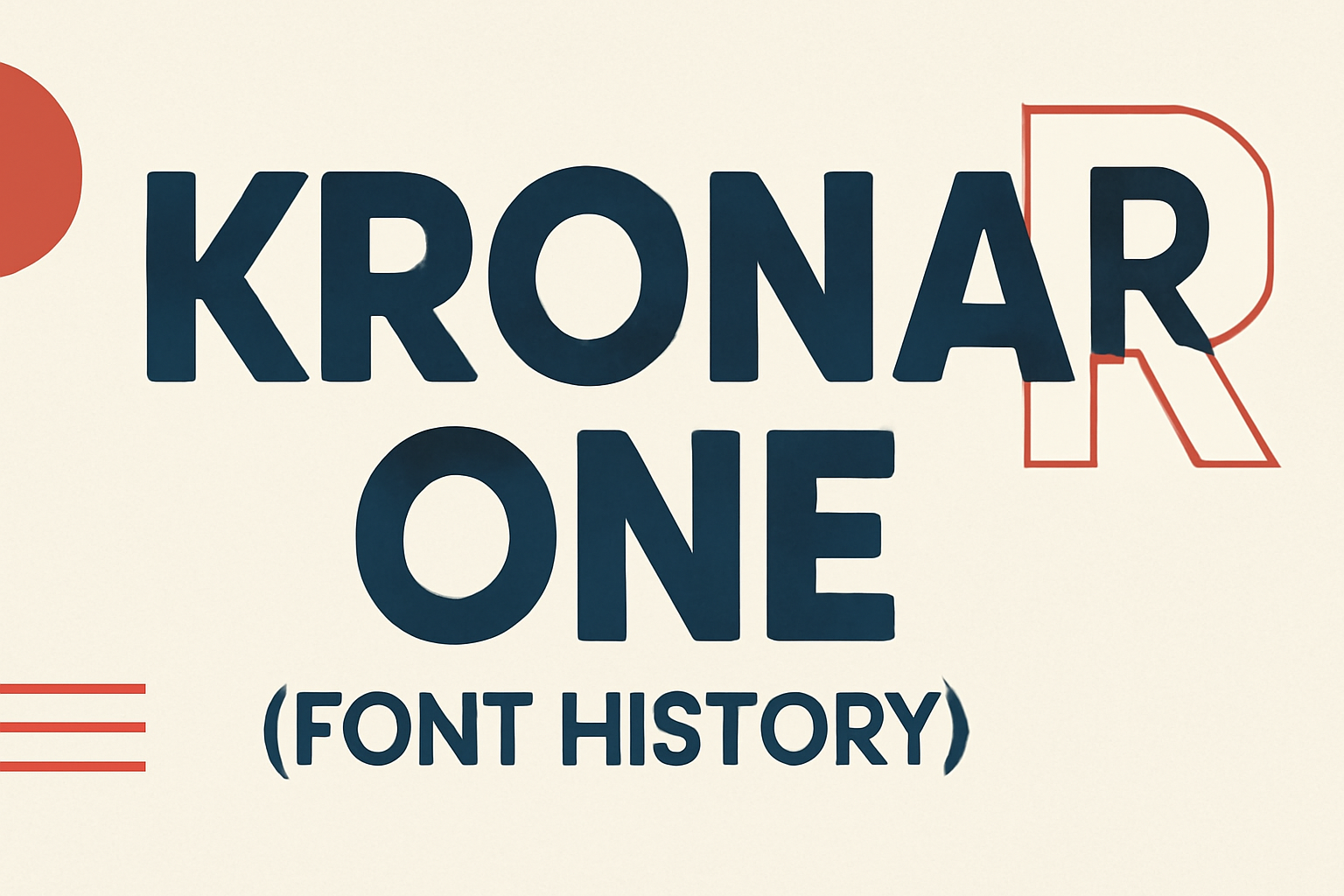
Krona One is a sans serif font full of personality, making it a standout choice for a variety of design needs. Created by Yvonne Schüttler, it draws inspiration from hand lettering on early 20th-century Swedish posters, combining nostalgia with modern readability. This unique blend makes Krona One both readable and memorable, suitable for both small text and large display settings.
Designers appreciate Krona One for its low contrast and semi-extended style, which allows for versatility across different projects. Whether it’s a clean, understated look or a bold statement, this font adapts with ease. Its ability to maintain clarity at various sizes ensures it is a reliable choice for many uses.
Beyond its visual appeal, Krona One’s availability is also a significant draw. It can be accessed and downloaded for free, making it an attractive option for both personal and commercial projects. For those interested, the font is available on platforms like Google Fonts and Font Squirrel, which offer easy access for immediate use.
Origin of Krona One
Krona One is a sans-serif typeface created by Yvonne Schüttler. Its design draws influence from early 20th-century Swedish posters, which contributes to its unique style and functionality.
Creator Background
Yvonne Schüttler, a talented designer, crafted Krona One. Her passion for clean and readable fonts shines through this creation. Krona One was designed with a focus on simplicity and clarity, making it suitable for various contexts. As part of the Google Fonts collection, Schüttler’s work is accessible, allowing designers worldwide to incorporate this font into their projects. Her design philosophy revolves around creating fonts that are visually appealing yet functional, embodying a blend of modern aesthetics and usability.
Design Inspiration
Krona One was inspired by hand lettering seen in early 20th-century Swedish posters. These posters featured bold and distinctive typography that captured attention. This historical influence can be seen in Krona One’s geometric structure and uniform stroke widths. It boasts a semi-extended style with low contrast, ensuring readability at different sizes. The design reflects a blend of nostalgia and modernity, making it versatile for both small and large text applications. It balances personality and function, providing a fresh take on classic sans-serif styles.
Characteristics of Krona One
Krona One is a sans-serif typeface known for its geometric structure and versatile style. Designed by Yvonne Schuttler, it combines modern elegance with high readability, making it suitable for both small and large text.
Typography Style
Krona One boasts a clean, sans-serif design with a low contrast semi-extended style. Its geometric shapes give it a modern look, while the uniform stroke widths enhance readability. This typeface was inspired by hand lettering seen on early 20th-century Swedish posters. These design elements make Krona One effective in various settings, from body text to headlines. It maintains legibility across different sizes, offering flexibility in design projects. The combination of clean lines and balanced spaces ensures an appealing appearance across both digital and print formats.
Unique Features
One of Krona One’s distinct features is its versatility. While maintaining a consistent, clean aesthetic, it carries a bit of personality in its design. This is partly due to its semi-extended structure that adds subtle uniqueness to the typical sans-serif format. Krona One’s design allows it to pair well with other fonts. For instance, pairing Krona One with Open Sans offers a harmonious balance, enhancing the overall design project. Its open-source nature allows for widespread use, contributing to its popularity and accessibility in various design contexts. It is available on Google Fonts, ensuring easy access for designers worldwide.
Usage of Krona One
Krona One is a versatile typeface appreciated for its clean and modern look. It’s used in various applications because of its readability and unique design.
Popular Applications
Krona One is often used in web design because of its clarity on screens. It’s perfect for headlines and banners, capturing attention with its bold and straightforward style. Graphic designers frequently choose it for posters and flyers, thanks to its strong visual impact. In educational materials, its legibility helps ensure text is easy to read. Easily adapting to different sizes, Krona One works well in both small body text and larger, more attention-grabbing headlines. Its clean lines make it a favorite for many projects needing a professional touch.
Industry Acceptance
Krona One has gained popularity across multiple industries. It is well-received in the technology sector for its modern aesthetic and ease of reading on digital devices. Industries like advertising and marketing prefer it for its fresh look, enhancing brand visibility. Many companies also appreciate its open-source nature, allowing it to be used freely and suited to a range of commercial purposes. With its strong, geometric form, Krona One provides a trusted option for businesses aiming for a professional appearance in their visual communications.
Technical Specifications
The Krona One font combines versatility with a stylish design. This section covers the file formats it is available in and its compatibility with various systems and applications.
File Formats
Krona One is available in multiple file formats, making it adaptable for various uses. Designers can download it in the TrueType (.ttf) and Web Open Font Format (.woff). These formats are ideal for both print and web use. TrueType ensures accuracy in printing, while WOFF is optimized for use on websites, providing quick loading times. Some platforms also offer the font in OpenType (.otf), which is known for supporting advanced typesetting features. These format options make it easy to incorporate Krona One into any project.
Compatibility
Krona One is highly compatible, usable on both Windows and macOS. The font works seamlessly with graphic design software like Adobe Illustrator and Photoshop. Websites can also display it efficiently thanks to the WOFF format support. It is handily accessible for commercial and personal projects, aligning with its SIL Open Font License. This flexibility of use makes it a favorite among creative professionals and hobbyists alike, offering a reliable and versatile option.
Evolution of the Font
Krona One has seen changes and improvements since it was first designed. This font has undergone several updates, and its design has been refined to meet modern needs.
Version Updates
The initial release of Krona One set the stage for its use as a versatile sans serif font. Over time, updates have focused on enhancing compatibility with different platforms. With each update, the font has become more efficient in terms of file size and rendering speed. These changes ensure that designers can use it seamlessly across both print and digital media.
Another key update included improvements in character mapping, allowing for wider language support. This has made Krona One more accessible internationally, appealing to a broader audience.
Design Refinements
Krona One’s design has been refined to ensure readability at various sizes. Inspired by early 20th-century Swedish posters, its low-contrast, semi-extended style has been preserved while enhancing its clarity and visual appeal.
Adjustments to the spacing and kerning have been made to improve the flow of text when used in paragraphs. These changes have made it popular for both small print uses and larger display settings. Designers favor its personality-packed style for projects needing a unique yet accessible look.
These refinements highlight the font’s adaptability to modern design requirements, while still keeping its original charm.
Licensing and Usage Rights
Krona One is available under the SIL Open Font License, which has specific rules. This section will cover its use in both commercial and personal settings, as well as the process for obtaining necessary licenses.
Commercial vs. Personal Use
Krona One is licensed under the SIL Open Font License, allowing for broad usage. This license permits use in both personal and commercial projects without the need for additional fees. Users can include the font in a variety of media like websites, prints, and applications.
For personal use, individuals can install and utilize the font on their devices freely. The free usage policy simplifies things for hobbyists and small projects. However, when used commercially, there must be no restriction on embedding the font within digital products, such as PDFs or apps.
An extra benefit is the ability to modify the font, making it a great option for developers and designers. The only requirement is that any modifications should not be sold under the original font name, which protects the original identity of the typeface.
Obtaining Licenses
To use Krona One, acquiring the font is simple due to its licensing under the SIL Open Font License. Users can access and download the font from various reputable platforms like Google Fonts. This straightforward download process ensures easy integration into projects.
No distinct license purchase is necessary for any standard use, whether personal or commercial. This openness encourages widespread use in creative works. However, if someone plans to redistribute the font with modified versions, they should offer it under the same open license terms.
Availability on multiple platforms fosters easier adoption. Accessing and using Krona One under its licensing terms makes it an excellent choice for those needing flexibility without complex licensing procedures.
Community and Support
The Krona One font has a lively community and many resources available for designers. Its open-source nature encourages collaboration and sharing, making it accessible and easy to use for various design projects.
Online Forums and Discussions
Communities focused on typography often discuss Krona One. Enthusiasts and professionals gather in forums to share ideas and provide feedback on using this font. These discussions help users understand how to implement the font in different contexts effectively. Adobe Fonts provides a platform for such exchanges, allowing users to connect and solve common challenges. Forums are great places to find tips and tricks for optimizing font usage, especially when working on diverse design projects. They are invaluable for anyone looking to enhance their skills and apply Krona One creatively.
Resources for Designers
Designers can find a variety of resources to make the most out of Krona One. Open-source repositories, like the ones on GitHub, allow designers to access, modify, and improve the font. This accessibility fosters innovation, giving designers the freedom to adapt the font to their specific needs. Websites such as Google Fonts and 1001 Fonts offer free downloads and licensing information. This makes it easy for designers to incorporate the font into both personal and commercial projects. These resources ensure that designers have the tools they need to work efficiently and creatively with Krona One.
Critiques and Reviews
Krona One is admired for its unique design, yet it receives mixed reviews. Some love its retro feel while others find it challenging to pair with different fonts.
Design Community Feedback
The design community appreciates Krona One for its clean, modern aesthetic. It is described as having a geometric structure with consistent stroke widths, making it very legible. Many designers enjoy using Krona One in projects that require a contemporary feel with a touch of vintage charm. Its inspiration from early 20th-century Swedish posters is often highlighted as a positive aspect.
Some designers note that while it shines in specific contexts, it may not suit every project. Those who prefer more traditional or varied typefaces might find it limiting.
Comparisons with Other Fonts
When compared to other popular fonts, Krona One holds its ground due to its distinctive style. Fonts like Open Sans are commonly paired with Krona One for balance. Open Sans offers more versatility, with a wider range of weights and styles, which contrasts with Krona One’s more specialized look.
Some designers choose Krona One over other sans-serif fonts for its historical flair and unique visual impact. Its semi-extended form sets it apart from more common fonts. However, those seeking a more traditional appearance might prefer fonts like Helvetica or Arial, which are more universally compatible.