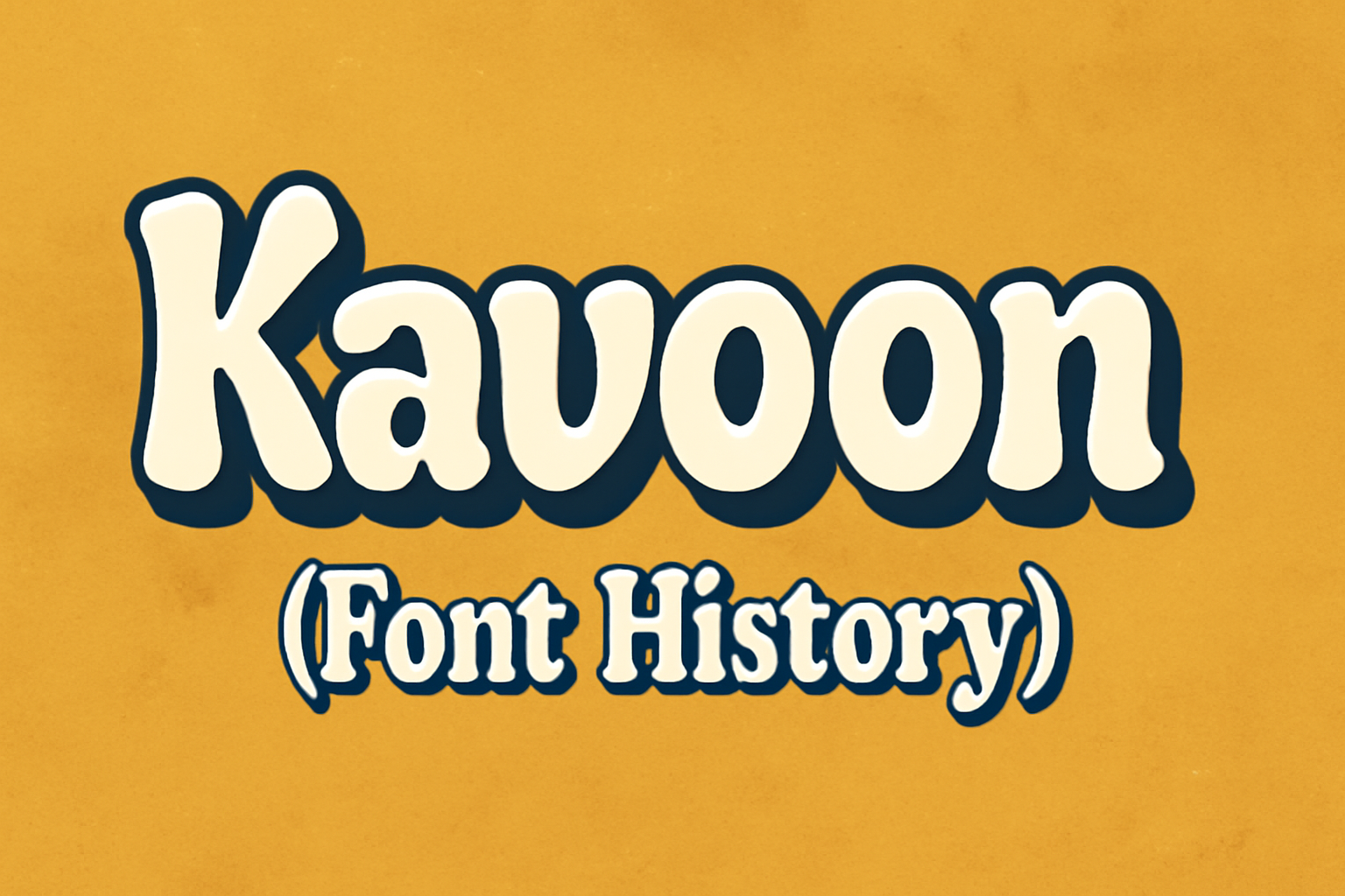
Kavoon is a lively and expressive font with unique features that make text pop on the page. Designed by Viktoriya Grabowska, it merges bold strokes with a playful style, perfect for catching the eye in various design projects. Its history began with experiments in brush and ink, resulting in a typeface that stands out for its thickness and rounded edges.
This font offers a whimsical touch while maintaining readability, making it suitable for both professional and casual use. Pairing Kavoon with simpler fonts like Montserrat or Lato can create a balanced and engaging visual appeal. For those interested in typography, Kavoon offers a blend of creativity and practicality, making it a must-explore typeface.
Understanding Kavoon’s journey, from its origins to its applications, invites readers to appreciate the craft behind type design. Its aesthetic versatility can enhance everything from digital media to print, offering designers a tool to make graphics more dynamic and inviting.
Origins of Kavoon
Kavoon is a unique typeface designed by Viktoriya Grabowska. It was created to combine boldness with a playful, whimsical touch. The design features thick strokes, rounded edges, and exaggerated curves. These qualities make it ideal for creating standout text.
In its design process, Kavoon drew inspiration from experiments with brush and ink. The font’s expressive characteristics help words appear vivid and engaging. This makes it particularly effective for medium to large-sized displays.
Kavoon is licensed under the SIL Open Font License (OFL), allowing for both personal and commercial use. This open licensing encourages widespread use and adaptation in various design projects.
The foundry behind Kavoon is Sorkin Type Co., known for creating fonts that capture attention. Their commitment to high-quality, expressive typefaces is evident in Kavoon’s distinct style and functionality.
Typeface Characteristics
Kavoon is known for its expressive and bold design, which makes text stand out with thick strokes and rounded edges. These subtopics will explore the unique aspects of its glyph design and the available font weights and styles.
Glyph Design
Kavoon’s glyphs present a playful yet robust appearance. Created by designer Viktoriya Grabowska, this typeface combines bold strokes with whimsical, rounded edges, which contribute to its unique style. The exaggerated curves add character, making it ideal for projects that aim to capture attention and convey a sense of fun.
The letters are easily distinguishable, making Kavoon suitable for display purposes. Its brush and ink inspiration give it a dynamic feel that can energize a design. Such features ensure that Kavoon is not just eye-catching but also easy to read at various sizes.
Font Weights and Styles
Kavoon primarily comes in a single weight, designed for display use. This simplicity highlights its bold characteristics and ensures consistency across designs. While it may lack multiple weights, its strength lies in its vivid presentation, which is perfect for headlines and titles.
The typeface works best when used at medium to large sizes, drawing readers in with its lively appearance. This makes it an excellent choice for branding and advertising where the text needs to pop. By focusing on boldness, Kavoon can deliver impactful messages with clarity and style.
Usage and Application
Kavoon is a playful and bold typeface that works well in different settings. Its expressive features make it suitable for both digital and print media, offering a unique style for each medium.
Digital Media
In the world of digital media, Kavoon stands out with its bold, whimsical style. This makes it a top choice for websites and online advertisements. Designers prefer Kavoon in headlines to grab the viewer’s attention quickly. Its legibility at larger sizes suits banners and web graphics. Kavoon’s ability to support a variety of languages using the Latin alphabet adds to its versatility online.
Kavoon also pairs well with other fonts in digital layouts. It can be combined with clean, sans-serif fonts like Montserrat or Open Sans for added contrast. Designers enjoy using Kavoon for a creative twist in apps and interactive media. This makes it a fun addition to any digital project where boldness and playfulness are needed.
Print Media
In print media, Kavoon’s bold character shines through. It’s often used in posters, flyers, and book covers to create eye-catching headings. The font’s playful nature makes it ideal for children’s books, offering an engaging visual appeal. Its expressive lines bring life to any printed material, ensuring it doesn’t get lost in the clutter.
Kavoon’s compatibility with other fonts, such as Raleway and Roboto, provides added flexibility in print designs. This allows graphic artists to create balanced layouts with readable body text. Kavoon is often a top pick for branding materials, like business cards and brochures, where a unique, memorable touch is desired. The font’s distinct style ensures that print projects are lively and unforgettable.
Designer and Foundry
Kavoon is a unique typeface designed by Viktoriya Grabowska. She aimed to create a font that combines boldness with a touch of whimsy. The design reflects her intent, featuring thick strokes and rounded edges.
The font was developed by Sorkin Type Co. This foundry is known for its experimental approach to type design. Their work often includes innovative combinations of traditional and modern design elements.
Kavoon’s design process involved experiments with brush and ink techniques. This gives the typeface an expressive and vivid appearance. It is particularly striking in larger sizes, making it ideal for headlines or attention-grabbing text.
The Kavoon font family is available for free, offering designers an opportunity to use it in various projects. It can be easily downloaded and tested across different applications.
Attention to detail in Kavoon makes it stand out. Its large x-height and exaggerated curves add to its playful and strong character, making it a favorite for eye-catching design tasks.
Major Releases and Versions
Kavoon is a display typeface known for its bold and expressive design. The development of Kavoon has seen several notable releases.
The font was first crafted by designer Viktoriya Grabowska. Its unique style draws from experiments with brush and ink techniques, giving it a whimsical yet bold appearance.
Key Versions and Features:
-
Initial Release: The font’s bold nature made it popular for headings and large text. It supports a variety of languages that use the Latin alphabet.
-
Updated Styles: While Kavoon traditionally featured a single weight of 400, it continues to stand out due to its visual impact. Designers often favor it for creative projects because of its distinctive look.
The font remains available for free under open-source licenses, allowing users to modify and distribute it. Permissions include use, study, and even selling both modified and unmodified versions, as you can see on its GitHub page.
Typography and Readability
Typography plays a crucial role in how easily text can be read. Different fonts have different levels of readability based on their design elements. Key factors affecting readability include font size, spacing, and style.
Font Size and Spacing
Make sure to choose a font size that is comfortable for the target audience. Spacing between letters and lines also impacts how easily text can be read. Wider spacing often improves clarity and reduces eye strain.
Font Styles
Fonts like Kavoon add character to text but may not be suitable for small sizes due to their decorative nature. In contrast, more straightforward fonts, such as those used in print or digital media, are often selected for materials where clarity is essential.
Tips for Better Readability
- Use fonts with clear letter forms.
- Opt for a consistent style throughout the text.
- Choose contrasting colors between text and background.
Typography isn’t just about aesthetics. It’s about facilitating a seamless reading experience. Different contexts may call for different typographic choices. Always keep the reader’s comfort in mind when selecting fonts and layouts.
Influence and Reception
Kavoon, with its unique and expressive style, has impacted both the design community and popular culture. Its bold characteristics make it stand out among modern fonts, becoming a popular choice for designers and enthusiasts alike.
Design Community
In the design community, Kavoon has earned a distinct spot. Its playful and bold characteristics make it ideal for projects that need a touch of whimsy. Designers value its ability to draw attention while maintaining readability.
Kavoon fits well in posters, logos, and branding materials. It allows designers to experiment with expressive typography without losing clarity. Its history and origins add an intriguing layer for those interested in typography evolution.
The font’s creator, Viktoriya Grabowska, is recognized for blending the bold with the whimsical. Her work has inspired other designers to explore expressive styles, showcasing the creative potential within typography. This font is celebrated at design events, highlighting its place in modern design aesthetics.
Popular Culture
In popular culture, Kavoon appears frequently due to its eye-catching design. It’s used in advertising campaigns, social media graphics, and packaging. Its whimsical look makes it ideal for entertainment and lifestyle brands that want to stand out.
The font’s adaptability and charm attract brands looking to create memorable and vibrant images. Its influence extends to digitally shared content, where striking visual identity is key.
Kavoon’s growing presence in media reflects its versatility and appeal. The blend of thick strokes and curves provides a modern feel that resonates with diverse audiences, making it a widely recognized font in various platforms across the globe.
Licensing and Availability
Kavoon is licensed under the SIL Open Font License (OFL). This makes the font freely available for both personal and commercial use. Users can share, modify, and even sell the font without paying a licensing fee. This open framework supports worldwide font development and collaboration.
The Open Font License encourages creativity. Designers can experiment or adapt Kavoon to fit their needs. This ensures continuous evolution and improvement of the font while maintaining its unique style.
Kavoon can be downloaded from several online platforms. Google Fonts offers an easy download for web use. This makes it accessible for web designers looking to enhance their projects with a playful touch.
For desktop use, Kavoon is also available on Font Squirrel and 1001 Fonts. These sites provide free downloads that allow users to utilize the font in various projects without restrictions.
The availability of Kavoon on multiple platforms and its open licensing make it an attractive choice for designers. Whether working on digital designs or print media, this font offers flexibility and creative freedom.