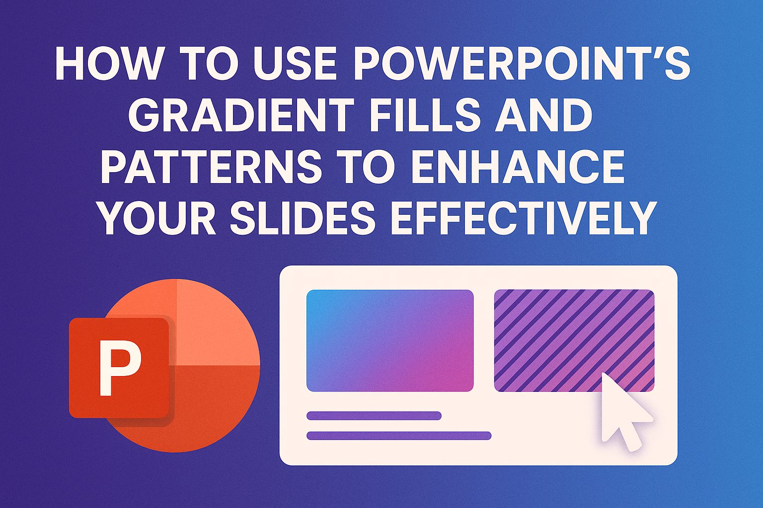
Using gradients and patterns in PowerPoint can transform ordinary slides into engaging visuals.
These design elements add depth and interest, making presentations more appealing and easier to follow.
Understanding how to effectively apply gradient fills and patterns is key to enhancing presentations.
Many users may not realize the potential of gradients beyond simple color choices. They can create a sense of movement and highlight important information.
By exploring different gradient styles and patterns, presenters can better capture their audience’s attention.
Learning to use these tools can make a significant difference in presentation quality. With just a few adjustments, slides can reflect professionalism and creativity.
This article will guide readers through the steps to master gradient fills and patterns in PowerPoint.
Understanding Gradient Fills
Gradient fills can add depth and interest to PowerPoint slides. They allow users to blend colors smoothly, creating a more dynamic visual experience.
Knowing the types of gradient fills and how to create custom gradients is essential for enhancing presentations.
Types of Gradient Fills
There are several types of gradient fills available in PowerPoint. The two main styles are linear and radial gradients.
-
Linear Gradient: This type transitions colors in a straight line. It can move either vertically, horizontally, or diagonally. Users can choose how many colors to include and the direction of the gradient.
-
Radial Gradient: This style radiates from a central point outward. It creates a circular effect that can draw attention to the center of the shape. Both types can be customized further with different color stops.
Understanding these types helps to select the right one based on the desired effect on the slide.
Creating a Custom Gradient
Creating a custom gradient is simple and allows for personalization. Users can follow these steps:
-
Select the Object: Click on the object where the gradient will be applied.
-
Open Format Options: Right-click and choose “Format Shape” or select “Shape Format” at the top.
-
Choose Gradient Fill: In the Format Shape pane, select “Fill” and then choose “Gradient fill.”
-
Adjust Colors: Here, users can add or remove color stops. Each color stop can be adjusted to set the exact color and opacity.
-
Set Direction and Type: Users can also select the gradient type and adjust its angle. This allows for total control of how the gradient appears on the slide.
These steps empower users to create unique and engaging visuals tailored to their presentation needs.
Applying Gradient Fills to Slides
Gradient fills can bring life and dimension to PowerPoint slides. They help create visual interest and can be used effectively in backgrounds or shapes. Here’s how to apply them.
Adding Gradient Backgrounds
To add a gradient background, start by clicking on the Design tab. Once there, choose Format Background in the toolbar. A side panel will open.
In the panel, select the Gradient Fill option. Here, users can see several gradient stops. They can click on a stop to choose a color using the Color button.
Adding multiple stops allows for a smoother transition between colors. It’s important to play around with the positions of each stop to see how colors blend.
Adjust the Type of gradient, whether linear, radial, or rectangular, to suit the desired look.
Using Gradients in Shapes
To apply gradient fills to shapes, first, select the desired shape on the slide. Right-click and choose Format Shape. This brings up a menu where users can select Fill and then opt for Gradient Fill.
Similar to backgrounds, users can add or remove gradient stops. They can also adjust the transparency of each stop, creating different effects.
As an example, a shape with a radial gradient can give the appearance of depth. Adjusting the angle can change the direction of the gradient, making the design more dynamic.
Experimenting with these options allows for unique and creative presentations.
Experimenting with Patterns
Patterns can add a unique touch to presentations. By using both standard and custom patterns, he can create designs that stand out and enhance the overall look of slides.
Choosing From Standard Patterns
PowerPoint offers a variety of standard patterns to choose from. These can easily be applied to shapes, text boxes, and backgrounds.
To access standard patterns, follow these steps:
- Select the shape or text box.
- Right-click and choose Format Shape.
- In the fill options, select Pattern Fill.
He can then explore the different patterns available. These include lines, dots, and waves, each providing a distinctive look.
It’s important to choose patterns that complement the content, ensuring readability.
Using contrasting colors can help patterns pop. For instance, a light color pattern on a dark background can make the pattern stand out effectively.
Creating Custom Patterns
Custom patterns allow for more creativity in a presentation. He can create his own patterns using images or by layering colors and shapes.
To create a custom pattern:
- Open the Format Shape menu.
- Select Fill and click on Picture or Texture Fill.
- Choose an image or create a texture to use.
He can adjust the transparency and scale to improve the appearance.
Custom patterns can enhance branding by incorporating logos or specific color schemes.
Combining multiple shapes with different custom patterns can lead to interesting designs. Experimenting with these options can lead to unique and personal presentations.
Enhancing Slide Design with Patterns
Using patterns in slides can add visual interest and make content stand out. Patterns can be utilized creatively to enhance images and create seamless transitions, making presentations more engaging.
Overlaying Patterns on Images
Overlaying patterns on images elevates the visual appeal of slides. This technique can help maintain focus on the main content while enhancing overall aesthetics.
To get started, it’s important to choose the right image and pattern.
First, select an image that serves as the background for your slide. Next, pick a pattern that complements the image without overwhelming it.
Steps to Overlay Patterns:
- Insert your desired image into the slide.
- Select a pattern fill, which can be found under the “Format Shape” menu.
- Adjust transparency to allow the image to show through while the pattern adds depth.
This method helps convey messages effectively while keeping slides visually captivating.
Combining Patterns and Transitions
Combining patterns with transitions brings dynamic movement to a presentation. It helps to create a flow between slides, making the transition engaging and smooth.
When using patterns, consider how they can frame or enhance transitions.
Tips for Effective Combination:
- Choose Complementary Patterns: Ensure the patterns used in transitions match or complement those on the current slide.
- Consistent Theme: Maintain a consistent theme throughout the presentation with patterns that reflect the topic.
- Timing and Effects: Adjust the timing of transitions to create a seamless effect that draws attention without distracting from the content.
Employing these strategies makes a notable difference in slide design, ensuring presentations are both meaningful and visually appealing.
Best Practices for Using Gradients and Patterns
Using gradients and patterns effectively can make a presentation visually appealing. Here are some best practices to consider:
-
Subtle Transitions: Stick to two or three colors that blend smoothly. Overly complex gradients can be distracting.
-
Color Choice: Choose colors that complement each other. Lighter shades can add brightness, while darker shades provide depth.
-
Readability Matters: Ensure text stands out against the background. Use solid colors or lighter gradients behind text for better visibility.
-
Limit Patterns: While patterns can add interest, too many can overwhelm the audience. Use them sparingly and in targeted areas.
-
Layering Effects: Gradients can create a sense of dimension. Applying a gradient to shapes can suggest depth and animate visuals.
-
Consistency Is Key: Keep a uniform style throughout the presentation. This approach helps maintain a professional look.
Adjusting Transparency and Effects
Adjusting transparency can make elements on a slide look smoother and more integrated. It allows light to show through, which can create a more professional appearance.
To start, select the shape or image. Then, right-click and choose Format Shape. In the format pane, find the Fill section and look for the Transparency slider.
-
Increase Transparency: Moving the slider to the right makes the shape more see-through. This works well to emphasize text or images behind it.
-
Decrease Transparency: Moving the slider to the left makes the shape solid, allowing it to stand out more.
Another effect to consider is adding a gradient. Gradients can enhance visual interest. They can also convey depth.
Here’s a quick way to apply a gradient:
- Select the shape.
- Choose Gradient Fill from the fill options.
- Pick color stops and adjust their transparency for unique effects.
Using subtle gradients can improve readability and aesthetic appeal. Remember, too many colors can be distracting.
By pairing transparency and gradients, designs can become more engaging and clearer. It is a smart way to guide the viewer’s focus on significant content without overwhelming the slide.
Troubleshooting Common Issues
Using gradients and patterns in PowerPoint can enhance the visual appeal of slides. However, users may face some common issues that need addressing for the best results.
Gradient Banding and Artifacts
Gradient banding occurs when smooth transitions between colors appear as distinct bands. This can happen due to limited color depth or the display settings of the device.
To fix this, try the following steps:
- Increase Color Depth: Ensure the display settings are set to at least 24-bit color. This allows for smoother gradients.
- Adjust the Gradient Stops: In PowerPoint, add more gradient stops for better color blending. This technique can reduce visible bands.
Another helpful tip is to use a slightly textured background behind the gradient. This can help to break up the bands visually, giving a more polished look.
Pattern Scaling and Alignment
When adding patterns to shapes in PowerPoint, scaling and alignment issues may arise. Patterns might not fill the selected area as expected.
To resolve this, check the following:
- Pattern Fill Options: Right-click the shape and choose “Format Shape.” Under “Fill,” ensure the pattern is set to the correct size.
- Use the Align Function: Ensure shapes are aligned properly when applying patterns. Use the “Align” tool in the toolbar to assist with placement.
Also, consider resizing the shape itself. Sometimes, simply adjusting the shape’s dimensions can help the pattern fit better, creating a more consistent look across slides.
Incorporating Company Branding with Custom Fills
Using custom fills in PowerPoint can help to showcase a company’s brand effectively. This can be achieved through gradient fills and patterns that reflect the organization’s colors and values.
To start, identify the brand colors. This allows for consistent use across presentations.
For example:
- Primary Color: The main color representing the brand.
- Secondary Color: An additional color that complements the primary color.
- Accent Color: A color used for highlights and details.
Next, users can apply these colors in gradient fills. To do this, select the shape or background and choose Format Shape.
Here, they can pick Gradient Fill and adjust the colors to match the brand.
Patterns can also be useful. They add texture and depth while still promoting brand identity.
Patterns should be subtle, allowing the core message to stand out.
For logos, it’s easy to incorporate them into slides. By selecting Insert > Pictures, a user can add the logo file.
Position and resize it to fit well within the layout.