Creating an organizational chart can seem daunting, but Canva makes it straightforward and accessible for everyone. By using Canva, you can design clear and impactful organizational charts with ease.
This tool offers a user-friendly interface that helps visualize team structures and roles in a visually appealing way.
Canva’s library contains a wide range of templates that cater to different organizational needs. Whether you’re organizing a school festival or a corporate team, Canva has options to fit various scenarios and styles.
Use elements like names, roles, and connections to bring clarity and structure to your organization.
Even if you’re new to Canva, their intuitive design features make it easy to create professional looking charts. Video tutorials and helpful articles are available to guide users through each step. This ensures you can create an effective organizational chart quickly and efficiently.
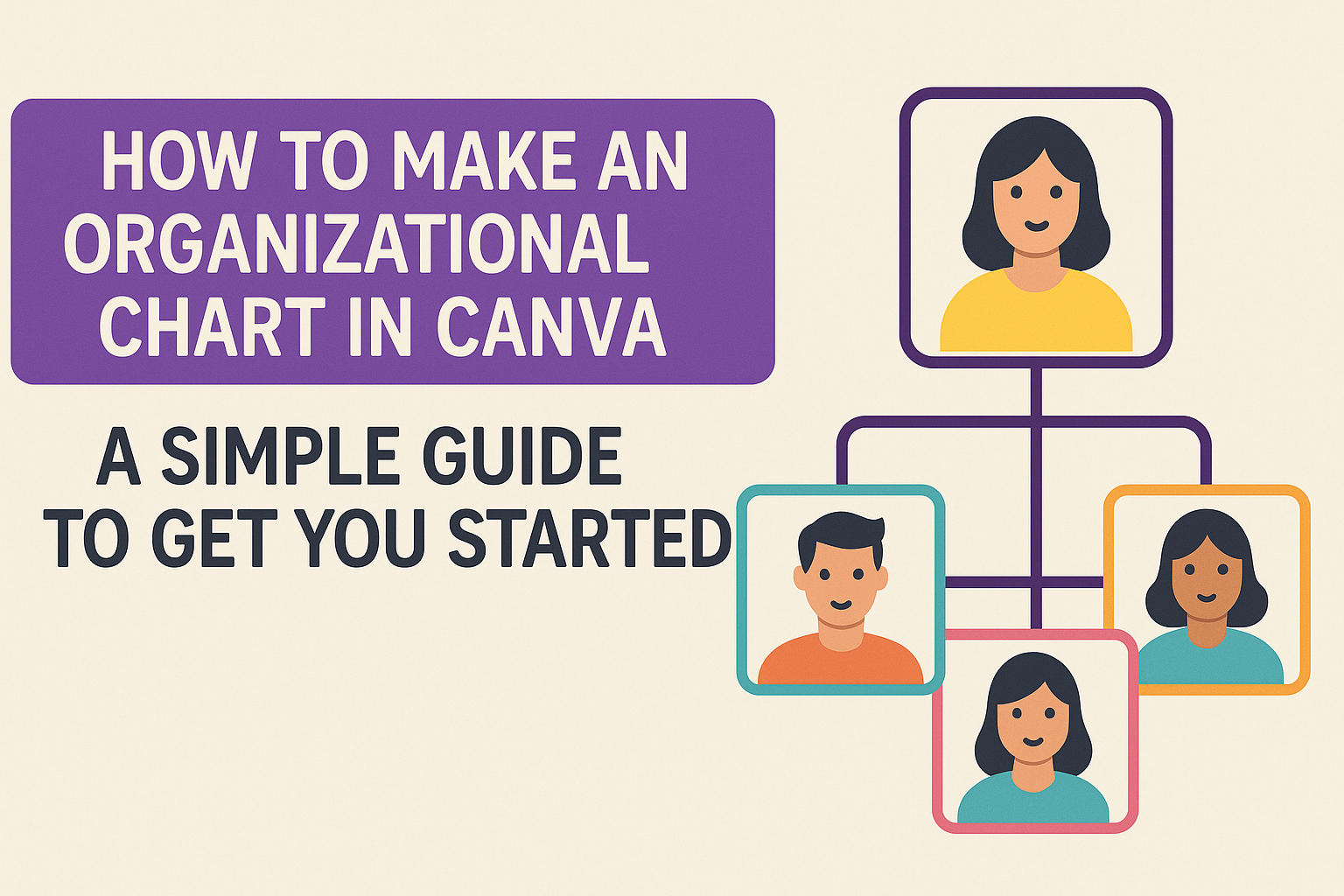
Understanding Organizational Charts
Organizational charts are essential tools in visualizing a company’s structure. They display roles, responsibilities, and relationships in a clear and concise manner.
Below, you’ll find explanations of their purpose and main components.
The Purpose of Organizational Charts
Organizational charts help in understanding the structure of a company. They offer a clear representation of the hierarchy, showing who reports to whom. This clarifies responsibilities and helps new employees understand their team and role quickly.
These charts are also valuable for planning. Companies can use them to restructure teams, identify gaps, and improve efficiency. They play a key role in managing growth, as they help monitor organizational complexity.
Another important use is in performance management. By clearly defining roles, employees can better understand expectations, leading to improved accountability and productivity. They are practical tools that simplify the organization’s internal functions.
Key Components of an Organizational Chart
An organizational chart includes several key components.
First, simple text boxes represent each role or employee, making it easy to see who fills each position. Names, roles, and functions are usually included within these boxes.
Connecting lines illustrate reporting relationships, showing the flow of communication and authority. This helps in identifying decision-makers and understanding the chain of command.
Different styles are available, such as hierarchical, matrix, or flat charts. The choice depends on the company’s structure and needs. Hierarchical charts are common for traditional organizations, while matrix charts can suit companies with multiple reporting lines.
Visual elements like colors and fonts enhance readability and provide a more appealing presentation. This customization aids in emphasizing particular sections or departments.
Getting Started with Canva
To create an organizational chart in Canva, you first need to sign up for an account and familiarize yourself with the Canva dashboard. This will help you easily access and use Canva’s tools for designing charts.
Signing Up for an Account
Signing up for Canva is simple and quick. Start by visiting the Canva website. On the homepage, look for the “Sign Up” or “Get Started” button. Click it to open the signup form.
Users can sign up with an email address or a Google account. Choosing the Google option allows for faster registration as it uses existing Google credentials.
After signing up, Canva may send a confirmation email to verify the email address used during registration.
Once the account is confirmed, users are asked to provide some basic information about their design needs. This helps Canva tailor the dashboard experience. Completing this step ensures access to useful templates and tools suited for creating organizational charts.
Navigating the Canva Dashboard
After signing in, users land on the Canva dashboard. This is the central hub where all design projects are managed. The layout is user-friendly. It features a left sidebar with tabs like “Home,” “Projects,” and “Templates.”
To begin a new project, click on the “Create a Design” button. This opens a dropdown menu with various options, including templates for organization charts. The search bar at the top is useful for quickly finding specific templates.
The main area showcases recent designs and recommended templates. Users can click on any of these to continue editing or start a new design. Familiarity with these features helps users efficiently create professional organizational charts.
Creating Your First Organizational Chart
Getting started with an organizational chart in Canva is simple and straightforward. Begin by selecting the right template, customize it to match your needs, and then add the necessary text. Each step is crucial to ensure the chart effectively represents your organization’s structure.
Choosing the Right Template
Choosing a template in Canva is an essential first step in creating an organizational chart. Canva offers a wide variety of templates tailored to different needs, making it easy to start.
Users can browse templates by industry or style, such as modern or classic designs.
When picking a template, consider the size of the organization it needs to represent. Smaller businesses might prefer a simple chart with fewer levels, while larger companies might need more detailed templates.
Selecting a template that closely matches the company’s structure is helpful, minimizing time spent customizing it later.
It’s also essential to consider color schemes and fonts. Choose ones that align with your brand identity for consistency. If you need some inspiration, Canva provides templates like the Neutral Beige Minimalist chart, which is versatile and easy to adapt.
Customizing the Template
After selecting a template, personalization is key. Canva’s drag-and-drop interface makes it simple to adjust templates. Users can reposition elements easily, ensuring that the hierarchy is clear and accurate.
Colors, fonts, and shapes can be changed to better fit an organization’s branding. This customization helps make the chart unique and professional looking.
Emphasizing certain structures or individuals by altering their text size or color can also enhance clarity.
Icons and images can be added to provide more visual appeal. These features are particularly useful for representing different departments or roles vividly. Overall, customization ensures the chart is not only informative but also visually engaging.
Adding and Editing Text
Text plays a vital role in an organizational chart, clearly identifying each position and person. Canva makes it easy to add names, roles, and other relevant details by double-clicking on text boxes.
Ensure that the text is concise yet comprehensive enough to convey critical information. Users can adjust font size, style, and alignment for better readability.
Use bold or italic styles to emphasize specific roles or hierarchy levels.
Spell-checking is crucial to avoid errors in names or titles, as accuracy reflects professionalism.
Use Canva’s sharing feature to collaborate with team members for accuracy and completeness. More tips on sharing can be found in this tutorial.
Designing for Clarity
When creating an organizational chart in Canva, designing for clarity is key. This involves careful choices about fonts, colors, lines, and shapes to ensure the information is easy to understand and visually appealing.
Thoughtful design choices help the viewer quickly grasp relationships and hierarchies within the organization.
Selecting Fonts and Colors
Choosing clear, legible fonts and harmonious color schemes enhances readability. Fonts should generally be simple and professional; sans-serif fonts are often a good choice.
It’s important to maintain consistency by using the same font style across the chart.
Colors can highlight different sections or roles. Contrast is critical; ensure text stands out from backgrounds.
A consistent color theme helps reinforce the structure and importance within the chart. Avoid using too many bright colors, as they can become overwhelming. Instead, opt for a neutral base with a few accent colors to guide the eye.
Using Lines and Shapes Effectively
Lines and shapes are vital for showing connections and hierarchies. Use straight lines to connect roles clearly and avoid overly curved or decorative lines, which can distract.
Arrows can indicate direction or flow but should be used sparingly.
Shapes such as rectangles for roles and ellipses for departments can help organize information. Consistent size and spacing keep the chart clean and easy to navigate. Ensure shapes are evenly aligned to avoid clutter, which can confuse viewers. Small design adjustments like these can make a significant difference in how well the chart communicates.
Collaboration and Sharing
In Canva, collaboration and sharing are made simple with accessible features. Whether inviting team members to join a project or sharing the finished chart, Canva provides tools to streamline communication and enhance teamwork.
Inviting Team Members
To collaborate on a project, users can invite team members directly through Canva’s platform.
By clicking the “Share” button at the top right of the editor, users can enter email addresses of colleagues they want to invite.
This feature allows members to edit the chart together or offer feedback. It’s a useful way to ensure everyone is on the same page and each role is correctly represented.
Permissions can also be managed by the design owner, allowing them to control who can edit or just view the project.
Including multiple perspectives ensures that the organizational chart meets everyone’s needs. This collaborative step helps in accurately depicting the structure of an organization while also being a user-friendly way to gather input.
Sharing and Exporting Your Chart
Once the chart is ready, it’s time to share or export it. Canva provides several options for exporting designs, including direct download, email, and social media sharing.
The chart can be downloaded as a PDF, PNG, or JPEG, depending on the user’s needs and the platform for which the chart is intended.
For broader sharing, Canva offers a collaboration link. By selecting “Anyone with the link,” users can choose whether others may edit, view, or simply comment on the chart.
This is especially useful for getting feedback from stakeholders or sharing in presentations without needing team members to be on the platform.
Such flexibility ensures that the chart reaches the right audience, while also keeping control over who can alter the design. This makes collaborating on organizational charts easy and effective for teams of all sizes.
Tips and Best Practices
Creating an effective organizational chart in Canva requires attention to detail and regular updates. Balancing hierarchy and staying updated will ensure the chart serves its purpose and remains accurate.
Maintaining Hierarchical Balance
An organizational chart should clearly represent the structure of the organization. It’s important to distribute roles in a way that reflects actual reporting relationships.
Balanced spacing is key; avoid clutter by ensuring there is enough space between text boxes.
Use simple lines to connect positions. This keeps the chart tidy and easy to read.
Color coding can also be useful. It helps differentiate departments or teams, making the chart more intuitive.
Additionally, limit the levels in your chart to prevent overcrowding. This helps focus on core hierarchies without excess detail.
Updating Your Chart Regularly
An organizational chart should be a dynamic tool, adjusted as changes occur within the company.
Regular updates ensure accuracy and reflect evolving structures. They also help new employees understand roles.
Make it a practice to revise the chart whenever there’s a change in staff or roles.
Using Canva’s collaboration feature can streamline updates. Team members can directly input changes, keeping the chart current.
Consider scheduling periodic reviews to ensure nothing is overlooked.
Consistent updates will maximize the chart’s usefulness.