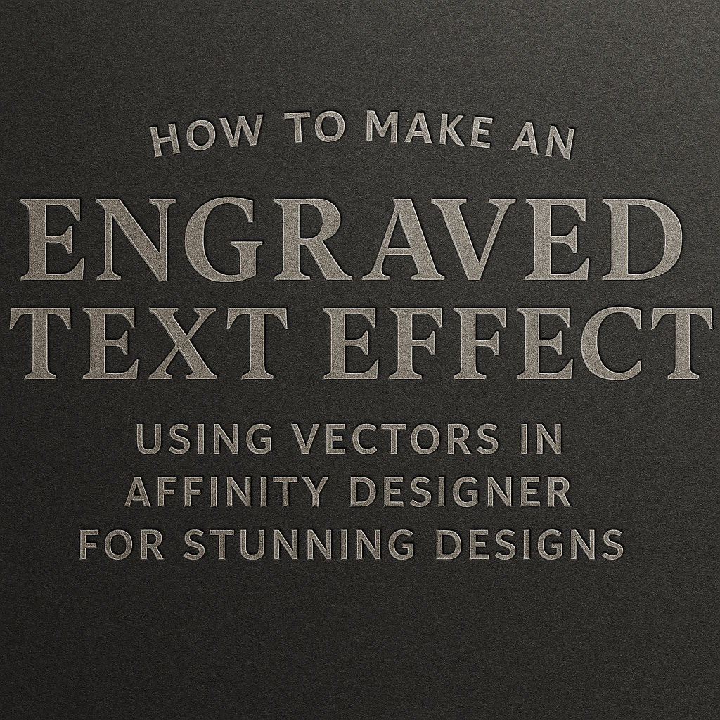
Creating stunning graphics can be a fun and rewarding experience. One popular technique is the engraved text effect, which adds depth and texture to any design.
In this article, readers will learn how to make this eye-catching effect using vectors in Affinity Designer.
Affinity Designer offers powerful tools that make it easier to achieve professional results. By following simple steps, anyone can transform basic text into engraved masterpieces that stand out.
With this guide, he or she will gain the skills to enhance their designs and impress others.
Whether for a personal project or professional work, mastering the engraved text effect can elevate any graphic. Dive into the process and discover how to create beautiful, lasting designs that capture attention and spark creativity.
Getting Started with Affinity Designer
Affinity Designer is a powerful tool for creating vector graphics.
Knowing the interface and how to set up your document is essential for creating engraved text effects. This section will help in navigating the software and preparing for design work.
Understanding the Affinity Designer Interface
The interface in Affinity Designer is designed to be user-friendly.
On the left side, there is a Toolbar with various tools like the Pen Tool, Shape Tool, and Text Tool. These tools allow users to create and manipulate vector graphics effectively.
On the right side, the Panels include Layers, Swatches, and Styles. The Layers panel is crucial for organizing different elements of a design. Users can easily toggle visibility and order of elements here.
At the top, the Menu Bar gives access to file options, editing tools, and view settings. Familiarizing oneself with these elements can significantly enhance productivity while working on projects.
Setting Up Your Document for Vector Work
Before starting any project, it’s important to set up the document correctly.
Begin by selecting New Document from the File menu. Choose the desired dimensions based on your project needs.
Next, set the DPI (dots per inch) to 300 if the design is intended for print. For web designs, 72 DPI is sufficient.
Users should also select the Color Format. RGB is ideal for screens, while CMYK is better for print projects.
Finally, ensure to work in the Vector format. This will keep your designs sharp and scalable.
Starting with these settings helps in creating crisp and clean graphics that can be adjusted without losing quality.
Creating the Base for Your Engraved Text
Before starting the engraving effect, it’s essential to set the foundation. This includes adding text to the canvas and converting it into curves for precise editing. These steps will ensure that the text can be manipulated correctly to achieve the desired engraved look.
Adding Text to Your Canvas
To begin, the user opens Affinity Designer and creates a new document. They should select the Text Tool from the toolbar and click anywhere on the canvas. After that, they can type the desired text.
It’s important to choose a font that complements the engraving style. Bold and serif fonts often work well since they have more surface area for effects.
Once the text is entered, the user can adjust the size and position using the Move Tool. This step is crucial to ensure the text is centered and proportionate within the design.
Converting Text into Curves
Next, the text needs to be converted into curves. This step allows for more intricate edits that wouldn’t be possible with standard text.
To do this, the user selects the text layer and goes to the menu.
They can find the option under Layer > Convert to Curves. This action transforms the text into vector shapes, allowing for detailed adjustments.
Once converted, each letter becomes an editable shape. The user can now modify outlines, add details, or adjust the text’s placement. This feature is particularly useful for creating unique, personalized engraving effects.
Applying the Engraved Effect
Creating an engraved text effect in Affinity Designer involves several key steps. It requires layering vectors, adjusting depths and shadows, and fine-tuning the effect to enhance realism. This section will cover how to achieve these techniques effectively.
Layering Vectors for the Engraved Look
To start, it’s essential to create depth through vector layers. The text should be duplicated and positioned slightly above the original layer. This gives the impression of engraving.
- Duplicate the Text: Select the text layer, right-click, and choose “Duplicate.”
- Adjust Position: Move the duplicated layer slightly upwards using the Move Tool.
- Apply Color: Use a darker shade for the duplicated text to mimic the shadow cast by engraving.
This layering creates a sense of depth. The user can add a rectangle behind the text to enhance the effect. Changing the rectangle’s color helps it blend with the background, making the text appear engraved.
Adjusting Depths and Shadows
Next, adjusting depths and shadows is crucial in achieving a realistic engraved effect. The user can manipulate the text-shadow settings to add dimension.
- Select the Text Layer: Click on the text layer to access its properties.
- Text Shadow Settings: In the Effect panel, enable the “Text Shadow” option.
- Customize Settings: Adjust the blur, distance, and color to create a shadow that complements the engraving.
Fine-tuning these elements will provide a more authentic appearance. The user can use darker shadows to create a deeper effect and lighter shadows for a subtler look. Experimentation will lead to the best results.
Fine-Tuning for Realism
Finally, fine-tuning the engraved effect will enhance its realism. This involves adjusting the overall design for a polished finish.
- Add Texture: Applying a texture layer over the engraved text can simulate a carved look.
- Masking: Use a mask to blend the texture with the text smoothly.
- Final Adjustments: Make slight tweaks to colors, shadows, and positions as needed.
These finishing touches ensure that the engraved effect looks professional. Utilizing various layer modes can also help in achieving unique results. The user should regularly step back to see how the design appears overall.
Final Touches and Exporting Your Design
When completing an engraved text effect, it’s essential to finalize the design with color adjustments and prepare it for export. These steps enhance the overall look and ensure the design is ready for its intended use.
Color Enhancements and Contrast Adjustments
To make the engraved text stand out, color enhancements are crucial.
He can start by selecting the text layer and adjusting the hue and saturation in the color panel. Adding a slight drop shadow or inner shadow can create depth, making the engraving effect pop.
Next, contrast adjustments play a vital role. By increasing contrast, he can emphasize the engraving details.
Using layer effects, like changing the blending mode to multiply, can enrich the texture’s appearance.
It helps to experiment with these settings. For instance, trying different backgrounds will show how the engraved text interacts with various colors. This experimentation ensures the final product is vibrant and visually appealing.
Export Options for Different Uses
Once satisfied with the design, it’s time to export. Affinity Designer offers several formats depending on the end use.
For print projects, exporting as a high-resolution PNG or a PDF is ideal, as these formats maintain quality.
For digital use, like web graphics, a smaller PNG or JPEG file is sufficient. He must consider the resolution; 72 DPI is standard for web, while 300 DPI is ideal for print.
Additionally, using the Export persona allows him to select specific layers to export. This feature is handy if only the engraved text is needed without additional elements.
Choosing the right export options ensures the design looks fantastic wherever it’s displayed.