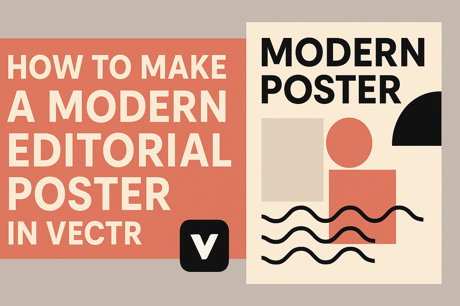
Creating a modern editorial poster can be a fun and rewarding experience.
To make a stunning poster in Vectr, one can start by choosing a clear theme and using basic shapes to define the layout. This tool allows for easy manipulation of elements, making it simple for anyone to craft eye-catching designs.
In the world of digital design, simplicity often leads to elegance. By focusing on clean lines and effective color choices, individuals can make their posters stand out. Vectr’s intuitive interface helps users bring their visions to life without feeling overwhelmed.
Whether designing for a school project or promoting an event, learning how to utilize Vectr effectively is valuable. With the right techniques, anyone can produce a professional-quality poster that captures attention and communicates ideas clearly.
Getting Started with Vectr
Vectr is a user-friendly graphic design tool that allows users to create stunning designs easily. Understanding its interface and setting up a document are crucial first steps to ensure a smooth design process.
Understanding Vectr’s Interface
Vectr’s interface is designed to be intuitive for beginners.
When opening Vectr, users are greeted by the dashboard, which includes the menu bar, side panel, and workspace.
- Menu Bar: Located at the top, it provides options for file management, editing, and viewing.
- Side Panel: This area offers tools like shapes, text, and colors.
Each tool is easy to navigate. To help users, there are also tutorials available directly in the program. This support makes it easier to explore Vectr’s capabilities and unleash creativity.
Setting Up Your Document
Setting up the document properly lays a strong foundation for any design project.
To create a new file, the user should click on Create File in the top left corner of the menu bar.
After clicking, a dialog box appears where the user can choose the page size and dimensions. This includes selecting preset sizes like A4 or custom dimensions.
It’s important to pay attention to the background color during this step, as it can greatly affect the final look. Once the document is set up, the user can start designing right away, making the process efficient and enjoyable.
Design Fundamentals of Editorial Posters
Designing an effective editorial poster requires attention to detail in typography and color. These elements play a crucial role in capturing the viewer’s attention and ensuring the message is clear.
Typography and Readability
Typography greatly impacts how a message is received. Choosing the right font is essential. Clean, sans-serif fonts often work best for modern designs. They are easier to read from a distance.
When working with text, consider size and spacing. Headlines should be bold and stand out, while body text needs to be legible. Line height should be generous to avoid crowding.
Adding contrast between the text and background enhances readability. Dark text on a light background or vice versa often works well. It’s also a good idea to limit the number of fonts used to maintain harmony.
Color Schemes and Contrast
Color schemes can evoke emotions and set the tone for a poster. Using a limited color palette helps create a cohesive look. Complementary colors enhance visual appeal and draw attention to key areas.
Contrast is vital for making text and images pop. A strong contrast between background colors and text can improve legibility. Choose colors that not only look great together but also align with the brand or message.
When selecting colors, consider the psychological effects. For example, blue often conveys trust, while red can evoke excitement. Keeping these factors in mind leads to a more impactful design.
Creating Your Modern Editorial Poster
Designing a modern editorial poster involves thoughtful choices in text, visuals, and layout. Attention to detail can elevate the design and make it stand out to viewers.
Adding and Formatting Text
Choosing the right fonts is crucial. It’s best to stick with 1-2 font families to maintain a clean look. Headings should be bold and clear, grabbing attention right away.
Contrast is also important. Ensure that text colors stand out against background colors. Adjust font sizes to create a hierarchy, so important information is easily readable.
Use short sentences and bullet points where possible. This helps to convey information quickly without overwhelming the reader.
Finally, align text for a neat appearance. Left-aligned text is often easier to read, while centered text can work for titles or slogans.
Incorporating Visual Elements
Visuals can enhance a poster significantly. Start by selecting high-quality images that relate to the message. Original graphics or stock photos can capture interest effectively.
Using icons can clarify complex ideas quickly. Small images that symbolize concepts can be useful. Ensure these visuals are relevant and support the text.
Color choice is important too. Stick with a palette that complements the overall design. A consistent color scheme makes the poster visually appealing and cohesive.
Additionally, make sure that visual elements do not overpower the text. Balance between images and text keeps the design engaging without being cluttered.
Utilizing Grids and Alignment
Grids are helpful for maintaining structure. They provide a guideline for placing text and images evenly across the page. A well-structured layout guides the viewer’s eye.
Alignment plays a key role in professionalism. Use grids to align images and text, creating a polished look. This consistency helps in conveying the message clearly.
Spacing is also significant. Adequate whitespace around elements can improve readability. A cluttered design can confuse viewers, so it’s good to leave some areas open.
In Vectr, use the grid feature to easily adjust elements. Make sure all parts of the poster feel connected through thoughtful placement and alignment.
Exporting and Sharing Your Poster
Exporting your poster in Vectr is a straightforward process. Before sharing, it’s important to consider the best formats and methods for distribution. This ensures that the poster maintains its quality and reaches the intended audience effectively.
Export Options in Vectr
In Vectr, users can choose between different export options. They can export the current page or select specific elements. This choice helps in managing file size and focusing on key parts of the design.
To export a poster:
- Click on the “File” menu.
- Select “Export” and choose the desired format, such as PNG, JPG, or SVG.
- Adjust settings like quality and dimensions if needed.
PNG is great for high-quality images, while SVG works well for scalability without loss of detail. This flexibility allows for better use in various contexts.
Tips for Online Sharing
When sharing the poster online, consider the target audience.
Platforms like social media require different formats than email or websites.
- Image Size: Ensure the image resolution is suitable for the platform.
- Aspect Ratio: Check the preferred size for the specific platform to avoid cropping important elements.
- File Name: Use a descriptive file name that relates to the content for searchability.
Remember to include a link or call to action if sharing on websites.
This encourages viewers to engage further, enhancing the poster’s impact.