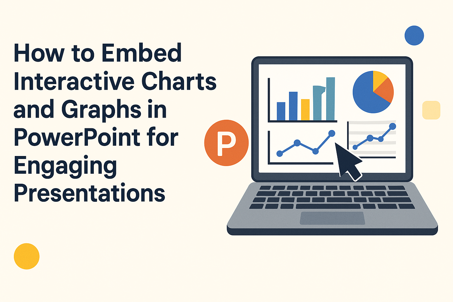
Embedding interactive charts and graphs in PowerPoint can transform a standard presentation into an engaging experience. With the right tools and steps, anyone can seamlessly integrate these dynamic visuals into their slides.
By making data interactive, presenters can capture their audience’s attention and enhance understanding.
There are several methods to achieve this, from using PowerPoint Add-ins to linking charts from Excel. Each approach comes with its own benefits, allowing users to choose what best fits their needs.
Learning how to embed these visual aids can make a significant difference in how information is conveyed.
This article will guide readers through various techniques for embedding interactive charts and graphs. By exploring these options, they will be better equipped to create compelling presentations that leave a lasting impact.
Understanding PowerPoint and Its Capabilities
PowerPoint is a versatile tool that allows users to create dynamic presentations. It offers various features that enhance the way information is presented, making it more engaging and interactive.
Basics of PowerPoint
PowerPoint is designed to help users easily create visual presentations. It uses slides to organize content, which can include text, images, videos, and charts.
Each slide can be customized with different layouts and designs to suit the topic.
Users can choose from various templates or create their own designs. Basic functions like inserting images, changing fonts, and adjusting colors are straightforward.
Features like animations and transitions add excitement to the presentation, helping to captivate the audience’s attention.
Interactive Elements in Presentations
PowerPoint supports interactive elements that encourage audience engagement.
Users can incorporate hyperlinks in slides to navigate to websites or different parts of the presentation. This feature is useful for providing additional resources or references without cluttering the slides.
Adding interactive charts and graphs helps in visualizing data effectively. Users can use add-ins like Datawrapper for seamless integration.
These tools enable real-time interaction, keeping the audience involved and allowing them to explore information on their own.
Types of Interactive Charts and Graphs
Interactive charts and graphs can effectively present data. They engage the audience and allow for deeper exploration of information. Here are some popular types of interactive charts and graphs.
Column and Bar Charts
Column and bar charts are great for comparing different categories. Column charts display vertical bars, while bar charts use horizontal bars. Both types allow viewers to see the size of each category easily.
Interactivity enhances these charts. Users can hover over bars to see exact values or trends. This feature helps audiences understand the data at a glance.
Common uses include displaying sales data, survey results, or performance metrics. Overall, column and bar charts offer clear visibility while enabling user engagement with the content.
Line and Area Charts
Line and area charts track changes over time, making them popular for showing trends. A line chart uses points connected by lines, while an area chart fills the space under the line with color.
These charts allow users to view data dynamically. They can zoom in on specific time periods or hover to get precise values. This interactivity helps audiences understand patterns and fluctuations.
Line and area charts are often used in financial reports, weather data, or website traffic analysis. Their visual simplicity and interactive features help effectively communicate time-based data to viewers.
Pie and Doughnut Charts
Pie and doughnut charts show how parts make up a whole. A pie chart displays slices from a circle, whereas a doughnut chart has a hole in the middle. Both formats can effectively represent percentage distribution.
With interactive options, users can click on segments to see detailed information. This could include figures or additional breakdowns. Such features make data more digestible and engaging.
These charts are widely used in surveys, demographic studies, and market research. They visually illustrate proportions, allowing audiences to grasp the data quickly and easily.
Custom Interactive Elements
Custom interactive elements add unique features to charts and graphs. These can include pop-up annotations, clickable icons, or animated transitions.
With tools like Plotly or Datawrapper, users can create tailored experiences. For instance, viewers can explore different dimensions of data by clicking on the graph.
Custom interactive elements are perfect for presentations or marketing materials. They create vibrant visuals, making data not only informative but also enjoyable to explore.
Creating Charts and Graphs Within PowerPoint
PowerPoint provides a simple way to create charts and graphs. Users can access various tools to design, customize, and input their data effectively and efficiently. Each option helps to visually enhance presentations.
Using PowerPoint’s Chart Tools
PowerPoint’s built-in chart tools allow users to create different types of charts quickly. To begin, they can click on the “Insert” tab and select “Chart.” This opens a dialog box featuring options like pie, line, bar, and column charts.
After choosing a chart type, the software generates a sample chart and opens an Excel sheet for data input.
Users can easily replace sample data with their own numbers. This integration helps in visualizing the data without needing to switch between different applications.
Customizing Design and Layout
Customization is key when making charts stand out. After creating a chart, users can click on it to access chart design options. They can change colors, styles, and layouts via the “Chart Tools” design tab.
For instance, changing color schemes can help match the presentation’s theme. Additionally, users can add chart titles, labels, and legends to clarify the presented information. This flexibility ensures that the charts are not only informative but also visually appealing.
Incorporating Data
Incorporating accurate data is critical for creating effective charts. Users can input data directly into the Excel sheet that opens with the chart or link to external data sources.
When entering data, they should ensure that it is clear and concise. Organizing data in rows and columns helps PowerPoint recognize the correct values.
Once the information is entered, users can see real-time updates on their charts, making adjustments as necessary. This helps in keeping the charts relevant and up-to-date.
Embedding External Interactive Elements
Embedding external interactive elements can enhance presentations by allowing viewers to engage with data directly. Two main ways to achieve this are through Excel and various third-party tools, offering flexibility in creating dynamic content.
Embedding from Excel
To embed charts from Excel, users start by creating their desired chart within the Excel application.
Once the chart is ready, they must select it and copy it using Ctrl+C or right-click and choose the copy option.
Next, they open PowerPoint and navigate to the slide where the chart will be embedded. By using Ctrl+V to paste, a menu will appear offering different options.
Choosing “Embed” ensures the chart remains interactive. This way, any updates made in Excel can reflect in PowerPoint.
Users can also double-click the chart to edit data directly, making it a seamless experience for viewing and interacting with the data.
Using Third-Party Tools
Several third-party tools provide excellent options for embedding interactive charts and graphs into PowerPoint. Tools like Datawrapper or Plotly allow users to create visualizations online and then embed them into their presentations.
To use these tools, users typically sign up for an account and create their visualizations.
Once completed, they can obtain an embed code.
In PowerPoint, they can add a Web Viewer add-in from the Insert tab. After selecting the add-in, they can paste the embed code into the designated area.
This integration allows for interactive features, such as tooltips or filters, making presentations more engaging and informative for viewers.
Interactive Features in PowerPoint
PowerPoint offers various interactive features that enhance presentations. These tools allow users to engage the audience and make information more dynamic. Below are some key features that can be easily implemented.
Hyperlinks and Action Buttons
Hyperlinks are a great way to direct the audience to relevant content within a presentation or to external resources.
When creating a hyperlink, a user can select text or an object, right-click, and then choose “Link.” This creates a connection to a specific slide, a website, or even an email address.
Action buttons are another useful feature. These are pre-designed shapes that trigger a specific action when clicked.
For example, they can navigate to the next slide, play a sound, or even run a program. Using action buttons effectively can give presentations a more interactive feel, making the viewer’s experience more engaging.
Trigger Animations
Trigger animations allow specific animations to start when an action occurs. This means the audience can focus on important information as they interact with the presentation.
A user can select an object and set it as a trigger for another animation.
For instance, clicking on a chart can reveal further details or data. This method keeps the presentation controlled and tailored to the audience’s pace, ensuring key points do not get overlooked. It also makes the visuals more compelling and easy to follow.
Hover-Over Effects
Hover-over effects can make presentations more interactive and fun. When a user hovers over an object, text can appear, adding more information without cluttering the slide.
To create this effect, a user can utilize the “Format Object” options. By selecting “Mouse Over,” additional content can be shown on demand.
This way, the audience can explore more if they are interested, enhancing their understanding without overwhelming them. This feature is particularly useful for detailed charts or visuals where extra context is beneficial.
Design Tips for Interactive Presentations
Creating engaging interactive presentations is crucial for keeping the audience interested. Specific design choices can enhance understanding and retention. Here are some important tips to consider.
Understanding Audience Engagement
Interactive presentations should focus on audience involvement. Start by asking questions related to the topic. This encourages participation and helps gauge understanding.
Using polls or quizzes can also spark interest. Tools like Kahoot or Mentimeter make it easy to gather real-time feedback.
Incorporating stories or real-life examples can connect with the audience. This makes content more relatable. When people see themselves in the narrative, they are more likely to engage.
Color and Contrast
Choosing the right colors greatly affects visibility and mood. High contrast between text and background makes information easy to read. For example, dark text on a light background usually works well.
Colors can also evoke emotions. Blue often conveys trust, while red can grab attention. Therefore, think carefully about the message behind each color used.
Additionally, limit the color palette to three or four main colors. This prevents overwhelming the audience. Consistency across slides creates a smoother experience.
Simplicity and Readability
Keeping slides simple helps focus attention on key messages. Each slide should contain one main idea. This makes it easier for the audience to follow along.
Use bullet points for clarity. Short, concise sentences allow for quick comprehension. Aim for no more than six lines of text per slide.
Avoid cluttering slides with images or text. White space is beneficial; it gives viewers a break and enhances focus. Lastly, choose legible fonts that are easy to read from a distance.
Testing and Troubleshooting
Testing and troubleshooting are vital steps to ensure that interactive charts and graphs function correctly in PowerPoint. This section highlights how to preview features and identify potential issues for a seamless presentation.
Previewing Interactive Features
Before finalizing a presentation, it’s essential to preview the interactive elements in the chart or graph. This can be done by entering presentation mode or using the slideshow view in PowerPoint.
During this mode, users should click through the interactive features to ensure they respond correctly.
Pay attention to how the charts react to user interactions. Ensure tooltips, filters, or clickable areas function as intended.
If something doesn’t work, it may have been set up incorrectly. Catching issues early makes it easier to adjust the embedded elements before presenting.
Identifying Potential Issues
Sometimes, interactive charts may not work as expected. Various issues can arise, such as links not connecting or display problems.
Start by checking the internet connection. If the chart relies on web data, a stable connection is crucial.
Another common problem is incorrect URLs when embedding. Double-check that the URL entered matches the specific chart ID.
For example, a misspelled URL could lead to a broken link, which halts interactivity. Keeping a checklist of these potential pitfalls can save time and stress during presentations.
Best Practices for Presentation Design
Good presentation design helps the audience stay focused and understand the message. Here are some best practices:
-
Keep it Simple: Avoid cluttered slides. Use only essential elements to convey the message.
-
Use High-Quality Visuals: Clear and sharp images, charts, and graphs can enhance understanding. Blurry visuals can distract the audience.
-
Consistent Formatting: Use the same font styles and colors throughout the presentation. This creates a cohesive look.
-
Readable Text: Choose easy-to-read fonts. A size of at least 24 points for text is a good rule.
-
Limit Text: Use bullet points to summarize key ideas. Too much text can overwhelm the audience.
When embedding interactive charts:
-
Choose Relevant Data: Make sure the data presented is directly related to the topic. This keeps the audience engaged.
-
Interactive Features: Allow users to manipulate data. This can lead to a better understanding of the information.
-
Test Before Presenting: Ensure that all elements work smoothly. This avoids technical issues during the presentation.