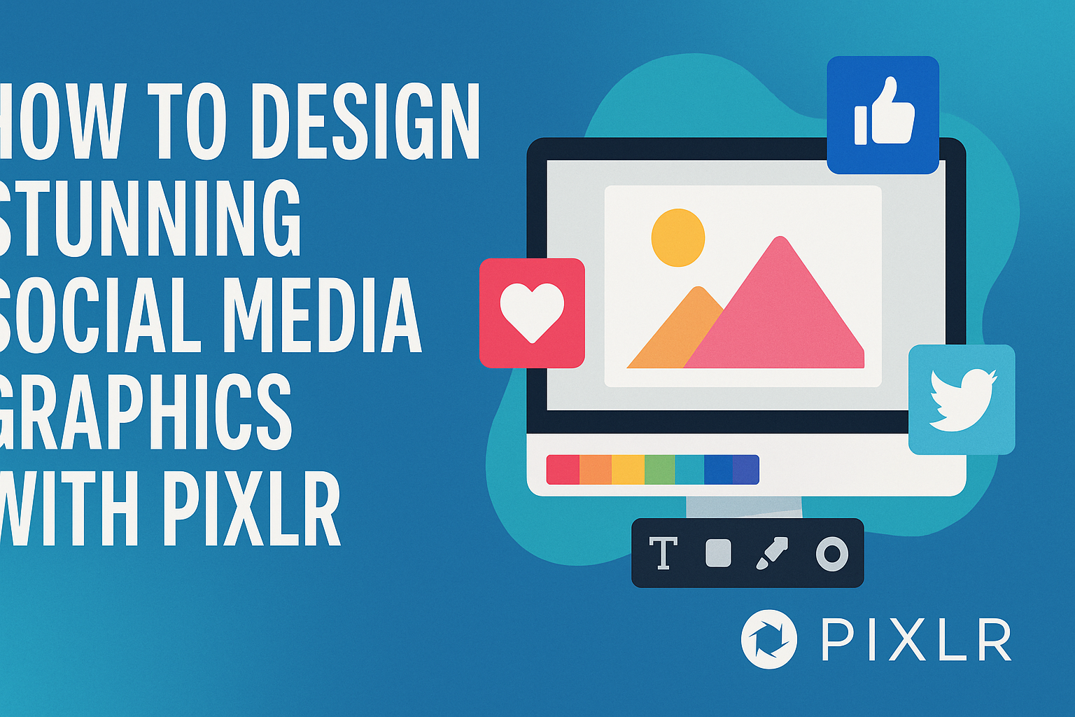
Creating eye-catching social media graphics is vital for standing out in a crowded digital space.
With Pixlr, anyone can easily design stunning visuals that capture attention and enhance their brand’s message. This user-friendly tool offers a range of features that help even the most inexperienced designer create professional graphics in no time.
Whether it’s for a business promotion or a personal project, the right design can make a significant impact.
Pixlr provides numerous templates and customization options, allowing users to maintain a cohesive look across all posts. This ensures every graphic aligns perfectly with their branding goals while engaging their audience effectively.
By using tools like Pixlr, creators can unleash their creativity without needing extensive design skills. From animated posts to vibrant visuals, the possibilities are endless.
This blog post will guide readers through the steps to design stunning social media graphics effortlessly.
Getting Started with Pixlr
Pixlr offers a user-friendly platform for creating attractive social media graphics.
Understanding its interface, setting up your canvas, and selecting the right tools are key steps to get started.
Understanding the Pixlr Interface
When she first opens Pixlr, the interface appears clean and organized. The main workspace displays the canvas where designs come to life.
On the left side, she will find the toolbar with various tools like selection, brush, and text options.
The layers panel on the right helps manage different elements in the design. Understanding how to navigate these panels is essential for smooth workflow. Familiarity with the interface allows her to access tools quickly, making the design process efficient.
Setting Up Your Canvas
Setting the canvas size is a critical first step. To kick off, she should select the appropriate dimensions for the platform she’s designing for.
For example, Instagram posts typically require a square format, while Pinterest uses vertical layouts.
Using the preset templates in Pixlr makes this process easier. Once the right size is chosen, adjusting the background color or adding images becomes straightforward. These initial adjustments lay the groundwork for a successful graphic design.
Choosing the Right Tools for Your Project
Selecting the tools suited for the project is vital.
Pixlr provides a variety of options such as crop, resize, and filter tools, which help enhance images effectively. The text tool is great for adding catchy phrases or calls to action.
Users can also explore creative options like overlays and stickers. Experimenting with these tools allows for unique designs that stand out. Understanding tool functions helps in creating graphics that truly capture attention.
Creating Your Graphic
Designing a social media graphic involves careful choices about fonts, colors, images, and layout. These elements must work together to create a visually appealing and effective design.
Selecting and Using Fonts Effectively
Choosing the right font is essential for clear communication. A good font can set the tone for the message.
For social media, it’s best to select fonts that are easy to read at a glance.
Using a mix of two to three fonts can create interest. For instance, pairing a bold headline font with a simple body font often works well.
Pixlr offers various font choices; he or she can easily browse and select styles that match the graphic’s purpose. Keeping font sizes appropriate for different devices ensures that text remains legible. A common practice is to use larger sizes for headlines and smaller sizes for details.
Incorporating Color Schemes and Gradients
Color plays a significant role in attracting attention. Using a color palette helps create harmony in the design.
It’s smart to limit the palette to three to five colors.
He or she can use tools in Pixlr to create gradients that add depth. Gradients can make a design feel more dynamic and modern.
Understanding color psychology can also enhance a graphic’s impact. For example, blue often conveys trust, while red can create a sense of urgency. Proper contrast between text and background colors is crucial for readability.
Adding Images and Illustrations
Images and illustrations can enhance a graphic’s message or mood. Selecting high-quality visuals is important; blurry or pixelated images can detract from the overall look.
Pixlr provides options to incorporate stock images, or users can upload their own. When adding images, resizing and cropping them appropriately ensures they fit well with other design elements.
Using transparent backgrounds can help images blend seamlessly. He or she can also add illustrations that complement the theme. Icons are effective, too; they quickly communicate ideas without needing words.
Layering and Grouping Elements
Layering design elements creates depth and visual interest. This technique allows for a clear layout where important items stand out.
In Pixlr, users can easily manipulate layers, moving them forward or backward as needed. This helps prioritize which elements should catch the viewer’s eye first.
Grouping similar elements makes it easier to manage complex designs. For example, keeping text close to related images keeps the graphic organized. Using alignment tools in Pixlr can help achieve a clean and professional look.
Fine-Tuning Your Design
Fine-tuning is essential for making social media graphics that look polished and professional. Attention to detail can elevate the design and catch the viewer’s eye. This section covers filters and adjustments, applying effects, and balancing composition.
Using Filters and Adjustments
Filters are a quick way to enhance images. Pixlr offers a variety of filters that can change the mood or theme of a design.
For example, a vintage filter can give a nostalgic feel, while a brightener can make colors pop.
Adjustments such as brightness, contrast, and saturation are also vital. These settings allow for precise changes to make the image stand out.
It’s helpful to experiment with these options to find the perfect balance that fits the brand’s style.
Developing a good understanding of how each filter and adjustment affects the image can lead to better designs. A little tweaking can make an average photo into a striking visual.
Applying Effects for Visual Interest
Adding effects can bring a unique flair to graphics. Effects like shadows, glow, and textures can create depth and dimension.
Pixlr’s effects are user-friendly and can be applied with just a few clicks.
It’s important to use effects judiciously. Overusing them can lead to a cluttered and confusing image.
A subtle shadow can enhance text readability, while a soft texture can add warmth to a background.
Experimenting with different combinations can yield striking results and keep the design fresh and engaging. The key is to find effects that align with the graphic’s purpose and the brand’s image.
Balancing Composition and Negative Space
Good composition makes a design more appealing. Balancing elements within the image ensures it doesn’t feel overcrowded.
Negative space is the area around and between content, and it plays a critical role in design.
Using negative space effectively can draw attention to the focal point. It allows the viewer’s eye to move freely across the image.
Striking a balance between filled space and empty space is crucial for clarity.
Pixlr allows users to easily adjust layouts. Creators should consider how each element interacts within the design. A well-composed graphic is not just beautiful; it’s effective in communicating the intended message.
Exporting and Sharing
After creating stunning graphics in Pixlr, it’s essential for users to know how to export and share their work effectively. This process ensures that the graphics look great across various platforms and reach the intended audience.
Saving Your Work in Different Formats
Pixlr allows users to save their graphics in multiple formats, making it easy to choose the right one for each project. The most common formats include JPEG, PNG, and GIF.
- JPEG is excellent for photos and images with smooth variations in color. It is widely used for most social media graphics.
- PNG is ideal for images that need transparency or require sharper edges. It’s perfect for logos and icons.
- GIF is useful for simple animations or graphics with fewer colors.
To save a graphic, users can click on the “File” menu, select “Save,” and then choose the desired format. This flexibility helps in maintaining the quality and compatibility of graphics across different platforms.
Optimizing Graphics for Different Platforms
Different social media platforms have varying requirements for image dimensions and sizes.
Proper optimization ensures graphics display correctly and look appealing.
- Instagram: Recommended size is 1080 x 1080 pixels for square posts.
- Facebook: A good size is 1200 x 630 pixels for shared images.
- Twitter: The recommended size is 1200 x 675 pixels for tweets.
Users should also pay attention to file sizes.
Keeping graphics under 1MB can help avoid slow loading times.
By adjusting the format and size before sharing, users can enhance visibility and engagement on each platform.