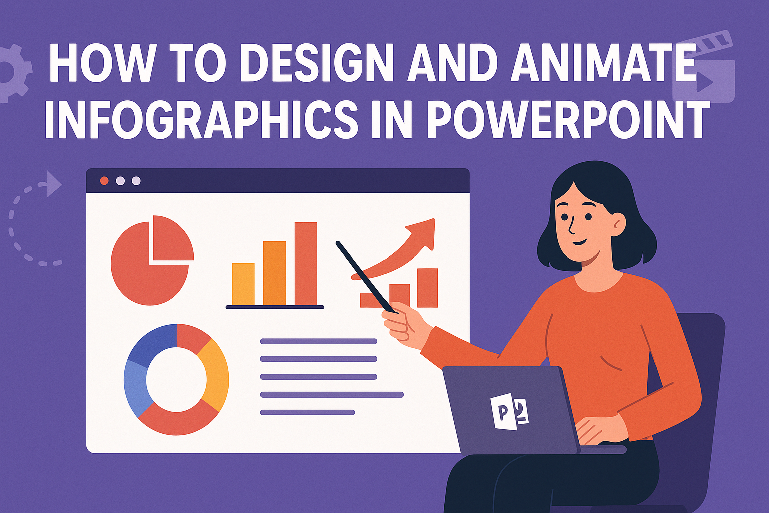
Creating infographics can transform complex information into engaging visuals.
PowerPoint is a powerful tool for designing and animating infographics that captivate audiences.
By using simple shapes, vibrant colors, and clever animations, anyone can make their presentations stand out.
Designing infographics in PowerPoint is easier than it seems. With just a few easy steps, people can learn to arrange data visually and animate it to grab attention.
This process not only conveys information effectively but also keeps viewers interested and informed.
Through this guide, readers will discover techniques to create eye-catching graphics and animations tailored to their needs.
Whether for a school project or a business presentation, mastering these skills can lead to impressive results.
Understanding Infographics
Infographics are powerful tools for visual communication. They help convey complex information quickly and effectively, making data easy to understand.
Definition and Importance
An infographic is a visual representation of information or data. It uses graphics, charts, and icons to present information in a clear and engaging way.
Infographics are important because they simplify complex topics, allowing viewers to grasp information quickly.
People often respond better to visuals than to text. Infographics can enhance learning and retention by presenting facts in a more digestible format.
They are widely used in presentations, reports, and social media to capture attention and share insights.
Types of Infographics
There are several types of infographics, each serving different purposes. Here are a few common types:
- Statistical Infographics: These focus on data and statistics, using charts and graphs to present numbers clearly.
- Informational Infographics: These provide an overview of a specific topic, offering insights and knowledge.
- Timeline Infographics: These illustrate a sequence of events or processes over time, making trends easy to follow.
- Comparison Infographics: These enable users to compare and contrast two or more subjects effectively.
Each type of infographic has its strengths. Choosing the right style depends on the message one wants to communicate.
PowerPoint Basics
Learning how to use PowerPoint is essential for creating and animating infographics. Familiarity with the interface, templates, and customization options will empower anyone to design engaging presentations.
Navigating the Interface
The PowerPoint interface includes several important elements. At the top, the Ribbon contains tabs like Home, Insert, and Design. Each tab has specific tools needed for various tasks.
On the left, the slide pane allows users to see thumbnails of all slides in the presentation. The main workspace shows the active slide, where users can edit content directly.
In the bottom right corner, the status bar displays useful information, such as the slide number and any presentation mode options. Understanding these components helps users navigate PowerPoint efficiently.
Using Templates and Themes
PowerPoint offers many ready-made templates and themes for easy design. Users can access these by clicking on the Design tab.
Choosing a theme sets the overall look and feel of the presentation. Each theme has pre-defined colors, fonts, and effects that match.
Templates provide a structured layout, making it easier to organize information. This is especially useful for infographics, as it ensures a consistent design throughout. Users can also customize templates to fit their content better.
Customizing Slides
Customizing slides adds a personal touch to any presentation.
Users can change backgrounds, fonts, and colors to match their preferences.
To add images or shapes, simply use the Insert tab. Adding charts or icons can enhance visual appeal and convey information more clearly.
Animations can also be applied to text and objects. This feature creates engaging transitions and highlights key points.
Each slide can be tailored for maximum impact, ensuring the audience stays interested.
Design Principles for Infographics
Designing effective infographics in PowerPoint requires a keen understanding of several key principles. These principles help to ensure that the infographic is not only visually appealing but also easy to read and interpret.
Color Theory and Usage
Color plays a vital role in any infographic. It can evoke emotions and attract attention.
When choosing colors, it’s smart to limit the palette to about three to five colors that harmonize well together.
Using contrasting colors can help distinguish different sections and highlight important information. For example, a dark color on a light background improves visibility.
It’s also effective to use colors that align with the brand’s identity, reinforcing brand recognition.
When designing, consider color blindness. Tools are available to test color combinations to make sure everyone can understand the infographic.
Typography and Readability
Typography significantly impacts how information is conveyed.
Selecting the right fonts is crucial; they should be clear and easy to read. Sans-serif fonts like Arial or Helvetica often work best for digital content.
It’s advisable to use a maximum of two to three font styles per infographic. This creates a clean look.
Hierarchy is important too. Using bold for headers and lighter styles for body text helps guide the viewer’s eye through the content.
Furthermore, ensuring sufficient space between lines increases readability. Keeping font sizes large enough so that even distant viewers can read the information is essential.
Layout and Composition
The layout of an infographic should guide the viewer’s flow of information. An organized layout helps communicate ideas quickly.
Using grids can be advantageous for maintaining alignment and balance.
Each section should be distinct, with clear headings separating different topics. This helps viewers locate information without confusion.
Adding images or icons can visually break up text while supporting the written content.
White space is another key element. It prevents clutter and allows the viewer’s eyes to rest.
Balancing visuals with text ensures that the infographic is engaging without overwhelming the audience with information.
Creating Static Infographics
Designing static infographics involves selecting the right elements, visualizing data effectively, and engaging the audience.
This process is essential for conveying information clearly and making a memorable impact.
Selecting Elements and Icons
Choosing the right elements and icons is crucial for any infographic. They should be relevant to the topic and help to illustrate key points.
Icons can simplify complex ideas, making them more digestible.
Here are some tips for selecting elements:
- Use Simple Icons: Icons should be easily recognizable. Avoid overly detailed designs to keep the focus clear.
- Maintain Consistency: Stick to a similar style (line, flat, or 3D) for coherence.
- Color Choices: Choose a limited color palette that aligns with the brand or message.
These choices help create a polished look that captures attention.
Effective Data Visualization
Data visualization is about presenting numbers and statistics in a way that is easy to understand. Good visuals can tell a story quickly.
Consider these techniques:
- Charts and Graphs: Use bar charts, pie charts, and line graphs to present data clearly.
- Highlight Key Figures: Bold or enlarge important numbers to draw attention.
- Avoid Clutter: Too much information can confuse viewers. Focus on the most pertinent data points.
These strategies can enhance comprehension and retention of the information.
Designing for Audience Engagement
Engaging the audience is vital in designing infographics. The goal is to retain attention and encourage interaction.
Here are effective design principles to follow:
- Balanced Layout: Ensure that text and visuals are well-balanced, guiding the viewer’s eye across the infographic.
- Readable Typography: Choose fonts that are easy to read from a distance. Use varying sizes for emphasis.
- Call to Action: Include a prompt that encourages the audience to learn more, share, or take a specific action.
Implementing these design principles can create a meaningful connection with the audience.
Animating Your Infographics
Animating infographics can make them more engaging and help convey information clearly. Using PowerPoint’s animation features, anyone can add visual interest and emphasize important data.
Animation Basics in PowerPoint
PowerPoint offers different animation options to enhance infographics. The main types of animations are Entrance, Emphasis, Exit, and Motion Paths.
- Entrance animations make elements appear on the slide, like a chart coming in from the left.
- Emphasis animations highlight elements already on the slide, such as changing color or pulse effects.
- Exit animations remove elements smoothly, which can keep the presentation clean.
- Motion Paths allow objects to move along a defined path.
To apply these animations, select the object to animate and go to the Animations tab. Choose from the gallery, or click Add Animation for more options.
Using these basics can greatly improve the visual flow.
Animating Charts and Graphs
Charts and graphs can effectively display data, and animating them brings the numbers to life.
To animate a chart, select it, then go to the Animations tab.
- Choose an Entrance animation like Fade or Wipe.
- Adjust the animation sequence to control the order in which elements appear.
- Use Chart Animation options to animate each series separately or all at once.
This approach helps the audience focus on specific data points. For example, revealing one section of a pie chart at a time can create suspense and better understanding.
Transitions and Motion Paths
Transitions are the effects that occur when moving from one slide to another, while motion paths let you animate objects throughout a single slide.
To add transitions, go to the Transitions tab. Choose from options like Fade, Push, or Zoom. Set the duration for each transition to control the pace.
For motion paths, select an object, go to the Animations tab, and select Add Animation. Choose from the motion path options.
Adjust the path length and directions to make the movement more dynamic. This adds energy and helps retain the audience’s attention.
Finalizing Your Project
Before wrapping up a project, it’s essential to focus on key areas that enhance the quality and presentation of the infographic. This includes reviewing and editing content, exploring exporting options, and preparing for sharing and presenting.
Review and Edit
Careful review is crucial for any project.
Start by checking for errors in text, visuals, and animations. Look for spelling or grammar mistakes, as these can distract from the overall message.
Next, evaluate the flow of information. Ensure that the sequence is logical and that all components work together.
It may help to have someone else review the work for fresh insights.
Lastly, double-check your animations. They should enhance the message without overwhelming the audience. Adjust timing and effects as needed for a smooth presentation.
Exporting Options
When finished, it’s time to export the project.
PowerPoint offers several formats for exporting. The most common format is PowerPoint Presentation (PPTX), but consider exporting as a PDF for easy sharing with others.
If animations are essential, it’s best to save it as a video file. Choose formats like MP4 or WMV to keep the animated effects intact.
Checking the export settings is important to ensure high quality and compatibility with different devices.
Sharing and Presentation Tips
Sharing the project effectively enhances its impact. Start by choosing the right platform.
Email, cloud storage, or presentation software can facilitate sharing.
During the presentation, consider engaging the audience. Use clear visuals and practice the delivery to maintain interest.
Adjust the environment for the best viewing experience. Ensure that the room is well-lit and that the technology works smoothly.
Preparing in advance makes the presentation more professional and enjoyable.