GIMP is a powerful tool that lets users create stunning website mockups without spending a dime. With its range of features, GIMP offers flexibility to craft detailed designs that can bring any website concept to life. The software’s photo manipulation capabilities make it a favorite among designers who need to visualize their ideas quickly.
Designing a website mockup involves using GIMP to integrate elements like logos, headers, and buttons into a cohesive layout. Websites can benefit from elements like the gold foil business card or embroidered hat mockups as seen in projects shared on platforms like Logos By Nick. These resources help designers add flair to their projects easily.
For those new to GIMP, video guides on platforms like YouTube demonstrate step-by-step processes to design website layouts effectively. These tutorials are an excellent way to learn how to manipulate and arrange visual elements creatively, making website mockup creation accessible to everyone.
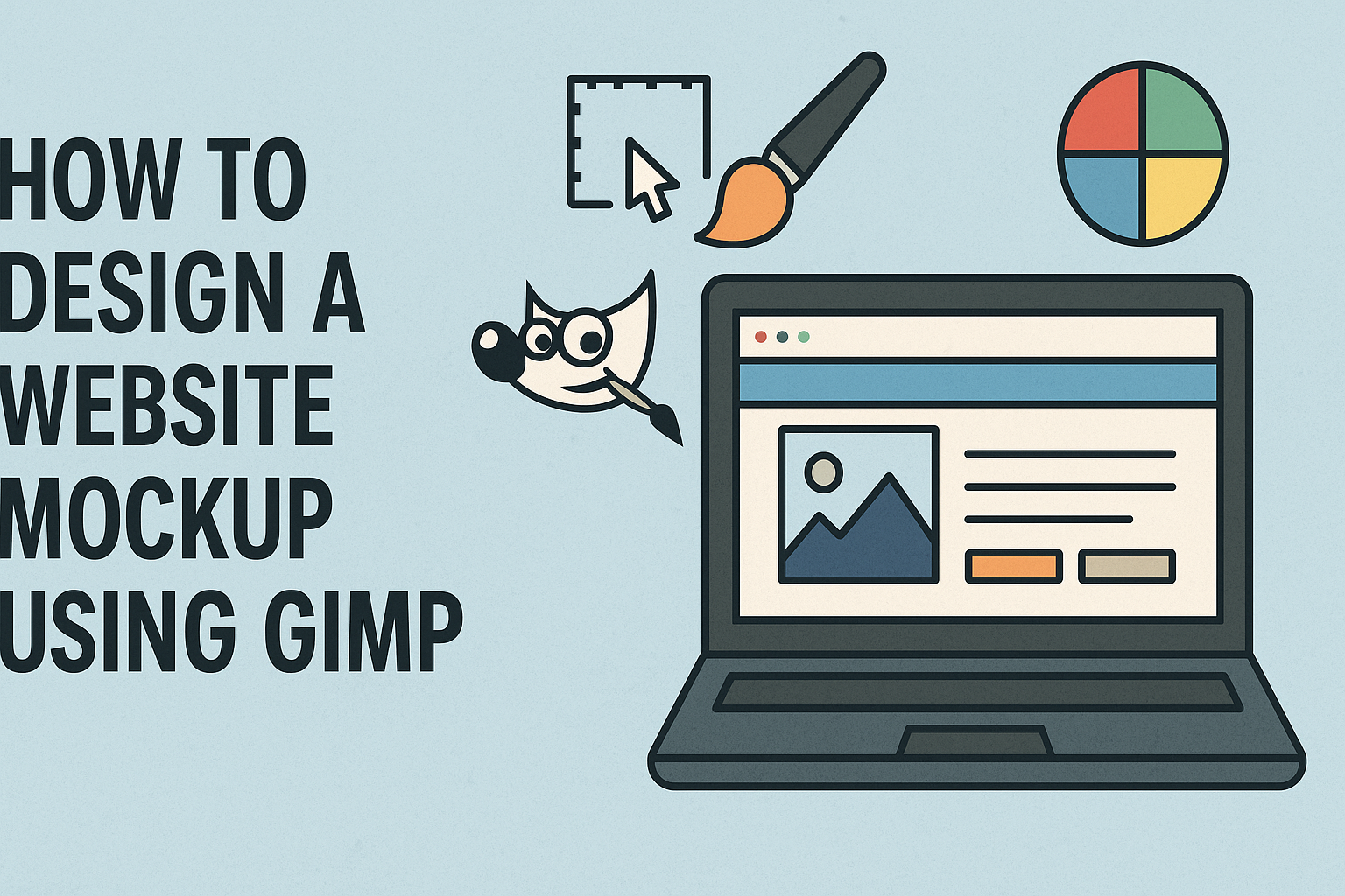
Understanding GIMP for Web Design
GIMP is a free and open-source image editor used widely for web design projects. It offers numerous features that make it an effective tool for creating website mockups.
What Is GIMP?
GIMP, or GNU Image Manipulation Program, is software used for editing images. It is known for its flexibility and wide range of features that are ideal for graphic design, such as layers, filters, and customizable brushes. GIMP is available for various operating systems, including Windows, macOS, and Linux, making it accessible for many users.
The software supports numerous file formats, allowing easy import and export of images. This compatibility is useful for web designers when transitioning between different design tools or platforms. GIMP’s community also provides a wealth of tutorials and plugins, which help in learning new techniques or extending the software’s capabilities. For beginners, this support system can make the learning curve more manageable, allowing them to quickly start designing.
Advantages of Using GIMP
One of the main advantages of GIMP is that it is free, eliminating cost barriers. This makes it an attractive option for small businesses or individuals starting in web design. Despite being free, it offers powerful features comparable to paid software like Adobe Photoshop.
GIMP’s open-source nature means developers can customize its code, adapting the software to specific needs. Numerous plugins are available that can extend its functionalities, catering to specialized tasks in web design. The software’s interface is straightforward, with features like drag-and-drop support, making it easy for users to navigate and use.
Its low resource requirement ensures it runs smoothly on older hardware, which is beneficial for users without high-end systems. The combination of powerful features, accessibility, and cost-effectiveness makes GIMP an excellent choice for web designers.
Setting Up Your Workspace
Before starting with a website design in GIMP, setting up the workspace efficiently can make the process smoother. Customizing the interface, arranging panels, and setting the preferences are key steps to streamline your workflow.
Customizing the Interface
A personalized interface can improve productivity. In GIMP, users can adjust the layout by dragging and docking tools and tabs to make frequently used items easily accessible. The toolbar and dockable dialogs can be rearranged to fit individual preferences.
Turning on the Single-Window Mode can be beneficial for those who prefer a consolidated view. This option is available under the “Windows” menu. It merges all separate windows into one, which can reduce distractions and make navigation simpler.
Working with Panels
Panels in GIMP provide access to layers, brushes, colors, and more. Organizing these panels can make it easier to find what you need quickly. Layers are crucial in web design, so positioning the Layers panel prominently can be helpful.
Users can open or close panels by going to “Windows” -> “Dockable Dialogs.” This allows adding new panels or removing unnecessary ones. Frequently used panels like Brushes or Tool Options should be kept open. This setup ensures that essential tools are always within reach.
Setting Preferences for Web Design
Adjusting preferences helps tailor GIMP to better fit web design needs. Under “Edit” -> “Preferences,” users can set the default resolution, which is important for matching display and print settings. A standard resolution for the web is 72 pixels per inch.
Color management is another crucial setting. Ensuring that GIMP displays colors accurately is vital for web design. In the “Color Management” section, users can select an RGB color profile that closely matches online standards.
Keyboard shortcuts can also be customized for efficiency. If a particular tool or function is used frequently, setting up a shortcut can save time. These small adjustments can significantly enhance the user experience in GIMP for designing website mockups.
Beginning Your Web Mockup
Starting a web mockup in GIMP involves setting clear project goals, creating a new workspace, and understanding key layout principles. Familiarity with these steps will make designing an effective mockup more manageable.
Defining the Project Scope
Defining the project scope is crucial before beginning the mockup. This means knowing the purpose of the website, the audience it serves, and any specific features or pages it needs.
It’s helpful to jot down these objectives in a list. For instance, knowing whether the site will have a blog, gallery, or shopping cart can influence the design choices. This step provides clarity and prevents misunderstandings later.
The scope might also include deadlines and resources available, like any existing branding elements that must be incorporated. Having all this information at the start can save time and reduce revisions.
Creating a New Document
Once the scope is clear, creating a new document in GIMP sets the foundation for the mockup. Start by opening GIMP and selecting “New” from the File menu.
Set the document size based on the standard web dimensions, such as 1920×1080 pixels, which is common for desktop designs. GIMP allows for the setting of resolutions and color modes, which should align with the project’s requirements.
It’s important to name the file appropriately, reflecting the project or page, to keep organized. Saving the document frequently as you work will help to avoid losing progress due to unexpected issues.
Understanding Web Layout Basics
Understanding web layout basics is key to creating an effective mockup. Web layouts commonly follow a grid system, which helps in aligning elements systematically. GIMP can display guides and grids to assist with this.
Key elements like headers, footers, navigation bars, and content areas need to be positioned thoughtfully. Familiarity with design principles like balance, contrast, and alignment ensures aesthetic and functional efficiency.
Considering mobile responsiveness is also vital, as designs should adapt well to smaller screens. Planning these aspects early helps in creating a clean and user-friendly web experience that meets the needs of various users.
Design Principles for Web
Designing a website mockup involves several key principles that can guide the creative process. Some important areas are color theory, typography, and responsive design. Each of these elements plays a crucial role in creating an appealing and functional website.
Color Theory
Color can set the mood and evoke emotions. In web design, using the right color palette is essential to attract users and convey the brand’s message. A consistent color scheme helps in maintaining a professional look.
Colors can be divided into primary, secondary, and accent colors. Primary colors establish the main theme, while secondary colors complement them. Accent colors draw attention to specific elements.
Contrast is important. High contrast between text and background improves readability. Accessibility is also crucial, ensuring that color choices accommodate users with visual impairments. Designers often use tools to check color contrast levels.
Typography
Typography is more than just choosing fonts. It involves making text clear and engaging. Selecting the right font style and size ensures the text is legible across all devices.
Hierarchy in typography helps guide users through the content. Titles should stand out with larger fonts, while body text remains simple and easy to read. Consistent use of heading styles strengthens the visual structure.
Font pairing is when designers choose two or more complementary fonts. It adds variety without compromising readability. Many opt for one serif and one sans-serif font to create balance.
Responsive Design
With mobile internet usage on the rise, responsive design is crucial. It ensures that websites look good on all devices, from desktops to smartphones.
Using a fluid grid system helps arrange elements in a way that they adjust automatically to different screen sizes. This approach enhances user experience as content remains accessible and easy to navigate.
Media queries in CSS allow developers to apply different styles based on device characteristics. This helps tailor the layout to various screen sizes and orientations, maintaining usability across devices.
Responsive design is not just about aesthetics. It’s about function and accessibility, making it a key component of modern web design principles.
Crafting the Website Layout
Designing a website mockup using GIMP involves crafting a clear layout that enhances user experience. Key aspects include using grids to maintain structure, managing layers for organization, and incorporating essential UI elements for functionality.
Utilizing Grids
Grids are essential for maintaining a structured and balanced design. They help in aligning elements precisely, ensuring that everything looks neat and professional. Using grids can prevent elements from overlapping and enables a cleaner visual hierarchy.
In GIMP, grids can be set up by navigating to the “View” menu and selecting “Show Grid.” Adjusting the grid size can be done through “Image” > “Configure Grid,” where settings can be changed according to the design requirements. A regular check ensures elements adhere to the desired layout.
Grids not only help in alignment but also guide the designer in dividing the webpage into consistent sections, such as headers, content areas, and footers. This consistency aids in enhancing the user’s navigation experience and maintains aesthetic appeal across different pages.
Managing Layers
Layers in GIMP offer flexibility and control over individual design elements. They allow a designer to edit parts of the mockup independently, making it easier to test different design variations without affecting the entire composition.
By using the Layers panel, designers can manage the visibility, order, and properties of each layer. Naming layers can help keep the workspace organized, making it easier to locate and modify specific elements as needed. Locking important layers can prevent accidental changes while adjustments are made to other parts of the design.
Organizing layers into groups can further streamline the workflow, grouping related elements together, such as text, images, or buttons. This layered approach increases efficiency and enhances the designer’s ability to make precise adjustments.
Incorporating UI Elements
UI elements are critical for creating an interactive and appealing mockup. Incorporating buttons, menus, and icons helps simulate the user’s interaction with the site, providing a realistic preview before development begins.
In GIMP, designers can create or import various UI components. Using tools like the rectangular selection tool, buttons can be crafted, and text can be aligned using the text tool. Icons might be imported from external sources like Flaticon, adding visual flair to the design.
Ensuring these elements are clear and intuitive is crucial. They must guide the user effortlessly through the website. Proper spacing, sizing, and alignment are essential to maintain functionality and aesthetic consistency, which ultimately helps in achieving a successful mockup.
Adding and Editing Text
In GIMP, adding text is a straightforward process. Designers can use the Text tool to place text anywhere on the canvas. They can choose different fonts and sizes to ensure the text aligns with the mockup’s style.
Adjusting the kerning and leading (spacing between letters and lines) enhances readability and visual appeal. Color and style can be altered to match the overall theme. If specific emotions need to be conveyed, experimenting with bold or italic styles works well.
Text layers in GIMP remain editable, allowing for easy updates. Users can also create text along a path for creative effects like curved text or custom shapes. This flexibility is essential for adapting to different design needs and preferences.
Designing Icons and Buttons
Creating icons and buttons requires careful attention to detail. Using GIMP, designers can start by drawing shapes with tools like the Rectangle or Ellipse tool. These basic shapes form the foundation of buttons and icons.
Adding a gradient fill or shadow can make these elements pop, providing a 3D effect. This enhances interactivity, making buttons appear clickable. The use of layers separates different design elements, allowing for non-destructive editing.
To ensure the icons and buttons are clear and effective, use simple and recognizable designs. Keeping icons intuitive helps users navigate the website easily. With GIMP, designers have the freedom to craft unique, functional elements that improve the user experience.
Enhancing User Experience (UX)
The user experience sets the tone for how visitors engage with a website. Key elements, such as navigation, interactivity, and accessibility, contribute to making the design more appealing and user-friendly.
Navigation Elements
Effective navigation is like a map, guiding users intuitively through the website. Clear menus help users find what they need without confusion. Websites should have a consistent structure, with main categories listed prominently, often at the top or side of the page.
Dropdown menus can be useful for grouping related pages. This keeps the design clean and organized. Using descriptive labels for menu items improves clarity. Instead of generic terms like “Products,” more specific labels, such as “Appliances” or “Clothing,” help users understand what to expect.
It’s also important to implement a search bar for direct queries. This feature is especially helpful on content-heavy sites. Users can quickly find specific pages or information, enhancing their overall experience.
Interactive Components
Interactivity can make a website more engaging. Elements such as buttons, sliders, and forms invite users to interact with the content. Careful placement and design of these components are crucial. Buttons should be large enough to notice and easy to click.
Animations can also make interactions more dynamic. Subtle animations, like hover effects on buttons, draw attention without overwhelming the user. However, overusing animations can slow down the site and frustrate users.
Feedback from interactive elements reassures users. For example, when a button is clicked, a color change or a loading icon signals that something is happening. This keeps users informed and engaged.
Accessibility Features
Designing for accessibility ensures that everyone, including those with disabilities, can use the website. Features such as keyboard navigation, screen reader compatibility, and text alternatives for images make a website more inclusive.
Color contrast is also vital. Text should be readable against the background to accommodate users with visual impairments. Additionally, using alt text for images provides context for users who rely on screen readers.
Incorporating accessibility doesn’t just help those with disabilities. It also improves the overall usability of a website for everyone. Following guidelines like the Web Content Accessibility Guidelines (WCAG) can help in creating an inclusive design.
Finalizing the Mockup
Once the initial draft of the website mockup is ready in GIMP, it’s essential to focus on ensuring design consistency and preparing for presentations. Thoughtful exporting options can also aid in gathering feedback efficiently.
Reviewing Design Consistency
Reviewing design consistency is crucial for a polished look. It’s important to check that elements like fonts, colors, and sizes are uniform across all pages. This might involve comparing the layout to a style guide or template.
Ensuring that the branding elements match the company’s identity is key. This creates a seamless experience for users. Designers should also verify that alignment and spacing are even, contributing to a balanced design.
Using GIMP, layers can be revisited to adjust any mismatched sections. Paying attention to details like these can elevate the overall aesthetic and make the design more professional and appealing.
Preparing for Client Presentation
Preparing the mockup for presentation involves tailoring it to the client’s needs. Clean and organized files can make the process smooth. Designers might want to create a slideshow or presentation that highlights key aspects of the mockup.
It’s helpful to anticipate questions clients may have. Having ready explanations for design choices can make the presentation more effective. Including interactive elements or notes can make it easier for clients to visualize the final product.
Engage the client by putting their goals into context. Ensure the mockup aligns with their vision and objectives. This preparation demonstrates professionalism and a keen attention to client needs.
Export Options for Feedback
When exporting from GIMP, selecting the right format is important. Formats like JPEG or PNG are common for visual feedback, while PDF might be used for more detailed comments. These formats maintain the quality while being easy to share.
Mockups should be exported in high quality to ensure clarity when reviewed by stakeholders. Providing multiple views of the design, such as desktop and mobile versions, can offer a comprehensive understanding of the layout.
Feedback is crucial for refining the design. Sharing the mockup via email or collaborative platforms can facilitate quick responses. These steps help in gathering necessary input that can guide further improvements.