Designing a user interface for a mobile app can seem overwhelming, but it doesn’t have to be.
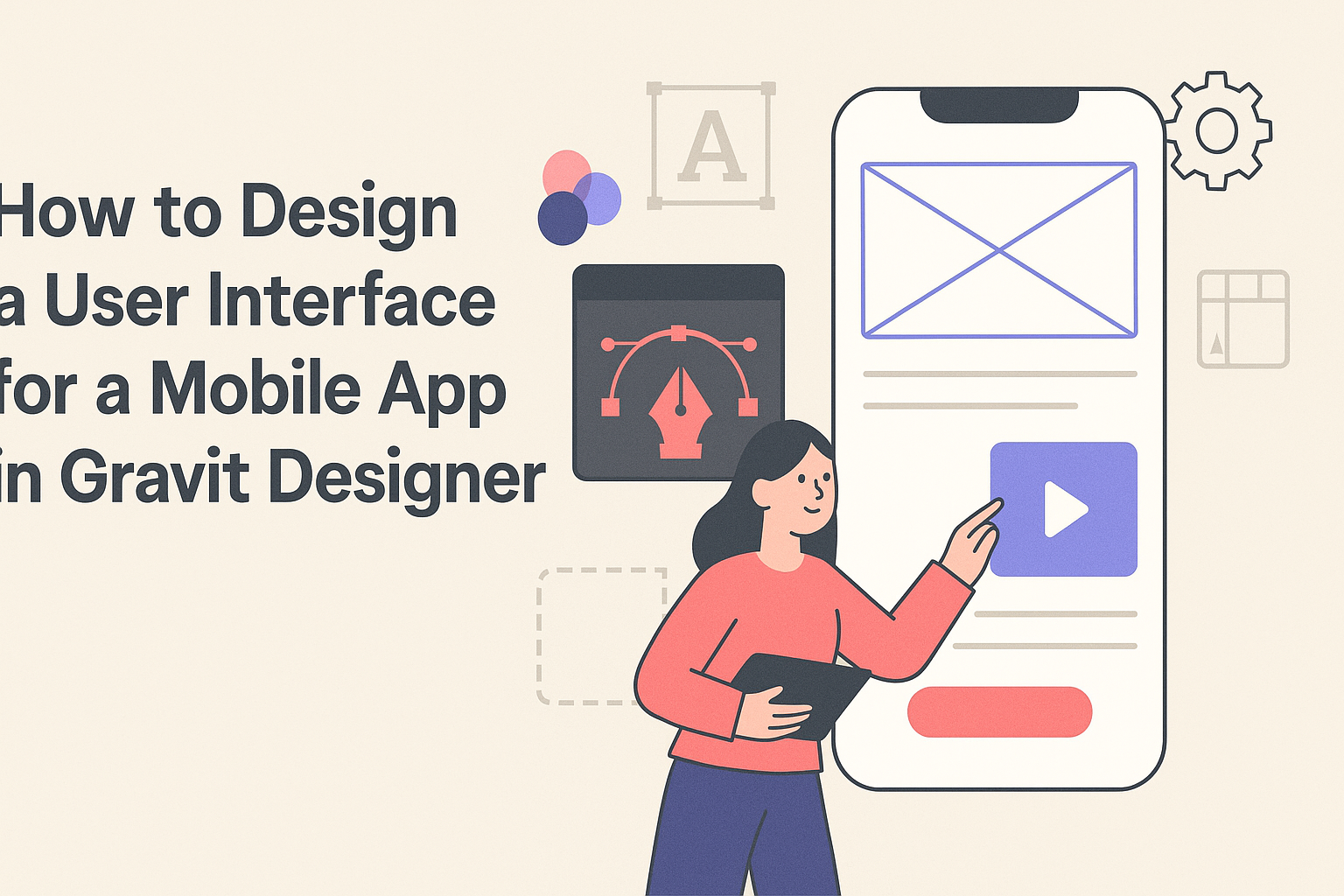
With Gravit Designer, anyone can create stunning mobile app interfaces by utilizing its user-friendly tools and features. This article will guide readers step-by-step through the process, making it accessible even for those new to design.
Gravit Designer is a powerful and free vector design tool that allows users to bring their ideas to life. They will learn how to navigate the platform, select the right elements, and create an engaging user experience.
By following the tips and techniques outlined here, they can effectively design a mobile interface that stands out.
Whether it’s for a personal project or a professional app, mastering Gravit Designer can enhance one’s skills and boost creativity. Mobile app design is an essential skill in today’s digital world, and with the right guidance, they can become proficient in creating beautiful and functional user interfaces.
Understanding Gravit Designer
Gravit Designer is a powerful tool for creating stunning user interfaces. It offers a variety of features that help designers bring their ideas to life. Knowing how to effectively use its tools and set up the workspace is essential for getting started.
Overview of Gravit Designer Tools
Gravit Designer provides a comprehensive set of tools that cater to different design needs.
Key tools include:
- Shape Tools: Used to create basic shapes like rectangles, circles, and polygons. These shapes can be customized in various ways.
- Text Tool: Allows users to add and style text, making it easy to integrate typography into designs.
- Pen Tool: Offers precision for creating custom shapes. It’s great for those who want to draw unique paths and designs.
Understanding these tools can significantly enhance design efficiency. Each tool serves a specific purpose and can be combined for more complex designs.
Users can access these tools from the toolbar on the left side of the interface.
Setting Up Your Workspace
Setting up a workspace in Gravit Designer can streamline the design process. Here are some steps to consider:
- Customize the Toolbar: Users can choose which tools to display. This helps focus on what’s needed for the current project.
- Adjust the Canvas Size: It’s essential to set the right dimensions for a mobile app design. Users can create a custom size based on the target device.
- Use Panels: Designers can arrange panels for layers, styles, and assets. This organization makes navigation easier while working.
A well-organized workspace can improve focus and efficiency during projects. Proper setup allows designers to quickly access the tools and resources they need.
Planning Your Mobile App UI
Effective planning for a mobile app UI involves understanding its purpose, knowing the users, and creating detailed user personas. Each element plays a crucial role in setting a solid foundation for design.
Defining Your App’s Purpose
Defining the app’s purpose is the first step in the design process. It is important to ask specific questions about what the app will accomplish. Consider what problems it solves or what needs it meets.
Clear goals will guide design choices. For instance, a fitness app focuses on tracking workouts, while a budgeting app aims to help users manage their finances. Writing a mission statement can clarify the app’s intentions and ensure the design aligns with those objectives.
Researching Your User Base
Understanding the target user base is essential for creating an effective UI.
Conduct research to gather data on user preferences, behaviors, and challenges. Surveys, interviews, and focus groups are great tools for this purpose.
Creating a demographic profile can help identify who the users are. Consider age, gender, location, and lifestyle. Knowing these details will guide design decisions, ensuring that the app meets the needs and expectations of its intended audience.
Crafting User Personas
User personas are fictional characters representing different user types. They help visualize and understand the audience, making it easier to design user-centered interfaces.
When creating personas, include key details such as background, goals, and pain points. This information provides context for design choices. For example, a busy professional might need quick access to features, while a student may prioritize a visually engaging interface.
Using visual aids, like charts or tables, can enhance persona presentations. User personas serve as a reference throughout the design process, ensuring the final product resonates with real users.
Creating the Interface
To create an effective user interface in Gravit Designer, attention should be given to layout, color schemes, fonts, and interactive elements. Each aspect plays a critical role in ensuring a user-friendly experience.
Designing the Layout
When designing the layout, the user’s journey within the app should be the focus.
It’s important to use grids to align elements neatly. A grid system helps in maintaining consistency and organization.
He or she can begin by sketching the main screens on paper. After that, Gravit Designer can be used to create a digital version. Incorporating enough white space is key so that the interface does not feel cluttered.
Using sections, such as headers and footers, helps guide the user. Clear navigation should be a priority. Buttons should be large enough for easy clicking, especially on mobile devices.
Choosing Color Schemes and Fonts
Color schemes can greatly influence the app’s look and feel.
He or she should select a limited color palette that reflects the brand and is visually appealing. A good rule is to choose one main color, a secondary color, and an accent color.
Fonts matter too. They should be easy to read on small screens. Sans-serif fonts often work well for digital interfaces.
It’s smart to limit font styles to two or three types. Using contrasting colors for text and background will make the content stand out. This approach ensures that users can quickly read and understand the information presented.
Adding Interactive Elements
Interactive elements enhance user engagement. These can include buttons, sliders, and toggles.
When designing these elements, clarity in function is paramount. Buttons should have labels that clearly describe their action. For example, “Submit” is better than just “Go.”
It’s also helpful to use visual feedback for interactivity. Changing color or style when a button is tapped can make the interface feel more responsive.
Lastly, ensure that elements are spaced well to avoid accidental clicks. Keeping these tips in mind will lead to a smoother user experience.