Creating a postcard that stands out can be a fun project.
To design a trendy postcard for mailouts in Vectr, one can focus on vibrant colors, clear messaging, and unique graphics. These elements together can grab attention and leave a lasting impression on recipients.
Using Vectr makes this process easier, as the tool offers user-friendly features for both beginners and experienced designers.
They can explore various templates and customize them to fit their style and purpose, ensuring that each postcard is unique and visually appealing.
Whether for marketing campaigns or personal messages, a well-designed postcard can effectively convey the intended message. With the right approach, anyone can create beautiful postcards that attract interest and engagement right off the bat.
Understanding the Basics of Postcard Design
Postcard design is essential for creating effective mailouts. It involves several key elements that influence how the message is received.
Paying attention to purpose, audience, and size can significantly improve the impact of the postcard.
Identifying the Purpose of Your Mailout
Knowing the purpose of the postcard is the first step in the design process. Is it for promoting a sale, inviting customers to an event, or sharing updates? Each purpose will guide the design choices.
For instance, a promotion should include a clear call-to-action, like “Visit us for 20% off!” This directs the recipient’s next steps. An event invitation, on the other hand, must clearly state the date, time, and location.
Staying focused on the purpose ensures the postcard will effectively communicate its message.
Defining Your Target Audience
Understanding the target audience is crucial for postcard design. This involves identifying the group’s age, interests, and preferences.
For example, a postcard aimed at young adults may use bold colors and trendy fonts, while one for seniors might favor simpler designs.
Creating a persona for the audience can be helpful. This might include hobbies, favorite activities, and common values. Tailoring the message and visuals to what resonates with the audience increases engagement and response rates.
A well-targeted postcard speaks directly to the reader’s needs and interests.
Choosing the Right Dimensions and Orientation
Selecting the right dimensions and orientation is vital for postcard effectiveness.
Standard sizes like 4″x6″ or 5″x7″ work well. These sizes fit easily in mailboxes and are likely to be opened.
Orientation can also affect design decisions. A landscape orientation often provides more space for images and longer text. Portrait orientation may highlight illustrations or serve well for minimalistic designs.
Consider the printing and mailing process as well. Ensure there are sufficient margins for addressing and stamps. This practical aspect should complement creative choices, making the postcard practical and visually appealing.
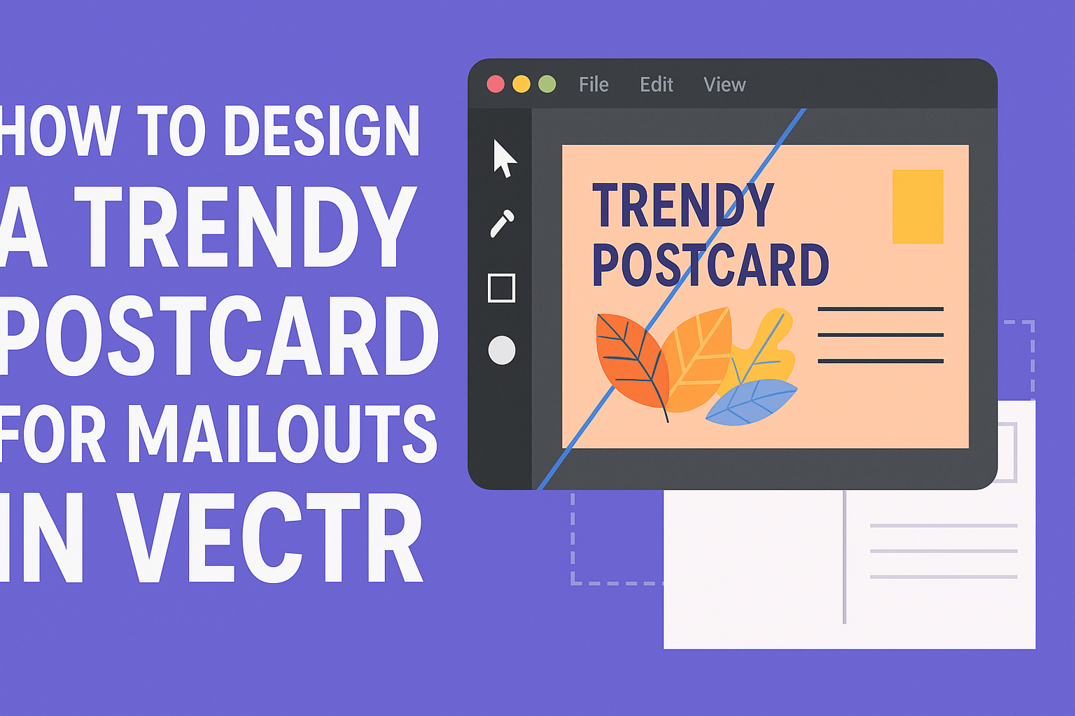
Getting Started with Vectr
Vectr is a user-friendly design tool that makes creating graphics easy and efficient. Understanding its interface and setting up a new project can help users create impressive postcard designs quickly.
Navigating the Vectr Interface
The Vectr interface is designed to be intuitive.
When users first open Vectr, they will see a toolbar on the left side. This toolbar contains essential tools like the selection, shape, text, and pen tools.
Key areas to notice:
- Canvas: The main area where designs are created.
- Layer Panel: Located on the right, this panel helps manage different design layers.
- Properties Panel: Below the layer panel, it allows customization of selected objects.
Users can easily move, resize, and rotate objects using the mouse or by entering specific values in the properties panel. Familiarity with these features can boost design efficiency.
Setting Up a New Project
To start a new project, users should click on the “New Document” button. Then, they can select dimensions for their postcard.
A common postcard size is 4″x6″, but users can choose according to their needs.
Once the canvas is set, it’s time to explore the design features. Users can add shapes, images, and text to create unique designs.
For example, to add a background, they may use a rectangle and fill it with color or an image.
Quick tips:
- Save Frequently: Regularly saving work prevents loss of progress.
- Use Templates: Vectr offers templates that can serve as a starting point.
With these steps, users can start creating their trendy postcards in no time!
Designing Your Postcard
Designing a postcard involves several important elements. By focusing on branding, text, images, and colors, one can create an appealing and effective postcard for mailouts.
Incorporating Branding Elements
Branding is crucial for creating recognition and trust. It helps to establish a connection with the audience.
Include your logo prominently on the postcard. This will ensure that your brand stands out.
Use brand colors consistently. This reinforces brand identity and creates a cohesive look.
Choose fonts that match your brand’s personality. Whether it’s modern, classic, or playful, typography should represent your brand effectively.
Finally, add a tagline or slogan that embodies your brand message. This can leave a lasting impression on recipients.
Adding Text and Typography Best Practices
Clear and engaging text is vital for effective communication. It’s the message that draws the reader in.
Choose a font that is easy to read. Sans-serif fonts often work well for postcards due to their simplicity.
Limit the amount of text. Use short sentences and bullet points to convey messages efficiently.
Highlight important information using bold or italic styles. This grabs attention and makes key points stand out.
Consider the hierarchy of text. Place the most important information at the top to ensure it captures the reader’s eye first.
Selecting Images and Graphics
Images can significantly enhance the visual appeal of a postcard. They should align with the message being conveyed.
Choose high-quality images that are relevant to the content. Blurry or irrelevant images can distract from the message.
Consider including illustrations or icons. These can add a unique touch and make the design engaging.
Ensure that images do not overwhelm the text. A good balance between visuals and text helps maintain clarity.
When using multiple images, maintain a consistent style. This could mean similar color tones or artistic styles to create harmony.
Working with Color Schemes
Color plays a significant role in design and can evoke emotions. Picking the right colors is essential for effective communication.
Start with the brand colors as a foundation. This can create a cohesive look throughout the postcard.
Choose complementary colors to make elements pop. Use tools like color wheel charts to find appealing combinations.
Limit the color palette to avoid overwhelming the reader. Two to four colors often work best for a clean look.
Use contrasting colors for text to enhance readability. Dark text on a light background (or vice versa) ensures information is easily visible.
Consider the mood the colors convey. For example, blue can suggest trust, while yellow can promote happiness.
Preparing for Print and Distribution
When preparing a postcard for print and distribution, attention to detail is essential. Important factors include the right resolution and file format, printing considerations, and mailing guidelines to ensure a smooth process.
Ensuring the Right Resolution and File Format
To achieve the best quality, it’s crucial to use the correct resolution for images and text. Recommended resolution for print is typically 300 DPI (dots per inch). This clarity avoids any pixelation in the final printed product.
File formats also play a key role. The most common formats for printing are PDF, TIFF, and JPEG.
PDFs are preferred for their ability to retain layout and quality. Always save images in their highest quality before exporting.
Printing Considerations
Several factors affect how a postcard will look once printed.
Choosing the right paper stock is vital. For example, a thicker cardstock can give a premium feel. Typical options include glossy, matte, or uncoated finishes.
In addition to material, consider color choices. Using CMYK color mode instead of RGB ensures colors appear as intended in print.
It’s also wise to request a proof copy from the printer to check for any issues before the final print run.
Mailing Guidelines
Following mailing guidelines is essential for successful distribution.
Postcards must meet certain size requirements. Common sizes include 4” x 6” or 5” x 7”.
There will also need to be adequate space for the address and postage.
Leave a 1” x 1” space in the upper right corner for the stamp. Ensure the address area is 2 ⅛” tall to comply with postal regulations.
Knowing these details helps ensure smooth delivery to clients or potential customers.
Proper preparation is key to effective postcard marketing.