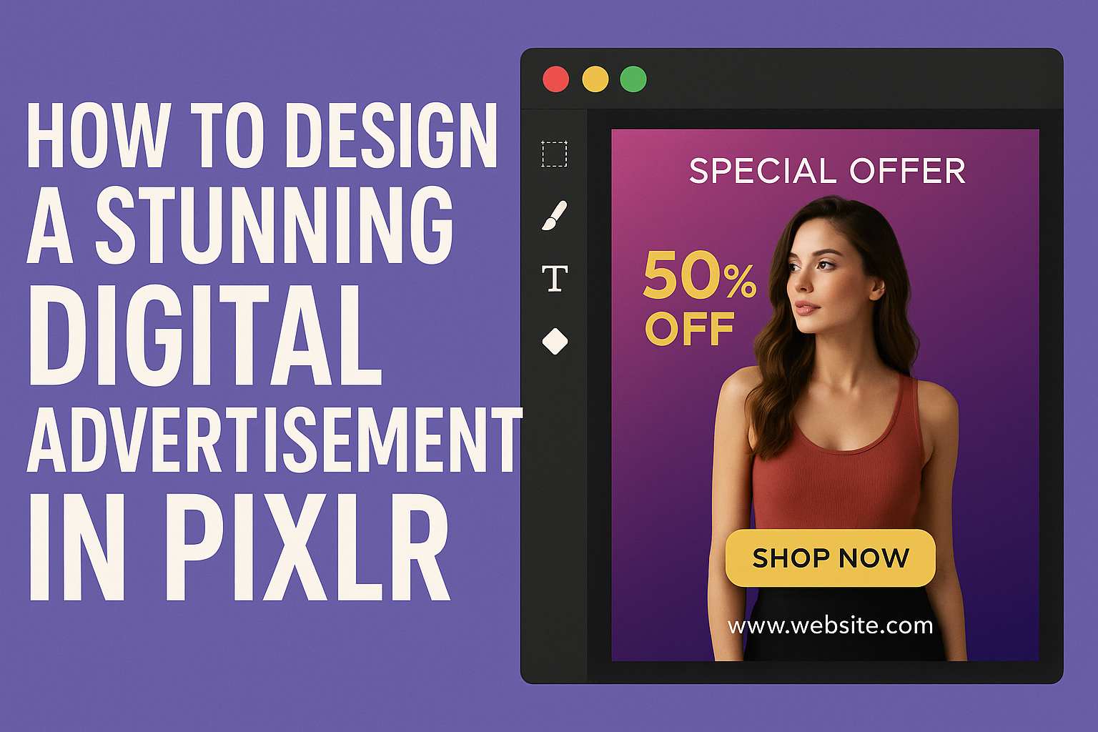
Creating an eye-catching digital advertisement can be a game changer for any business. Using Pixlr, anyone can design stunning ads by choosing the right templates, customizing images, and experimenting with colors and fonts. This user-friendly platform provides the tools needed to grab attention and boost traffic.
With a few simple steps, an advertiser can make an impact without needing professional design experience. They can easily incorporate high-quality stock images and personal branding elements to establish a unique presence.
Pixlr makes it accessible for everyone to bring their ideas to life.
The best part is that designing an advertisement doesn’t have to be complicated. By following straightforward tips, anyone can create ads that resonate with viewers and effectively promote their products or services.
Setting Up Your Workspace
Creating a digital advertisement requires a well-organized workspace. This makes it easier for users to navigate and utilize the available tools effectively for their projects.
There are a few key steps to set up before diving into the design process.
Creating a New Project
To begin, the user should open Pixlr and select “Create New.” They can choose from a variety of preset sizes or set custom dimensions based on their needs.
It’s important to remember the purpose of the advertisement when selecting dimensions. For instance, social media ads often require specific sizes, such as 1080×1080 pixels for Instagram.
Once the dimensions are selected, the user can name their project and click “Create.” This sets a foundation for the design work ahead.
Familiarizing With Pixlr Interface
After creating a new project, getting to know the Pixlr interface is vital. The top menu has options for File, Edit, and View, which help manage the project.
On the left side, there lies a toolbar with essential tools like the brush, text, and shape options. Each tool can change depending on the selected layer, providing flexibility in design.
Users should explore the right sidebar, which houses layers, history, and adjustment options. Understanding these features will enhance their design experience.
Understanding Pixlr Tools and Features
Knowing the tools and features in Pixlr can make the design process smoother. The toolbar offers various functions such as crop, rotate, and filters.
Each tool can be clicked to display additional settings. For example, the text tool allows the user to change font style and size easily.
Layers play a crucial role in design. They enable users to edit individual elements without affecting others. Mastering layers helps the user achieve complex designs with ease.
Design Fundamentals
Effective digital advertisement design involves several key elements that enhance visual appeal and communication. Understanding color schemes, typography, shapes, and the use of filters can significantly impact how the audience perceives the message.
Choosing Color Schemes
Selecting the right color scheme is crucial for creating an impactful ad. Colors evoke emotions and can influence decisions. For example, blue often conveys trust, while red can stimulate excitement.
When choosing colors, consider the target audience and the brand’s identity. A balanced color palette typically involves a primary color, secondary colors, and accents. Tools like Adobe Color Wheel can help create harmonizing schemes.
To ensure readability, contrast is vital. Light text on a dark background or bold colors can draw attention. Test different combinations to find the most engaging palette that fits the ad’s purpose.
Incorporating Text and Typography
Typography plays a significant role in conveying messages in digital ads. Selecting the right fonts can enhance readability and brand recognition. Sans-serif fonts are usually easier to read on screens.
Limit the number of different fonts to two or three. This helps maintain visual coherence. Use larger text for headlines and smaller sizes for body text.
It’s also important to pay attention to line spacing and alignment. Proper spacing ensures clarity, making the ad more inviting. Bold or italic styles can highlight essential details, guiding viewers’ attention where it’s needed most.
Using Shapes and Lines
Shapes and lines help to create structure in an advertisement. They can guide the viewer’s eye and emphasize important elements. For instance, a circle can draw attention, while straight lines can create a sense of order.
Using geometric shapes effectively can also enhance the design’s overall appeal. For example, rectangles can provide backgrounds for text while adding balance. The placement and size of these shapes should complement the ad’s other elements.
Incorporating white space is also vital. It helps to avoid clutter, making the ad easier to digest. A clean layout enables the audience to focus on the message without distractions.
Applying Filters and Effects
Filters and effects can enhance the visual elements of an ad, making it stand out. Subtle effects like shadows or gradients can add depth to images, catching the viewer’s eye.
However, it’s essential not to overdo it. Too many effects can make the design feel unprofessional. Stick to a few well-chosen enhancements that serve to highlight key areas.
Different platforms may have specific requirements for images. Always check dimensions and quality settings. High-resolution files ensure clarity, while filters can be adjusted to maintain the ad’s effectiveness across various media.
Creating the Advertisement
To design an eye-catching advertisement, it is important to choose the right images, manage layers efficiently, and incorporate brand elements. Each of these steps plays a crucial role in creating a cohesive visual message.
Selecting Images and Backgrounds
Choosing the right images can make or break an advertisement. It is vital to select high-quality visuals that resonate with the target audience. Websites like Pixlr offer a variety of free stock images.
She should consider using images that reflect the brand’s values or the advertisement’s message. Backgrounds should enhance the foreground images without overpowering them.
Contrasting colors can help the main subject stand out. Using subtle textures or gradients can add depth, making the ad more engaging.
Layer Management
Effective layer management is key when designing in Pixlr. Each element, such as images, text, and backgrounds, should be on separate layers. This allows for easy adjustments and changes.
To organize layers, it can be helpful to label them clearly. Using groups for related layers can streamline the process.
This approach makes it easier to edit parts of the design without affecting others. She should also use layer styles to add effects like shadows or borders, enhancing the advertisement’s appeal.
Implementing Brand Elements
Incorporating brand elements gives the advertisement a consistent look. This includes logos, color schemes, and fonts that align with the brand identity.
Using brand colors can create a recognizable and professional appearance. It’s best to ensure that text is readable against the background.
If using a logo, it should be placed prominently but not distract from the main message. Importantly, all brand elements should work together harmoniously to create a unified design.
Final Touches and Export
Before finishing a digital advertisement, it’s important to refine the design. This includes reviewing the overall look, ensuring everything is aligned properly, and exporting the work in the right format. Attention to detail at this stage can greatly affect the final product.
Reviewing Your Design
After completing the design, reviewing it is a crucial step. This involves checking for any typos or design errors. It’s helpful to zoom in and observe all elements closely.
They should consider color balance, font legibility, and image quality. Comparing with initial ideas can also provide direction. If time allows, getting feedback from others is beneficial. Fresh eyes can spot things that may go unnoticed.
Exporting Final Ad
When the design is ready, exporting it correctly is next. Pixlr offers various formats like JPEG, PNG, and TIFF. Choosing the right format depends on where the ad will be displayed.
For social media, JPEGs are common due to their smaller file size. For images with transparency, PNG is preferred. After selecting the format, click “File” then “Save” to begin exporting. Remember to choose the appropriate quality settings.
Best Practices for File Handling
Managing files properly is essential for keeping everything organized.
Naming files clearly will help in identifying different versions. A good practice is to create folders for each project.
Backing up files is also important.
Consider using cloud storage or an external hard drive. This protects against accidental loss or corruption of data.
Regular backups prevent panic when files go missing.