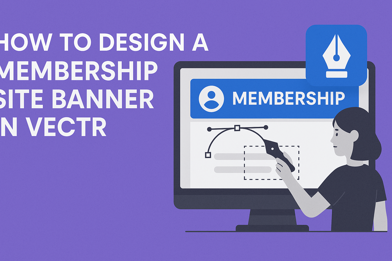
Creating an eye-catching banner for a membership site can seem challenging, but it doesn’t have to be. With tools like Vectr, anyone can design a professional-looking banner in just a few simple steps. This tool allows users to unleash their creativity without needing advanced design skills.
In this article, readers will discover how to navigate Vectr and utilize its features effectively.
From choosing the right dimensions to adding engaging graphics and text, each step will guide them toward making a banner that stands out.
By the end, they will feel confident in creating banners that attract more members to their site.
Getting Started with Vectr
Vectr is a user-friendly graphic design tool that makes it easy to create stunning visuals.
To dive in, it’s important to understand the interface and how to set up a new project effectively. Here’s how to begin.
Understanding the User Interface
When first using Vectr, the interface can seem intimidating. However, it is quite intuitive once you get familiar with it.
The main screen consists of several key areas:
- Menu Bar: Located at the top, this contains options for file management and editing tools.
- Side Bar: On the left, the side bar offers quick access to tools like shapes, text, and layers.
- Workspace: The center area is where all the design action happens. Users can create, adjust, and refine their graphics here.
By exploring these areas, anyone can feel more comfortable navigating Vectr. Clicking on different features will help discover what each tool can do.
Setting Up Your Project
To start a new project in Vectr, the first step is to log in. After logging in, the dashboard appears.
From there, users can create a new file by clicking the “Create File” button in the top left corner.
Next, a prompt will appear to set the page size. Choosing the right dimensions is crucial for the design, especially for a membership site banner.
After setting up the project, tools for adding shapes, text, and colors become available. Understanding these options helps in crafting an eye-catching banner.
Adjustments can be made easily, allowing for creative flexibility.
Designing the Banner
Creating an eye-catching banner for a membership site involves careful planning. Key aspects like dimensions, color schemes, text, and images all play important roles in the design process.
Selecting the Right Dimensions
Choosing the correct banner dimensions is crucial. For most membership sites, a standard size is 1200 x 300 pixels. This size ensures the banner is wide enough to stand out without overwhelming the page.
When designing, it is essential to think about the banner’s placement. If it’s at the top of the page, ensure it fits well in that space.
Testing how the banner looks on various devices like phones and tablets is also important. Using responsive design help ensures the banner looks great everywhere.
Choosing a Color Scheme
A cohesive color scheme can enhance the appeal of the banner.
First, he or she should consider the site’s overall color palette. Colors should align with the site’s branding to create a unified look.
Using tools like Adobe Color can help find complementary colors.
It’s often best to stick to three or four colors to avoid overwhelming the viewer. Also, contrasting colors can draw attention to important elements, like calls to action.
Keeping the colors consistent across all platforms will strengthen brand recognition.
Adding Text and Typography
Text plays a vital role in conveying a clear message. It should be easy to read, even from a distance.
Choosing a bold, simple font can often work best. He or she should also limit the amount of text to ensure clarity.
Using different font sizes can help emphasize key points. For example, the main message might be larger than any supporting details.
Additionally, contrasting the text color with the background color makes it pop. Always ensure there’s enough spacing to keep the text from feeling cramped.
Incorporating Images and Icons
Images and icons can make a banner more engaging.
He or she should select images that resonate with the membership theme. High-quality graphics help maintain a professional look.
Incorporating simple icons can also be effective. They can represent features or benefits of the membership.
It’s essential to ensure that these visuals are not too busy. The imagery should complement the text and not distract from the main message.
Keeping a consistent style for all images and icons will create harmony in the design.
Finalizing and Exporting
This stage involves adding the final details to make the banner visually appealing and preparing it for export. The user should focus on applying finishing touches and then choosing the right export settings for the design.
Applying Finishing Touches
To enhance the membership site banner, a few key adjustments can make a significant difference.
The designer should first review the color scheme to ensure it aligns with the brand’s identity. Consistency in color makes the banner look professional.
Next, adding effects such as shadows or gradients can give depth. This can be done through the editing panel in Vectr.
Adjust the sizes and positions of elements to create balance and ensure no areas look too cluttered.
Lastly, it’s important to have clear text. Make sure the font is easy to read and contrasts well with the background.
Utilizing a limited number of fonts can help maintain focus and clarity.
Exporting Your Design
Once the design is complete, exporting it correctly is crucial.
Vectr provides two main options: exporting the entire page or selecting specific elements.
It’s best to choose the option that best serves the purpose of the banner.
To export, the designer should navigate to the export menu.
They can right-click on the design for the “Save As” option or drag the preview directly to the desktop.
When choosing file formats, PNG and SVG are commonly used.
PNG is excellent for high-quality images, while SVG is best for vector graphics.
Adjust the file size in the export preview to meet web requirements.
This ensures the banner looks great on the membership site without slowing down load times.