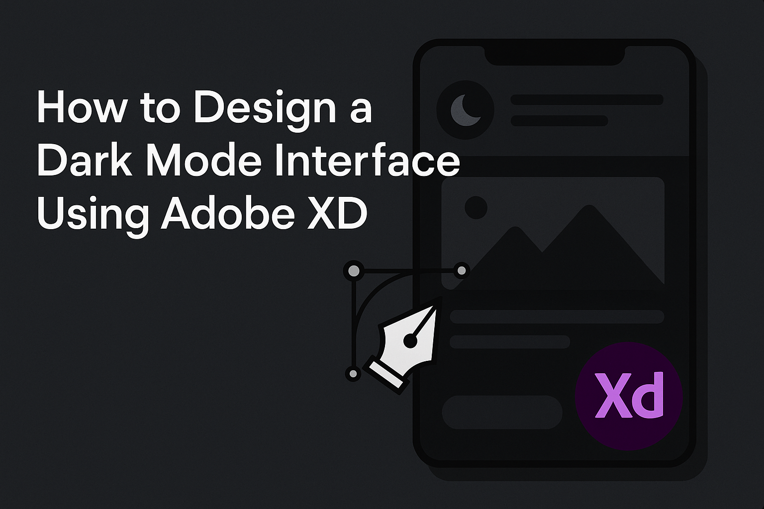
Creating a dark mode interface using Adobe XD is a practical skill that enhances user experience, especially in low-light conditions. With Adobe XD, designers can create visually appealing dark themes by focusing on contrast, readability, and aesthetic balance. This blog post will guide you through the steps necessary to achieve a well-designed dark mode interface.
Adobe XD offers flexibility for experimentation with colors and layout. Even though it doesn’t have a built-in dark mode, designers can still craft beautiful designs by adjusting color schemes manually. For inspiration, tutorials on platforms like YouTube provide valuable insights into transitioning from light to dark themes.
Designing for dark mode isn’t just about aesthetics; it also includes accessibility considerations. By following best practices and using the right tools, such as color contrast checkers, designers can ensure an inclusive design. This read is perfect for anyone looking to expand their design toolkit and keep users’ needs in mind.
Understanding Dark Mode
Dark Mode has become increasingly popular in app and web design. It provides a sleek appearance and can reduce eye strain. Let’s explore what makes Dark Mode special and how it compares to Light Mode.
What is Dark Mode?
Dark Mode is a user interface option where the background is dark, and the text and other elements are light. This design choice has grown in popularity because it offers a modern look and can be easier on the eyes, especially in low-light environments.
Designers often use Dark Mode to create contrast and focus for apps and websites. While it doesn’t change the functionality, it provides a new visual experience. This setting can vary slightly depending on the device or software, but the core idea remains the same: light on dark.
Benefits of Dark Mode
The rise of Dark Mode is not just about aesthetics. One major benefit is the potential to reduce eye strain. Many users find it more comfortable to look at dark backgrounds for extended periods, especially at night.
Dark Mode can also help save battery life on OLED screens since dark pixels use less power. Additionally, it can make text and images stand out, helping with readability and highlighting important information.
Finally, some users enjoy the sleek and modern feel that Dark Mode provides. It can create a more immersive experience, drawing attention to content in a visually appealing way.
Dark Mode vs. Light Mode
Both Dark and Light Modes have their unique advantages. Light Mode, with its dark text on a light background, is traditional and often used in daytime settings. It can be easier to read for some users in bright conditions.
In contrast, Dark Mode is ideal for dim environments and can reduce glare. It’s preferred by many who work or read in low-light situations. The choice between them often depends on personal preference and context.
While both modes serve similar purposes, they cater to different needs and situations. Users appreciate having the option to switch between them based on their environment and comfort.
Preparing for Dark Mode Design
A well-crafted dark mode interface requires thoughtful planning and the right tools. From using Adobe XD effectively to understanding key design principles and selecting the right colors, it’s important to cater to users who prefer a darker theme.
Required Tools
For designing dark mode in Adobe XD, the software itself is the primary tool. Adobe XD offers features like artboards and prototyping capabilities, which are essential for creating and testing designs. Users should ensure they have the latest version of Adobe XD to make the most of updates and features.
Plugins can be useful. Color Designer assists in picking harmonious colors for a dark interface. Stark helps check accessibility, ensuring contrast is adequate. Using these plugins can enhance the overall design process, making it more efficient.
Other tools, like a color wheel or online palette generator, can aid in finding color combinations that suit dark mode. This avoids potential issues like poor visibility or eye strain.
Basic Principles of Dark Mode
When designing for dark mode, certain principles should be followed to ensure clarity and usability. Contrast is Key. Text should stand out against the background, but not too harshly. Bright white text on a black background can cause strain, so softer tones are recommended.
Another important principle is not to simply invert colors from light mode. This can result in unappealing and impractical designs. Instead, consider how colors might interact in darker environments. Use dark shades like charcoal over pure black for a softer appearance.
Lastly, it’s crucial to maintain consistency across the interface. This helps users navigate the design intuitively, without needing to adjust frequently between different styles or shades.
Selecting a Color Palette
Choosing the right color palette for dark mode is an important step. Adobe XD can be used to test different shades and combinations effectively. Dark mode designs typically use dark grays, blacks, and muted colors as backgrounds.
Accent colors should be chosen thoughtfully. They provide visual interest and direct attention where needed. Vibrant hues may work, but they should be used sparingly to avoid overwhelming the user.
Always test color palettes in various lighting conditions. This ensures the interface remains practical and appealing in low-light environments. Accessibility should be a priority, ensuring all text and elements are legible and clear.
Getting Started with Adobe XD
To begin designing a dark mode interface in Adobe XD, first download and install the software. Visit the official Adobe website to download and follow the installation prompts.
After installing, open Adobe XD. The home screen will display recent projects and templates. Choose a template or create a new document by selecting the appropriate artboard size.
Familiarize yourself with the Adobe XD interface. The toolbar on the left offers tools for drawing shapes, text, and other design elements. On the right, you’ll find the Properties Inspector, where you can adjust sizes, colors, and styles.
For those new to Adobe XD, using repeat grids and components can enhance your workflow. Repeat grids allow for easy duplication of design elements, while components enable the reuse of elements across different artboards.
Explore Adobe XD’s plugins. These can add extra functionalities like adding stock images or special effects. Access them from the window’s menu and browse through available options.
To facilitate designing in dark mode, create a color palette with darker shades. Use contrasting colors for text and important elements to ensure readability.
Lastly, practice using different features by experimenting with designs. The more familiar a designer becomes with the tools available in Adobe XD, the smoother their design process will be.
Designing in Adobe XD
Designing in Adobe XD involves using a range of tools to bring creative ideas to life. The process generally starts with creating a new project and then setting up artboards, which serve as the canvas for design elements. Utilizing layers and assets is crucial for maintaining an organized and efficient workflow.
Creating a New Project
In Adobe XD, starting a new project is the first step to bring design ideas to life. Users begin by launching the software and selecting the desired screen size for their design. This can range from a mobile screen to a web page or custom size.
Once the size is selected, a new workspace is created where designers can start building their interface. It’s important to keep the project name descriptive so that they can easily locate it later. This saves time and keeps multiple projects manageable. Users should explore Adobe XD’s options like repeat grids and component states to enhance their projects right from the beginning.
Working with Artboards
Artboards act as the canvases in Adobe XD. They help designers visualize each part of the user interface. To add an artboard, users can click the artboard tool in the toolbar. They can then choose a preset size or draw a custom-sized artboard.
Multiple artboards can be used to design different screens of an app or website in one project file. This makes managing and reviewing designs efficient. Designers can easily switch between screens, share assets, and make consistent design updates. To maintain an organized workflow, it’s beneficial to label artboards clearly and place them logically within the workspace.
Utilizing Layers and Assets
Layers in Adobe XD are essential for keeping track of all the elements in a design. Each object, such as text boxes or images, resides on its own layer. This allows designers to lock, hide, or arrange elements with ease. To access the layers panel, users click the “Layers” icon.
Assets, on the other hand, are reusable design components. These may include colors, character styles, symbols, and components. By dragging elements to the assets panel, they can be reused across different artboards. This aids in maintaining consistency throughout the design. Selecting the right layers and assets can simplify the design process and enable quick adjustments when needed.
Applying Colors and Textures
When designing a dark mode interface in Adobe XD, picking the right colors and textures is crucial. This section explains how to select background and text colors, as well as how to use gradients and overlays to create depth and clarity.
Choosing Background Colors
Background colors set the tone for a dark mode interface. Deep blacks, navy blues, and charcoal grays are commonly used, as they provide a strong contrast with lighter elements.
When selecting a background color, consider how it will affect readability. Colors should not strain the eyes or make text difficult to read. Testing the design in various lighting conditions can help ensure the choice is comfortable for users in both bright and dim environments.
Also, backgrounds should complement the brand’s identity. It’s important to be consistent with other branding elements to create a cohesive look. A good practice is to add subtle textures or patterns to prevent large areas of solid color from feeling flat or monotonous.
Applying Text Colors
Text color must stand out against dark backgrounds. White or light gray text is popular because it is easy to read against darker shades.
Contrast is important for readability. Use tools or plugins to check the contrast ratio between the text and background colors. A high contrast ratio ensures clarity and accessibility for all users.
Beyond just choosing white or gray, incorporate colors occasionally to highlight specific text, such as headings or links. This not only draws attention but also adds visual interest. However, applying too much color can be distracting, so it’s critical to keep it minimal and purposeful.
Using Gradients and Overlays
Gradients and overlays add depth and richness to a design. In dark mode, gradients can subtly transition from one shade to another, providing a smooth and elegant background.
Linear or radial gradients can mark different sections, create visual hierarchy, or highlight important areas. Using gradients helps to naturally guide the user’s eyes through the interface.
Overlays provide another texture layer. Implementing semi-transparent black or colored overlays on images can enhance text visibility or convey a specific mood. Overlays also ensure that no element is too overpowering, keeping the interface balanced and easy to use.
UI Components for Dark Mode
Designing a dark mode interface in Adobe XD requires careful consideration of various UI components. It’s important to focus on how elements like buttons, icons, forms, input fields, and navigational elements adapt to a darker theme.
Buttons and Icons
Buttons in a dark mode design should stand out clearly. A common approach is using light text on dark button backgrounds. This ensures contrast and readability. Choosing colors that differentiate between primary, secondary, and disabled states is crucial. Icons also need proper visibility. White or light-colored icons typically work well, but they need to harmonize with the rest of the interface. Adding a subtle shadow or an outline can enhance visibility and make buttons feel more clickable. Consistent spacing and sizing across all buttons and icons promote a cohesive look.
Forms and Input Fields
Form fields in a dark mode need sufficient contrast to distinguish them from the background. Light borders or shadows around input fields help define areas for user interaction. Text inside these fields should contrast well with the background. Placeholder text can be in a lighter shade to indicate input areas without overwhelming the design. Form labels above the fields should be clear and legible. Error messages or validation cues might require distinct colors to stand out effectively. It’s also helpful to maintain consistent spacing and alignment to enhance the user experience.
Navigational Elements
Navigation bars and menus should be designed to be intuitive and easy to use. Text in navigation bars must contrast sharply with the background for readability. Hover and active states need clear visual cues, such as changing color or adding a light underline. Consistency in the color scheme across all navigational elements is key to a seamless user experience. In side menus or dropdowns, clear labels and visual separators can help users easily find what they’re looking for. Using icons alongside text in navigation can improve usability, provided they are easily distinguishable in the dark theme.
Adobe XD Features for Dark Mode
Designing a dark mode interface in Adobe XD involves using various features that enhance creativity and usability. These include Repeat Grids for creating consistent patterns, Responsive Resize for adaptable designs, and Prototyping and Animation for interactive elements.
Repeat Grids
Repeat Grids in Adobe XD are vital for maintaining consistency across a design. Designers can use this feature to duplicate elements quickly, such as buttons or cards, while keeping the layout uniform. This is particularly useful in dark mode, where consistent design helps in minimizing eye strain.
With Repeat Grids, users can adjust the spacing between items effortlessly. This means making changes to one element can automatically apply to others in the grid. This saves time and ensures that each part of the interface shares the same stylistic features. Using Repeat Grids streamlines the design process, making it efficient to construct complex layouts without repetitive manual adjustments.
Responsive Resize
Responsive Resize allows designers to create flexible layouts that adapt to different screen sizes. This feature is especially handy for dark mode interfaces, as it ensures that elements look good on both small and large screens. Adobe XD automatically resizes content, maintaining its visual integrity by keeping important elements aligned.
The tool makes it easier to switch between desktop, tablet, and mobile views seamlessly. Designers can ensure that the user experience remains consistent across all devices, which is crucial for users who prefer dark mode. This adaptability leads to more accessible designs, accommodating user preferences and device capabilities without needing to manually redesign each layout.
Prototyping and Animation
Prototyping in Adobe XD offers interactive designs that bring dark mode interfaces to life. By adding animations, users can create engaging transitions and effects that guide a user’s experience. This can include simple hover effects or more complex page transitions that respond to user input smoothly.
These features enable designers to test different animations and interactions, providing a real-world feel to the design. Using this, designers can identify potential usability issues and address them before the final implementation. The animations not only enhance visual appeal but also improve user navigation through intuitive motions. Adobe XD’s prototyping tools thus play a critical role in refining dark mode designs, providing both functionality and style.
Testing and Iterating
Designing a dark mode interface in Adobe XD involves testing your design thoroughly. Previewing in various environments helps spot any issues. User testing provides real-world insights, while iteration based on feedback ensures the design meets user needs.
Previewing Your Design
Before sharing, it’s crucial to preview your dark mode design. Use Adobe XD’s preview feature to see how your interface looks on different screens.
Adjust brightness and contrast to ensure text and elements stand out.
Check for color consistency. Sometimes, colors that look good in one mode may not work as well in another. Experiment with shades that maintain readability.
Previewing also helps identify and fix any alignment or spacing issues, ensuring a polished design.
User Testing Approaches
User testing is key to understanding how well your dark mode design works. Start with small groups to observe how they interact with the interface.
Focus on their navigation and readability experience. It’s helpful to use both remote testing and in-person sessions for diverse feedback.
Include questions that guide users but allow for open-ended feedback.
Tools like user surveys or interview sessions can be beneficial. Prioritize making test participants comfortable to get genuine responses.
Iterating Based on Feedback
Once feedback is collected, it’s time to iterate. Start by categorizing feedback into actionable tasks and prioritize them based on impact.
Address major usability issues first. For instance, adjust color schemes if users reported difficulty reading text.
Testing elements like contrast or layout changes should be a priority.
Communicate with your team about changes and test again to ensure improvements solve the identified issues.
Continuous iteration leads to a more user-friendly dark mode design.
Best Practices
When designing a dark mode interface in Adobe XD, it’s important to keep a few best practices in mind.
Color Choices: Use dark grays instead of pure black. This reduces eye strain and helps make text more readable. Pair these with lighter colors for contrast.
Text Readability: Ensure that text is easily readable. Use white or light-colored text on dark backgrounds and check for sufficient contrast to maintain accessibility.
Consistent Design: Maintain consistency across your design elements. Design both light and dark versions to ensure a cohesive look. Focus on major elements first, like buttons and navigation bars.
[List of Important Tips:]
- Avoid overly saturated colors.
- Utilize shadows and highlights to create depth.
- Keep icons and images subtle yet clear.
Testing: Regularly test your design on multiple devices. This will ensure that colors and elements render well across different screens.
Incorporating these practices will enhance the user experience while keeping the design appealing and functional.
Accessibility Considerations
Designing a dark mode interface in Adobe XD needs a focus on accessibility to enhance user experience. Key areas include contrast and legibility, support for color blindness, and integrating voice and sound options to aid navigation.
Contrast and Legibility
Ensuring that text and elements stand out against a dark background is crucial. High contrast settings help users read content more easily, especially in low-light conditions. When using Adobe XD, designers should aim for a contrast ratio of at least 4.5:1 for regular text and 3:1 for larger text.
Using bold and distinct fonts can further enhance legibility. Avoid very light or very bright shades against dark backgrounds, as they can cause eye strain. Adobe XD’s tools can help check contrast levels, ensuring that text remains clear and readable.
Color Blindness Support
Designers must consider users with color vision deficiencies. It’s helpful to use tools like Adobe XD’s color blindness simulator to check designs. Instead of relying solely on color to convey information, alternative indicators such as patterns, shapes, or text labels should be used.
Limiting the color palette simplifies differentiation among elements. Ensuring that color-coded features are supported by other cues helps make the design more inclusive and accessible.
Voice and Sound Guidelines
Voice control and sound cues can enhance accessibility for visually impaired users. Adobe XD integrates with macOS Voice Control, allowing users to navigate using simple voice commands. Examples include saying “Click Layer one” or “Select All” to manage design elements effectively.
Sound feedback can provide additional interaction cues. However, it’s important to offer users control over sound settings to customize their experience. Ensuring sound is used thoughtfully can make interfaces more user-friendly and engaging.
Sharing and Collaboration
When working on design projects in Adobe XD, effective sharing and collaboration are key. Designers need to export assets seamlessly, share work for client review, and manage various versions of their designs.
Exporting Assets
Exporting assets in Adobe XD is straightforward and essential for collaboration with developers or other team members. Designers can choose specific size options and file formats like PNG, SVG, JPG, or PDF.
Additionally, Adobe XD supports batch exporting, which saves time by allowing multiple assets to be exported at once. Selecting the “Export for Web” or “Export for iOS” options ensures that the right specifications are met for each platform. This feature makes it easy to get assets ready for different environments efficiently.
Sharing for Review
Sharing designs for feedback is crucial in any design process. In Adobe XD, designers can generate web links that showcase the design project. These links allow clients or team members to view the project in their web browsers.
Viewers can leave comments directly on the design, making it easier for designers to gather and implement feedback. Adobe XD’s integration with tools like Slack and Microsoft Teams helps streamline communication, allowing teams to stay connected without leaving their primary messaging platforms.
Version Control
Version control in Adobe XD helps manage multiple iterations of a design. The platform’s document history feature allows users to view and revert to previous versions. Combining this with cloud documents ensures that work is always saved and accessible.
Designers can create named versions to mark significant milestones and changes in their projects. This makes it easier to track the project’s progress and helps in reverting to an earlier design if needed. The version control features of Adobe XD enhance collaboration by providing a clear timeline and backup of the design process.