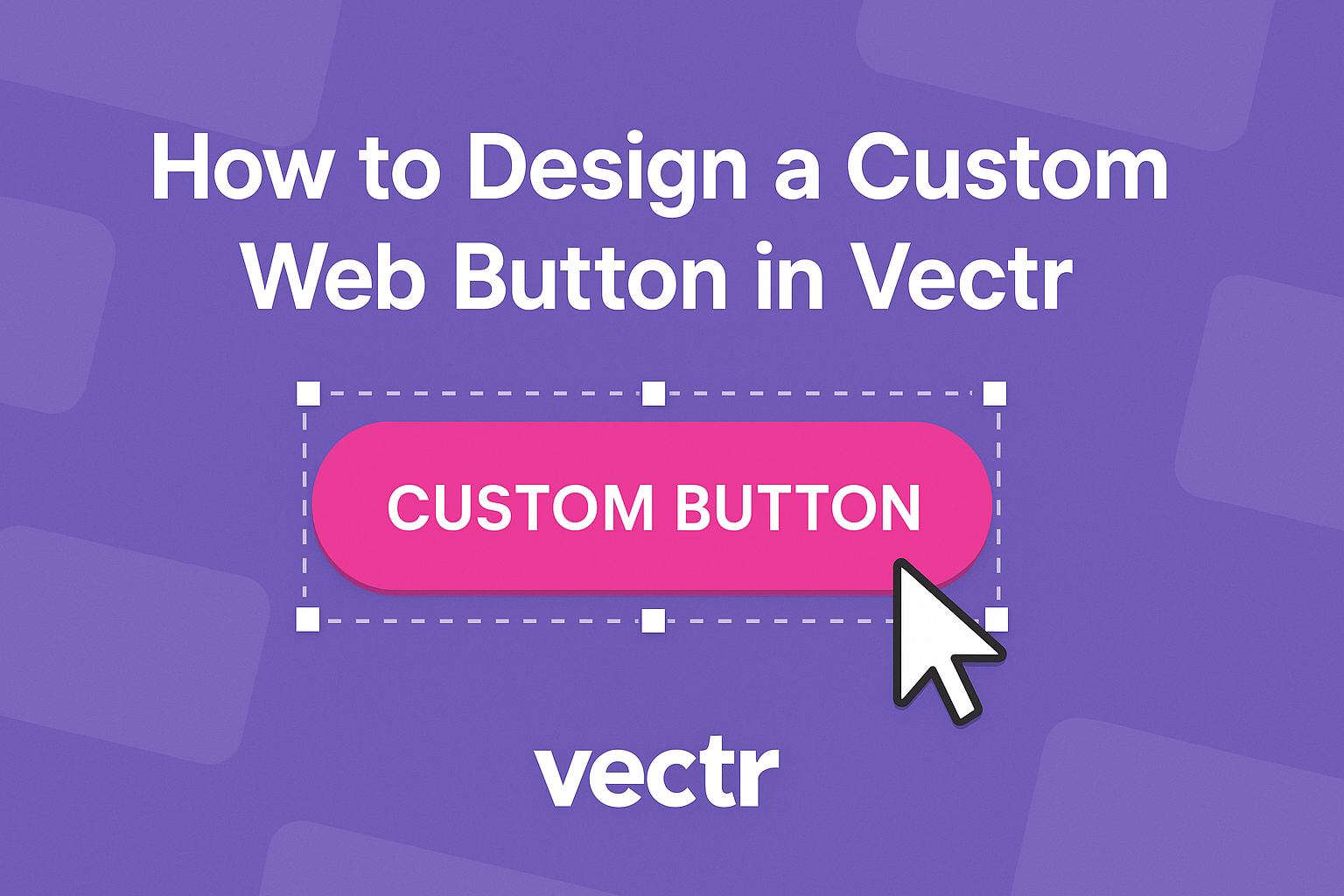
Designing a custom web button can enhance a site’s look and feel while improving user experience.
In Vectr, you can create unique buttons that stand out by using customizable shapes and intuitive design tools. This allows for greater creativity and personalization in web design.
With the right approach, creating a button becomes a simple and enjoyable task.
By following a few steps, you can incorporate different shapes, colors, and icons into your designs. This not only adds visual interest but also makes the buttons more functional.
Readers will discover how to use Vectr to bring their button designs to life. They will learn practical tips and tricks to make their website buttons more engaging and effective. Whether designing for personal projects or professional websites, mastering this skill offers valuable benefits.
Getting Started with Vectr
Vectr is a user-friendly tool for designing graphics, including custom web buttons.
Once you set up an account, you can easily navigate the interface to start creating.
Setting Up Your Account
To begin, you need to create an account.
This can be done by visiting the Vectr website and clicking on the “Sign Up” button.
You can register using an email address or even sign in with Google. After entering necessary details, a confirmation email will arrive.
Once the account is verified, you can log in and access the dashboard. This dashboard will be your main hub for all design projects.
Navigating the Vectr Interface
After logging in, you will land on a clean and intuitive interface.
The main features include a menu bar at the top and a sidebar on the left.
On the left sidebar, you can find tools for creating and editing designs. Here you can choose shapes, text, and images to use in your projects.
The workspace center is where all the magic happens. It allows you to see and manipulate your designs in real-time.
To start a new project, simply click the “Create File” option. You can set preferred page sizes to suit your needs, setting the stage for your designs.
Creating Your First Button
Designing a web button in Vectr involves careful selection of shape, colors, and text. Each of these elements plays a vital role in the button’s usability and appeal.
Selecting the Right Shape
The shape of a button is crucial for its function and aesthetics.
In Vectr, users can choose basic shapes like rectangles, circles, or even custom polygons.
Step-by-Step:
- Use the Shape Tool: Select the Shape Tool from the toolbar.
- Draw Your Shape: Click and drag on the canvas to create the desired form.
- Adjust as Needed: Use the nodes to modify the shape to fit your design.
Rounded edges often make buttons more inviting, while sharp angles can give a modern look. Consider how different shapes align with your website’s layout and user experience.
Applying Colors and Gradients
Colors can make a button stand out and attract user attention.
Vectr allows for solid colors and gradients, giving designers flexibility.
Color Tips:
- Use Contrasting Colors: This helps the button catch the eye against the background.
- Consistency is Key: Match colors with your website’s theme.
Creating a Gradient:
- Select the Fill Option: Choose the button and access the Fill settings.
- Pick Gradient or Solid: Opt for either a solid color or a gradient for depth.
- Customize Colors: Choose two or more colors for gradients and adjust their angle.
This choice enhances visual interest and can guide user actions.
Adding Text and Styling
Adding text to the button is essential for communicating its purpose. Clear and concise text ensures users know what action to take.
Text Guidelines:
- Keep It Short: Use a few words that clearly state the action (e.g., “Sign Up”).
- Font Style Matters: Choose a font that is easy to read and aligns with the design.
Styling Tips:
- Select Text Tool: Click on the Text Tool to add words.
- Positioning: Place the text centrally within the button shape.
- Adjust Font Size and Color: Ensure the text color contrasts well with the button’s background.
This attention to detail makes the button more effective and visually appealing.
Adding Advanced Effects
Using advanced effects can elevate a custom web button, making it more visually appealing and effective. Key techniques include adding shadows for depth and incorporating icons or logos for brand identity.
Using Shadows for Depth
Shadows create an impression of depth, making buttons stand out.
To add a shadow in Vectr, select the button, then access the effects menu. Choose “Drop Shadow” and adjust the settings for distance, blur, and color.
- Distance controls how far the shadow is from the button.
- Blur softens the edge of the shadow, adding realism.
- Color should match the theme of the site for consistency.
Experiment with different settings until achieving the desired look. A subtle shadow can enhance clarity, making buttons easier for users to identify.
Incorporating Icons and Logos
Icons and logos can strengthen a button’s function and brand recognition.
In Vectr, users can easily import graphic assets to customize designs.
To add an icon:
- Find an icon that aligns with the button’s action.
- Import the icon into the project.
- Resize it appropriately to fit within the button without overwhelming it.
It is helpful to maintain a balance between the text and the icon.
A well-placed icon can make a button more intuitive and engaging, encouraging users to click.