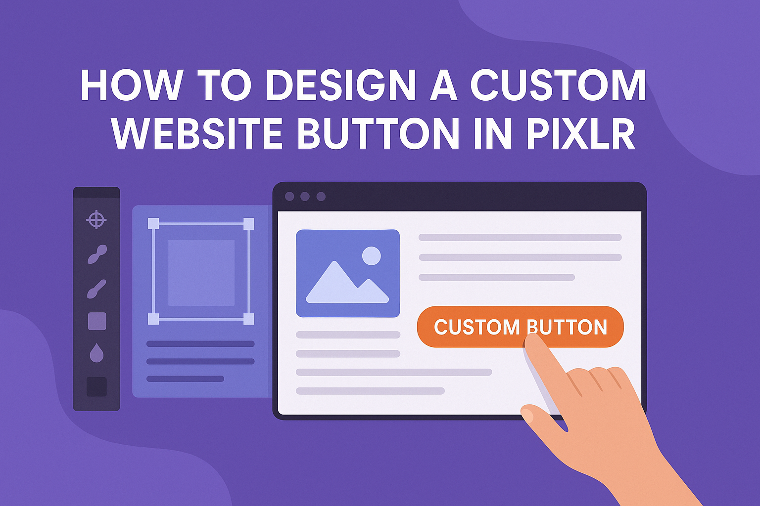
Designing a custom website button can enhance the look and feel of a website while also boosting its functionality. Using Pixlr, anyone can create personalized buttons that fit their brand and needs without needing advanced design skills.
This easy-to-use tool allows users to customize colors, shapes, and text, making the process straightforward and enjoyable.
With just a few simple steps, users can transform their ideas into vibrant buttons that attract attention. By following the right techniques in Pixlr, they can ensure their buttons stand out and effectively guide visitors on their website.
This article will walk through the process, offering helpful tips to make button design simple and fun.
Getting Started with Pixlr
Pixlr is an easy-to-use online photo editing tool that allows users to create and edit images for various projects. Understanding how to navigate the interface and use its tools is key to designing custom elements like website buttons.
Overview of Pixlr Interface
When opening Pixlr, users are greeted with a clean and simple interface. The home screen presents options to start a new project or access recent files.
Key components on the top bar include File, Edit, and Layer menus, which offer essential functions like saving and exporting.
The left side features the Tool Panel, where users can find selection, drawing, and editing tools. Familiarity with these components helps streamline the design process.
Creating a New Project
To create a new project, users should click on the “Create New” button from the home screen. A pop-up window appears, allowing individuals to set the project specifications.
They can choose the canvas size, which is vital for button design. For a standard website button, a size like 200×50 pixels is common.
Users can also select a background color or transparency. Once the settings are done, clicking “Create” opens the new workspace, ready for design.
Navigating the Tool Panel
The Tool Panel on the left side is crucial for editing and designing in Pixlr. Users find a variety of tools such as Brush, Eraser, and Text.
Each tool has adjustable settings. For instance, the brush size can be modified, which changes the width of lines drawn on the canvas.
Icons illustrate the tools’ functions, making them easy to identify. Hovering over each icon reveals tool names to assist in navigation. This panel is central to customizing designs effectively.
Designing Your Button
Creating a custom button involves several important steps, including setting dimensions, choosing colors, adding text, and incorporating shapes. Each of these elements plays a crucial role in making the button functional and appealing.
Setting the Dimensions
Dimensions are key when designing a button. A button should be large enough to be easy to click but not so large that it disrupts the layout.
Common dimensions for web buttons include:
- Width: 100 to 200 pixels
- Height: 40 to 60 pixels
When setting dimensions, keep in mind the type of device. Buttons might need to be larger for mobile users.
Pixlr allows users to input exact pixel sizes to ensure the button meets specific requirements.
Choosing a Color Scheme
Color selection is essential for creating a visually attractive button. Colors should contrast with the background to stand out but also fit the website’s overall theme.
A recommended approach includes:
- Primary Color: This is the main color for the button. It should be eye-catching.
- Secondary Color: Used for hover effects or outlines. It can provide depth.
- Text Color: Ensure readability. Light text on a dark button or dark text on a light button works well.
Using tools to test color combinations can help in making effective choices.
Adding Text and Typography
Text on a button should convey the action clearly. Short phrases work best, like “Click Here” or “Learn More.”
Choosing the right font and size is crucial:
- Font Style: Stick to clear fonts, using a sans-serif type for modern looks.
- Font Size: Typically between 14 to 18 pixels, ensuring readability.
Alignment is also important. Centered text enhances appearance. Buttons should feel clickable, so bold text can help achieve that.
Incorporating Shapes and Icons
Button shape can impact how users perceive a button. Common shapes include rectangles with rounded corners for a modern look.
Adding icons can improve functionality:
- Use Icons: An arrow can indicate a link; a question mark can suggest help.
- Position Icons: Placing an icon before the text can guide the eye.
Designing the button with a simple shape and a clear icon helps users understand and engage easily. The combination of these elements makes the button not only functional but also appealing to click.
Refining Your Button
Refining a button design is important for its functionality and appearance. Fine-tuning elements like styles, colors, and effects can make the button more appealing and effective for users.
Applying Layer Styles
Layer styles are a powerful way to enhance a button’s look. In Pixlr, users can apply various styles to add depth and interest.
To start, select the button layer. From the layer options, choose “Layer Styles.” Here, users can find options for shadows, glows, and more.
Drop Shadow adds dimension by creating depth behind the button. Outer Glow can make a button stand out with a soft light effect.
Adjust the opacity and spread to fit the design.
Experimenting with these styles can transform a simple button into a polished design that attracts attention.
Using Gradients and Overlays
Gradients and overlays can add a modern touch to button designs. Gradients allow transitions between colors, giving buttons a vibrant look.
To create a gradient, use the gradient tool in Pixlr. Choose the colors and direction for the gradient effect. This can make the button feel more dynamic and appealing.
Overlays, such as patterns or textures, can also enhance the button.
By adding an overlay layer, users can experiment with different patterns, like stripes or dots, to create visual interest. Adjusting the layer’s opacity makes it blend well with the background.
Adding Shadows and Highlights
Adding shadows and highlights can significantly improve a button’s depth and realism. Shadows give the illusion of the button being raised, making it look clickable.
In Pixlr, select the button layer and use the brush tool to paint a shadow. Choose a soft brush with a darker color and set the opacity low. This creates a subtle shadow that enhances the button’s pop.
Highlights work similarly. By adding a lighter color to the top edge, it simulates light reflecting off the button. This technique ensures the button looks three-dimensional and inviting.
Both shadows and highlights should be used sparingly to keep the design clean yet effective.
Exporting and Integration
Once the custom website button design is complete, it’s time to save and integrate it into the website. This process involves a few key steps, ensuring that the design is correctly exported and ready for use.
Saving Your Design
After finalizing the button in Pixlr, he must save the design. To do this, he can click on the File menu at the top left.
From there, selecting Save allows him to choose a format for the button.
Options typically include formats like PNG for transparency or JPG for a more general use.
It’s essential to name the file clearly, so it’s easy to find later. He should select an appropriate folder on his computer for better organization.
This step ensures that he doesn’t lose his work and can access it quickly when needed.
Exporting as Image Format
When ready to export, he should choose the Export option. This lets him pick the image format he needs. For web buttons, PNG is often recommended due to its support for transparency.
He can also adjust quality settings to balance file size and image quality.
Once chosen, clicking Export will prompt him to select a save location. After saving, he should check the file to ensure it looks good and opens properly.
Integrating into Your Website
To integrate the button into his website, he must upload the saved image file to his site’s media library. Most website builders, like WordPress or Wix, offer an easy way to do this.
After uploading, he can drag and drop the button onto the desired page. Additionally, he can add a hyperlink to the button to direct users where needed.
This step makes the button functional and visually appealing on his website.
With these steps, he can effectively save, export, and integrate his custom button design with ease.