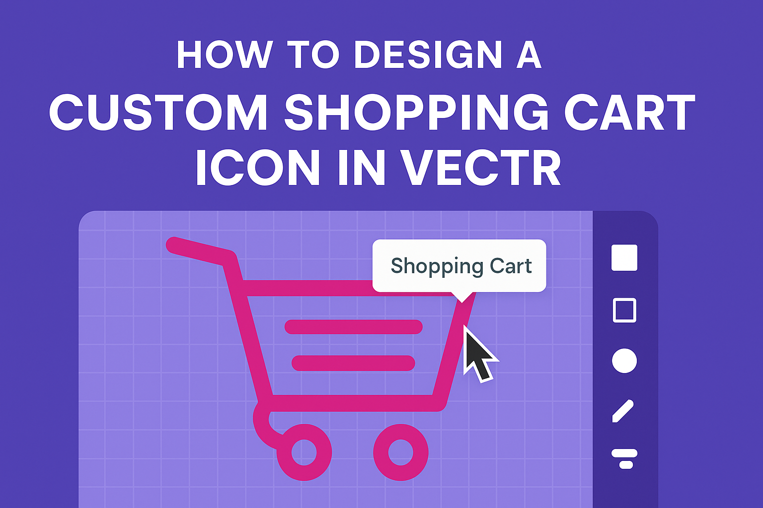
Designing a custom shopping cart icon can be an exciting project for anyone looking to enhance their digital presence. With tools like Vectr, creating a unique and professional-looking icon is easier than ever.
This guide will help readers understand the step-by-step process to design an attractive shopping cart icon that will capture attention.
In this article, readers will find helpful tips on using Vectr’s features effectively, from the basic shapes to adding personalized touches.
They will learn how to create a clean and modern design that aligns with their brand’s identity. By following along, they can produce an icon that stands out in any online store or app.
Whether a beginner or someone with a bit of experience, anyone can create a beautiful shopping cart icon. This guide provides clear instructions and inspiration to spark creativity. With these insights, they can elevate their design skills and make their projects shine.
Getting Started with Vectr
Starting to use Vectr is straightforward and enjoyable. This section provides the essentials to help users set up their workspace, understand the interface, and configure basic settings.
Setting Up Your Workspace
To begin, the user should create an account on Vectr’s website and log in. Once logged in, they will see the main dashboard. This dashboard contains key elements like the menu bar, side bar, and the creation box.
To start a new project, it’s important to click on Create File in the upper left corner. Users can select a specific page size based on their project needs.
Vectr allows for customization, enabling the user to choose between various standard sizes or create a new custom size.
Understanding Vectr’s Interface
Vectr’s interface is user-friendly and designed for ease of use. The central area is the canvas, where designs come to life. On the side bar, useful tools are available, including shapes, text, and layers.
The menu bar at the top offers options to save, share, and export designs. It also contains undo and redo buttons, which are helpful for managing mistakes.
Learning the layout is crucial as it helps users navigate effectively.
Configuring Basic Settings
Before diving into design, configuring basic settings is essential. Users can adjust preferences by clicking on the settings icon within the menu bar.
Here, they can choose units of measurement (pixels, inches, etc.) and set preferred color palettes.
Saving default settings will streamline future projects. Customizing these settings allows for a more tailored user experience and improves workflow efficiency.
Designing Your Icon
Creating a custom shopping cart icon involves careful planning and attention to detail. Each step, from choosing the right dimensions to adding personal touches, plays a vital role in achieving the desired visual effect.
Choosing the Right Dimensions
Selecting the right dimensions is crucial for clarity and adaptability. A common size for icons is 32×32 pixels, which is effective for web use.
Designers should also consider scalability; starting with a 24×24 pixel grid can help maintain proportion.
Creating a grid layout within a design tool, like Vectr, allows for precise alignment. This approach also ensures the icon looks sharp on different devices.
Additionally, exporting designs in higher resolutions, such as 48×48 pixels for Retina displays, is necessary to maintain quality.
Drawing Basic Shapes
To draw the basic shapes of the shopping cart, simple geometric forms like rectangles and circles are essential. The cart itself can be made using two rectangles for the body and wheels.
Using the pen tool in Vectr can help to create curves, giving the cart a more dynamic appearance.
It’s important to maintain clear lines and shapes to ensure the icon is recognizable at a small size.
Also, using consistent corner radii can create a polished look. Sticking to a basic shape foundation will make adding details easier later in the design process.
Adding Custom Details and Textures
Custom details can make the shopping cart icon stand out. Adding elements like a handle, a basket, or even a shadow can enhance depth and visual interest.
Designers can also apply textures or gradients for a more three-dimensional effect. In Vectr, using layers allows them to manipulate these details without altering the entire image.
This flexibility helps refine the icon’s final look.
Moreover, colors should match the overall design theme, helping the icon blend well across various interfaces. Using a limited color palette can create a cohesive and appealing icon.
Refining Your Icon
Refining an icon is an important step that can enhance its visual appeal. This involves focusing on colors, organization, and precise positioning to achieve a clean look.
Applying Colors and Gradients
Choosing the right colors is essential for a custom shopping cart icon. The designer should start by selecting a color palette that aligns with their brand.
Tools in Vectr allow for easy color application, making it simple to fill shapes.
Adding gradients can provide depth to the icon. By applying a gradient, they can make the cart look more three-dimensional.
It’s crucial to use gradients that are subtle and complementary to the existing colors. This can elevate the overall design and make it more engaging.
Working with Layers and Groups
Layers help in organizing different parts of the icon. Designers can separate the cart, handles, and any additional elements into distinct layers. This makes it easier to edit specific parts without affecting the entire design.
Grouping related elements is another effective strategy. For instance, all parts of the cart can be grouped together.
This not only streamlines editing but also helps in moving the icon as a single unit if needed.
Using Alignment and Distribution Tools
Alignment tools ensure that all elements of the icon are properly aligned. Designers should use Vectr’s alignment options to center the cart and its details.
This creates a balanced look and makes the icon visually appealing.
Distribution tools help in spacing elements evenly. For example, if the cart has multiple compartments, using these tools ensures they are equidistant.
Proper alignment and distribution make the icon appear more professional and polished.
Optimizing for Different Platforms
To ensure the icon looks good on all platforms, optimization is key.
This includes adjusting the size and resolution.
- For web use, a size of 64×64 pixels is common.
- For mobile applications, it may need to be larger, around 128×128 pixels.
Additionally, testing the icon on different screens helps identify any issues.
Different platforms may render colors and clarity differently.
Using the correct formats and optimizing the icon can enhance its effectiveness, ensuring it serves its purpose in the design.