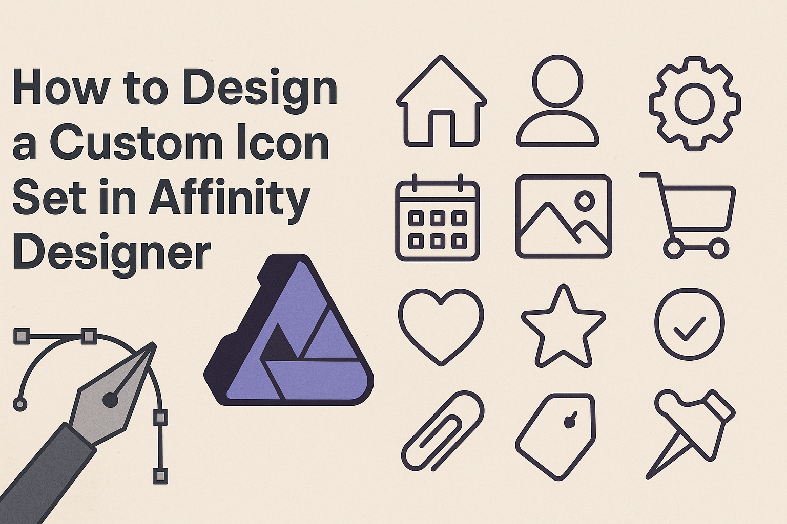
Creating a custom icon set can elevate any project, making it more unique and visually appealing.
In this article, readers will learn step-by-step how to design a professional-looking icon set using Affinity Designer. With the right techniques and tools, they can craft icons that truly represent their brand’s identity.
Affinity Designer offers many features that streamline the icon design process. From using basic shapes to mastering the Symbols Studio, this software enables users to create stunning icons without a steep learning curve.
By following the tips and methods outlined in this post, anyone can develop their own customized icon set.
Whether designing for a personal project or a client, having a tailored icon set can make a significant difference. Readers will find valuable insights and practical instructions that will guide them through each stage of the design process. Embracing creativity while utilizing the power of Affinity Designer can lead to impressive results.
Getting Started with Affinity Designer
Getting familiar with Affinity Designer is an exciting journey.
Understanding the interface, setting up the workspace, and choosing the right canvas size will lay a solid foundation for designing custom icons.
Understanding the Interface
Affinity Designer’s interface is user-friendly and intuitive. It consists of several key elements, including the toolbar, studio panels, and canvas.
The toolbar at the top contains essential tools for drawing, shaping, and editing.
To the right, the studio panels house options like layers, swatches, and properties. These panels help users manage different aspects of their designs effectively.
The canvas is where the magic happens. It allows for real-time editing and viewing of the designed elements.
Familiarizing oneself with these parts can boost efficiency. Users can customize the layout according to their preferences. This can be done by dragging panels around to create a more personal workspace.
Setting Up Your Workspace
Setting up a suitable workspace in Affinity Designer is crucial for productivity.
First, decide on the tools and panels needed for the tasks at hand. This might include the layers panel for organizing designs, the color panel for quick access to swatches, and the text panel for any typography adjustments.
To customize, go to View > Studio and select the panels. Users can then arrange them where needed.
This setup helps reduce clutter and makes it easier to focus on the design work.
Additionally, users can save their workspace layout. This makes it quick to return to a familiar setup later. It can be an excellent way to ensure consistency in their design sessions.
Choosing the Right Canvas Size
Choosing the right canvas size is an important step.
The size will depend on the specific project and the intended use of the icons. For web use, a smaller canvas like 512×512 pixels may be adequate. This size keeps the icons crisp and clear on screens.
For printing or larger displays, a larger canvas of 1024×1024 pixels or more could be ideal. It provides flexibility for detail without compromising quality.
Users can always resize later, but starting with the right dimensions saves time.
To set the canvas size, choose File > New and enter the desired dimensions. Keeping aspect ratios in mind is essential too. This helps maintain the icon’s proportions, ensuring they look great whatever the use.
Designing the Icon Set
Creating a custom icon set involves understanding key design principles, selecting a cohesive theme, and ensuring consistency throughout the icons. Each aspect plays a vital role in making icons effective and visually appealing.
Basic Principles of Icon Design
Good icon design begins with simplicity. Icons should communicate their purpose quickly and clearly. They must be easily recognizable, even at smaller sizes.
Another principle is scalability. Icons should maintain clarity whether they are displayed as small buttons or larger images. This often involves using vector graphics to ensure sharpness at any size.
Additionally, designers should use appropriate contrast and colors. High contrast helps to make icons stand out. Using a limited color palette can enhance harmony across the entire set.
Selecting a Theme and Style
Choosing a theme is crucial for a successful icon set. A theme provides a foundation for the design. It can be based on subject matter, such as office tools or nature, or style, like flat or 3D.
The style should align with the intended use. For example, a playful theme suits a children’s app, while a minimalistic style fits a corporate software. This alignment enhances user experience and sets the right mood.
Designers can gather inspiration from existing icon sets. Reviewing styles and themes can ignite creative ideas. They should also consider their target audience when selecting a theme.
Creating a Consistent Look
Consistency ties an icon set together. Designers should establish a uniform size and shape for all icons. This gives the set a cohesive appearance, making it easier for users to recognize related functions.
Using similar design elements, like line weight and rounded corners, can enhance this consistency. A common color scheme also helps in unifying the set. Consistency makes the icons visually appealing and more functional.
It’s essential to test icons in context. Trying out icons in the actual application or website allows designers to see how they work together. This step ensures the icons are not only beautiful but also effective and user-friendly.
Drawing and Refining Icons
Creating custom icons involves a few essential steps that make the process smoother. Understanding how to use vector tools, work with shapes and paths, and add details and textures are crucial for designing effective icons.
Using Vector Tools
Affinity Designer has powerful vector tools that are perfect for drawing icons. The Pen Tool allows designers to create precise paths and shapes. They can click to create points and adjust curves by dragging the handles.
Using the Node Tool helps in modifying these paths easily. Designers can select and move nodes to refine shapes. To maintain smooth lines, keeping the node count low is beneficial. Exploration of other tools like the Brush Tool or Shape Tool also enhances creativity.
Working with Shapes and Paths
Shapes are fundamental in icon design. Icons often start with basic shapes like circles, squares, and triangles.
Designers can combine these using the Geometry tools in Affinity Designer, such as Union, Subtract, and Intersect.
Knowing how to manipulate paths is key. They can adjust anchor points to alter the shape’s curvature and angles.
Oversimplifying shapes often leads to clearer icons. This is especially true for smaller sizes where details can get lost.
Adding Details and Textures
Details give icons personality. Adding elements like outlines or shadows can make them stand out. Designers should use the Effects panel to add shadows for depth.
Textures, like gradients or patterns, can also enrich the design. Using the Fill Tool allows easy application of color and texture.
Designers must be careful not to overcomplicate their icons. Simple additions often result in a cleaner look that is more recognizable.
Exporting Your Icon Set
Exporting an icon set correctly is essential for ensuring that the icons display well on various platforms and devices. This process involves selecting appropriate file formats, optimizing the icons for different uses, and presenting them in a user-friendly way.
Choosing the Right File Formats
When exporting icons, the choice of file format matters. The two most common formats are SVG and PNG.
- SVG is great for scalability. It allows icons to be resized without losing quality. This is perfect for responsive designs.
- PNG works well for rasterized images and is suitable for web use, especially if transparency is needed.
Additionally, it’s a good idea to provide different sizes of PNGs. This ensures compatibility across various devices, from mobile to desktop.
Optimizing Icons for Different Devices
Optimization is key for effective icon use across different devices.
- For web applications, consider providing multiple resolutions. Standard sizes include 16×16, 32×32, and 64×64 pixels.
- For mobile apps, provide icons in different formats like @1x, @2x, and @3x for various screen densities.
Checking how icons render on both light and dark modes is also beneficial. This ensures that your designs look good in any environment.
Packaging and Presentation Tips
Packaging your icons well enhances their appeal.
- Organize icons by category, such as Social Media, User Interface, or E-commerce.
- Including a preview image helps users see what they are getting.
Consider creating a small documentation file.
This could explain usage rights and provide examples of the icons in action.
An attractive presentation can make a significant difference in how your icons are perceived.