Creating a custom icon for a mobile app can seem challenging, but it is a rewarding experience that adds uniqueness to an app.
Designing a standout icon in Affinity Designer involves choosing the right shapes, colors, and symbols that reflect the app’s purpose.
This guide will simplify the process, making it accessible even for beginners.
Affinity Designer is a powerful tool that offers various features ideal for icon creation. With its user-friendly interface, designers can experiment with different styles to craft an eye-catching icon that grabs users’ attention.
By following the steps outlined here, anyone can learn to create a custom icon that elevates their mobile app’s appeal.
Whether it’s for a game, productivity tool, or creative platform, having a well-designed icon is crucial. This article will provide insight into the design principles and techniques that lead to successful mobile app icon creation in Affinity Designer.
Getting Started with Affinity Designer
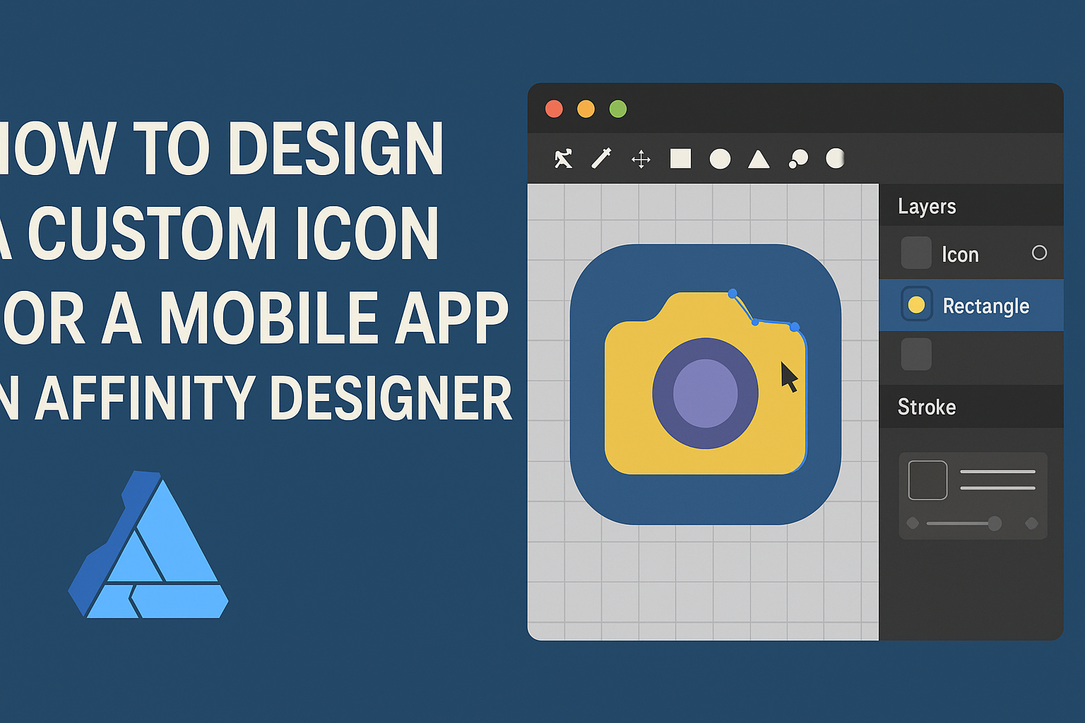
Affinity Designer offers a user-friendly interface for creating custom icons.
Understanding its layout, setting up a canvas, and getting to know basic tools will set a strong foundation for design projects.
Understanding the Affinity Designer Interface
The Affinity Designer interface resembles other graphic design software, making it easy to navigate.
At the top, users find the main toolbar, where essential functions are located. The left side features the toolbox, which contains drawing and selection tools.
On the right, users can access the Layers panel. This is essential for organizing design elements and keeping the workspace organized.
The top-left corner includes three icons known as personas. These allow switching between vector and pixel design modes, giving flexibility in the design process.
Setting Up Your Canvas
To start designing, setting up the canvas is crucial.
Users should go to the File menu and select New to open the canvas setup window. Here, they can choose dimensions suitable for mobile app icons, such as 512×512 pixels.
It’s also important to select the right color model. For mobile apps, RGB is preferred for vibrant colors.
Users can also decide the resolution; a typical choice is 72 DPI for screen displays, ensuring clarity and quality in the final design.
Once the canvas is set, it helps to keep it organized. Adding guides can assist in aligning elements while creating a balanced icon.
Basic Tools and Techniques
Affinity Designer has a variety of basic tools to help in the creation of icons.
The Pen Tool is essential for drawing precise shapes and outlining details.
When needing to create geometric shapes, the Shape Tools come in handy, allowing the user to choose circles, rectangles, and polygons easily.
Coloring can enhance an icon’s appeal. The Color Palette offers quick access to a range of colors.
Users can also adjust the opacity and gradients for a more polished look.
Lastly, utilizing the Transform Tool can help resize and reposition the elements without losing quality. These tools provide a solid base for creating custom icons efficiently.
Designing Your Icon
Designing a custom icon for a mobile app requires careful attention to detail. Each aspect, from size to style, plays a significant role in how the app is perceived. Below are important steps to help create an effective icon.
Choosing the Right Dimensions
The dimensions of an app icon are crucial for delivering a clear and professional look.
Common sizes for mobile app icons are typically 180 x 180 pixels for iOS and 192 x 192 pixels for Android.
Using a grid system can help maintain balance and symmetry in the design. Designers should start with 24 x 24 pixels to ensure clarity on various devices.
It’s important to keep in mind that icons may appear smaller on the screen, so they should be easily recognizable at various sizes.
Vector vs. Pixel Persona
When designing an icon, choosing between vector and pixel-based designs can impact flexibility and quality.
Vector graphics are ideal for icons because they can be resized without losing quality. This means the icon will look sharp on any device.
Affinity Designer offers both vector and pixel personas, allowing designers to work efficiently.
Pixel-based icons might work for detailed images, but they lack the scalability that is vital for app icons.
Selecting the right persona at the start will save time and effort in later stages.
Creating a Sketch and Concept
Before diving into the digital workspace, creating a rough sketch is a valuable step. This allows for brainstorming and refining ideas quickly.
A good practice is to explore various styles and concepts on paper first. By sketching out different designs, the designer can consider color, shapes, and themes without the constraints of software.
After settling on a strong concept, the designer can transfer it to Affinity Designer, where the icon can be polished and finalized. This process helps maintain creativity and ensures the final icon aligns with the app’s branding and purpose.
Refining Your Design
Refining a custom icon enhances its clarity and appeal. This involves carefully adjusting layers, selecting colors, and adding subtle details that bring the icon to life.
Working with Layers and Shapes
Layers are crucial in Affinity Designer. They help keep different elements separate, making adjustments easier.
He can start by grouping related shapes, which allows for smoother edits later. Using the Control-G shortcut can streamline grouping.
It’s essential to name each layer clearly. This avoids confusion and speeds up the design process, especially in complex icons.
Using basic shapes as building blocks can simplify the design. Aligning shapes through the alignment tools ensures they fit together properly.
This meticulous approach helps in visualizing the final product while keeping the design organized.
Color Palettes and Gradients
Choosing the right color palette significantly influences an icon’s attractiveness.
He should start with a limited color scheme to keep the design cohesive.
Using a tool like the Color Wheel in Affinity Designer can help visualize color harmony.
Gradients can add depth and dimension. When applying a gradient, it’s best to use subtle transitions that don’t overpower the main design.
He might choose colors that reflect the app’s purpose. For example, using green tones could signify health or wellness.
Testing colors against different backgrounds is crucial to ensure high visibility.
Adding Details and Effects
Adding small details can elevate an icon, making it more engaging.
He should consider layering textures or shadows for depth.
Effects like drop shadows can separate the icon from the background, enhancing its prominence.
Subtle highlights can draw attention to key areas, making the design pop.
It’s vital to keep effects consistent with the overall style. Overdoing them can make the icon look cluttered.
He should step back and evaluate the design periodically. This can help ensure it remains balanced and clean.
Exporting Your Icon
After creating a custom icon in Affinity Designer, it’s important to export it correctly. Choosing the right format and optimizing for various devices ensures that the icon looks great everywhere it is used.
Choosing the Right Format
When exporting an icon, selecting the appropriate file format is crucial. Common formats include PNG, SVG, and JPG.
- PNG: This format supports transparency and is widely used for app icons. It’s ideal for crisp images with sharp edges.
- SVG: As a vector format, SVG is perfect for scalability. It works well for icons that might need resizing without losing quality.
- JPG: While not recommended for icons due to its lack of transparency, it’s useful for photographic images.
To export, go to the File menu and select “Export.” Choose the desired format based on the needs of the project and the platforms where the icon will be used.
Optimizing for Different Devices
Different devices have various screen sizes and resolutions, so optimization is key.
This can improve the appearance and performance of the icon.
- Resolution: Export icons in multiple sizes to cater to devices like tablets and smartphones.
- Typical sizes include 48×48, 72×72, and 192×192 pixels.
- Aspect Ratio: Maintain a consistent aspect ratio.
- This helps the icon look uniform across platforms.
- File Size: Keep the file size small for quicker loading times.
- Tools like TinyPNG can help reduce file size without sacrificing quality.