Creating an eye-catching poster can be a fun and rewarding project. With Gravit Designer’s tools, anyone can bring their creative vision to life without needing advanced technical skills.
Using simple techniques and features, designers can create stunning posters that grab attention and convey their message effectively.
In this blog post, readers will discover step-by-step methods for using Gravit Designer. From setting up a document to applying text and graphic elements, each tool offers unique possibilities for creativity.
With just a few clicks, they can transform an idea into a vibrant visual piece.
Whether it’s for an event, promotion, or personal art project, understanding how to navigate Gravit Designer can make a significant difference. Exploring its various design tools equips designers with the knowledge to produce professionally styled posters that stand out.
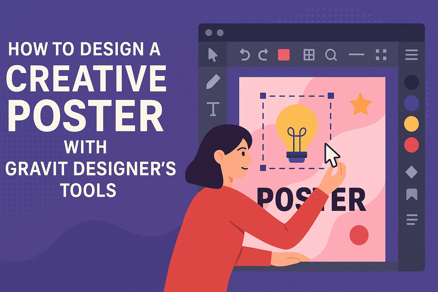
Getting Started with Gravit Designer
Gravit Designer is a user-friendly vector design application that helps users create stunning graphics. It offers various tools and features that can elevate your design skills. Here’s how to get started with this powerful software.
Overview of Gravit Designer Interface
The Gravit Designer interface is designed to be intuitive.
At the top, users find the menu bar with options to create new documents, open existing files, and access various settings. The toolbar on the left side holds essential tools like the selection, shape, and text tools.
On the right side, the inspector panel allows for easy adjustments to selected elements. This includes settings for fill, stroke, shadows, and more.
The canvas in the center is where all the magic happens, displaying the design in progress. Familiarity with this layout is crucial for smooth navigation.
Setting Up Your Document
Before diving into design, setting up the document is essential.
Users can start by selecting File > New Document. This opens a dialog box where they can choose from various sizes and orientations, depending on project needs.
They can also set up custom dimensions if required. After choosing dimensions, click Create to open a new workspace.
It’s also helpful to select the units (like pixels or inches) based on the project. Understanding these initial settings will help streamline the design process later.
Familiarizing with Core Tools
Gravit Designer comes with a range of core tools that every user should know.
The vector tool allows for precise shapes and paths, making it a fundamental feature for any design.
The text tool is used for adding typography, where users can adjust the font, size, and style easily.
Additionally, the pen tool provides more control for custom shapes. Reviewing these tools through practice will build confidence and skill in the design process.
Creating Your Poster Layout
A well-structured layout is key to making an engaging poster. It helps guide viewers’ eyes and ensures that the important information stands out. Here are some essential strategies to create an effective poster layout.
Working with Grids and Guides
Grids and guides are valuable tools in Gravit Designer. They help to align elements consistently.
By enabling grids, a designer can ensure that text, images, and designs are properly positioned.
Using a grid system, she can create sections for each part of the poster, like titles, images, and body text. For instance, a simple 3-column grid can help organize content and make it visually appealing.
Guides can also be used to set margins and padding. This provides a clean layout with enough space around elements. It prevents clutter and keeps the design balanced.
Choosing a Focal Point
Selecting a focal point is crucial for attracting attention to the poster. The focal point should be the most important element, such as the title or a striking image.
The designer can achieve this through size and contrast. Making the focal point larger or using bold colors can help it stand out.
Placement is also key. Typically, the focal point is placed near the top or center of the poster. This position naturally draws the viewer’s eye.
Balancing Elements for Visual Impact
Balance is important in any design. It ensures that no single part overwhelms others.
To achieve balance, they should distribute text and images evenly throughout the layout.
Using a mix of different element sizes can create visual interest. For example, pairing a large header with smaller images creates a dynamic look.
Whitespace is a powerful tool in balancing elements. It provides breathing room, making the design easier to digest. A balanced layout improves readability and keeps the viewer engaged without feeling overwhelmed.
Adding Creativity with Visual Elements
Creative posters come alive through thoughtful visual elements. Using color, texture, illustrations, and typography can significantly enhance any design. Here’s how to make these aspects work for a more engaging poster.
Incorporating Colors and Textures
Colors are one of the most powerful tools in design. They evoke emotions and set the mood.
When choosing a color palette, consider using complementary or analogous colors to create a harmonious look.
Textures add depth and interest. Gravit Designer allows users to apply textures easily. This can transform flat designs into something more dynamic.
For example, a paper texture can make a poster feel more vintage, while a glossy finish can give it a modern flair.
Utilizing Vector Illustrations and Icons
Vector illustrations and icons are excellent for conveying messages quickly. They can simplify complex ideas and attract attention.
Gravit Designer has a library of vector elements that can be customized easily.
Adding personalized illustrations can help in expressing unique themes. For example, a custom icon can represent a theme or event directly. This approach gives posters a professional touch while maintaining individuality.
Creating Custom Typography
Typography plays a critical role in poster design. The right font can enhance readability and add character.
Gravit Designer enables users to manipulate text in various ways. Adjusting size, spacing, and placement can make a big difference.
Custom typography can also help in creating a unique brand identity. Designers can modify fonts or combine styles to fit their theme. Bold headlines paired with elegant script can create an eye-catching contrast that draws viewers in.
Finalizing and Exporting Your Design
Once the poster design is complete, it’s time to make sure everything looks perfect before exporting. The following tips will help with review techniques and explain how to export your design effectively, ensuring high-quality results.
Review and Revision Techniques
Reviewing a design involves critical attention to detail. It’s important to look for spelling errors, color mismatches, or improper alignment.
Here are some effective techniques:
- Zoom In: Check elements closely to find minor flaws that may be missed at a normal view.
- Seek Feedback: Share the design with peers for fresh eyes and new perspectives.
- Use Gravit Designer’s Preview Mode: This mode shows how the poster will look in its final form.
Taking notes during the review process can help track necessary changes. After revisions, it’s wise to conduct a final review before exporting.
Export Options for High-Quality Output
When exporting a design in Gravit Designer, there are several options to consider for quality.
Key export formats include:
- JPEG: Great for photographs, but it’s a lossy format, which means some quality may be lost. Use it for vibrant images.
- PNG: This format preserves quality and is ideal for graphics with transparency.
- PDF: Perfect for print, maintaining high resolution and quality.
To export, navigate to the “File” menu and select “Export.”
Users can choose specific settings, such as resolution and format, to ensure the best output.
Making use of these options helps create impressive final products.