Creating a standout event banner for conferences can greatly enhance a brand’s visibility.
Using PicMonkey, anyone can easily design a branded banner that captures attention and communicates the right message to potential attendees.
With a variety of templates and customizable options, it provides the tools needed to bring creative ideas to life.
Many struggle with the design process, worrying about technical skills or artistic flair.
Fortunately, PicMonkey simplifies everything, allowing users to focus on their brand style and event theme. This means that anyone can create professional-looking banners without prior design experience.
For those wanting to make a memorable impact, knowing how to effectively design a banner is essential.
Readers can expect helpful insights and tips that will guide them through the process of using PicMonkey for their next conference banner design.
This practical approach will make event marketing not just easier, but also more engaging.
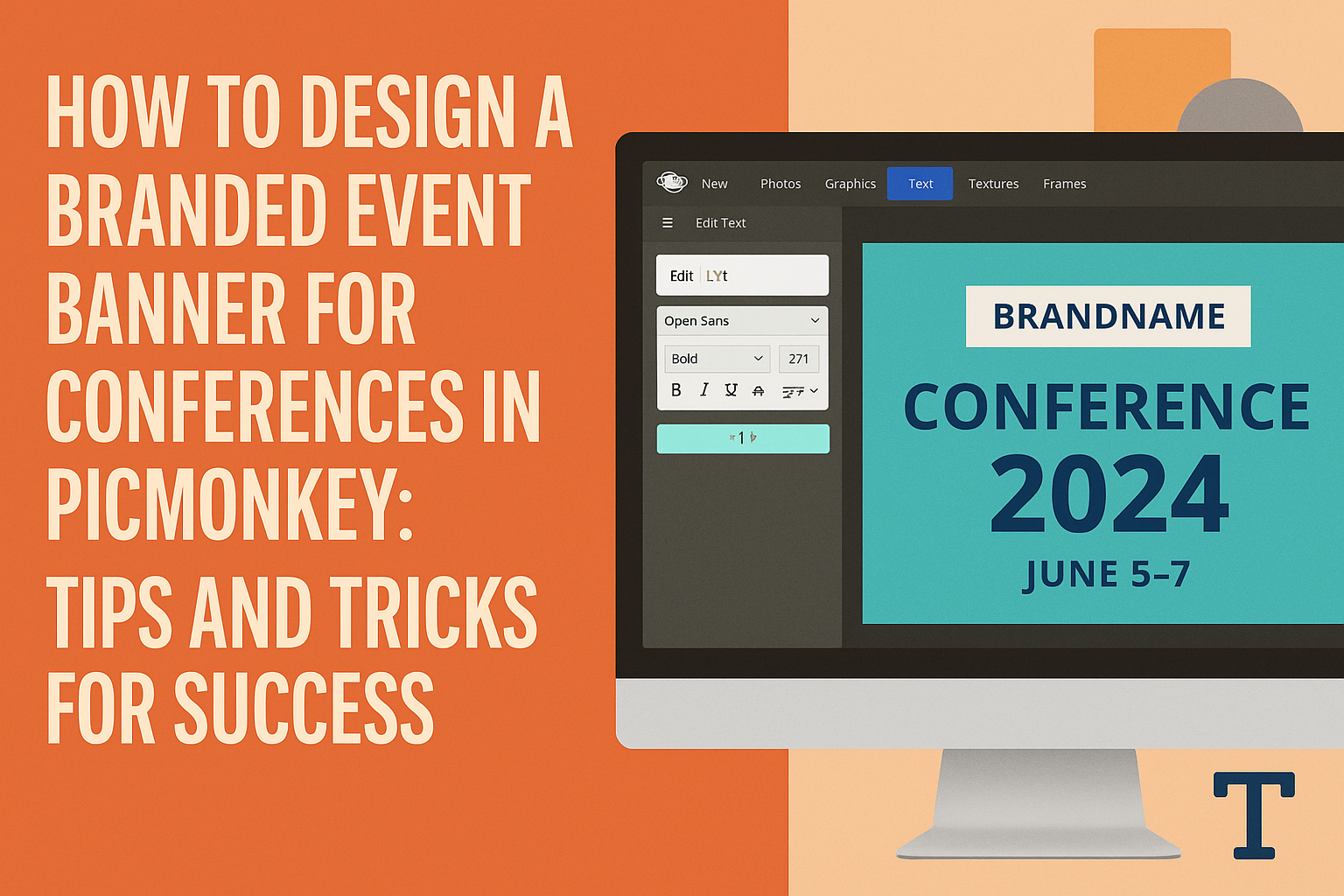
Understanding PicMonkey’s Features
PicMonkey provides users with a range of tools that simplify the design process for event banners.
With its intuitive interface and various features, anyone can create eye-catching banners that represent their brand effectively.
Starting with Templates
PicMonkey offers a wide selection of customizable templates that are perfect for creating event banners.
Users can browse different categories, such as social media, promotions, or events. Each template is designed with various sizes in mind, making it easy to find the right fit.
Choosing a template is a fantastic starting point. It saves time and provides a solid framework for designs.
Users can then modify elements to align with their branding, like colors and images. This functionality makes creating a unique event banner accessible and efficient, even for beginners.
Customizing Designs
Customization is key to making a banner stand out. PicMonkey allows users to adjust every aspect of their design.
From changing colors to uploading their own images, flexibility is built into the process.
Users can access a range of fonts and graphics to enhance their banner. They can also apply filters and effects to images to create a professional look.
Adding personal touches through these customizations helps build a stronger connection with the audience.
Utilizing Layers and Textures
Layers and textures are vital in giving depth to designs. PicMonkey lets users manipulate layers easily, allowing them to create complex visuals.
Users can arrange elements in different orders, making the design more dynamic.
Adding textures can elevate the overall aesthetic of a banner. It brings richness and dimension to the design.
Users can select from various textures or upload their own. This feature ensures that each banner is not only beautiful but also unique to the event or brand it represents.
Design Principles for Event Banners
Effective design makes a lasting impression. Key elements such as color, typography, and images play vital roles in creating event banners that align with brand identity and attract attention.
Color Theory and Brand Identity
Color selection is crucial for establishing brand identity. Different colors evoke various emotions and reactions. For instance, blue often represents trust, while red conveys excitement.
Using a consistent color palette helps strengthen a brand’s recognition.
It’s advisable to choose colors that align with the brand’s existing materials. This creates unity and coherence.
When designing an event banner, consider using bold colors to attract attention, especially from a distance. High contrast between background and text improves visibility.
A harmonious combination keeps the design appealing without overwhelming the viewer.
Typography and Legibility
Typography directly impacts how easily the message is understood. Selecting the right font is essential for clarity.
Sans-serif fonts are often preferred for banners due to their clean lines.
Limit the number of font styles used to maintain cohesion. Mixing too many fonts can create a chaotic look. A good rule is to stick to two or three complementary typefaces.
Font size also matters. The text should be large enough to read from a distance, with headings being bolder and bigger than body text.
Using bold and italic fonts can emphasize key points, but they should be used sparingly.
Image Selection and Enhancement
Images capture attention and convey messages quickly. Choosing high-quality images is essential. Blurry or pixelated visuals can harm a brand’s image.
Images should relate directly to the event’s theme or purpose. For instance, a tech conference can use images of gadgets or innovative technology.
Enhancing images with filters or adjustments can make them more vibrant.
It’s important to maintain a balance so the images do not overpower the text.
Adding a subtle overlay can help text stand out against the image background, improving overall legibility. This ensures that the banner communicates the message effectively.
Creating Your Branded Event Banner
Designing a branded event banner requires careful thought about how to represent the brand and what design elements will catch the audience’s attention. Focusing on brand elements and effective layout strategies can greatly enhance the banner’s impact.
Incorporating Brand Elements
To make the banner instantly recognizable, it is key to incorporate brand elements such as logos, colors, and fonts.
Start by using the brand’s color palette. This unifies the design and attracts attention.
Logos should be prominently displayed. They should be large enough to be seen clearly from a distance.
Using brand-specific fonts for any text helps create consistency and strengthens brand identity.
Consider adding imagery that aligns with the brand’s message. Visuals can evoke emotions and encourage engagement. This can include pictures related to the brand’s values or mission.
Effective Layout Strategies
An effective layout ensures that the banner is clean and easy to read.
Aim for a balanced design by grouping elements in a way that avoids clutter. Use plenty of white space to allow each part to stand out.
Text should be bold and clear.
Key information such as event dates, locations, and topics should be easy to find.
Placing the most important details at eye level can capture attention quickly.
Aligning text and visuals strategically helps guide viewers’ eyes across the banner.
Consider using grids or guides in PicMonkey to maintain a balanced layout. This creates a professional-looking banner that reflects the brand’s commitment to quality.